Home >Web Front-end >HTML Tutorial >Deep understanding of CSS overflow
Deep understanding of CSS overflow
- 巴扎黑forward
- 2017-06-09 14:05:563804browse
Previous words
When an element is fixed to a certain size, but the content cannot fit in the element. At this time, you can use the overflow attribute to control this situation
Definition
overflow overflow
Value: visible | hidden | scroll | auto | inherit
Initial value: visible
Applies to: block-level elements, replacement elements, table cells
Inheritance: None
[Note]Except for IE7-browser, other browsers do not support setting the overflow attribute for the table-cell element. Firefox and IE11 browsers do not support setting the overflow attribute for child elements of the table-cell element that are set to 100% height
##overflow-X | overflow- y
The attributes of overflow-x and overflow-y were originally attributes independently developed by IE browser, and were later adopted and standardized by CSS3. overflow-x is mainly used to define the shearing of horizontal content overflow, and overflow-y is mainly used to define the shearing of vertical content overflow [Note] If the overflow-x and overflow-y values The same is equivalent to overflow. If the overflow-x and overflow-y values are different, and one of the values is explicitly set to visible or is not set, the default is visible, and the other value is a non-visible value. The visible value will be reset to auto Value: visible | hidden | scroll | auto | inherit | no-display | no-content Initial value: visible Applies to: block-level elements, replacement elements, table cells Inheritance: NoneAttribute
visible
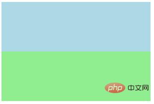
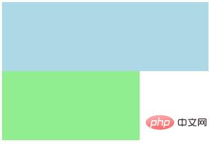
# The content of the element is also visible outside the element box [Note 1] The containing block of the element in IE6-browser will be extended, making You can wrap the excess content.box{
height: 200px;
width: 200px;
background-color: lightgreen;
}.in{
width: 300px;
height: 100px;
background-color: lightblue;
}
<p class="box">
    <p class="in"></p></p>
The picture on the left is IE6-browser, and the picture on the right is other browsers
 |
 |

