

1. Timing-function: steps()
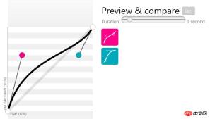
At first, I didn’t pay much attention to this timing-function when using CSS3. Notice the custom Bezier curve.
1) Example in a project
Let’s first look at the difference between adding steps on the left and not adding them on the right. The one on the left is hammer after hammer, and a shadow will appear on the right.

[Note that the following demo cannot be executed in Firefox, but can only be executed in Chrome, because I am animating the "background-image" attribute 】
The code is as follows. I only posted the key codes. For details, you cansee here:
.btn-pay {
  background: url(t_btn-pay.png) no-repeat -30px;
  animation: pay-interval 0.5s steps(1) infinite;
}
.btn-pay2 {
  animation: pay-interval 0.5s linear infinite;
}
@keyframes pay-interval {
  from {
    background-image: url(t_btn-pay.png);
  }
  30% {
    background-image: url(t_btn-pay-active.png);
  }
  to {
    background-image: url(t_btn-pay.png);
  }
}
2) Parameter description
The syntax is as follows:

a. The first parameter specifies the number of intervals in the time function (must be a positive integer). This number of intervals is used between two key frames, that is, form and 30% between, between 30% and to.
b. The second parameter is optional and accepts two values: start and end, specifying a step change at the starting point or end point of each interval. The default is end.
I set 1 in CSS (there is not much difference between start and end in this example), which is a step-by-step animation. If not set, there will actually be multiple steps in it. operation, a shadow will appear.
There is an example written in a foreign article that can distinguish the difference between these two values. The demo link can be clicked here, and the specific principles can be searched online. .
.contain-car {
  animation: drive 4s steps(4, end) infinite;
}
.contain-car-2 {
  animation: drive 4s steps(4, start) infinite;
}
3) Create animation through sprite pictures
Through the synthesized pictures, and then Set an interval number, and animation will appear. For example, the loading picture below, click to view Online demo.

## 2. animation-direction
animation-direction defines whether the animation should be played in reverse in turn. The options are normal, alternate, reverse, etc.
1) Example in a project
The jitter on the left is obviously much smoother, while the jitter on the right is smooth after 100% completion. Jump back to 0% state.

The code is as follows. I only posted the key codes. For details, you cancheck here:
.img1 {
  animation: tel-rotate 1s linear infinite alternate;
}
.img2 {
  animation: tel-rotate 1s linear infinite;
}
@keyframes tel-rotate {
  from {
    -webkit-transform: rotate(-20deg);
    transform: rotate(-20deg);
  }
  to {
    -webkit-transform: rotate(40deg);
    transform: rotate(40deg);
  }
}
2) CSS3 animation frame number calculator
When I was doing this dithering, I didn’t notice this property at first, but later I found it. Such a CSS3 animation frame number calculator.
And noticed that the animation scrolling back and forth in this is very smooth. The calculation of key frames is very particular, and there are some algorithms in it. There is also a lot of relevant information on the Internet.

3. Timing-function: cubic-bezier()
Customize the Bezier curve function. By setting four parameters, you can control the speed of the animation.
The commonly used ease, linear, ease-in, etc. are actually the results obtained after inputting four parameters.
1) An online example
Through customization, you can organize more complex synthetic animations, such as the scene of the ball falling to the ground, click View Online Code.

When I saw this example, I was quite shocked. I always thought that this kind of animation needs to be coordinated with JavaScript.
The picture comes from "Twelve Principles of Web Animation". This article was translated from abroad. The principles inside are summarized by Disney Animation.
2) Bezier auxiliary tools
On the easings.net page, you can view various easing effects.

In cubic-bezier.com, you can make it online. Drag the two red or blue dots to automatically display the corresponding parameter.
The above is the detailed content of Powerful applications of several CSS3 properties that go unnoticed. For more information, please follow other related articles on the PHP Chinese website!

 css怎么隐藏元素但不占空间Jun 01, 2022 pm 07:15 PM
两种方法:1、利用display属性,只需给元素添加“display:none;”样式即可。2、利用position和top属性设置元素绝对定位来隐藏元素,只需给元素添加“position:absolute;top:-9999px;”样式。
 原来利用纯CSS也能实现文字轮播与图片轮播!Jun 10, 2022 pm 01:00 PM
怎么制作文字轮播与图片轮播?大家第一想到的是不是利用js,其实利用纯CSS也能实现文字轮播与图片轮播,下面来看看实现方法,希望对大家有所帮助!
 css3如何实现鼠标点击图片放大Apr 25, 2022 pm 04:52 PM
实现方法:1、使用“:active”选择器选中鼠标点击图片的状态;2、使用transform属性和scale()函数实现图片放大效果,语法“img:active {transform: scale(x轴放大倍数,y轴放大倍数);}”。
 css3什么是自适应布局Jun 02, 2022 pm 12:05 PM
自适应布局又称“响应式布局”,是指可以自动识别屏幕宽度、并做出相应调整的网页布局;这样的网页能够兼容多个不同的终端,而不是为每个终端做一个特定的版本。自适应布局是为解决移动端浏览网页而诞生的,能够为使用不同终端的用户提供很好的用户体验。
 css3动画效果有变形吗Apr 28, 2022 pm 02:20 PM
css3中的动画效果有变形;可以利用“animation:动画属性 @keyframes ..{..{transform:变形属性}}”实现变形动画效果,animation属性用于设置动画样式,transform属性用于设置变形样式。
 css3怎么设置动画旋转速度Apr 28, 2022 pm 04:32 PM
在css3中,可以利用“animation-timing-function”属性设置动画旋转速度,该属性用于指定动画将如何完成一个周期,设置动画的速度曲线,语法为“元素{animation-timing-function:速度属性值;}”。
 css3线性渐变可以实现三角形吗Apr 25, 2022 pm 02:47 PM
css3线性渐变可以实现三角形;只需创建一个45度的线性渐变,设置渐变色为两种固定颜色,一个是三角形的颜色,另一个为透明色即可,语法“linear-gradient(45deg,颜色值,颜色值 50%,透明色 50%,透明色 100%)”。
 一文了解CSS3中的新特性 ::target-text 选择器Apr 12, 2022 am 11:24 AM
本篇文章带大家一起深入了解一下CSS3中的新特性::target-text 选择器,聊聊该选择器的作用和使用方法,希望对大家有所帮助!


Hot AI Tools

Undresser.AI Undress
AI-powered app for creating realistic nude photos

AI Clothes Remover
Online AI tool for removing clothes from photos.

Undress AI Tool
Undress images for free

Clothoff.io
AI clothes remover

AI Hentai Generator
Generate AI Hentai for free.

Hot Article
Hot Tools

Dreamweaver CS6
Visual web development tools

SAP NetWeaver Server Adapter for Eclipse
Integrate Eclipse with SAP NetWeaver application server.

mPDF
mPDF is a PHP library that can generate PDF files from UTF-8 encoded HTML. The original author, Ian Back, wrote mPDF to output PDF files "on the fly" from his website and handle different languages. It is slower than original scripts like HTML2FPDF and produces larger files when using Unicode fonts, but supports CSS styles etc. and has a lot of enhancements. Supports almost all languages, including RTL (Arabic and Hebrew) and CJK (Chinese, Japanese and Korean). Supports nested block-level elements (such as P, DIV),

PhpStorm Mac version
The latest (2018.2.1) professional PHP integrated development tool

Dreamweaver Mac version
Visual web development tools

