

 Web Front-endCSS TutorialDetailed explanation on CSS3 multiple backgrounds and background image cropping, positioning and size
Before CSS3 we could add a image to the background
CSS3 allowed us to add multiple images to one element
Multiple background images
<p class="demo"></p>
.demo { width: 600px; height: 200px; border: 1px solid black; background: url('1.png') no-repeat;}
Multiple backgrounds You can add multiple image resources to the background attribute, separate them with commas
and then use background -position Position them where you want
.demo { width: 600px; height: 200px; border: 1px solid black; background: url('1.png') no-repeat, url('2.png') no-repeat 200px 0, url('3.png') no-repeat 400px 0;}
If no-repeat is not set, the image resources below will overwrite the image resources above
Pictures Starting positionbackground-origin
background-origin allows us to define where the image starts to be positioned
optional attribute valuepadding-box (default), border-box, content-box;
padding-box default image starts from padding
We can add padding to prove this
.demo { width: 600px; height: 200px; border: 20px solid gray/*改*/; padding: 20px/*增*/; background: url('1.png') no-repeat, url('2.png') no-repeat 200px 0, url('3.png') no-repeat 400px 0;}[Note: Comments cannot be used in css. I am commenting like this for the purpose of highlighting. Don’t be misled] 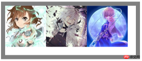
border-box defines the image starting from the border
.demo { width: 600px; height: 200px; border: 20px solid gray; padding: 20px; background: url('1.png') no-repeat, url('2.png') no-repeat 200px 0, url('3.png') no-repeat 400px 0; background-origin: border-box/*增*/;}
After changing to border-box, we found that part of the image was blocked at the bottom of the gray background color
It can be understood that the border should actually be above the element
.demo { width: 600px; height: 200px; border: 20px solid gray; padding: 20px; background: url('1.png') no-repeat, url('2.png') no-repeat 200px 0, url('3.png') no-repeat 400px 0; background-origin: content-box/*改*/;}content-box defines the starting position from the content part of the element
Picture croppingbackground-clip
Although we The starting position is set to the content area
But this does not mean that our picture is limited to the content area
It can be drawn within the entire element border and within the border
You can slightly modify the above code to prove This
.demo { width: 600px; height: 200px; border: 20px solid transparent/*改*/; padding: 20px; background: url('1.png') no-repeat, url('2.png') no-repeat 200px 0, url('3.png')/*删掉no-repeat 默认repeat*/ 400px 0; background-origin: content-box;}
So is there a way to set the range of image display?
This uses our background-clip attribute
and content-origin attributes The values are similar
There are padding-box (default), border-box, content-box;
Set the image display range, as if it has been cropped
.demo { width: 600px; height: 200px; border: 20px solid transparent; padding: 20px; background: url('1.png') no-repeat, url('2.png') no-repeat 200px 0, url('3.png') 400px 0; background-origin: content-box; background-clip: content-box/*增*/;}
In this way, the excess part of the image will not be visible.
The image cropping attribute in our webkit also has a special attribute value which is text
It means that the background image is limited to the text
Combined with text-fill-color, a unique masking text effect can be formed. Learn about
<p class="demo">某科学的超电磁炮</p> <--添加内容
.demo {    width: 600px;    height: 200px;    border: 20px solid transparent;    padding: 20px;    background: url('1.png') no-repeat,                url('2.png') no-repeat 200px 0,                url('3.png') 400px 0;    background-origin: content-box;    -webkit-background-clip: text;/*增*/
    -webkit-text-fill-color: transparent;/*增*/
    font: 75px/200px bold;/*增*/}
background-size
Back to one of our picturesBackground-size This attribute allows us to control the size of the picture
For example, write two pixel values to control the width and height
.demo {/*新*/
    width: 600px;    height: 200px;    border: 1px solid black;    background: url('1.png') no-repeat;    background-size: 180px 140px;}
 Write one pixel The value means that the width and height are the same in pixels
Of course it can also be written in percentage form
In addition, there are two keywords: cover and contain
cover covers the entire area. In our example, the width will be full
.demo { width: 600px; height: 200px; border: 1px solid black; background: url('1.png') no-repeat; background-size: cover/*改*/;}

contain is to ensure that the image is displayed at its maximum within the area, and in our example the height will be full
.demo { width: 600px; height: 200px; border: 1px solid black; background: url('1.png') no-repeat; background-size: contain;}

The above is the detailed content of Detailed explanation on CSS3 multiple backgrounds and background image cropping, positioning and size. For more information, please follow other related articles on the PHP Chinese website!

 The Slideout FooterApr 09, 2025 am 11:50 AM
A fascinating new site called The Markup just launched. Tagline: Big Tech Is Watching You. We’re Watching Big Tech. Great work from Upstatement. The
 Pages for LikesApr 09, 2025 am 11:47 AM
I posted about parsing an RSS feed in JavaScript the other day. I also posted about my RSS setup talking about how Feedbin is at the heart of it.
 Recreating the CodePen Gutenberg Embed Block for Sanity.ioApr 09, 2025 am 11:43 AM
Learn how to create a custom CodePen block with a preview for Sanity Studio, inspired by Chris Coyier’s implementation for Wordpress’ Gutenberg editor.
 How to Make a Line Chart With CSSApr 09, 2025 am 11:36 AM
Line, bar, and pie charts are the bread and butter of dashboards and are the basic components of any data visualization toolkit. Sure, you can use SVG
 Programming Sass to Create Accessible Color CombinationsApr 09, 2025 am 11:30 AM
We are always looking to make the web more accessible. Color contrast is just math, so Sass can help cover edge cases that designers might have missed.
 How We Created a Static Site That Generates Tartan Patterns in SVGApr 09, 2025 am 11:29 AM
Tartan is a patterned cloth that’s typically associated with Scotland, particularly their fashionable kilts. On tartanify.com, we gathered over 5,000 tartan
 A Follow-Up to PHP TemplatingApr 09, 2025 am 11:14 AM
Not long ago, I posted about PHP templating in just PHP (which is basically HEREDOC syntax). I'm literally using that technique for some super basic
 Creating a Modal Image Gallery With Bootstrap ComponentsApr 09, 2025 am 11:10 AM
Have you ever clicked on an image on a webpage that opens up a larger version of the image with navigation to view other photos?


Hot AI Tools

Undresser.AI Undress
AI-powered app for creating realistic nude photos

AI Clothes Remover
Online AI tool for removing clothes from photos.

Undress AI Tool
Undress images for free

Clothoff.io
AI clothes remover

AI Hentai Generator
Generate AI Hentai for free.

Hot Article
Hot Tools

Dreamweaver CS6
Visual web development tools

DVWA
Damn Vulnerable Web App (DVWA) is a PHP/MySQL web application that is very vulnerable. Its main goals are to be an aid for security professionals to test their skills and tools in a legal environment, to help web developers better understand the process of securing web applications, and to help teachers/students teach/learn in a classroom environment Web application security. The goal of DVWA is to practice some of the most common web vulnerabilities through a simple and straightforward interface, with varying degrees of difficulty. Please note that this software

SAP NetWeaver Server Adapter for Eclipse
Integrate Eclipse with SAP NetWeaver application server.

Zend Studio 13.0.1
Powerful PHP integrated development environment

ZendStudio 13.5.1 Mac
Powerful PHP integrated development environment

