Home >Web Front-end >CSS Tutorial >In-depth understanding of CSS series flex compatibility
In-depth understanding of CSS series flex compatibility
- 巴扎黑Original
- 2017-05-21 10:46:411548browse
As the number of pages I have written increases, I have also encountered many CSS compatibility issues. These compatibility issues are inevitable because technology is constantly advancing, so in order not to be eliminated, we must do some compatibility processing. This article mainly introduces the compatibility of flex in CSS. Friends in need can refer to it. Let’s take a look together.
Preface
I have used a lot of flex layout when writing pages, and I think it is very easy to use. Attached below is a good introduction to flex layout.
If you want to know more about the Flex layout tutorial, you can read this blog post yourself, or go to Baidu. Here we will introduce more first, and we will mainly talk about the compatibility issues of flex layout.
#why?
You may want to ask, why does flex layout have compatibility issues?
The reason why compatibility issues exist is because technology is constantly being updated. Some old browsers only support the old syntax writing method, so so-called compatibility issues arise.
what?
So what are the old and new versions?
The flex layout is divided into the old version display: box;, the transitional version display: flex box;, and the current standard version display: flex;. So if you just write a new version of the syntax, there will definitely be compatibility issues.
Android
IOS
## 6.1 starts to support the old version display:-webkit-box;
7.1 Started to support the standard version display: flex;
ie10 started to support, but IE10 is in -ms form.
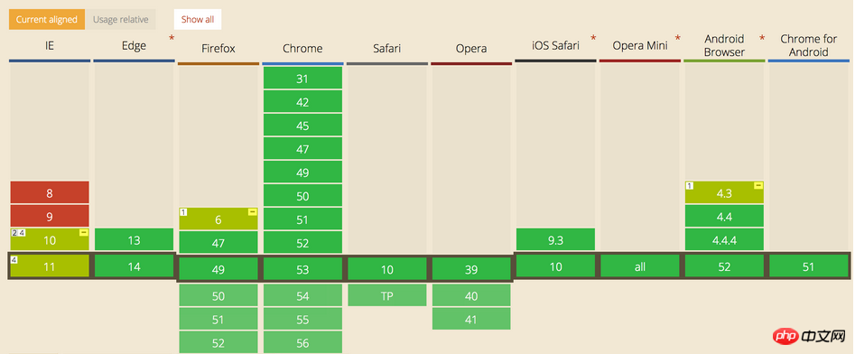
The following is the support status of each browser

how? So how should we write compatibility?
How to write the compatibility of the box
.box{
    display: -webkit-box;  /* 老版本语法: Safari, iOS, Android browser, older WebKit browsers. */
    display: -moz-box;     /* 老版本语法: Firefox (buggy) */
    display: -ms-flexbox;  /* 混合版本语法: IE 10 */
    display: -webkit-flex; /* 新版本语法: Chrome 21+ */
    display: flex;         /* 新版本语法: Opera 12.1, Firefox 22+ */
}
How to write the compatibility of the child element
.flex1 {
    -webkit-box-flex: 1   /* OLD - iOS 6-, Safari 3.1-6 */
    -moz-box-flex: 1;     /* OLD - Firefox 19- */
    -webkit-flex: 1;      /* Chrome */
    -ms-flex: 1           /* IE 10 */
    flex: 1;              /* NEW, Spec - Opera 12.1, Firefox 20+ */
}
This compatible writing method may not be effective. Especially in the base version of Android. Why? Because everything is backward compatible, the order of writing must be written before it will work. Just write the old syntax at the bottom, and only some incompatible mobile settings will recognize it. You will know which ones are the old syntax. Those with boxes must be written at the bottom.
.box{

    display: -webkit-flex;  /* 新版本语法: Chrome 21+ */
    display: flex;          /* 新版本语法: Opera 12.1, Firefox 22+ */
    display: -webkit-box;   /* 老版本语法: Safari, iOS, Android browser, older WebKit browsers. */
    display: -moz-box;      /* 老版本语法: Firefox (buggy) */
    display: -ms-flexbox;   /* 混合版本语法: IE 10 */

 }

.flex1 {
    -webkit-flex: 1;        /* Chrome */
    -ms-flex: 1             /* IE 10 */
    flex: 1;                /* NEW, Spec - Opera 12.1, Firefox 20+ */
    -webkit-box-flex: 1     /* OLD - iOS 6-, Safari 3.1-6 */
    -moz-box-flex: 1;       /* OLD - Firefox 19- */
}
The above is the detailed content of In-depth understanding of CSS series flex compatibility. For more information, please follow other related articles on the PHP Chinese website!
Related articles
See more- How Can I Reliably Hide `` Elements in `` Menus Using CSS?
- How to Generate Accurate CSS Paths from DOM Elements: Why :nth-child Matters?
- How to Create a Responsive Bootstrap 4 Card-Deck with Column Count Based on Viewport?
- Why Aren\'t My Flex Items Respecting Margins When Using `box-sizing: border-box`?
- How to Achieve Smooth Opacity Transitions While Abruptly Changing CSS Display?

