
Home >WeChat Applet >WeChat Development >Detailed explanation of examples of input controls developed by WeChat
Detailed explanation of examples of input controls developed by WeChat

- Y2JOriginal
- 2017-05-12 11:25:461745browse
This article mainly introduces the relevant information of the WeChat applet input boxControlDetailed explanation and examples (various examples). The input box is the most common in the program, login, registration, acquisitionSearchThe content in the box and so on are required. Friends who need it can refer to the following
WeChat applet input input box control
Today’s main details are written Let’s take a look at the Input input box control in the WeChat applet. The input box is the most common in the program. It is needed for logging in, registering, getting the content in the search box, etc. At the same time, you also need to set up different styles of input boxes. Today’s code must be used accordingly.
First of all, the login style is simply displayed and used on the main page.
The code is as follows:
925a1f3a4f482e42fdef638109e2ed51
<!--如果在同一个form表单中创建了多个input输入框,可以给给每个输入框,创建自己的
name=“userName”属性,可以区别哪个输入框,并通过添加
属性提交:bindsubmit="方法名" 重置:bindreset="方法名",达到清除输入框内容的目的
js文件中的用法,e.detail.value.userName.length-->
<view class="itemView">用户名:
 <input class="input" name="userName" placeholder="请输入用户名"
 bindinput="userNameInput"/>
 </view>
<view class="itemView">密 码:
 <input class="input" password placeholder="请输入密码"
 bindinput="passWdInput" />
 </view>
<view class="viewName" style="background-color:#fbf9fe">
 <button class="loginBtn" bindtap="loginBtnClick">登录</button>
 <button class="resetBtn" bindtap="resetBtnClick">清除</button>
</view>
<view>{{infoMess}}</view>
<view>{{userName}}</view>
<view>{{passWd}}</view>
<view class="viewName" style="margin-top: 60px;">
 <navigator url="Component/TextInput/TextInput">
 <text class="view-Name">各类型输入框展示</text>
 </navigator>
</view>
//index.js
##
//获取应用实例
var app = getApp()
Page({
data: {
infoMess: '',
userName: '',
userN:'',
passWd: '',
passW:''
},
//用户名和密码输入框事件
userNameInput:function(e){
this.setData({
userN:e.detail.value
})
},
passWdInput:function(e){
this.setData({
passW:e.detail.value
})
},
//登录按钮点击事件,调用参数要用:this.data.参数;
//设置参数值,要使用this.setData({})方法
loginBtnClick:function(){
if(this.data.userN.length == 0 || this.data.passW.length == 0){
this.setData({
infoMess:'温馨提示:用户名和密码不能为空!',
})
}else{
this.setData({
infoMess:'',
userName:'用户名:'+this.data.userN,
passWd:'密码:'+this.data.passW
})
}
},
//重置按钮点击事件
resetBtnClick:function(e){
this.setData({
infoMess: '',
userName: '',
userN:'',
passWd: '',
passW:'',
})
},
onLoad: function () {
console.log('onLoad')
var that = this
//调用应用实例的方法获取全局数据
app.getUserInfo(function(userInfo){
//更新数据
that.setData({
userInfo:userInfo
})
})
}
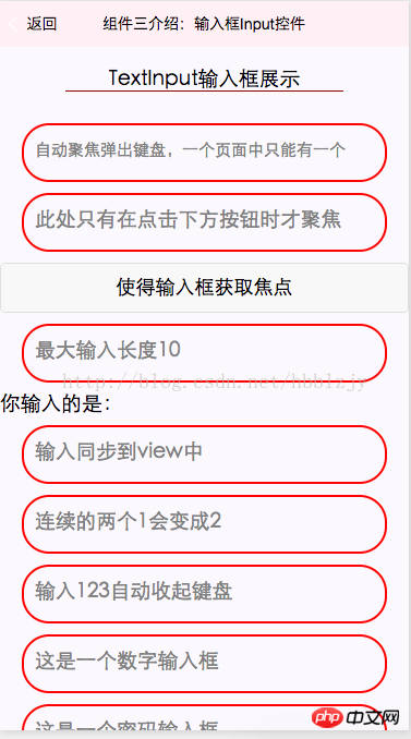
})Then it is displayed in the second interface Different styles and functions of input<!--pages/index/Component/TextInput/TextInput.wxml-->
<view class="viewTitle">
<text class="view-Name">TextInput输入框展示</text>
<view class="lineView"></view>
</view>
<view class="section">
<input class="input" placeholder-style="font-size:15px"
placeholder="自动聚焦弹出键盘,一个页面中只能有一个" auto-focus/>
</view>
<view class="section">
<input class="input" placeholder="此处只有在点击下方按钮时才聚焦" focus="{{focus}}" />
</view>
<view class="section1">
<button bindtap="bindButtonTap">使得输入框获取焦点</button>
</view>
<view class="section">
<input class="input" maxlength="10" placeholder="最大输入长度10" />
</view>
<view class="sectiontitle">你输入的是:{{inputValue}}</view>
<view class="section">
<input class="input" bindinput="bindKeyInput" placeholder="输入同步到view中"/>
</view>
<view class="section">
<input class="input" bindinput="bindReplaceInput" placeholder="连续的两个1会变成2" />
</view>
<view class="section">
<input class="input" bindinput="bindHideKeyboard" placeholder="输入123自动收起键盘" />
</view>
<view class="section">
<input class="input" type="number" placeholder="这是一个数字输入框" />
</view>
<view class="section">
<input class="input" password type="text" placeholder="这是一个密码输入框" />
</view>
<view class="section">
<input class="input" type="digit" placeholder="带小数点的数字键盘"/>
</view>
<view class="section">
<input class="input" type="idcard" placeholder="身份证输入键盘" />
</view>
<view class="section">
<input class="input" placeholder-style="color:red" placeholder="占位符字体是红色的" />
</view>
// pages/index/Component/TextInput/TextInput.js
Page({
 data: {
 focus: false,
 inputValue: ''
 },
 bindButtonTap: function() {
 this.setData({
 focus: true
 })
 },
 bindKeyInput: function(e) {
 this.setData({
 inputValue: e.detail.value
 })
 },
 bindReplaceInput: function(e) {
 var value = e.detail.value
 var pos = e.detail.cursor
 if(pos != -1){
 // 光标在中间
 var left = e.detail.value.slice(0,pos)
 // 计算光标的位置
 pos = left.replace(/11/g,'2').length
 }

 // 直接返回对象,可以对输入进行过滤处理,同时可以控制光标的位置
 return {
 value: value.replace(/11/g,'2'),
 cursor: pos
 }
 // 或者直接返回字符串,光标在最后边
 // return value.replace(/11/g,'2'),
 },
 bindHideKeyboard: function(e) {
 if (e.detail.value === "123") {
 //收起键盘
 wx.hideKeyboard()
 }
 },
 onLoad:function(options){
 // 页面初始化 options为页面跳转所带来的参数
 },
 onReady:function(){
 // 页面渲染完成
 },
 onShow:function(){
 // 页面显示
 },
 onHide:function(){
 // 页面隐藏
 },
 onUnload:function(){
 // 页面关闭
 }
})
Rendering: 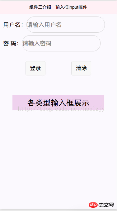
WeChat public account platform source code download
2.WeChat Lala Takeaway 2.2 .4 Decrypt the open source version of WeChat Rubik’s Cube source code
The above is the detailed content of Detailed explanation of examples of input controls developed by WeChat. For more information, please follow other related articles on the PHP Chinese website!
Related articles
See more- Detailed explanation and simple usage of WeChat mini program textarea
- PHP WeChat public account development (2) Baidu BAE construction and database use
- php WeChat public account development (3) php implements simple WeChat text communication
- php WeChat public account development (4) php implements custom keyword reply
- PHP version of WeChat store calling api sample code