
Home >Backend Development >Python Tutorial >Introduction to the basic operation methods of python drawing library
Introduction to the basic operation methods of python drawing library

- Y2JOriginal
- 2018-05-21 11:31:426293browse
This article mainly introduces you to the basic operations of drawing using numpy+matplotlib. The introduction in the article is very detailed and has certain reference learning value for everyone to learn matplotlib drawing. Friends who need it, come and learn together.
Brief description
Matplotlib is a 2D drawing library based on python, which can easily draw line charts using python scripts. Commonly used charts such as histograms, power spectra, scatter plots, etc., and the syntax is simple. For detailed introduction, please see the matplot official website.
Numpy (Numeric Python) is an extension of Python numerical operations that imitates matlab. It provides many advanced numerical programming tools, such as matrix data types, vector processing, and sophisticated operation libraries. It is specially designed for strict digital processing, and it is said that since its appearance, NASA has handed over many tasks originally done with fortran and matlab to numpy, which shows its power. . . His official website is here, and the specific information is in it.
Installation
$sudo apt-get install python-matplotlib
$sudo apt-get install python-numpy
(Niu Li Dafa is good~)
Use
matplotlib can be used in scripts, but it will be more dazzling if used in ipython (directly adding the –pylab parameter can avoid the process of importing the package), and you can get something similar to Matlab/Mathematica The same function, instant input, instant output. Personally, I feel that to put it bluntly, it is imitating Matlab/Mathematica, but it is indeed more convenient to program than the former.
In many cases, matplot needs to be used together with the numpy package. I am not going to talk about the numpy package separately. I will just mention it when it is used. One thing to note is that the numpy package is usually imported like this:
import numpy as np
will give it an alias called np, and this is almost a convention.
Just enter help(*function to be found*) in python or ipython (of course you need to import the package first).
First image
Package that needs to be imported:
import numpy as np
from pylab import *
A function image
X = np.linspace(-np.pi, np.pi, 256,endpoint=True)
C,S = np.cos(X), np.sin(X)
plot(X,C)
plot(X,S)
show()
Students with matlab foundation must be familiar with it. . . Yes, the combination of these two modules is almost the same as the usage of matlab. .
1. First use the np.linspace method to generate an array X. This array starts from $-\pi$ to $\pi$ is an array containing a total of 256 elements. The endpoint parameter indicates whether to include the first and last endpoints (its value is True or False, and the first letter must be capitalized...). Of course, this array is just an ordinary array, no different from other arrays.
2. Then use the np.cos() and np.sin() methods to act on the X array, and calculate each element in X, Generates an array of results. (Eliminating the iterative process).
3. Then call the plot method of pylab. The first parameter is the abscissa array, the second parameter is the ordinate array, and other parameters will not be discussed for the time being. This will generate a default chart. (It will not be displayed immediately)
4. Of course, the show method must be called at the end to display the chart.
5. Result:
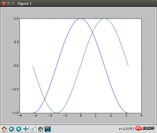
The name of the chart is figure1, and there are several buttons on the lower left, which are very practical things. , the lower right corner will display the current left side of the mouse, which is also very convenient.
Chart layout and coordinate distribution
Each chart is in a figure. We can generate an empty one through the following command figure:
figure(figsize=(8,6), dpi=80)
There is no requirement for the order of parameters here, but the parameter name must be added, because it distinguishes each parameter based on the parameter name, which is similar to C language Functions of different types. The figsize parameter represents the aspect ratio of the figure, and dpi represents the length of each part. For example, here it means that the image is 640x480.
After outputting the command, a window will appear immediately. All subsequent plot commands will be displayed in this window immediately without entering the show command.
A figure can also display multiple charts. We can use the following function to split a figure:
subplot(3,4,6)
This will split the current figure into 3 lines A table with 4 columns, and activate the 6th one, that is, the 3rd one in row 2. Future plots will be generated on this subtable. If you need to replace it, you can re-enter the subplot command to determine its new position.
In addition, if we are not satisfied with the range displayed by the chart, we can also directly adjust the coordinate range of the chart:
xlim(-4.0,4.0)
ylim(-1.0,1.0)
这就表示x轴的范围设置在-4到4,y轴的范围设置在-1到1。当然,如果是想相对的进行修改我们可以利用下numpy数组的min和max方法。比如X.min() 这样的东西。
如果对坐标显示的密度啊什么的不满意,我们也可以调节他的标注点:
xticks(np.linspace(-4,4,9,endpoint=True))
yticks(np.linspace(-1,1,5,endpoint=True))
对于xticks和yticks,我们实际上可以传入任意的数组,这里不过是为了方便而用numpy快速生成的等差数列。
当然,我们也可以给标注点进行任意的命名,像下面这样:
xticks([1,2,3,4,5],['one','two','three','four','five'])
效果也很好想象,就不贴图了。需要注意的是这里也可以支持LaTex语法,将LaTex引用在两个$之间就可以了。(关于LaTex)
这里也有个小窍门,就是如果想不显示标注的话,我们就可以直接给xticks赋一个空的数组。
更改色彩和线宽
我们可以在画plot的时候用如下方法指定他的颜色和线宽:
plot(X, C, color='#cadae3', linestyle='-',linewidth=1.3, marker='o', markerfacecolor='blue', markersize=12,)
同样,这里参数的顺序不重要,名字才重要。
color参数可以指定RGB的色相,也可以用一些默认的名字,比如red blue之类的。
linestyle参数则指定了线的样式,具体参照以下样式:
| 参数 | 样式 |
|---|---|
| ‘-‘ | 实线 |
| ‘–' | 虚线 |
| ‘-.' | 线-点 |
| ‘:' | 点虚线 |
linewidth参数指定折线的宽度,是个浮点数。
marker参数指定散点的样式,具体参照以下样式:
| 参数 | 样式 |
|---|---|
| ‘.' | 实心点 |
| ‘o' | 圆圈 |
| ‘,' | 一个像素点 |
| ‘x' | 叉号 |
| ‘+' | 十字 |
| ‘*' | 星号 |
| ‘^' ‘v' ‘545710c31060c68aa33a6f2f6c6a04be' | 三角形(上下左右) |
| ‘1' ‘2' ‘3' ‘4' | 三叉号(上下左右) |
markerfacecolor参数指定marker的颜色
markersize参数指定marker的大小
这样就基本上能够自定义任何的折线图、散点图的样式了。
移动轴线
这段有点小复杂,暂时不想具体了解奇奇怪怪的函数调用,姑且先记录下用法和原理:
ax = gca()
ax.spines['right'].set_color('none')
ax.spines['top'].set_color('none')
ax.xaxis.set_ticks_position('bottom')
ax.spines['bottom'].set_position(('data',0))
ax.yaxis.set_ticks_position('left')
ax.spines['left'].set_position(('data',0))
我们知道一张图有上下左右四个轴线,这里我们把右边和上边的轴线颜色调为透明,然后把下边设置到y轴数据为0的地方,把左边设置到x轴数据为0的地方。这样我们就能根据自己想要位置来调节轴线了。
比如下面这段官方的代码:
# -----------------------------------------------------------------------------
# Copyright (c) 2015, Nicolas P. Rougier. All Rights Reserved.
# Distributed under the (new) BSD License. See LICENSE.txt for more info.
# -----------------------------------------------------------------------------
import numpy as np
import matplotlib.pyplot as plt
plt.figure(figsize=(8,5), dpi=80)
ax = plt.subplot(111)
ax.spines['right'].set_color('none')
ax.spines['top'].set_color('none')
ax.xaxis.set_ticks_position('bottom')
ax.spines['bottom'].set_position(('data',0))
ax.yaxis.set_ticks_position('left')
ax.spines['left'].set_position(('data',0))
X = np.linspace(-np.pi, np.pi, 256,endpoint=True)
C,S = np.cos(X), np.sin(X)
plt.plot(X, C, color="blue", linewidth=2.5, linestyle="-")
plt.plot(X, S, color="red", linewidth=2.5, linestyle="-")
plt.xlim(X.min()*1.1, X.max()*1.1)
plt.xticks([-np.pi, -np.pi/2, 0, np.pi/2, np.pi],
 [r'$-\pi$', r'$-\pi/2$', r'$0$', r'$+\pi/2$', r'$+\pi$'])
plt.ylim(C.min()*1.1,C.max()*1.1)
plt.yticks([-1, 0, +1],
 [r'$-1$', r'$0$', r'$+1$'])
plt.show()
显示的结果就是:

图例和注解
图例十分简单,下述代码就可以解决:
plot(X, C, color="blue", linewidth=2.5, linestyle="-", label="cosine")
plot(X, S, color="red", linewidth=2.5, linestyle="-", label="sine")
legend(loc='upper left')
在plot里指定label属性就好了,最后调用下legend函数来确定图例的位置,一般就是'upper left'就好了。
注解就有点麻烦了,要用到annotate命令,挺复杂的,暂时是在不想看,姑且贴一段完整的代码和效果图吧:
# -----------------------------------------------------------------------------
# Copyright (c) 2015, Nicolas P. Rougier. All Rights Reserved.
# Distributed under the (new) BSD License. See LICENSE.txt for more info.
# -----------------------------------------------------------------------------
import numpy as np
import matplotlib.pyplot as plt
plt.figure(figsize=(8,5), dpi=80)
ax = plt.subplot(111)
ax.spines['right'].set_color('none')
ax.spines['top'].set_color('none')
ax.xaxis.set_ticks_position('bottom')
ax.spines['bottom'].set_position(('data',0))
ax.yaxis.set_ticks_position('left')
ax.spines['left'].set_position(('data',0))
X = np.linspace(-np.pi, np.pi, 256,endpoint=True)
C,S = np.cos(X), np.sin(X)
plt.plot(X, C, color="blue", linewidth=2.5, linestyle="-", label="cosine")
plt.plot(X, S, color="red", linewidth=2.5, linestyle="-", label="sine")
plt.xlim(X.min()*1.1, X.max()*1.1)
plt.xticks([-np.pi, -np.pi/2, 0, np.pi/2, np.pi],
  [r'$-\pi$', r'$-\pi/2$', r'$0$', r'$+\pi/2$', r'$+\pi$'])
plt.ylim(C.min()*1.1,C.max()*1.1)
plt.yticks([-1, +1],
  [r'$-1$', r'$+1$'])
t = 2*np.pi/3
plt.plot([t,t],[0,np.cos(t)],
  color ='blue', linewidth=1.5, linestyle="--")
plt.scatter([t,],[np.cos(t),], 50, color ='blue')
plt.annotate(r'$\sin(\frac{2\pi}{3})=\frac{\sqrt{3}}{2}$',
  xy=(t, np.sin(t)), xycoords='data',
  xytext=(+10, +30), textcoords='offset points', fontsize=16,
  arrowprops=dict(arrowstyle="->", connectionstyle="arc3,rad=.2"))
plt.plot([t,t],[0,np.sin(t)],
  color ='red', linewidth=1.5, linestyle="--")
plt.scatter([t,],[np.sin(t),], 50, color ='red')
plt.annotate(r'$\cos(\frac{2\pi}{3})=-\frac{1}{2}$',
  xy=(t, np.cos(t)), xycoords='data',
  xytext=(-90, -50), textcoords='offset points', fontsize=16,
  arrowprops=dict(arrowstyle="->", connectionstyle="arc3,rad=.2"))
plt.legend(loc='upper left', frameon=False)
plt.savefig("../figures/exercice_9.png",dpi=72)
plt.show()
效果图:
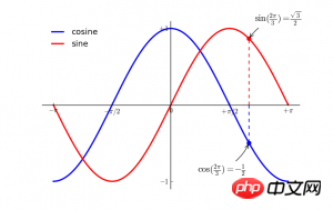
还是十分高能的。。。
总结
【相关推荐】
1. Python免费视频教程
2. Python基础入门教程
The above is the detailed content of Introduction to the basic operation methods of python drawing library. For more information, please follow other related articles on the PHP Chinese website!