
Home >Web Front-end >CSS Tutorial >What are Viewport and device-width?
What are Viewport and device-width?

- 零下一度Original
- 2017-05-11 11:30:053222browse
I have been developing mobile web for more than a year, and I have encountered some very confusing things during this period. For example:
What does the viewport in we often use mean? What is the difference and connection between the device-width here and the screen width we get using JS? , why does the page become very small after removing the tag?
<meta name="viewport" content="width=device-width, initial-scale=1.0, minimum-scale=1.0, maximum-scale=1.0, user-scalable=no">
Why are many screen widths with large resolutions actually not that large? What are the differences and connections between screen resolution and screen width obtained using JS? What is it?
Wait for a series of questions about "pixels" and "width".
Recently I have read a lot of information to find things about "width" and "pixel", and finally I feel that I have a little enlightenment. Here I will share some of my understanding and ask for your criticism and correction. Of course, the article also contains quotes of sentences from other articles. At the end of the article, some reference article links will be posted for your reference~
CSS pixel and device pixels (css px and device px)
First understand what CSS pixels/ 'pɪks (ə)l; -sel /, what are device pixels;
1. CSS pixels can be understood as CSS pixels, which are abstract units used by browsers and are mainly used to draw content on web pages. It can also be said that css px is an abstract concept specially proposed for web developers, and it is only related to the css styles we usually write, and has nothing to do with px in resolution (such as 720px*1280px).
2. Device pixels can be understood as device pixels. The official explanation is: the smallest physical unit of the display screen. Each dp contains its own color, height and width, etc.
For those of us who do web development, the place we use most is "css pixel", which is used in css statements like width:300px;font-size:14px; . It has nothing to do with the px of the device itself. In other words, it is uncertain how many physical pixels one CSS pixel occupies. This problem is easier to understand by scaling the page. For example, on an ordinary HTML page, there is a 300px element; if we enlarge the page, the element will occupy more device pixels (i.e. device pixels), but its CSS pixels remain unchanged, still 300px; the same is true when the page is reduced. The reason is that it occupies fewer device pixels, but its CSS pixels remain unchanged. In other words, how many device pixels an element occupies is determined by the scaling ratio of the current page.
However, page scaling seems to have no meaning for our web development. But there is a problem. The page we develop wants to be displayed in the best style on each screen. We cannot allow uncontrollable elements to exist in the page. So it appeared: That is, we are doing web Viewport is often used during development. So what exactly is a viewport, and why should the width in content be equal to device-width? What is the concept of device-width? Let's take a look at what they are.
Viewport and device-width
Before explaining these two concepts, let’s talk about a situation that everyone knows but doesn’t understand why: converting an ordinary HTML page developed on a PC Put it directly on the mobile phone, and you will find that no matter how big the page is, it can be displayed on the small mobile phone screen, but the graphics and text will be displayed very small; if you use JAVASCRIPT to get the page width, you will find that most page widths They are all 980px, this is related to the viewport.
Viewport originated from Apple, but is now supported by most browsers. There are two concepts about viewport: visual viewport and layout viewport. Here the visual viewport is the visual window, which can be understood as the width of the device itself. At this time, if you have a page with a length of 960, one element is 20% (actually parsed to 192px). But if I open it on a screen with a width of 320px, the element becomes 64px, but at this time the font size I set is 12px, and only 64/12 characters can be displayed on the 320px screen~
In view of this problem, Apple found a solution and defined the viewport meta tag in the mobile version of Safari. Its function is to create a virtual window (viewport). This virtual window is the layout viewport resolution close to the desktop monitor. , apple positions it at 980px. On mobile phones, it can be obtained through document.documentElement.clientWidth.
Other browser manufacturers also have different solutions. For example, UCweb uses intermediate technology.
It is also said that different browser manufacturers have their own definitions of the size of layout viewport. However, the results I tested with the few mobile phones I have (Xiaomi 2s, SONY, Gionee, iPad) are all 980px. Among them, Xiaomi's own browser, QQ browser, UC browser, Google Chrome, and Opera browser were tested on Xiaomi 2s, and the results were the same; no matter what browsers were installed on other mobile phones, they were all tested. The results are all 980px. But this value seems to be of little use to our web development.
Because in most cases, this tag is the most powerful for us, and can make our page The graphics and text are displayed normally, which greatly improves the readability of the page. The function of this meta tag is to set the layout viewport to the width of device-width. But what exactly is device-width?
The first generation iPhone had a resolution of 320*480 and a screen size of 3.5 inches (note that 3.5 inches refers to the diagonal width of the screen). At this time, device-width was 320px. It is also the resolution width of the mobile phone. In this case, device-width is the device width. However, the resolution of the second-generation iPhone has been increased to 480*960, and the screen size is still 3.5 inches. If the device-width is still the device width, then the same 320px page will be placed on the 480*960 mobile phone screen, and the graphics and text will change. It must be relatively small, which will affect its readability. Therefore, the device-width of the iPhone has always been maintained at 320px, and the iPad has been maintained at 1024px. At this time, device-width is no longer the width of the device (that is, it is not the width of the resolution), but an intermediate layer. Android also adopts this concept. Most of its device-width values are 360, but there are also some weird ones like 540px and 600px. After setting the tag, the device-width value can be obtained by using window.innerWidth.
About DPI
dpi (Dots Per Inch), sometimes also called ppi (Point Per Inch), translated as pixel density, represents the number of pixels per inch occupied by the device; the higher the value High means that the display can display images at a higher density. (Note: The pixels here refer to device pixels.) DPI calculation formula:
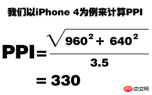
What’s interesting is that this value is higher than the 326 announced on Apple’s official website A little bit.
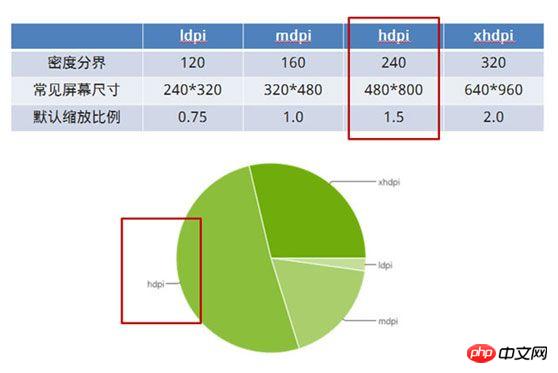
Among them, mobile phones with a PPI between 120-160 are classified as low-density mobile phones, 160-240 are classified as medium-density mobile phones, and 240-320 are classified as high-density mobile phones. , 320 and above are classified as ultra-high density (Apple gave it an elegant name - retina).
These densities correspond to a specific scaling value. Take the iPhone 4 or 4s that we are most familiar with. Their PPI is 326, which is an ultra-high-density mobile phone. When we write a page with a width of 320px and display it on the iPhone, you will find that it is actually full width. This is because the page is enlarged twice by default, which is 640px, and the width of iPhone 4 or 4s is exactly 640px.
DevicePixelRadio
DevicePixelRadio, definition: window.devicePixelRatio is the physical pixels on the device (that is, device-width) and device-independent pixels (device-independent pixels, That is, the ratio of dips). The formula expression is: window.devicePixelRatio = physical pixels/dips
Both Android and iPhone have a conversion unit that occupies the entire screen size. It is called dip or dp in Android and point in iPhone. Dip is device independent pixels, device independent pixels. The ratio of the device's physical pixels to dip is devicePixelRatio. This value can be obtained through window.devicePixelRatio property.
According to some information I found, the value of the independent pixel here is actually the device-width value. This value is the width we usually use for layout on mobile phones, of course, under the premise that the tag is set.
Why is the concept of devicePixelRatio mentioned here?
Because when devicePixelRatio=1.5, that is to say, when the ratio of screen resolution width to device-width is 1.5, the browsers that come with some mobile phones (especially Samsung phones that appear the most) will There is a bug where 1px lines are parsed into 2px, but after testing, the UC browser installed on the same phone generally does not have this bug. Regarding this bug, there is an article on the Internet that gives a better explanation:
[Related recommendations]
1. Free css online video tutorial
3. php.cn Dugu Jiujian (2)-css video tutorial
The above is the detailed content of What are Viewport and device-width?. For more information, please follow other related articles on the PHP Chinese website!
Related articles
See more- Why Does Chrome Display Colors Differently When Switching Monitors?
- Why Do Auto Margins Not Work with Absolute Positioning in CSS?
- How Can I Access CSS-Generated Content Using JavaScript?
- How Can I Show and Hide Divs with Clicks Using Only CSS and HTML?
- Does CSS :not() Selectively Exclude Distant Descendants?