Introduction to two methods of implementing progress bar using CSS3
This article mainly introduces you to the two postures of using CSS3 to realize progress bar. The article gives detailed sample code and graphic introduction, which has certain reference value for everyone. If you need Friends, let’s take a look together.
The renderings are as follows:


#The first posture is as follows
First enter the code
<p id="progress">
      <span></span>
</p>
/*对应CSS*/
#progress{
width: 300px;
height: 30px;
border:1px solid #ccc;
border-radius: 15px;
overflow: hidden; /*注意这里*/
box-shadow: 0 0 5px 0px #ddd inset;
}
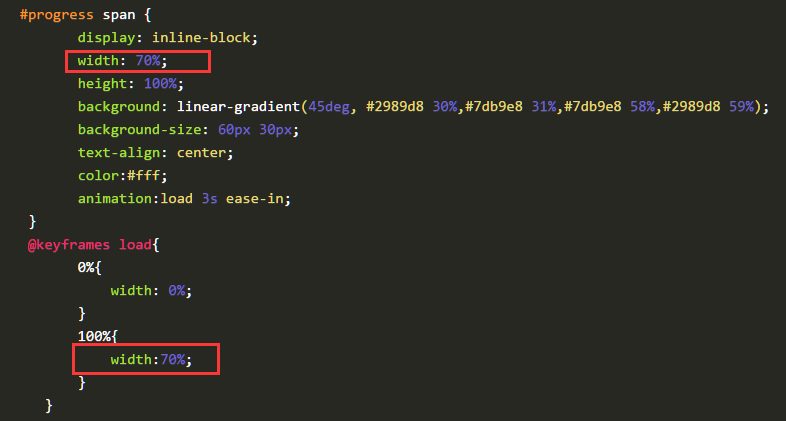
#progress span {
display: inline-block;
width: 70%;
height: 100%;
background: linear-gradient(45deg, #2989d8 30%,#7db9e8 31%,#7db9e8 58%,#2989d8 59%);
background-size: 60px 30px;
text-align: center;
color:#fff;
animation:load 3s ease-in;
}
@keyframes load{
0%{
width: 0%;
}
100%{
width:70%;
}
}The gradient above The color uses linear-gradient in css3
linear-gradient syntax
<linear-gradient> = linear-gradient([ [ <angle> | to <side-or-corner> ] ,]? <color-stop>[, <color-stop>]+)
<side-or-corner> = [left | right] || [top | bottom]
<color-stop> = <color> [ <length> | <percentage> ]?
- angle: Use the angle value to specify the direction (or angle) of the gradient ).
- to left: Set the gradient from right to left. Equivalent to: 270deg
- to right: Set the gradient from left to right. Equivalent to: 90deg
- to top: Set the gradient from bottom to top. Equivalent to: 0deg
- #to bottom: Set the gradient from top to bottom. Equivalent to: 180deg. This is the default value, which is equivalent to leaving it blank.
- color-stop: Used to specify the starting and ending colors of the gradient:
- color: Specify the color.
- length: Use the length value to specify the starting and ending color positions. Negative values are not allowed
- percentage: Use percentage to specify the starting and ending color positions.
Chestnut:
.test1{
    background: linear-gradient(#EA2000, #E5A399);
}
.test2 {
    background: linear-gradient(45deg,#EA2000 20%,#E5632D 50%, #E5B12D 80%);
}
.test3 {
    background: linear-gradient(to top right, #000, #416796 50%, #B5CAE4);
}
.test4{
    background: linear-gradient(45deg, #2989d8 30%,#7db9e8 31%,#7db9e8 58%,#2989d8 59%);
}
Rendering:

It is implemented through keyframes, and the progress effect is achieved by changing the width of span. Isn’t it simple? !
The current progress bar effect is only 70% effective. Just change the value of width. Just like the picture below, change it to a certain value.

Second posture
First, structure it A square p, symmetrically divide the square into two left and right pieces, as follows
What is constructed here is a square of 200px 200px, divided into two rectangles of 100px200px.
<p class="progress2">
        <p class="rect right">
        </p>
        <p class="rect left">
        </p>
 </p>
.progress2{
width: 200px;
height: 200px;
margin: 100px auto;
position: relative;
border:1px solid #ddd;
}
.rect{
width: 100px;
height: 200px;
position: absolute;
top:0;
overflow: hidden; /*注意这里*/
}
.right{
right:0;
}
.left{
left:0;
}The following effect
 Next, construct a hollow circle in each rectangle, first construct the right half, as follows
<p class="progress2">
        <p class="rect right">
            <p class="circle rightcircle"></p>
        </p>
        <p class="rect left">

        </p>
 </p>
.circle{
width: 160px;
height: 160px;
border:20px solid #ccc;
border-radius: 50%;
position: absolute;
top:0;
}
.rightcircle{
border-top:20px solid rgb(41,137,216);
border-right:20px solid rgb(41,137,216);
right:0;
}will see the following effect

Because in
:rect, overflow is set to hidden , so that the overflowing part is covered, and the subsequent effect implementation is closely linked to this attribute relationship.
If this property is not set, the effect will be like this.

Then you will find that part of it is covered, we can rotate it 45 degrees
.circle{
        width: 160px;
        height: 160px;
        border:20px solid #ccc;
        border-radius: 50%;
        position: absolute;
        top:0;
        transform: rotate(45deg); /*注意这里*/
    }
The effect is as follows
 ##The way we achieve the animation effect is to rotate the right half 180 degrees, and then rotate the left half 180 degrees to complete the complete effect.
先给这右半边设置动画效果,即一开始让其旋转45度,然后旋转180度,由于这只是右半边,所以在50%的时候就应该旋转完毕,之后一直保持不变。
.rightcircle{
        border-top:20px solid rgb(41,137,216);
        border-right:20px solid rgb(41,137,216);
        right:0;
        animation: load_right 5s linear infinite;
    }
    @keyframes load_right{
        0%{

            transform: rotate(45deg);
        }
        50%{

            transform: rotate(225deg);
        }
        100%{

            transform: rotate(225deg);
        }
    }
这是没有在class rect中设置overflow:hidden的效果

这是在class rect中设置了overflow:hidden的效果

现在,我们就可以把左半边也凑上了,同理,动画效果一开始先旋转45度,调正,然后一直保持不变,到50%之后,再开始旋转180度。这样就与右半边衔接上了。
<p class="progress2">
        <p class="rect right">
            <p class="circle rightcircle"></p>
        </p>
        <p class="rect left">
            <p class="circle leftcircle"></p>
        </p>
 </p>
.leftcircle{
border-bottom:20px solid rgb(41,137,216);
border-left:20px solid rgb(41,137,216);
left:0;
animation: load_left 5s linear infinite;
}
@keyframes load_left{
0%{
transform: rotate(45deg);
}
50%{
transform: rotate(45deg);
}
100%{
transform: rotate(225deg);
}
}这是整体的效果

可以调整角度或者调整颜色即可实现反向的效果。
我是调整了颜色就可以得到最开始的动画效果啦,下面是完整的代码
<p class="progress2">
        <p class="rect right">
            <p class="circle rightcircle"></p>
        </p>
        <p class="rect left">
            <p class="circle leftcircle"></p>
        </p>
 </p>
.progress2{
width: 200px;
height: 200px;
margin: 100px auto;
position: relative;
}
.rect{
width: 100px;
height: 200px;
position: absolute;
top:0;
overflow: hidden;
}
.right{
right:0;
}
.left{
left:0;
}
.circle{
width: 160px;
height: 160px;
border:20px solid rgb(41,137,216);
border-radius: 50%;
position: absolute;
top:0;
transform: rotate(45deg);
}
.rightcircle{
border-top:20px solid #ccc;
border-right:20px solid #ccc;
right:0;
animation: load_right 5s linear infinite;
}
.leftcircle{
border-bottom:20px solid #ccc;
border-left:20px solid #ccc;
left:0;
animation: load_left 5s linear infinite;
}
@keyframes load_right{
0%{
transform: rotate(45deg);
}
50%{
transform: rotate(225deg);
}
100%{
transform: rotate(225deg);
}
}
@keyframes load_left{
0%{
transform: rotate(45deg);
}
50%{
transform: rotate(45deg);
}
100%{
transform: rotate(225deg);
}
}
The above is the detailed content of Introduction to two methods of implementing progress bar using CSS3. For more information, please follow other related articles on the PHP Chinese website!
 CSS Flexbox vs Grid: a comprehensive reviewMay 12, 2025 am 12:01 AM
Choosing Flexbox or Grid depends on the layout requirements: 1) Flexbox is suitable for one-dimensional layouts, such as navigation bar; 2) Grid is suitable for two-dimensional layouts, such as magazine layouts. The two can be used in the project to improve the layout effect.
 How to Include CSS Files: Methods and Best PracticesMay 11, 2025 am 12:02 AM
The best way to include CSS files is to use tags to introduce external CSS files in the HTML part. 1. Use tags to introduce external CSS files, such as. 2. For small adjustments, inline CSS can be used, but should be used with caution. 3. Large projects can use CSS preprocessors such as Sass or Less to import other CSS files through @import. 4. For performance, CSS files should be merged and CDN should be used, and compressed using tools such as CSSNano.
 Flexbox vs Grid: should I learn them both?May 10, 2025 am 12:01 AM
Yes,youshouldlearnbothFlexboxandGrid.1)Flexboxisidealforone-dimensional,flexiblelayoutslikenavigationmenus.2)Gridexcelsintwo-dimensional,complexdesignssuchasmagazinelayouts.3)Combiningbothenhanceslayoutflexibilityandresponsiveness,allowingforstructur
 Orbital Mechanics (or How I Optimized a CSS Keyframes Animation)May 09, 2025 am 09:57 AM
What does it look like to refactor your own code? John Rhea picks apart an old CSS animation he wrote and walks through the thought process of optimizing it.
 CSS Animations: Is it hard to create them?May 09, 2025 am 12:03 AM
CSSanimationsarenotinherentlyhardbutrequirepracticeandunderstandingofCSSpropertiesandtimingfunctions.1)Startwithsimpleanimationslikescalingabuttononhoverusingkeyframes.2)Useeasingfunctionslikecubic-bezierfornaturaleffects,suchasabounceanimation.3)For
 @keyframes CSS: The most used tricksMay 08, 2025 am 12:13 AM
@keyframesispopularduetoitsversatilityandpowerincreatingsmoothCSSanimations.Keytricksinclude:1)Definingsmoothtransitionsbetweenstates,2)Animatingmultiplepropertiessimultaneously,3)Usingvendorprefixesforbrowsercompatibility,4)CombiningwithJavaScriptfo
 CSS Counters: A Comprehensive Guide to Automatic NumberingMay 07, 2025 pm 03:45 PM
CSSCountersareusedtomanageautomaticnumberinginwebdesigns.1)Theycanbeusedfortablesofcontents,listitems,andcustomnumbering.2)Advancedusesincludenestednumberingsystems.3)Challengesincludebrowsercompatibilityandperformanceissues.4)Creativeusesinvolvecust
 Modern Scroll Shadows Using Scroll-Driven AnimationsMay 07, 2025 am 10:34 AM
Using scroll shadows, especially for mobile devices, is a subtle bit of UX that Chris has covered before. Geoff covered a newer approach that uses the animation-timeline property. Here’s yet another way.


Hot AI Tools

Undresser.AI Undress
AI-powered app for creating realistic nude photos

AI Clothes Remover
Online AI tool for removing clothes from photos.

Undress AI Tool
Undress images for free

Clothoff.io
AI clothes remover

Video Face Swap
Swap faces in any video effortlessly with our completely free AI face swap tool!

Hot Article

Hot Tools

SublimeText3 Linux new version
SublimeText3 Linux latest version

Zend Studio 13.0.1
Powerful PHP integrated development environment

WebStorm Mac version
Useful JavaScript development tools

MinGW - Minimalist GNU for Windows
This project is in the process of being migrated to osdn.net/projects/mingw, you can continue to follow us there. MinGW: A native Windows port of the GNU Compiler Collection (GCC), freely distributable import libraries and header files for building native Windows applications; includes extensions to the MSVC runtime to support C99 functionality. All MinGW software can run on 64-bit Windows platforms.

Dreamweaver CS6
Visual web development tools


