

 Web Front-endH5 TutorialUse HTML5/CSS3 to quickly create special effects code examples for sticky notes in five steps (pictures and text)
Abstract
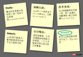
What this article will show you is how to use HTML5/CSS3 to create HTML with sticky note effect in just 5 steps Page, the renderings are as follows:
(Note: The text in the picture is purely fabricated, for humorous purposes, any similarity is purely coincidental, thank you! )

Note: This effect can be seen in Safari, Chrome, Firefox and Opera. The effect cannot be seen on IE due to incomplete support for HTML5.
Step 1: Create basic HTML and squares
First add the basic HTML structure and build the basic square. The code is as follows:
Dudu:
最近咋没有美女发帖呢?我一定给个头条推荐,recommend!recommend!


汤姆大叔:
Team的一个成员去了Microsoft做SDE3,又得hire new member了


技术弟弟:
O2DS和我翻译的书是一样,我一定要比他翻得快, 晚上加班翻,fast! fast! fast!


Artech:
WCF的帖子真是少,看来我得多发点帖子让大家学习呢


吉日嘎拉:
将权限管理、工作流管理做到我能力的极致,一个人只能做好那么很少的几件事情


某武林高手:
低于25000块的面试再也不去了,它grandma的
Add an href to each note Connection, mainly to support keyboard access, the CSS code is as follows:
{:;:;}{:;:;:;:;:;}{:;:;}{:;}{:;:;}{:;:;:;:;:;:;:;}{:;:;}The effect is as follows:

Step 2: Shadow and handwritten cursive characters
This step is to achieve the square shadow effect and change the font to cursive (English only), because Google provides support for Font API , so we can use it directly. First add the call to the Google API:
<link href="http://fonts.googleapis.com/css?family=Reenie+Beanie:regular" rel="stylesheet" type="text/css">
and then set the reference to this font:
{:;:;:;}{:;:;}Regarding the shadow, since each browser still has Neither of them are fully supported, so they need to be processed separately. The code is as follows:
{:;:;:;:;:;:;:; :; :; :;}The effect is as follows:

Step 3: Incline the square
In order to make the square tilt, we need to add the following code in li->a:
{:;:;:;}But in order to make the square tilt randomly instead of all tilting, we need to use a new CSS3 selector to make the square In every 2 tilts, 4 deg, every 3 tilts, negative 3 deg, and every 5 tilts, 5 deg:
{:;:;:;:;:;}{:;:;:;:;:;}{:;:;:;:;:;}The effect is as follows:
Step 4: Scale the square during Hover and Focus
To achieve the scaling effect during Hover and Focus, we need to add the following code:
{:;:;:;:;:;:;:;:;}Set z-index The value of 5 is to allow the square to cover other squares when zooming in. At the same time, because focus is also set, the Tab key is also supported for switching access. The effect is as follows:

Step 5: Smooth transition and add color
The special effects in the fourth step look a bit stiff. We can add Transition to achieve a smooth animation effect. In addition, the color is relatively single. We can set different colors. First add Transition in ul->li->a:
<span style="color: #800000;"> -moz-transition:-moz-transform .15s linear; <br> -o-transition:-o-transform .15s linear; <br> -webkit-transition:-webkit-transform .15s linear; </span>
and then define different colors in even and 3n:
{:;:;:;:;:;:;}{:;:;:;:;:;:;}In this way, This completes our final effect:
Summary
At this point, we have used the basic features of HTML5 and CSS3 to make a pretty good sticky note The effect is that HTML5/CSS3 is indeed very powerful. If you add some advanced features, such as combining it with JavaScript, you can achieve even more awesome effects. You can see this from the HTML5 Lab series of articles given by Dang Knight Brick. .
The above is the detailed content of Use HTML5/CSS3 to quickly create special effects code examples for sticky notes in five steps (pictures and text). For more information, please follow other related articles on the PHP Chinese website!

 HTML5: The Standard and its Impact on Web DevelopmentApr 27, 2025 am 12:12 AM
The core features of HTML5 include semantic tags, multimedia support, offline storage and local storage, and form enhancement. 1. Semantic tags such as, etc. to improve code readability and SEO effect. 2. Simplify multimedia embedding with labels. 3. Offline storage and local storage such as ApplicationCache and LocalStorage support network-free operation and data storage. 4. Form enhancement introduces new input types and verification properties to simplify processing and verification.
 H5 Code Examples: Practical Applications and TutorialsApr 25, 2025 am 12:10 AM
H5 provides a variety of new features and functions, greatly enhancing the capabilities of front-end development. 1. Multimedia support: embed media through and elements, no plug-ins are required. 2. Canvas: Use elements to dynamically render 2D graphics and animations. 3. Local storage: implement persistent data storage through localStorage and sessionStorage to improve user experience.
 The Connection Between H5 and HTML5: Similarities and DifferencesApr 24, 2025 am 12:01 AM
H5 and HTML5 are different concepts: HTML5 is a version of HTML, containing new elements and APIs; H5 is a mobile application development framework based on HTML5. HTML5 parses and renders code through the browser, while H5 applications need to run containers and interact with native code through JavaScript.
 The Building Blocks of H5 Code: Key Elements and Their PurposeApr 23, 2025 am 12:09 AM
Key elements of HTML5 include,,,,,, etc., which are used to build modern web pages. 1. Define the head content, 2. Used to navigate the link, 3. Represent the content of independent articles, 4. Organize the page content, 5. Display the sidebar content, 6. Define the footer, these elements enhance the structure and functionality of the web page.
 HTML5 and H5: Understanding the Common UsageApr 22, 2025 am 12:01 AM
There is no difference between HTML5 and H5, which is the abbreviation of HTML5. 1.HTML5 is the fifth version of HTML, which enhances the multimedia and interactive functions of web pages. 2.H5 is often used to refer to HTML5-based mobile web pages or applications, and is suitable for various mobile devices.
 HTML5: The Building Blocks of the Modern Web (H5)Apr 21, 2025 am 12:05 AM
HTML5 is the latest version of the Hypertext Markup Language, standardized by W3C. HTML5 introduces new semantic tags, multimedia support and form enhancements, improving web structure, user experience and SEO effects. HTML5 introduces new semantic tags, such as, ,, etc., to make the web page structure clearer and the SEO effect better. HTML5 supports multimedia elements and no third-party plug-ins are required, improving user experience and loading speed. HTML5 enhances form functions and introduces new input types such as, etc., which improves user experience and form verification efficiency.
 H5 Code: Writing Clean and Efficient HTML5Apr 20, 2025 am 12:06 AM
How to write clean and efficient HTML5 code? The answer is to avoid common mistakes by semanticizing tags, structured code, performance optimization and avoiding common mistakes. 1. Use semantic tags such as, etc. to improve code readability and SEO effect. 2. Keep the code structured and readable, using appropriate indentation and comments. 3. Optimize performance by reducing unnecessary tags, using CDN and compressing code. 4. Avoid common mistakes, such as the tag not closed, and ensure the validity of the code.
 H5: How It Enhances User Experience on the WebApr 19, 2025 am 12:08 AM
H5 improves web user experience with multimedia support, offline storage and performance optimization. 1) Multimedia support: H5 and elements simplify development and improve user experience. 2) Offline storage: WebStorage and IndexedDB allow offline use to improve the experience. 3) Performance optimization: WebWorkers and elements optimize performance to reduce bandwidth consumption.


Hot AI Tools

Undresser.AI Undress
AI-powered app for creating realistic nude photos

AI Clothes Remover
Online AI tool for removing clothes from photos.

Undress AI Tool
Undress images for free

Clothoff.io
AI clothes remover

Video Face Swap
Swap faces in any video effortlessly with our completely free AI face swap tool!

Hot Article
Hot Tools

mPDF
mPDF is a PHP library that can generate PDF files from UTF-8 encoded HTML. The original author, Ian Back, wrote mPDF to output PDF files "on the fly" from his website and handle different languages. It is slower than original scripts like HTML2FPDF and produces larger files when using Unicode fonts, but supports CSS styles etc. and has a lot of enhancements. Supports almost all languages, including RTL (Arabic and Hebrew) and CJK (Chinese, Japanese and Korean). Supports nested block-level elements (such as P, DIV),

ZendStudio 13.5.1 Mac
Powerful PHP integrated development environment

Dreamweaver CS6
Visual web development tools

MantisBT
Mantis is an easy-to-deploy web-based defect tracking tool designed to aid in product defect tracking. It requires PHP, MySQL and a web server. Check out our demo and hosting services.

SecLists
SecLists is the ultimate security tester's companion. It is a collection of various types of lists that are frequently used during security assessments, all in one place. SecLists helps make security testing more efficient and productive by conveniently providing all the lists a security tester might need. List types include usernames, passwords, URLs, fuzzing payloads, sensitive data patterns, web shells, and more. The tester can simply pull this repository onto a new test machine and he will have access to every type of list he needs.

