This article mainlyintroduces the tutorial of using RGBa to adjust transparency in CSS3. RGBA is an extension of the RGB color model. This abbreviation represents the first of the three primary colors of red, green and blue. Letters and Alpha values represent the transparency or opacity of the color. Friends who need it can refer to
In CSS3, an opacity attribute is added, allowing developers to set the transparency of elements. Now Opacity has been supported by mainstream modern browsers, but opacity will set the set element and its sub-elements to the same transparency at the same time. Such transparency rules are quite inflexible and often cause a lot of trouble in actual development. In fact, there is another color transparency solution in CSS3 - RGBa. Compared with opacity, RGBa can set transparency on a single element without affecting its sub-elements. However, RGBa's browser support is not as extensive as opacity, so it has attracted relatively little attention from developers.
RGBA(R,G,B,A)
Value:
R: red value. PositiveInteger | Percentage
G: Green value. Positive integer | Percent
B: Blue value. Positive integer | Percent
A: Alpha transparency. The value is between 0~1.
The following is white using rgba() to set 50% transparency.
p {
color: rgba(255, 255, 255, 0.5);
}
RGBA is an extension of the RGB color model. This acronym stands for the first letters of the three primary colors red, green, and blue, and the alpha value represents the transparency/opacity of the color.
The following begins with a detailed introduction to RGBa colors.
1. RGBa Color Basics
RGBa essentially adds an alpha channel to the set element, that is, in addition to the three color channels of red, green, and blue. Add a channel representing transparency, in which the RGB value uses the familiar three integers from 0 to 255 to represent red, green, and blue respectively, while the alpha value is from 0 to 1 (one decimal place). The following is an example to illustrate its specific usage:
In CSS 2.1, the use of RGB color declarations is supported (although developers may be more accustomed to using hexadecimal representation such as #343434), for example To set the background color for the p element with the id of example, #343434, you can write
/* RGB 表示方式 */
#example {background: rgb(52, 52, 52); }
and then use RGBa to change the background color in the example to have 0.5 transparency.
/* 设置 0.5 透明度 */
#example-a {background: rgba(52, 52, 52, 0.5); }
/* 也可以省略小数点前的 0 */
#example-a {background: rgba(52, 52, 52, .5); }
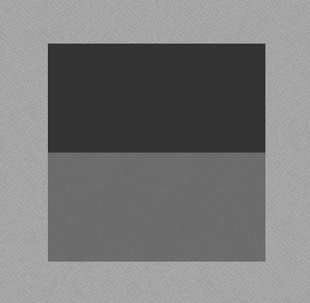
The effects before and after increasing transparency are as follows (in order to more clearly reflect the effect of transparency, the body in the example adds a background texture): 
As can be seen, RGBa just adds a parameter to the original RGB. Although this change is small, it provides developers with great convenience.
In addition, in addition to the background attribute, RGBa can also be used in the color and border attributes (Note: using RGBa for the border attribute in Firefox will be different from that in other browsers. The effect is slightly different).
2. Browser support and progressive enhancement
Although RGBa has received good support in mainstream modern browsers, Webkit's support for RGBa is the earliest,Chrome has started to support RGBa since at least version 0.415. In this regard, Chrome can be said to be very powerful. In addition, Gecko and Presto kernels have gradually implemented support for RGBa. IE browser has only supported RGBa since IE9. . More specific browser support is as follows:
Chrome 0.4.154.33+, Firefox 3.0+, Safari 3.2.1+, Opera 10.10+, IE9+
For more detailed browser support, please Reference here.
For browsers that do not support RGBa, you can use the progressive enhancement solution. Kayo recommends a solution that specifies a reserved color. First of all, developers must be aware that browsers that do not support RGBa will treat CSS property values that use RGBa as syntax errors, and therefore ignore the CSS property setting. Therefore, developers can first set an attribute that does not use transparency before setting the RGBa color to avoid the situation of no color at all when the browser does not support RGBa. The following is an expanded explanation of the above example:
#example1 {background: rgb(52, 52, 52); background: rgba(52, 52, 52, .5); }
does not support RGBa The browser will ignore the second background attribute setting and set the background color of the element according to the first attribute value. Although the effect between browsers cannot be the same, it has achieved a similar effect and reflects a good progressive enhancement solution.
Of course, for IE, you can use filters to achieve the same effect as in browsers that support RGBa. For example: for the above example, you can write the code as follows
<style type="text/css">
#example-a {background: rgba(52, 52, 52, .5); }
</style>
<!--[if IE]>
<style type="text/css">
#example-a {
background: transparent;
filter: progid:DXImageTransform.Microsoft.gradient(startColorstr='#34343432', endColorstr='#34343432');
zoom: 1;
}
</style>
<![endif]-->It should be noted here that the filter The mirror uses the same color and transparency as in the above example, just in hexadecimal.
IE 会忽略 RGBa 颜色设置,并且根据 filter 滤镜设置颜色,这样的效果与 RGBa 的效果相同。
三. 不影响子元素
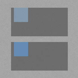
在文章的开头已经介绍过,RGBa 相对 opacity 的优势是不会影响其子元素,即可以单独为被设置的元素设置透明度,而子元素而不受该设置影响。下面再例举一个具体的例子,分别以 RGBa 和 opacity 为元素设置透明度说明两者的区别。
完整代码:
<!DOCTYPE HTML>
<html lang="zh-CN">
<head>
    <meta charset="UTF-8">
    <title>RGBa 与 opacity 效果的区别</title>
    <style type="text/css">
        body {padding-top: 200px; background: url(bg.png); }
        #example, #example-a {width: 200px; height: 100px; margin: 0 auto; }
        #example {background: rgb(52, 52, 52); opacity: 0.5; }
        #example-a {margin-top: 20px; background: rgba(52, 52, 52, .5); }
        .inside {display: block; width: 50px; height: 50px; margin-left: 10px; background: rgb(100, 140, 180); }
    </style>
</head>
<body>
    <p id="example">

        <span class="inside"></span>

    </p>

    <p id="example-a">

        <span class="inside"></span>

    </p>
</body>
</html>
具体效果
可以看出,opacity 会使其中的子元素 span 同时变为半透明的效果,而 RGBa 则只改变被设置的元素的透明度,而在大多数情况下,开发者只需要设置当前元素的透明度(如遮罩,半透明背景等),因此使用 RGBa 会更加的灵活。
另外,在 IE9 中,直接使用 RGBa 颜色与使用 opacity 设置透明的效果会有差异(读者可以在 IE9 下浏览 Demo 查看具体的效果),开发者需要注意这一点差异。
相关文章:
The above is the detailed content of Example of using RGBa to adjust transparency in CSS3. For more information, please follow other related articles on the PHP Chinese website!
 What is CSS Grid?Apr 30, 2025 pm 03:21 PM
CSS Grid is a powerful tool for creating complex, responsive web layouts. It simplifies design, improves accessibility, and offers more control than older methods.
 What is CSS flexbox?Apr 30, 2025 pm 03:20 PM
Article discusses CSS Flexbox, a layout method for efficient alignment and distribution of space in responsive designs. It explains Flexbox usage, compares it with CSS Grid, and details browser support.
 How can we make our website responsive using CSS?Apr 30, 2025 pm 03:19 PM
The article discusses techniques for creating responsive websites using CSS, including viewport meta tags, flexible grids, fluid media, media queries, and relative units. It also covers using CSS Grid and Flexbox together and recommends CSS framework
 What does the CSS box-sizing property do?Apr 30, 2025 pm 03:18 PM
The article discusses the CSS box-sizing property, which controls how element dimensions are calculated. It explains values like content-box, border-box, and padding-box, and their impact on layout design and form alignment.
 How can we animate using CSS?Apr 30, 2025 pm 03:17 PM
Article discusses creating animations using CSS, key properties, and combining with JavaScript. Main issue is browser compatibility.
 Can we add 3D transformations to our project using CSS?Apr 30, 2025 pm 03:16 PM
Article discusses using CSS for 3D transformations, key properties, browser compatibility, and performance considerations for web projects.(Character count: 159)
 How can we add gradients in CSS?Apr 30, 2025 pm 03:15 PM
The article discusses using CSS gradients (linear, radial, repeating) to enhance website visuals, adding depth, focus, and modern aesthetics.
 What are pseudo-elements in CSS?Apr 30, 2025 pm 03:14 PM
Article discusses pseudo-elements in CSS, their use in enhancing HTML styling, and differences from pseudo-classes. Provides practical examples.


Hot AI Tools

Undresser.AI Undress
AI-powered app for creating realistic nude photos

AI Clothes Remover
Online AI tool for removing clothes from photos.

Undress AI Tool
Undress images for free

Clothoff.io
AI clothes remover

Video Face Swap
Swap faces in any video effortlessly with our completely free AI face swap tool!

Hot Article

Hot Tools

mPDF
mPDF is a PHP library that can generate PDF files from UTF-8 encoded HTML. The original author, Ian Back, wrote mPDF to output PDF files "on the fly" from his website and handle different languages. It is slower than original scripts like HTML2FPDF and produces larger files when using Unicode fonts, but supports CSS styles etc. and has a lot of enhancements. Supports almost all languages, including RTL (Arabic and Hebrew) and CJK (Chinese, Japanese and Korean). Supports nested block-level elements (such as P, DIV),

SublimeText3 Linux new version
SublimeText3 Linux latest version

SublimeText3 Chinese version
Chinese version, very easy to use

SublimeText3 Mac version
God-level code editing software (SublimeText3)

EditPlus Chinese cracked version
Small size, syntax highlighting, does not support code prompt function


