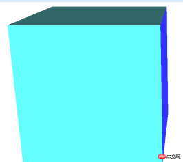
This article introduces the sample code for implementing 3D cube rotation effects using css
Let’s first look at the effect after running


It is a cube that is constantly running
Let’s look at the html part of the code first
<p class="rect-wrap">   <!--舞台元素,设置perspective,让其子元素获得透视效果。-->
    <p class="container">   <!-- 容器,设置transform-style: preserve-3d,让其子元素在3D空间呈现-->
        <p class="top slide"></p>   <!--立方体的六个面-->
        <p class="bottom slide"></p>
        <p class="left slide"></p>
        <p class="right slide"></p>
        <p class="front slide"></p>
        <p class="back slide"></p>
    </p>
</p>
Let’s take a look at their style sheets
<style type="text/css">
.rect-wrap {
    position: relative;
    perspective: 1600px;
}
.container {
    width: 800px;
    height: 800px;
    transform-style: preserve-3d;
    transform-origin: 50% 50% 200px;    /*设置3d空间的原点在平面中心再向Z轴移动200px的位置*/
}
.slide {
    width: 400px;
    height: 400px;
    position: absolute;  //定位
}
.top {
    left: 200px;
    top: -200px;
    transform: rotateX(-90deg);
    transform-origin: bottom;
    background-color:#C69
}
.bottom {
    left: 200px;
    bottom: -200px;
    transform: rotateX(90deg);
    transform-origin: top;
    background-color:#6FF
}
.left {
    left: -200px;
    top: 200px;
    transform: rotateY(90deg);
    transform-origin: right;
    background-color:#9F0
}
.right {
    left: 600px;
    top: 200px;
    transform: rotateY(-90deg);
    transform-origin: left;
    background-color:#33F
}
.front {
    left: 200px;
    top: 200px;
    transform: translateZ(400px);
    background-color:#366  /*立方体前面正对着屏幕,所以不用旋转,只需向Z轴前移动距离*/

}
.back {
    left: 200px;
    top: 200px;
    transform: translateZ(0);
    background-color:#09F   /*立方体后面正对着屏幕,所以不用旋转,只需向Z轴后移动距离*/
}
@keyframes rotate-frame {
    0% {
        transform: rotateX(0deg) rotateY(0deg);
    }
    10% {
        transform: rotateX(0deg) rotateY(180deg);
    }
    20% {
        transform: rotateX(-180deg) rotateY(180deg);
    }
    30% {
        transform: rotateX(-360deg) rotateY(180deg);
    }
    40% {
        transform: rotateX(-360deg) rotateY(360deg);
    }
    50% {
        transform: rotateX(-180deg) rotateY(360deg);
    }
    60% {
        transform: rotateX(90deg) rotateY(180deg);
    }
    70% {
        transform: rotateX(0) rotateY(180deg);
    }
    80% {
        transform: rotateX(90deg) rotateY(90deg);
    }
    90% {
        transform: rotateX(90deg) rotateY(0);
    }
    100% {
        transform: rotateX(0) rotateY(0);
    }
}
.container{
    animation: rotate-frame 30s linear infinite;
}


</style>
Only these codes can achieve 3D rotation
Also To turn it into a picture, you can do this

Add a picture to each p, and then set a unified name for each picture, and then give them a unified style and set Just the height and width are fine
You can paste and copy the code, come and try it
Related articles:
Easy to make HTML5 page turning effect text effects
CSS more commonly used flip effects
Details introduction to how to implement HTML5 3D clothes swing animation special effects
The above is the detailed content of Sample code for implementing 3D cube rotation effects using css. For more information, please follow other related articles on the PHP Chinese website!
 What is CSS Grid?Apr 30, 2025 pm 03:21 PM
CSS Grid is a powerful tool for creating complex, responsive web layouts. It simplifies design, improves accessibility, and offers more control than older methods.
 What is CSS flexbox?Apr 30, 2025 pm 03:20 PM
Article discusses CSS Flexbox, a layout method for efficient alignment and distribution of space in responsive designs. It explains Flexbox usage, compares it with CSS Grid, and details browser support.
 How can we make our website responsive using CSS?Apr 30, 2025 pm 03:19 PM
The article discusses techniques for creating responsive websites using CSS, including viewport meta tags, flexible grids, fluid media, media queries, and relative units. It also covers using CSS Grid and Flexbox together and recommends CSS framework
 What does the CSS box-sizing property do?Apr 30, 2025 pm 03:18 PM
The article discusses the CSS box-sizing property, which controls how element dimensions are calculated. It explains values like content-box, border-box, and padding-box, and their impact on layout design and form alignment.
 How can we animate using CSS?Apr 30, 2025 pm 03:17 PM
Article discusses creating animations using CSS, key properties, and combining with JavaScript. Main issue is browser compatibility.
 Can we add 3D transformations to our project using CSS?Apr 30, 2025 pm 03:16 PM
Article discusses using CSS for 3D transformations, key properties, browser compatibility, and performance considerations for web projects.(Character count: 159)
 How can we add gradients in CSS?Apr 30, 2025 pm 03:15 PM
The article discusses using CSS gradients (linear, radial, repeating) to enhance website visuals, adding depth, focus, and modern aesthetics.
 What are pseudo-elements in CSS?Apr 30, 2025 pm 03:14 PM
Article discusses pseudo-elements in CSS, their use in enhancing HTML styling, and differences from pseudo-classes. Provides practical examples.


Hot AI Tools

Undresser.AI Undress
AI-powered app for creating realistic nude photos

AI Clothes Remover
Online AI tool for removing clothes from photos.

Undress AI Tool
Undress images for free

Clothoff.io
AI clothes remover

Video Face Swap
Swap faces in any video effortlessly with our completely free AI face swap tool!

Hot Article

Hot Tools

Notepad++7.3.1
Easy-to-use and free code editor

Atom editor mac version download
The most popular open source editor

VSCode Windows 64-bit Download
A free and powerful IDE editor launched by Microsoft

WebStorm Mac version
Useful JavaScript development tools

Dreamweaver CS6
Visual web development tools


