Home >Web Front-end >CSS Tutorial >Detailed explanation of how to implement multiple borders in CSS3
Detailed explanation of how to implement multiple borders in CSS3
- 高洛峰Original
- 2017-03-09 17:36:511406browse
CSS3’s box-shadow is really powerful for making multiple borders. This is also the focus of this article’s detailed explanation of CSS3’s method of implementing multiple borders. But before that, let’s take a look at the traditional method with better compatibility:
Method 1: p nesting to achieve multiple borders.
Rendering: 
html code
<p id="outer">
    <p id="inner">p嵌套实现多重边框</p>
</p>
css code
#outer {
    width: 100px;
    height: 100px;
    background-color: bisque;
    border: 10px solid brown;
    position: relative;
}

#inner {
    width: 84px;
    height: 84px;
    border: 8px solid blue;
}
/*#outer,
#inner {
    -webkit-border-radius: 5px;
    -moz-border-radius: 5px;
    border-radius: 5px;
}*/
Disadvantages: It may not be possible to modify the structure or the cost of modifying the html structure is high; when multiple ps are set with rounded corners, the borders cannot fit together completely. Rounded multi-border renderings: 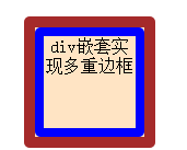
Method 2: Use outline+outline-offset to achieve multiple borders.
If we only need to draw two layers of borders, we can also use outline. The outline is a layer outside the border, which is the same as the border principle. By setting the outline style, you can set another layer of borders outside the border.
But it should be noted that the border set by the outline attribute will not change with the change of the border style of the internal element. In other words, if the element border has rounded corners, the outermost border drawn by outline is still rectangular. This is a shortcoming of outline drawing borders.
Rendering: 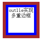
html code
<p id="outline">outlie实现多重边框</p>
#outline {
    width: 84px;
    height: 84px;
    border: 8px solid blue;
    /*-webkit-border-radius: 5px;
    -moz-border-radius: 5px;
    border-radius: 5px;*/
    outline: 10px solid brown;
    outline-offset: 0px;
    /*border和outline之间的距离*/
    margin: 20px;
    /*因为outline不影响布局,使用margin给边框腾位置*/
}
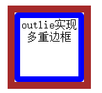
Method 3: Use box-shadow outer projection to achieve multiple borders.
The box-shadow property can set the shadow for the box model. But in fact, it also has the function of setting borders. box-shadow can pass five parameters. The first two parameters represent the offset of the projection, the third parameter represents the blur degree of the projection, the fourth parameter represents the expansion of the projection, and the last parameter represents the color of the projection. . However, we rarely use the fourth parameter. Using the fourth parameter here allows the projection to expand. By setting a more appropriate value, the effect of the border can be simulated.
Similarly, the box-shadow attribute can pass in a list of multiple shadows, which can be separated by ",". Therefore, as long as we define a shadow list and incrementally increase the value of its expansion parameter, we can draw the effect of multiple borders.
Rendering: 
<p id="boxShadow">boxshadow实现多重边框(外投影)</p>
##css code
#boxShadow {
    margin: 40px;
    /*因为box-shadow不影响布局,使用margin给边框腾出位置*/
    width: 84px;
    height: 84px;
    border: 8px solid blue;
    -webkit-border-radius: 5px;
    -moz-border-radius: 5px;
    border-radius: 5px;
    -webkit-box-shadow: 0 0 0 10px brown;
    box-shadow: 0 0 0 10px brown;
    /*参数分别为:水平偏移量、垂直偏移量、模糊距离、向外扩展距离和投影颜色*/
}
Advantages: Multiple rounded corners are perfectly aligned with each other; at the same time, you can also receive a list and set multiple projections (i.e. borders) at one time. Its expansion effect is based on the shape of the element itself. If the element is a rectangle, it will expand into a larger rectangle; if the element has rounded corners, it will also expand into rounded corners.
Disadvantages: CSS3 properties have poor compatibility; box-shadow does not affect the layout. If the relative position of this element and other elements is important, you need to use margins and other methods to provide these extra spaces. "Border" makes room to prevent it from being covered by other elements.
Note: Using inline projection (i.e. box-shadow added parameter is inset, the default is outer shadow when not set) seems to be a better choice. Because inline drop shadows allow the drop shadow to appear inside the element, setting padding to make room for multiple borders inside the element is easier to handle.
Method 4: Use box-shadow inner projection to achieve multiple borders. (Recommended)Rendering:
 html code
<p id="moreboxShadow">boxshadow实现多重边框(内投影)</p>
css code
/*使用box-shadow一次性设置多个边框,并且使用内嵌投影*/
#moreboxShadow {
    width: 120px;
    height: 120px;
    border: 8px solid blue;
    /*注意:向外扩张的距离要每次累加;内嵌投影即添加参数为inset,该参数可选,当不设置时即为外投影*/
    -webkit-box-shadow: inset 0 0 0 10px brown, inset 0 0 0 20px yellow, inset 0 0 0 30px green;
    box-shadow: inset 0 0 0 10px brown, inset 0 0 0 20px yellow, inset 0 0 0 30px green;
    padding: 30px;
    /*设置内边距,为box-shadow添加的添加的边框疼位置,这样就不会影响元素之间的位置*/
}
Advantages: Inline shadowing allows the shadow to appear inside the element, and setting padding makes room for multiple borders inside the element, making it easier to handle.
Disadvantages: CSS3 properties, poor compatibility
The above is the detailed content of Detailed explanation of how to implement multiple borders in CSS3. For more information, please follow other related articles on the PHP Chinese website!

