Home >WeChat Applet >Mini Program Development >Detailed introduction to WeChat mini program development
Detailed introduction to WeChat mini program development
- 高洛峰Original
- 2017-03-03 11:01:481626browse
1: Flex layout
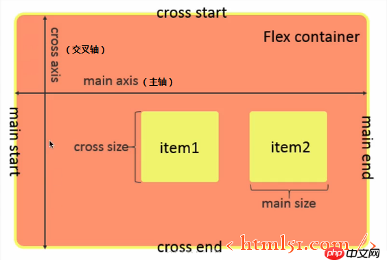
##Flex layout is shown in Figure 1
figure 1
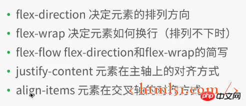
1.1 Flex container properties
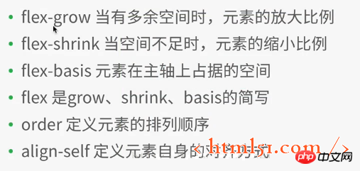
##1.2 Flex container Inner element attributes
WeChat In the mini program development project, create a new file layout, and then create various files (named after layout),
Add the following code to layout.wxml:<view class="container1">
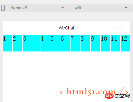
<view class="item1">
1
</view>
<view class="item1">
2
</view>
<view class="item1">
3
</view>
<view class="item1">
4
</view>
</view>
.container1{
    height: 100%;
    width:100%;

}


.item1{
    height:100rpx;
    width:100rpx;
    background-color:cyan;
    border: 1px solid #fff
}
Compile and run as shown in Figure 2
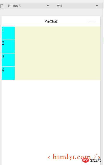
##Modify .container1 as follows: (Add display:flex;) The compilation and running are shown in Figure 3: It can be seen that the flex layout is the default horizontal arrangement of elements
.container1{
    height: 100%;
    width:100%;

    display:flex;
}
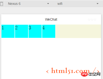 ##1.1.1 Containers Attributes: flex-direction
Add the following code in .container1: It means setting the flex layout to arrange the elements vertically (from left to right for the cross axis, from From top to bottom as the main axis), as shown in Figure 2. (row: flex layout arranges elements horizontally --- from left to right as the main axis, from top to bottom as the cross axis)
flex-direction :column
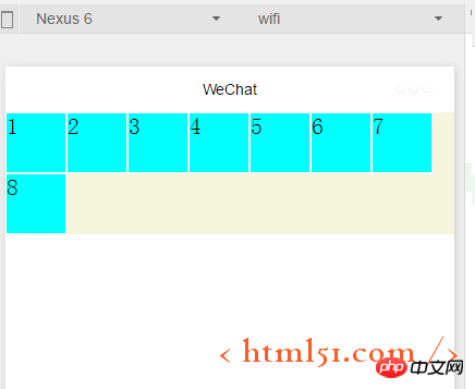
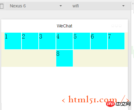
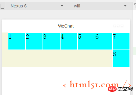
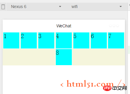
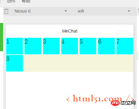
1.1.2 Container properties: flex-wrap Add the following code to .container1: At the same time Copy the element code in layout.wxml to the 8 element views, compile and run, and the effect is shown in Figure 4. It can be seen that the original height and width are 100rpx, and the square view has been transformed into a rectangle. flex-wrap:nowrap ##If modified to the following code: Compile and run as shown in Figure 5: Ensure that each subview is square, and then put the 8th subview that cannot fit on the next line flex-wrap:wrap ##1.1.3 Container properties: flex-flow ##flex-flow: wrap row ,Compilation and running results: As shown in Figure 5, flex-flow is equivalent to the combination of the two attributes flex-direction and flex-wrap ## Add the following code to .container1 : Compile and run as shown in Figure 6. Indicates the alignment on the main axis. Since we set in the above code, it is equivalent to the main axis being from left to right, so the 8th element that cannot be displayed on one line is displayed in the center of the next line. , and the first seven subviews are also displayed in the middle of a row, with blank margins on the left and right sides##justify-content:center
justify-content:flex-end (When the main axis is left to right: right-aligned) The compilation and running effect is shown in Figure 7:
##justify-content:flex-start (when the main axis is left to right: align left) Shown without examples ##justify-content:space-around ---The effect is shown in Figure 8. There are left edges on the left and right of each subview
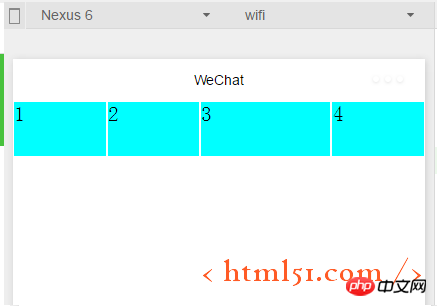
#justify-content:space-between---The effect is shown in Figure 9 , each subview has left and right edges, but the first and last two views are aligned left and right without leaving any edges 1.1.5容器属性:align-items 上面已经很详细讲解主轴上的对齐方式,这里关于这个交叉轴上的对齐方式同理很简单,就不详细展开了。 1.2.1 容器内元素属性:flex-grow layout.wxml中修改代码如下:增加i3 layout.wxss中修改代码如下:在item1中增加: flex-grow: 1,增加i3,表示在一行中如果有剩余空间的话,i3之外的子view占1份空间,而i3子view占2份空间,编译运行效果如图10所示:可以看出i3view所占据的空间比其余3个子view大,但是没有到2倍 1.2.2容器内元素属性:flex-shrink layout.wxml再增加4个子view layout.wxss中修改代码如下:i3的flex-shrink为0,其余子view为1,这表示当空间不足时所有子view都等比缩小,但是i3的view保持大小不变,编译运行,效果如图11所示 更多Detailed introduction to WeChat mini program development相关文章请关注PHP中文网!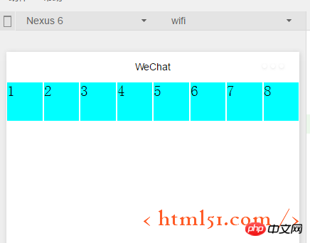
<view class="item1 i3">
3
</view>
.item1{
    height:100rpx;
    width:100rpx;

    border: 1px solid #fff;
    flex-grow: 1
}

.i3{
    flex-grow: 2
}
.item1{
    height:100rpx;
    width:100rpx;

    border: 1px solid #fff;
    flex-shrink: 1
}


.i3{
    flex-shrink: 0
}
Related articles
See more- WeChat Mini Program Simple DEMO layout, logic, and style exercises
- Detailed explanation and examples of WeChat applet wx.request (interface calling method)
- WeChat Mini Program - Detailed explanation of WeChat login, WeChat payment, and template messages
- WeChat applet (application account) simple example application and detailed explanation of the example
- Detailed explanation of WeChat applet for loop

