This article mainly introduces the use of CSS3 to create a material-design style login interface example. It has certain reference value. You can learn more if you need it.
On a whim, I wanted to learn the design style of material design, so I tried to complete the production of a login page.
This is the overall effect.
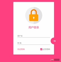
Responsive design
In this page, use the following 3 points to complete the responsive design1. Maximum width. A maximum width of max-width is set to ensure compatibility with large screens.2. Margin: 20px auto; to keep it centered at all times3. Components use pixelsThere are many more points about responsive design.
Overall page layout
<!DOCTYPE html>
<html lang="en">

<head>
    <meta charset="UTF-8">
    <title>Document</title>
    <meta http-equiv="X-UA-Compatible" content="IE=edge,chrome=1">
    <meta name="viewport" content="width=device-width, initial-scale=1.0">
    <link rel="stylesheet" href="styles/style.css">
</head>

<body>
    <p class="container">
        <p class="logo">
            <p class="logo-block-top">
            </p>
            <p class="logo-block-bottom">
            </p>
        </p>
        <h4 id="用户登录">用户登录</h4>
        <p class="content">
            <p class="form-group">
                <input type="text" required class="form-control">
                <label class="form-label">用户名</label>
            </p>
            <p class="form-group">
                <input type="text" required class="form-control">
                <label class="form-label">密 码</label>
            </p>
            <p class="option">
                <p class="option-left"><a href="">忘记密码</a></p>
                <p class="option-right">
                    <span class="md-checkbox" checked="checked"></span>
                    <label class="form-label">记住密码</label>
                </p>
            </p>
        </p>
        <button class="login-button">
            <span class="icon-login"></span>
        </button>
    </p>
</body>
<script src="./app.js type=" text/javascript "></script>

</html>
##CSS Startto body Add style
html {
    font-family: "Microsoft YaHei", 宋体, "Segoe UI", "Lucida Grande", Helvetica, Arial, sans-serif, FreeSans, Arimo;
    background-color: #FF4081;
    color: #777;
}
Heart
.container{
    position: relative;
    max-width: 360px;
    margin: 0 auto;
    margin-top: 30px;
    padding: 45px 20px;
    border-radius: 4px;
    box-shadow: 2px 2px 5px rgba(0, 0, 0, 0.3);
    background-color: #fff;
    box-sizing: border-box;
}
Note that the internal margins are adjusted here using Padding instead of using margin for child elements, because if you want to use margin, for the BFC effect, you need to add overflow: hidden. This will affect the overflow of the tail button.
Head logo.container>.logo {
height: 150px;
width: 150px;
position: relative;
background-color: #EFEFEF;
border-radius: 75px;
margin: 0 auto;
}
Set border-radius to normal width and height, which will make it a circle
 The following requires a darker semicircle
How to draw a semicircle?
.container>.logo::after {
    content: ' ';
    height: 150px;
    width: 75px;
    position: absolute;
    background-color: #E1E1E1;
    border-radius: 0 75px 75px 0;
    left: 75px;
    top: 0;
}
Set the width to the height. Then set the upper left corner and lower left corner rounded corners to 0, and the right corner to 75px
 Make a lock, divided into two parts, lock-top and lock-bottom
.container>.logo>.logo-block-top {
    box-sizing: border-box;
    height: 45px;
    width: 54px;
    border: 10px solid #F57C00;
    border-bottom: 0;
    position: absolute;
    border-radius: 27px 27px 0 0;
    left: 48px;
    z-index: 1001;
    top: 20px;
}
Similarly set the rounded corners
.container>.logo>.logo-block-bottom {
    position: absolute;
    height: 60px;
    width: 80px;
    box-sizing: border-box;
    background-color: #FFA000;
    z-index: 1001;
    top: 65px;
    left: 35px;
    border-radius: 7px;
}
 Set the key heart , this is also divided into two parts, the upper round hole and the lower ellipse
can just be set on the before and after pseudo-elements of lock-bottom
.container>.logo>.logo-block-bottom::before {
    content: " ";
    position: absolute;
    height: 12px;
    width: 12px;
    background-color: #EFEFEF;
    border-radius: 5px;
    top: 22px;
    left: 34px;
    box-sizing: border-box;
}
.container>.logo>.logo-block-bottom::after {
    content: " ";
    position: absolute;
    height: 12px;
    width: 6px;
    background-color: #EFEFEF;
    border-radius: 2px;
    top: 30px;
    left: 37px;
    box-sizing: border-box;
}
The logo is complete here
 The following is the 'User Login' title.
Note, it is best to use margin here instead of padding, do not destroy the original h4 tag.
.container>.login-header {
    text-align: center;
    font-size: 23px;
    color: #FF4081;
    font-weight: 400;
    margin: 15px 0 18px 0;
}
Add a container for the content
.container>.content {
    width: 90%;
    margin: 0 auto;
}
Add a form-group, including label and input tags, set the relative layout
.container>.content>.form-group {
    position: relative;
}
The following is the core part, set the style for the input (this will generate a bug, will be introduced at the end)
.container>.content>.form-group>.form-control {
    z-index: 3;
    position: relative;
    height: 58px;
    width: 100%;
    border: 0px;
    border-bottom: 1px solid #777;
    padding-top: 22px;
    color: #FF4081;
    font-size: 12px;
    background: none;
    box-sizing: border-box;
    outline: none;
    display: inline-block;
    -webkit-transition: 0.3s;
    transition: 0.3s;
}
labe label, use absolute positioning, and place it above the Input.
.container>.content>.form-group>.form-label {
    z-index: 1;
    position: absolute;
    bottom: 10px;
    left: 0;
    font-size: 15px;
    -webkit-transition: 0.3s;
    transition: 0.3s;
}
Set a certain distance between the two form groups, otherwise the lower part will block the box-shadow set above
.container>.content>.form-group>:first-child {
    margin-bottom: 5px;
}
Add Dynamic effect
.container>.content>.form-group>.form-control:focus,
.container>.content>.form-group>.form-control:valid {
    box-shadow: 0 1px #FF4081;
    border-color: #FF4081;
}

.container>.content>.form-group>.form-control:focus+.form-label,
.container>.content>.form-group>.form-control:valid+.form-label {
    font-size: 12px;
    -ms-transform: translateY(-20px);
    -webkit-transform: translateY(-20px);
    transform: translateY(-25px);
}
Now comes the bottom option, which is also divided into two parts, option-left and option-right
.container>.content>.option {
    width: 100%;
    height: 14px;
    margin-top: 24px;
    font-size: 16px;
}

.container>.content>.option>.option-left {
    width: 50%;
    float: left;
}

.container>.content>.option>.option-left>a,
.container>.content>.option>.option-left>a:hover {
    color: #FF4081;
    text-decoration: none;
}
In option-right, please note that this checkbox is not a native Input, but is rotated using p, because the native checkbox cannot change the style.
.container>.content>.option>.option-right {
    width: 50%;
    float: right;
    text-align: right;
    position: relative;
}

.container>.content>.option>.option-right>.md-checkbox {
    height: 18px;
    width: 18px;
    display: inline-block;
    box-sizing: border-box;
    position: absolute;
    background-color: #FF4081;
    cursor: pointer;
    position: absolute;
    top: 3px;
    right: 68px;
}

.container>.content>.option>.option-right>.md-checkbox[checked]:after {
    content: " ";
    border-left: 2px solid #fff;
    border-bottom: 2px solid #fff;
    height: 8px;
    width: 15px;
    box-sizing: border-box;
    position: absolute;
    transform: rotate(-45deg);
    top: 3px;
    left: 2px;
}
The rotation in css3 is used here to imitate a selection effect
Note: Although p cannot be directly selected, you can still add a checkd attribute to it. This attribute It is a special css event effect that can be controlled through js.
Finally, the login button.
Here, absolute positioning must also be used, and the reference points are bottom and right
.container>.login-button {
    position: absolute;
    height: 60px;
    width: 60px;
    border: 0px;
    outline: 0px;
    background-color: #FF4081;
    border-radius: 30px;
    right: -30px;
    bottom: 91px;
    box-shadow: 2px 0 0 rgba(0, 0, 0, 0.3) inset;
}
通过 box-shadow: 2px 0 0 rgba(0, 0, 0, 0.3) inset; 这句话可以知道一个内嵌效果.
中间的按钮在不适用字体图标的情况下也必须要用p 旋转来模仿了
.container>.login-button >.icon-login {
    box-sizing: border-box;
    position: relative;
    width: 18px;
    height: 3px;
    background-color: #fff;
    transition: 0.3s;
    display: block;
    margin: auto;
}

.container>.login-button >.icon-login::after {
    content: ' ';
    box-sizing: border-box;
    position: absolute;
    left: 8px;
    height: 12px;
    width: 12px;
    border-top: 3px solid #fff;
    border-right: 3px solid #fff;
    transform: rotate(45deg);
    top: -4px;
}
最后是鼠标hover上的放大和阴影效果
.container>.login-button:hover {
    box-shadow: 0 0 0 rgba(0, 0, 0, 0.3) inset, 0 3px 6px rgba(0, 0, 0, 0.16), 0 5px 11px rgba(0, 0, 0, 0.23)
}

.container>.login-button:hover>.icon-login {
    -ms-transform: scale(1.2);
    =webkit-transform: scale(1.2);
    transform: scale(1.2);
}
至此,所有的css已经结束了,查看效果

transition bug修复
当我刷新页面或者点击忘记密码的时候,input框就会抖动一下,这个问题只会出现在chrome 浏览器上,firefox 或者edge都不会重现,所以我才这应该是兼容性的问题。 在不断尝试中,我发现,只有取消 transition属性,就不会产生抖动。
这个问题困扰了我3天,真实百思不得其姐。
在某度中查询半天,未果 。
后来终于在 StackOverFlow 中,搜索chrome input transition 时,终于一个回到让我貌似顿开。
this bug has been reported, adding an script tag somewhere can advoid it.
之后,我在页面尾部添加一个下面节点,终于顺利解决。
<script src="./app.js type=" text/javascript "></script>
在阅读过一些文章之后,总结为
当chrome 的input 默认属性向自定义过度时,因为存在transition,所以会产生抖动。 而基本上所有的页面都有script标签,所以这个bug 几乎很难被重现。而我遇到,算是运气好吧。。
至此,这个页面全部内容已经完成。
material-design 很赞,angular-material 是使用 AngularJS 封装了 material-design 的UI 库,很漂亮。不同于 bootstrap的完全扁平化风格,它采用的是盒子堆砌效果,动画效果也比较赞。
以上就是本文的全部内容,希望对大家的学习有所帮助,也希望大家多多支持PHP中文网。
更多CSS3 制作一个material-design 风格登录界面实例相关文章请关注PHP中文网!
 What is CSS Grid?Apr 30, 2025 pm 03:21 PM
CSS Grid is a powerful tool for creating complex, responsive web layouts. It simplifies design, improves accessibility, and offers more control than older methods.
 What is CSS flexbox?Apr 30, 2025 pm 03:20 PM
Article discusses CSS Flexbox, a layout method for efficient alignment and distribution of space in responsive designs. It explains Flexbox usage, compares it with CSS Grid, and details browser support.
 How can we make our website responsive using CSS?Apr 30, 2025 pm 03:19 PM
The article discusses techniques for creating responsive websites using CSS, including viewport meta tags, flexible grids, fluid media, media queries, and relative units. It also covers using CSS Grid and Flexbox together and recommends CSS framework
 What does the CSS box-sizing property do?Apr 30, 2025 pm 03:18 PM
The article discusses the CSS box-sizing property, which controls how element dimensions are calculated. It explains values like content-box, border-box, and padding-box, and their impact on layout design and form alignment.
 How can we animate using CSS?Apr 30, 2025 pm 03:17 PM
Article discusses creating animations using CSS, key properties, and combining with JavaScript. Main issue is browser compatibility.
 Can we add 3D transformations to our project using CSS?Apr 30, 2025 pm 03:16 PM
Article discusses using CSS for 3D transformations, key properties, browser compatibility, and performance considerations for web projects.(Character count: 159)
 How can we add gradients in CSS?Apr 30, 2025 pm 03:15 PM
The article discusses using CSS gradients (linear, radial, repeating) to enhance website visuals, adding depth, focus, and modern aesthetics.
 What are pseudo-elements in CSS?Apr 30, 2025 pm 03:14 PM
Article discusses pseudo-elements in CSS, their use in enhancing HTML styling, and differences from pseudo-classes. Provides practical examples.


Hot AI Tools

Undresser.AI Undress
AI-powered app for creating realistic nude photos

AI Clothes Remover
Online AI tool for removing clothes from photos.

Undress AI Tool
Undress images for free

Clothoff.io
AI clothes remover

Video Face Swap
Swap faces in any video effortlessly with our completely free AI face swap tool!

Hot Article

Hot Tools

mPDF
mPDF is a PHP library that can generate PDF files from UTF-8 encoded HTML. The original author, Ian Back, wrote mPDF to output PDF files "on the fly" from his website and handle different languages. It is slower than original scripts like HTML2FPDF and produces larger files when using Unicode fonts, but supports CSS styles etc. and has a lot of enhancements. Supports almost all languages, including RTL (Arabic and Hebrew) and CJK (Chinese, Japanese and Korean). Supports nested block-level elements (such as P, DIV),

SublimeText3 Linux new version
SublimeText3 Linux latest version

SublimeText3 Chinese version
Chinese version, very easy to use

SublimeText3 Mac version
God-level code editing software (SublimeText3)

EditPlus Chinese cracked version
Small size, syntax highlighting, does not support code prompt function


