 Web Front-end
 PS Tutorial
 PS Web Design Tutorial III - Designing an Elegant Website Layout in Photoshop
PS Web Design Tutorial III - Designing an Elegant Website Layout in Photoshop
As a coder, my art foundation is weak. We can refer to some mature web PS tutorials to improve our design capabilities. To paraphrase a sentence, "If you are familiar with three hundred Tang poems, you can recite them even if you don't know how to compose them."
The tutorials in this series come from online PS tutorials, all from abroad, and all in English. I try to translate these excellent tutorials. Due to limited translation capabilities, the details of the translation still need to be worked out. I hope that the majority of netizens will give me some advice.
Agreement:
1. The software used in this article is the Photoshop CS5 version
2. The screenshots of the original tutorial are in English. I re-screened them based on the re-production. Chinese version of Figure
3. Some operations in the original text do not give parameters. I measured some parameters through repeated testing, which are displayed in red text. For some wrong parameters, the correct parameters are displayed directly in red text
For example: (90, 22, 231, 77) , indicating that the coordinates of the upper left corner of the rectangle are (90, 22) , width 231, height 77
For example: (90,22), indicating that the coordinates of the upper left corner of the rectangle are (90,22), the other two parameters of the rectangle have been specified in the tutorial
4. My own experience will be attached at the end of the tutorial. Some are optimizations of some steps in the tutorial, etc.
Let's start the tutorial.
Open Photoshop and create a new document 1020 by 1100px
Let's start the tutorial
Open Photoshop and create a new document A document, size: 1020*1100px

Next select Rectangle Tool and create a large rectangle over your document. I have used this color: #e5e4e4
Next, use the Rectangle Tool to create a rectangle covering the entire document. Color: #e5e4e4
You can consider this step. I personally think it is better to use the Paint Bucket Tool
Step 1
I will select ellipse tool and I will create this white shape
Step 1
Select the ellipse tool to create as follows White ellipse

Step 2
I will go to Filter>Blur>Gaussian Blur and I will apply a radius of about 35px
Step 2
Use Filter>Blur>Gaussian Blur, set the radius to 35px

I will lower the opacity to 4% also
Adjust its opacity to 4%

##Step 4
Next I will select Rectangle Tool and I will create this 3 shapes at the top:
Step 4
Next, use the Rectangle Tool to create 3 rectangles on top.
The height of the three rectangles is 6px, and the colors are: #cdaeac, #ad8b8a, #a18280
Step 5
With Type Tool I will write “Elegant Website” and as a tagline I will use “a design by trendyTUTS”. The font used is Ariston, with 48pt in size.
For “Elegant” I have applied this layer styles:
Step 5
Use the text tool to add the text elegant website, and add the text a design by trendyTUTS to the logo line below. The font is Ariston, size 48.
Add the following layer style to Elegant:

Color Overlay: Color: #c7c1c1


# #Here is my result:
The result is as follows:

Step 7
With Type Tool I will add some text on the right side. I will write “Call us – 1-800-elegant”
Step 7
Use the text tool to add call us – 1-800-elegant on the right side.
The call us is the same as the previous elegant layer style, and 1-800-elegant is the same as the previous website layer style.

Step 8
I will use Rectangle Tool and I will create this black shape.
Step 8
Use the rectangle tool to add the following black rectangle. (0, 223, 1020, 65) Color: #636363

Step 9
Having Rectangle Tool selected I will create another shape on the top of the shape created Step 6. I have used a red color just for demonstration proposals. When you create this shape you will need to use this color: # e5e4e4
Step 9
Use the Rectangle Tool to create another rectangle on top of the previous rectangle. I recommend using the red color for demonstration purposes. When you create this rectangle, you will need to use the color: #e5e4e4
Follow the tutorial, also using the red color first, then change it to #e5e4e4, Rectangle (70, 223, 882, 40)

Step10
Make sure that the layer of the shape created on step 8 is selected on your layer palette,select Direct Selection Tool and drag a little bit from the bottom left corner of the shape. Please see the screenshot:
Proceed in the same way for the right side. Here is my result:
Please Make sure that the newly created rectangular layer is selected, use the direct selection tool to drag the lower left corner of the rectangle, see the screenshot: Hold down shift while dragging, you can keep it horizontally, and follow the prompts on the information panel , can be perfectly dragged to a 45-degree angle

Use the same method, drag the lower right corner of the rectangle, and then change the color back to #e5e4e4, the results are as follows :

Step 11
With Rectangle Tool I will create this shape. Color used: # d67474
Step 11
Use the rectangle tool to create a rectangle (76, 187, 870, 76) , color: #d67474

Step 12
With Ellipse Tool I will create this shape:
Step 12
Use the Ellipse Tool to create the following ellipse:

I personally think that the radius of 8px is more appropriate. For some reason, basically nothing can be seen in his parameters). The results are as follows

Use the text tool to adjust the character spacing to achieve the effect of a dotted box


Step 14
With Type Tool I will add the text for navigation
I have used Ariston font with 24px in size
Step 14
Use the text tool to add some text to the navigation bar, font Ariston, size 24px
In order to be the same as the sample, also correct Added projection settings for text:


With rectangle Tool I will create this shape on the middle of the page. Make sure that the layer of the shape created is selected on your layer palette, select Direct Selection Tool and drag a little bit from the top left corner of the shape. Please see the screenshot:Step 16Use the rectangle tool to create a rectangle
(36, 552, 950, 50) in the middle of the page, making sure the rectangular shape. With the layer selected, use the direct selection tool to drag the upper left corner of the rectangle. Please refer to the image below:


##Step 17
With Rectangle Tool I will create another shape and I will apply this layer styles:
Step 17
Create another rectangle with the Rectangle Tool
(36, 602, 950, 438), and then add the following layer styles: The colors of the gradient editor from the left are only: #f6f6f6, #ffffff, #ffffff


Step 18
With Pen Tool I will create this triangles at the bottom of the shape created on Step 15
Use the Pen Tool to create two triangles at the bottom of the white rectangle

I will apply a Gaussian Blur of about 40px.
Add to the two triangles Gaussian blur, parameters: 40px
My result
The result is as follows:

Step 19
Next I'll make use of Premium Files. From Universal Vector Icons 2, I will add a Light Bulb and from Hand Drawn Vector Ornaments, I will use some ornaments.
Step 19
Next To add a lightbulb pattern from Universal Vector Icons 2 from Premium Files, and some patterns from Hand Drawn Vector Ornaments.
Step 20
With Type Tool I will add some text
Step 20
With Type Tool I will add some text
Step 21
To enhance the title “We Bring Ideas to Life” I have used 2 type of fonts: Arial and Ariston. I have used also 6 lines (3 on the left and 3 on the right side of the title). For this lines I have applied this layer styles:
Step 21
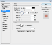
For the title text We Bring Ideas to Life, use two fonts : Arial and Ariston. Font size: 44px, add inner projection to the title text, the parameters are as shown in the figure, color: #bbb7b6.

Add 6 straight lines (3 to the left of the title, 3 to the right of the title), and add the following layer style to these lines:

Inner Shadow: Color: #797979

Color Overlay: Color: #fbfbfb


Step 22
With Pen Tool I will create this 2 triangles and I will apply a Gaussian Blur of about 10px
Step 22
Create 2 triangles with the Pen Tool and perform Gaussian Blur on them with parameters 10px

Step 23
On the top of the triangles created on Step 21, with Rectangle Tool I will create this shape and I will apply this layer styles.
Step 23
Above the shadow just now, use the rectangle tool to create a rectangle (720, 518, 184, 56) , and add the following layer style:
Reference sample, It seems that it should be the rounded rectangle tool. The radius parameter I gave is 10


Color Overlay: Color: #e7e7e7


Step 24
Having Rectangle Tool still selected, I will create another shape on the top of the shape created on Step 22, I will apply this layer styles and with Type Tool I will add some text
Step 24
Keep the Rectangle Tool selected, create a new rectangle above the previous rectangle, add the following layer style, and add Some text
reference sample, still use rounded rectangle, directly copy the layer just now, then freely transform, and indent each by 14px. The color and style of the text are the same as the text in step 19.


These two arrows still took a lot of effort. The current method is to first use the straight line tool to draw a horizontal straight line with a length of 40px, Ctrl +J Duplicate the layer and rotate the duplicated layer 90 degrees clockwise. Slightly adjust these two straight lines so that the upper left corners coincide. Then merge the layers and rotate them 45 degrees counterclockwise. Then use Ctrl+T to freely transform and adjust the height to about 94% of the original value. Then add the following styles. After making an arrow, Ctrl+J duplicates the layer and flips it horizontally to get another arrow. Then adjust the arrow to the appropriate position.


Color Overlay: Color: #c7c1c1


##Step 27
With Pen Tool I will create this 2 triangles and I will apply a Gaussian Blur of about 10px.
Over this triangles I will add an image. I will repeat the same process and I will create a total of 6 similar thumbnails.
Step 27
Draw 2 triangles with the pen tool , and add Gaussian blur to it, with the parameter 10px
above the triangle, add the image. Repeat the same process, creating a total of
8similar image thumbnails


 Photoshop for Designers: Creating Visual ConceptsApr 13, 2025 am 12:09 AM
Creating visual concepts in Photoshop can be achieved through the following steps: 1. Create a new document, 2. Add a background layer, 3. Use the brush tool to draw basic shapes, 4. Adjust colors and brightness, 5. Add text and graphics, 6. Use masks for local editing, 7. Apply filter effects, these steps help designers build a complete visual work from scratch.
 Is Photoshop Free? Understanding Subscription PlansApr 12, 2025 am 12:11 AM
Photoshop is not free, but there are several ways to use it at low cost or free: 1. The free trial period is 7 days, and you can experience all functions during this period; 2. Student and teacher discounts can cut costs by half, and school proof is required; 3. The CreativeCloud package is suitable for professional users and includes a variety of Adobe tools; 4. PhotoshopElements and Lightroom are low-cost alternatives, with fewer functions but lower prices.
 Photoshop's Value: Weighing the Cost Against Its FeaturesApr 11, 2025 am 12:02 AM
Photoshop is worth the investment because it provides powerful features and a wide range of application scenarios. 1) Core functions include image editing, layer management, special effects production and color adjustment. 2) Suitable for professional designers and photographers, but amateurs may consider alternatives such as GIMP. 3) Subscribe to AdobeCreativeCloud can be used as needed to avoid high one-time spending.
 The Core Purpose of Photoshop: Creative Image DesignApr 10, 2025 am 09:29 AM
Photoshop’s core use in creative image design is its powerful functionality and flexibility. 1) It allows designers to transform creativity into visual reality through layers, masks and filters. 2) Basic usages include cropping, resizing and color correction. 3) Advanced usages such as layer styles, blend modes and smart objects can create complex effects. 4) Common mistakes include improper layer management and excessive use of filters, which can be solved by organizing layers and using filters reasonably. 5) Performance optimization and best practices include rational use of layers, regular saving of files, and using shortcut keys.
 Photoshop for Web Design: Advanced Techniques for UI/UXApr 08, 2025 am 12:19 AM
Photoshop can be used in web design to create high-fidelity prototypes, design UI elements, and simulate user interactions. 1. Use layers, masks and smart objects for basic design. 2. Simulate user interaction through animation and timeline functions. 3. Use scripts to automate the design process and improve efficiency.
 Newbie's article: Use the ps brush to add crack effects to the font (share)Apr 07, 2025 am 06:21 AM
In the previous article "Teaching you step by step to add printing effects to plate images using ps (Favorites)", I introduced a small trick to use ps to add printing effects to plate images using ps. The following article will introduce to you how to use the ps brush to add crack effects to the font. Let’s take a look at how to do it.
 Photoshop Advanced Typography: Creating Stunning Text EffectsApr 07, 2025 am 12:15 AM
In Photoshop, you can create text effects through layer styles and filters. 1. Create a new document and add text. 2. Apply layer styles such as shadows and outer glow. 3. Use filters such as wave effects and add bevel and relief effects. 4. Use masks to adjust the effect range and intensity to optimize the visual impact of the text effect.
 How to cut picturesApr 06, 2025 pm 10:27 PM
Cutting is the process of removing the background part in the image and leaving the subject behind. Common cutout methods include: manual cutout: use image editing software to manually outline the edge of the subject. Automatic cutout: Use software to automatically identify the subject and separate it from the background. Use third-party cutout tools: use special tools to cut out images. Channel cutout: Use the channel of the image to segment and select channels with obvious differences from the subject color for operation.


Hot AI Tools

Undresser.AI Undress
AI-powered app for creating realistic nude photos

AI Clothes Remover
Online AI tool for removing clothes from photos.

Undress AI Tool
Undress images for free

Clothoff.io
AI clothes remover

AI Hentai Generator
Generate AI Hentai for free.

Hot Article

Hot Tools

Atom editor mac version download
The most popular open source editor

ZendStudio 13.5.1 Mac
Powerful PHP integrated development environment

SublimeText3 Chinese version
Chinese version, very easy to use

WebStorm Mac version
Useful JavaScript development tools

VSCode Windows 64-bit Download
A free and powerful IDE editor launched by Microsoft


