 Web Front-end
 JS Tutorial
 Flexible.js in js implements Taobao flexible layout scheme_javascript skills
the content of this article is to introduce the practice of taobao's flexible layout solution lib-flexible, and share it with everyone for your reference. the specific content is as follows
1. page requirements
this is what the page will look like (don't comment on the design, it's not the developer's decision):
this is the dimension diagram (750*1334):
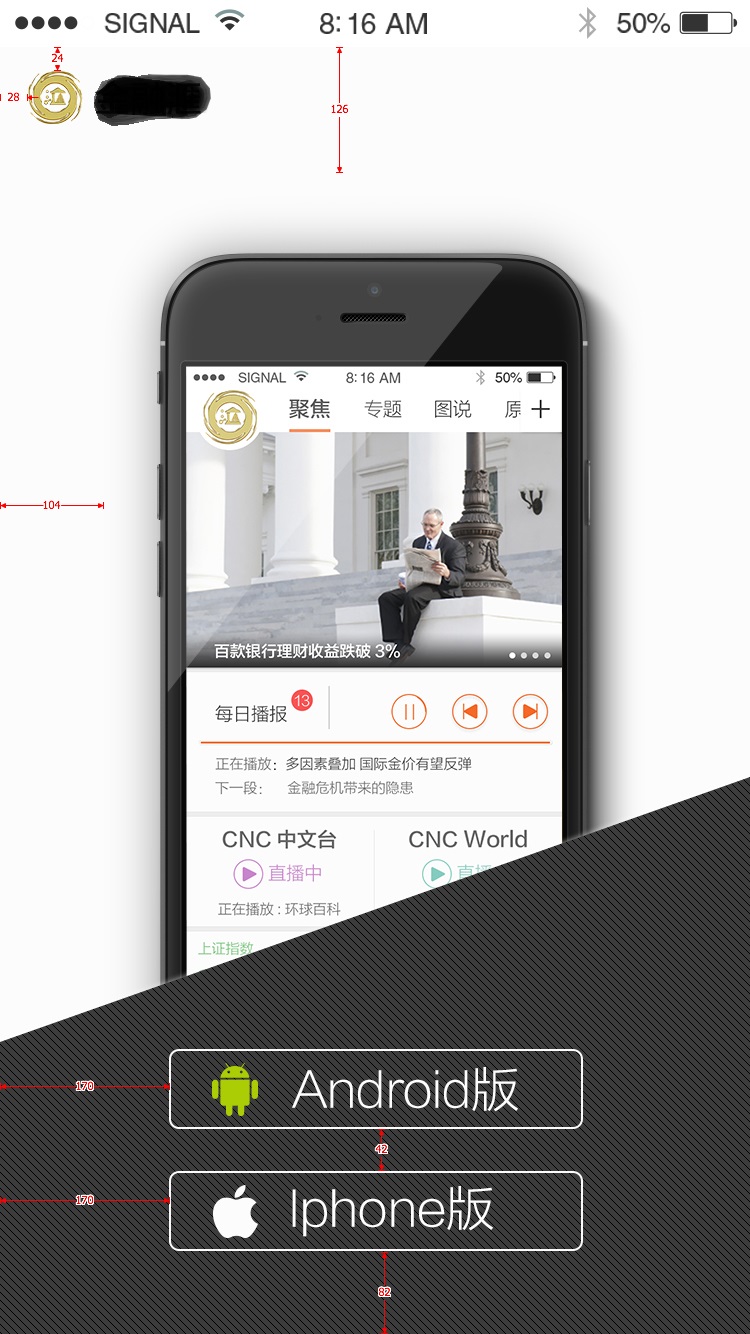
then the artist will provide cutouts of the following materials based on the 750*1334 design draft according to my requirements:
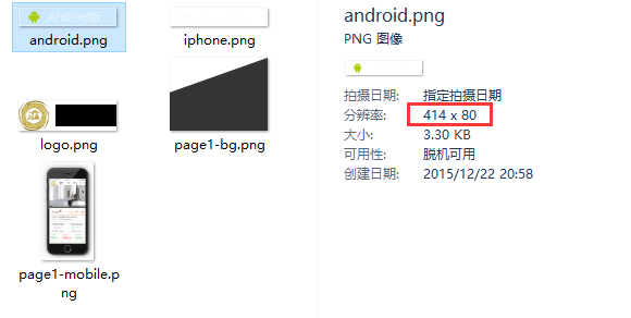
includes the background images of the two download buttons, the logo, the gradient background of the bottom trapezoid and the mobile background image of the body part. note that these pictures are all cut from the 750*1334 design draft, so the sizes are the original sizes in the design draft, such as android.png:
considering the problem of retina display, combine the following adaptation ideas:
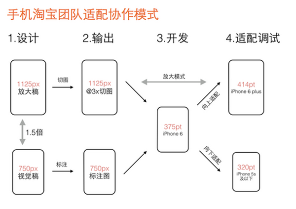
i think the feasible solution to the retina screen problem is:
1) when devicepixelratio
2) when devicepixelratio>=2, the pictures use 750*1.5=1125, which is the cut picture of the so-called @3x design draft.
i put all the cuts from the 750*1334 design draft given to me by the artist in the folder img/@2x:
then i asked her to help me enlarge the 750 design draft vector by 1.5 times, and then provided me with a @3x cutout according to the same cutout requirements, and placed it in the img/@3x folder:
theoretically the size of the image under @3x should be equal to the image under @2x*1.5, but my cut was not so perfect.
with the previous requirements introduction and material preparation, the next step is to introduce the core js file and write the css style.
2. introduce flexible.js
this step is actually very simple. just copy the content of flexible.js, create a new flexible.js file locally, open it and paste it in. i put this file under js/lib:
p>then in the html page, introduce this js file as early as possible (in order to make the adaptation effect faster):
note: when using lib-flexible, usually do not write:
let flexible.js handle it automatically.
then in the chrome simulator, select iphone6, you should be able to see that the font-size of the html has been set to font-size: 75px:
3. writing css
basic requirements:
1) except for font-size, all other sizes are converted into values in rem units based on the size of the 750 annotation draft. the conversion method is: annotation draft size / annotation draft base font size;
2) the standard font size of the annotation draft = the width of the annotation draft / 10. for example, the width of the annotation draft is 750, and the standard font size of the annotation draft is 75; the width of the annotation draft is 640, and the standard font size of the annotation draft is 64; (so taobao this the plan can be used in any design draft size)
3) if you need to set font-size, you can follow the data-dpr attribute of html, similar to the following writing:
[data-dpr="2"] p {
  font-size: 16px;
}

[data-dpr="3"] p {
  font-size: 24px;
}
take the android download button style as an example to illustrate this usage. the size of android.png is: 414*80, so the css is written like this:
.btn {
  width: 414rem/@font-size-base;
  height: 80rem/@font-size-base;
}
because less is used, a variable is defined in advance to save the base font size of the markup:
@font-size-base: 75;
so conversion to px2rem becomes very easy as shown above. after less is compiled, the correct rem value will be calculated:
.btn {
 width: 5.52rem;
 height: 1.06666667rem;
}
at this point, the basic practice of lib-flexible is over. however, there is still another problem, which is the problem of retina screen. up to now, i have not mentioned what to do with the cutouts in the picture below by @3x. it is actually very simple. with the help of the data-dpr attribute of the html element, you can easily implement another media query to enable images under @3x when devicepixelratio>=2. let’s take the android download button style as an example. the writing is:
.btn-android {
 background-image: url("../img/@2x/android.png?v=@@version");
 [data-dpr="3"] & {
  background-image: url("../img/@3x/android.png?v=@@version");
 }
}
now it’s ok. i didn’t know what role data-dpr had at first, but now i see it’s quite useful.
note:
- 1) since grunt is used to build, you need to install node and git first, and then install grunt and bower through npm
- 2) considering that the effect of full-screen scrolling may be required in the future, this page was created with fullpage.js from the beginning, and the jquery and fullpage.js libraries were introduced through bower
- 3) modularization uses requirejs
- 4) run grunt default to complete the build, and then run grunt server to start the static server preview.
the above is the entire process of implementing taobao's flexible layout solution lib-flexible. i hope it will inspire everyone's learning.
 淘宝ID是什么Nov 02, 2022 pm 04:00 PM
淘宝ID就是淘宝的账户名(账号名、会员名),是指成功注册淘宝时填写的会员或用户名;淘宝ID还可以称为淘宝会员名字、阿里旺旺名、淘宝账号登录名等。在跟卖家沟通的时候会显示淘宝会员名,就是淘宝id;在购物时能更方便查找到聊天记录,订单信息之类的,方便办理退货换货的售后服务。
 淘宝封号还能解封吗?Nov 15, 2023 pm 02:24 PM
淘宝封号能解封。其解封方法如下:1、申诉解封,通过淘宝的申诉渠道提交申诉请求。在申诉中,用户需要提供相关证据和解释,说明自己的行为符合淘宝的规定,并承诺遵守规定;2、联系客服,客服人员会根据实际情况进行审核和处理,并给予相应的建议和指导;3、整改行为,在解封申诉或联系客服时,用户可以说明自己已经认识到错误,并给出具体的整改方案和承诺。
 淘宝七天无理由退货条件是什么Aug 31, 2023 pm 02:30 PM
淘宝七天无理由退货条件是商品必须是支持七天无理由退货、商品必须保持原样、商品必须是正品、消费者需要承担退运费和退款方式。详细介绍:1、商品必须是支持七天无理由退货,购买前,消费者需要仔细阅读商品详情页面上的退货政策说明,确认商品是否支持七天无理由退货;2、商品必须保持原样,商品必须保持原包装完好无损,并且没有使用过;3、商品必须是正品等等。
 一个支付宝可以绑定两个淘宝号吗Mar 02, 2023 pm 04:43 PM
一个支付宝不可以绑定两个淘宝号。淘宝和支付宝是一对一的关系,支付宝账户和淘宝账户只能进行一对一的绑定,不能绑定多个,但是淘宝可以换绑支付宝;淘宝账户绑定了认证过的支付宝账户,则意味着其淘宝ID通过了支付宝认证。换绑方法:1、打开淘宝app,在“我的”页面点击右上角的“设置”图标;2、在设置页面点击“账号与安全”;3、选择“支付宝账号”;4、点击“更换支付宝绑定”即可。
 为什么淘宝消息发不出去有感叹号Nov 22, 2023 pm 04:01 PM
淘宝消息发不出去有感叹号可能是由于网络连接、账号设置、消息内容或系统问题引起的。其解决方法如下:1、网络连接问题,检查网络连接、关闭防火墙或代理;2、账号设置问题,检查账号状态跟设置;3、消息内容问题,确保消息内容符合淘宝平台的规定或者检查消息内容,避免使用敏感词汇;4、系统问题,更新版本过一段时间再发。
 淘宝消息发不出去有感叹号是什么情况Mar 27, 2023 am 11:53 AM
淘宝消息发不出去有感叹号的原因:1、群发大量广告垃圾信息或者营销信息;2、没有进行实人认证,需要尽快进行实名认证;3、当天对陌生人发送太多消息;4、发送内容涉及账号密码等信息;5、发送内容含有影响社会风气等。
 淘宝和京东有什么区别Aug 18, 2022 pm 05:47 PM
区别:1、淘宝网是C2C网购平台,而京东是B2C平台。2、京东采用得是价值链整合模式,淘宝则采用的是开放平台模式。3、京东采用自买自卖的模式,赚取商品中间的差价,通过低收益来获取规模化的销量;淘宝则并不参与商品的实际销售和服务,商品的销售以及服务都是由淘宝卖家直接负责的。4、京东有自己的物流平台,采用的是分布式库存管理;淘宝依赖于第三方物流平台,采用的是集约式库存管理。
 淘宝订单找不到了怎么回事Oct 31, 2023 pm 03:13 PM
淘宝订单找不到了可能是因为订单被删除、订单未发货、订单已取消、订单已删除、系统故障和账户异常等原因造成的。详细介绍:1、订单被删除,点击已买到的宝贝,点击单回收站,找到相应的订单,点击还原订单即可;2、订单未发货,等待商家发货,或者联系商家咨询订单状态;3、订单已取消,尝试联系商家,看看商家是否愿意重新发货;4、订单已删除,联系商家,询问订单状态和原因;5、系统故障等等。


Hot AI Tools

Undresser.AI Undress
AI-powered app for creating realistic nude photos

AI Clothes Remover
Online AI tool for removing clothes from photos.

Undress AI Tool
Undress images for free

Clothoff.io
AI clothes remover

AI Hentai Generator
Generate AI Hentai for free.

Hot Article

Hot Tools

EditPlus Chinese cracked version
Small size, syntax highlighting, does not support code prompt function

SublimeText3 Chinese version
Chinese version, very easy to use

DVWA
Damn Vulnerable Web App (DVWA) is a PHP/MySQL web application that is very vulnerable. Its main goals are to be an aid for security professionals to test their skills and tools in a legal environment, to help web developers better understand the process of securing web applications, and to help teachers/students teach/learn in a classroom environment Web application security. The goal of DVWA is to practice some of the most common web vulnerabilities through a simple and straightforward interface, with varying degrees of difficulty. Please note that this software

PhpStorm Mac version
The latest (2018.2.1) professional PHP integrated development tool

Dreamweaver CS6
Visual web development tools


