Home >Web Front-end >CSS Tutorial >CSS3 Tutorial-2D Conversion
CSS3 Tutorial-2D Conversion
- 黄舟Original
- 2016-12-27 15:46:271659browse
Dear front-end developers, do you know how CSS3 implements 2D and 3D rotation of divs in the CSS3 tutorial? This process is a very interesting one, you might as well come and learn it.
CSS3 Transformation:
Through CSS3 transformation, we can move, scale, rotate, lengthen or stretch elements.

So how does it work?
Transformation is an effect that causes an element to change its shape, size, and position.
You can transform your elements using 2D or 3D transformations.
Browser support:

Internet Explorer 10, Firefox and Opera support the transform attribute.
Chrome and Safari require the prefix -webkit-.
Note: Internet Explorer 9 requires the prefix -ms-.
2D conversion:
In this chapter, you will learn the following 2D conversion methods:
translate();
rotate();
scale();
skew();
matrix().
Instance:
div
{
transform: rotate(30deg);
-ms-transform: rotate(30deg); /* IE 9 */
-webkit-transform: rotate(30deg); /* Safari and Chrome */
-o-transform: rotate(30deg); /* Opera */
-moz-transform: rotate(30deg); /* Firefox */
}
translate() method:

div
{
transform: translate(50px,100px);
-ms-transform: translate(50px,100px); /* IE 9 */
-webkit-transform: translate(50px,100px); /* Safari and Chrome */
}
The translate value (50px, 100px) is moved 50 pixels from the left element and 100 pixels from the top. rotate() method:

div
{
transform: rotate(30deg);
-ms-transform: rotate(30deg); /* IE 9 */
-webkit-transform: rotate(30deg); /* Safari and Chrome */
}
rotate value (30deg) The element is rotated 30 degrees clockwise. scale() method:

div
{
transform: scale(2,4);
-ms-transform: scale(2,4); /* IE 9 */
-webkit-transform: scale(2,4); /* Safari and Chrome */
}
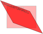
scale(2,4) transforms the width to 2 times its original size, and the height to 4 times its original size. skew() method:

div
{
transform: skew(30deg,20deg);
-ms-transform: skew(30deg,20deg); /* IE 9 */
-webkit-transform: skew(30deg,20deg); /* Safari and Chrome */
}
skew(30deg,20deg) is an element that is 20 degrees and 30 degrees around the X-axis and Y-axis. matrix() method:

div
{
transform:matrix(0.866,0.5,-0.5,0.866,0,0);
-ms-transform:matrix(0.866,0.5,-0.5,0.866,0,0); /* IE 9 */
-webkit-transform:matrix(0.866,0.5,-0.5,0.866,0,0); /* Safari and Chrome */
}
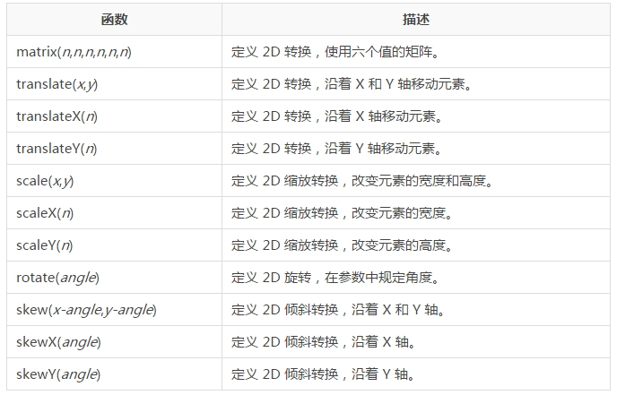
New transformation properties: All transformation properties are listed below:


