Home >Backend Development >C#.Net Tutorial >Detailed explanation of C# ListView usage
Detailed explanation of C# ListView usage
- 高洛峰Original
- 2016-12-13 16:09:092968browse
1. ListView class
1. Commonly used basic attributes:
(1) FullRowSelect: Set whether to row selection mode. (Default is false) Tip: This property is only meaningful in the Details view.
(2) GridLines: Set whether to display grid lines between rows and columns. (Default is false) Tip: This property is only meaningful in the Details view.
(3) AllowColumnReorder: Set whether the column header can be dragged to change the order of the columns. (Default is false) Tip: This property is only meaningful in the Details view.
(4) View: Get or set the display mode of items in the control, including Details, LargeIcon, List, SmallIcon, Tile (default is LargeIcon)
(5) MultiSelect: Set whether multiple items can be selected. (Default is false)
(6) HeaderStyle: Get or set the column header style. B Clickable: The role of the column header is similar to the button, and the operation can be performed (such as sorting) when clicking.
NonClickable: The column header does not respond to mouse clicks.
None: Do not display column headers.
(7) LabelEdit: Set whether the user can edit the label of the item in the control. For the Detail view, only the content of the first column of the row can be edited. (Default is false)
(8) CheckBoxes: Set whether to display check boxes next to each item in the control. (Default is false)
(9) LargeImageList: Large icon set. Tip: Only used in LargeIcon view.
(10) SmallImageList: Small icon set. Tip: Only used in SmallIcon view.
(11) StateImageList: Image mask. These image masks can be used as overlays for LargeImageList and SmallImageList images, which can be used to indicate an item's application-defined state. (I don’t understand it yet)
(12) SelectedItems: Get the items selected in the control.
(13) CheckedItems: Get the items selected by the current check box in the control.
(14)Soritng: Sort items in list view. (Default is None)
Ascending: Items are sorted in increasing order.
Descending: items are sorted in descending order.
None: items are not sorted.
(15) Scrollable: Set whether to display scroll bars when there is not enough space to display all items. (Default is true)
(16) HoverSelection: Set whether to automatically select an item when the mouse pointer hovers over it. (Default is false)
(17) HotTracking: Set whether the appearance of the mouse pointer changes to the form of a hyperlink when it passes through the item text. (Default is false)
(18) HideSelection: Set whether the selected item is still highlighted when the control has no focus. (Default is false)
(19) ShowGroups: Set whether to display items in groups. (Default is false);
(20) Groups: Set the grouped object collection.
(21) TopItem: Gets or sets the first visible item in the control, which can be used for positioning. (The effect is similar to the EnsureVisible method)
2. Commonly used methods:
(1) BeginUpdate: Avoid describing the control before calling the EndUpdate method. When inserting a large amount of data, it can effectively avoid control flickering and greatly increase the speed.
(2) EndUpdate: After the BeginUpdate method suspends the description, continue to describe the list view control. (end update)
(3) EnsureVisible: The list view scrolls to the item row of the specified index item. (The effect is similar to the TopItem property) (4) FindItemWithText: Find the first ListViewItem starting with the given text value. N (5) FindnearestISTIM: According to the specified search direction, look for the next item from a given point. Tip: This method can only be used in the LargeIcon or SmallIcon view.
3. Commonly used events:
(1) AfterLabelEdit: Occurs when the user finishes editing the label of the item, and the LabelEdit attribute needs to be true.
(2) BeforeLabelEdit: Occurs when the user starts editing the label of the item.
(3) ColumnClick: Occurs when the user clicks the column header in the list view control.
2. Five views of ListView:
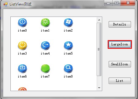
1. LargeIcon: Each item is displayed as a maximized icon with a label below it. (See the picture below for the effect)
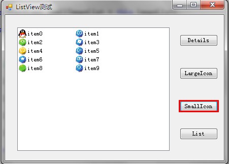
2. SmallIcon: Each item is displayed as a small icon with a label on the right. (See the picture below for the effect)
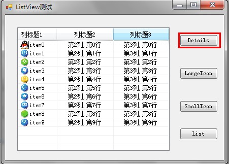
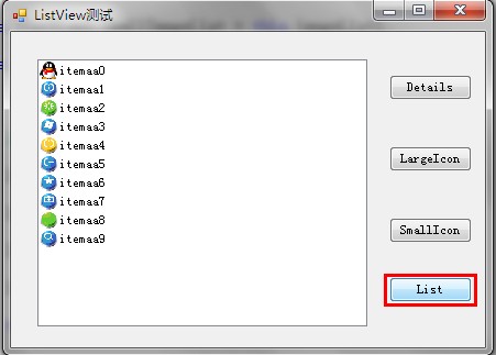
3. List: Each item is displayed as a small icon with a label on the right. Items are arranged in columns, with no column headers. (See the picture below for the effect) 4. Details: Any column can be displayed, but only the first column can contain a small icon and label, and other column items can only display text information and have column headers. (See the picture below for the effect)
5. Tile: Each item is displayed as a full-size icon with item label and sub-item information on the right side of it. (Only supported by Windows XP and Windows Server 2003 series)
①Details view:
this.listView1.SmallImageList = this.imageList1; //Bind the icon set of listView to imageList1
(1) List header creation (remember, Need to create a list header first) Create a list header.
(5) Row height setting (implemented using imageList )ColumnHeader ch= new ColumnHeader(); nbsp;ch.Text = "列标题1"; //设置列标题 ch.Width = 120; //设置列宽度 ch.TextAlign = HorizontalAlignment.Left; //设置列的对齐方式 this.listView1.Columns.Add(ch); //将列头添加到ListView控件。
ColumnHeader  ch= new ColumnHeader();

ch.Text = "列标题1";   //设置列标题

ch.Width = 120;    //设置列宽度

ch.TextAlign = HorizontalAlignment.Left;   //设置列的对齐方式

this.listView1.Columns.Add(ch);    //将列头添加到ListView控件。
(6) Clear
this.listView1.Columns.Add("列标题1", 120, HorizontalAlignment.Left); //一步添加this.listView1.Columns.Add("列标题1", 120, HorizontalAlignment.Left); //一步添加 Running effect:
②largeIcon view:
this.listView1.BeginUpdate();   //数据更新,UI暂时挂起,直到EndUpdate绘制控件,可以有效避免闪烁并大大提高加载速度

for (int i = 0; i < 10; i++)   //添加10行数据
{
     ListViewItem lvi = new ListViewItem();

     lvi.ImageIndex = i;     //通过与imageList绑定,显示imageList中第i项图标

     lvi.Text = "subitem" + i;

     lvi.SubItems.Add("第2列,第"+i+"行");

     lvi.SubItems.Add("第3列,第"+i+"行");

     this.listView1.Items.Add(lvi);
}

this.listView1.EndUpdate();  //结束数据处理,UI界面一次性绘制。
this.listView1.BeginUpdate(); //数据更新,UI暂时挂起,直到EndUpdate绘制控件,可以有效避免闪烁并大大提高加载速度
for (int i = 0; i < 10; i++) //添加10行数据
{
ListViewItem lvi = new ListViewItem();
lvi.ImageIndex = i; //通过与imageList绑定,显示imageList中第i项图标
lvi.Text = "subitem" + i;
lvi.SubItems.Add("第2列,第"+i+"行");
lvi.SubItems.Add("第3列,第"+i+"行");
this.listView1.Items.Add(lvi);
}
this.listView1.EndUpdate(); //结束数据处理,UI界面一次性绘制。Running effect:
③SmallIcon view:foreach (ListViewItem item in this.listView1.Items)
{
for (int i = 0; i < item.SubItems.Count; i++)
{
MessageBox.Show(item.SubItems[i].Text);
}
}foreach (ListViewItem item in this.listView1.Items)
{
for (int i = 0; i < item.SubItems.Count; i++)
{
MessageBox.Show(item.SubItems[i].Text);
}
}Running effect:

foreach (ListViewItem lvi in listView1.SelectedItems)  //选中项遍历
{
      listView1.Items.RemoveAt(lvi.Index); // 按索引移除
      //listView1.Items.Remove(lvi);   //按项移除
}
foreach (ListViewItem lvi in listView1.SelectedItems) //选中项遍历
{
listView1.Items.RemoveAt(lvi.Index); // 按索引移除
//listView1.Items.Remove(lvi); //按项移除
}Operation effect:

1. Grouping:
ImageList imgList = new ImageList();

imgList.ImageSize = new Size(1, 20);// 设置行高 20 //分别是宽和高

listView1.SmallImageList = imgList; //这里设置listView的SmallImageList ,用imgList将其撑大
ImageList imgList = new ImageList();

imgList.ImageSize = new Size(1, 20);// 设置行高 20 //分别是宽和高

listView1.SmallImageList = imgList; //这里设置listView的SmallImageList ,用imgList将其撑大
Operation effect: 
2. Search text (only matches can be found The text of the prefix can only be found Pick the first matching item):
this.listView1.Clear();  //从控件中移除所有项和列(包括列表头)。

this.listView1.Items.Clear();  //只移除所有的项。


