 Web Front-end
 JS Tutorial
 Comparison of three ways to implement waterfall flow in js_javascript skills
Comparison of three ways to implement waterfall flow in js_javascript skills
Waterfall flow is a website page layout that is visually represented by a jagged multi-column layout. As the page scroll bar scrolls down, this layout will continuously load data blocks and append them to the current tail. The first website to adopt this layout was Pinterest, which gradually became popular in the country. Most domestic fresh websites are basically of this style.

Waterfall Features:
1. Dazzling array: The whole page is mainly pictures, and pictures of different sizes are arranged according to certain rules.
2. Aesthetic: The style of pictures is mainly aesthetic pictures.
3. Simple operation: When browsing the website, you only need to gently slide the mouse wheel, and all the wonderful pictures will be presented in front of you.
How to implement waterfall flow layout:
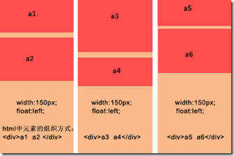
1. Traditional multi-column floating

- · Each column has a fixed width and floats left;
- · The data blocks in a column are a group, and each block in the column is arranged in sequence;
- · When loading more data, it needs to be inserted into different columns;
Advantages:
The layout is simple, it should be said that there is no particular difficulty;
There is no need to explicitly know the height of the data block. When there is a picture in the data block, there is no need to specify the picture height.
Disadvantages:
The number of columns is fixed and it is not easy to expand. When the browser window size changes, only x columns can be fixed. If you want to add a column, it is difficult to adjust the arrangement of the data blocks;
When scrolling to load more data, it is still inconvenient to specify which column to insert into.
Example:
<!DOCTYPE html>
<html lang="en">
<head>
  <meta charset="UTF-8">
  <title>传统多列浮动</title>
  <style>
    div{
       float:left;
       margin: 5px 5px 5px 5px;
    }
    p{
      background: #90EE90;
      width:160px;
      text-align:center;
    }
  </style>
</head>
<body>
  <div>
    <p style="height:230px;">a1</p>
    <p style="height:100px;">a2</p>
  </div>

  <div>
    <p style="height:100px;">a3</p>
    <p style="height:300px;">a4</p>
  </div>

  <div>
    <p style="height:250px;">a5</p>
    <p style="height:200px;">a6</p>
  </div>
</body>
</html>
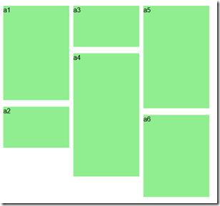
Effect:

2. CSS3 style definition

Advantages:
Direct CSS definition is the most convenient;
It is easy to expand, just add content directly to the container.
Disadvantages:
Only available in advanced browsers;
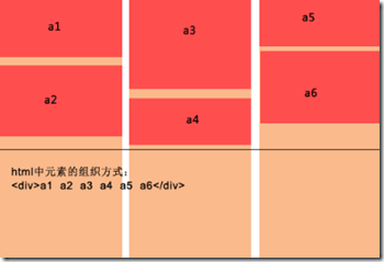
There is another shortcoming. His data blocks are arranged from top to bottom to a certain height, and then the remaining elements are added to the next column in turn. This is essentially different;
In view of these two main shortcomings, this method is destined to be limited to high-end browsers, and it is more suitable for text arrangement in multiple columns.
Example
<!DOCTYPE HTML>
<html>
<head>
<meta http-equiv="Content-Type" content="text/html; charset=utf-8">
<title>CSS3瀑布布局</title>
<style>
    .container{
        -webkit-column-width:160px;
        -moz-column-width:160px;
        -o-colum-width:160px;
        -webkit-column-gap:1px;
        -moz-column-gap:1px;
        -o-column-gap:1px;
    }
    div:not(.container){
        -webkit-border-radius:5px;
        -moz-border-radius:5px;
        border-radius:5px;
        background:#90EE90;
        border::#CCC 1px solid;
        display:inline-block;
        width:157px;
        position:relative;
        margin:2px;
    }
    .title{
         line-height:80px; font-size:18px; color:#999;
         text-align:center;
         font-family:"Microsoft YaHei";
    }
</style>
</head>

<body>
<section>
    <div class="container">
    <div style="height:80px" class="title">纯CSS3瀑布布局</div>
    <div style="height:260px"></div>
    <div style="height:65px"></div>
    <div style="height:120px"></div>
    <div style="height:145px"></div>
    <div style="height:90px"></div>
    <div style="height:145px"></div>
    <div style="height:160px"></div>
    <div style="height:65px"></div>
    <div style="height:230px"></div>
    <div style="height:140px"></div>
    <div style="height:85px"></div>
    <div style="height:20px"></div>
    <div style="height:145px"></div>
    <div style="height:50px"></div>
    <div style="height:65px"></div>
    <div style="height:230px"></div>
    <div style="height:140px"></div>
    <div style="height:85px"></div>
    <div style="height:20px"></div>
    <div style="height:145px"></div>
    <div style="height:50px"></div>
    <div style="height:145px"></div>
    <div style="height:160px"></div>
    <div style="height:240px"></div>
  </div>
</section>
</body>
</html>
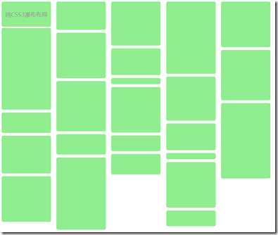
効果:

3. 絶対位置決め
最良の解決策は、データコンテンツを追加するのに便利です。ウィンドウが変更され、列/データブロックの数が自動的に調整されます。
利点:
データコンテンツを追加するとウィンドウが変わり、列/データブロックの数が自動的に調整されるので便利です。
データ ブロックに画像が含まれている場合は、その高さを知る必要があります。
JS はデータ ブロックの位置を動的に計算します。ウィンドウが頻繁にズームされると、パフォーマンスが消費される可能性があります。
もの:
1) データ ブロックの配置 (コンテナー内の既存の要素を配置)、アルゴリズムの手順を以下に簡単に説明します。
設定(ブロック要素の幅を同じにする)
· 初期化中に、コンテナ内の既存のデータ ブロック要素に対して最初の計算が実行されます。これには、ユーザーが次の情報を提供する必要があります。 a、コンテナ要素 - ウィンドウの合計幅を取得します。 b、列幅 (ブロック要素の幅)。 c、列の最小数 ;
・表示列数の計算:ウィンドウの幅をブロックボックスの幅で割って切り捨て、ウォーターフォール表示の中心を設定します
・各列の高さを保存
· 列の数を取得した後、各データ ブロックを追加するときに開始高さがわかるように、各列の現在の高さを保存する必要があります。
· コンテナ内のすべてのデータ ブロックを順番に取得し、最初に現在の高さが最も小さい列を見つけます。次に、左は列のシリアル番号に基づいてデータ ブロックの左と上の値を決定します。列に列の幅を乗じた値、top は列の現在の値、最後に更新された列の高さにデータ ブロック要素の高さを加えたものです。この時点で要素の挿入は終了します。
・全ての要素を挿入したら、コンテナの高さを各列の最大高さ値に調整し、順次調整を終了します。
2) データの非同期ロード (2 つのステップを含む):
· ロードデータ、関数パラメータが渡され、より便利な制御のためにデータロード機能とロード停止(ロード時に停止)機能を提供できます。
以上がこの記事の全内容です。皆様の学習のお役に立てれば幸いです。
 JavaScript Engines: Comparing ImplementationsApr 13, 2025 am 12:05 AM
Different JavaScript engines have different effects when parsing and executing JavaScript code, because the implementation principles and optimization strategies of each engine differ. 1. Lexical analysis: convert source code into lexical unit. 2. Grammar analysis: Generate an abstract syntax tree. 3. Optimization and compilation: Generate machine code through the JIT compiler. 4. Execute: Run the machine code. V8 engine optimizes through instant compilation and hidden class, SpiderMonkey uses a type inference system, resulting in different performance performance on the same code.
 Beyond the Browser: JavaScript in the Real WorldApr 12, 2025 am 12:06 AM
JavaScript's applications in the real world include server-side programming, mobile application development and Internet of Things control: 1. Server-side programming is realized through Node.js, suitable for high concurrent request processing. 2. Mobile application development is carried out through ReactNative and supports cross-platform deployment. 3. Used for IoT device control through Johnny-Five library, suitable for hardware interaction.
 Building a Multi-Tenant SaaS Application with Next.js (Backend Integration)Apr 11, 2025 am 08:23 AM
I built a functional multi-tenant SaaS application (an EdTech app) with your everyday tech tool and you can do the same. First, what’s a multi-tenant SaaS application? Multi-tenant SaaS applications let you serve multiple customers from a sing
 How to Build a Multi-Tenant SaaS Application with Next.js (Frontend Integration)Apr 11, 2025 am 08:22 AM
This article demonstrates frontend integration with a backend secured by Permit, building a functional EdTech SaaS application using Next.js. The frontend fetches user permissions to control UI visibility and ensures API requests adhere to role-base
 JavaScript: Exploring the Versatility of a Web LanguageApr 11, 2025 am 12:01 AM
JavaScript is the core language of modern web development and is widely used for its diversity and flexibility. 1) Front-end development: build dynamic web pages and single-page applications through DOM operations and modern frameworks (such as React, Vue.js, Angular). 2) Server-side development: Node.js uses a non-blocking I/O model to handle high concurrency and real-time applications. 3) Mobile and desktop application development: cross-platform development is realized through ReactNative and Electron to improve development efficiency.
 The Evolution of JavaScript: Current Trends and Future ProspectsApr 10, 2025 am 09:33 AM
The latest trends in JavaScript include the rise of TypeScript, the popularity of modern frameworks and libraries, and the application of WebAssembly. Future prospects cover more powerful type systems, the development of server-side JavaScript, the expansion of artificial intelligence and machine learning, and the potential of IoT and edge computing.
 Demystifying JavaScript: What It Does and Why It MattersApr 09, 2025 am 12:07 AM
JavaScript is the cornerstone of modern web development, and its main functions include event-driven programming, dynamic content generation and asynchronous programming. 1) Event-driven programming allows web pages to change dynamically according to user operations. 2) Dynamic content generation allows page content to be adjusted according to conditions. 3) Asynchronous programming ensures that the user interface is not blocked. JavaScript is widely used in web interaction, single-page application and server-side development, greatly improving the flexibility of user experience and cross-platform development.
 Is Python or JavaScript better?Apr 06, 2025 am 12:14 AM
Python is more suitable for data science and machine learning, while JavaScript is more suitable for front-end and full-stack development. 1. Python is known for its concise syntax and rich library ecosystem, and is suitable for data analysis and web development. 2. JavaScript is the core of front-end development. Node.js supports server-side programming and is suitable for full-stack development.


Hot AI Tools

Undresser.AI Undress
AI-powered app for creating realistic nude photos

AI Clothes Remover
Online AI tool for removing clothes from photos.

Undress AI Tool
Undress images for free

Clothoff.io
AI clothes remover

AI Hentai Generator
Generate AI Hentai for free.

Hot Article

Hot Tools

Zend Studio 13.0.1
Powerful PHP integrated development environment

SublimeText3 Linux new version
SublimeText3 Linux latest version

DVWA
Damn Vulnerable Web App (DVWA) is a PHP/MySQL web application that is very vulnerable. Its main goals are to be an aid for security professionals to test their skills and tools in a legal environment, to help web developers better understand the process of securing web applications, and to help teachers/students teach/learn in a classroom environment Web application security. The goal of DVWA is to practice some of the most common web vulnerabilities through a simple and straightforward interface, with varying degrees of difficulty. Please note that this software

Notepad++7.3.1
Easy-to-use and free code editor

MantisBT
Mantis is an easy-to-deploy web-based defect tracking tool designed to aid in product defect tracking. It requires PHP, MySQL and a web server. Check out our demo and hosting services.


