





如何通过CSS实现固定定位导航栏在向下滚动时隐藏
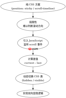
要实现固定定位导航栏在向下滚动时隐藏,最可靠的方法是使用javascript监听滚动事件并切换css类。具体做法是:定义一个包含`transform: translatey(-100%)`的css类(例如`.hidden-nav`),初始状态下导航栏不应用该类;当页面垂直滚动距离大于零时,通过js给导航栏添加该类使其向上移出视口;当用户向上滚动或回到顶部时,移除该类使导航栏重新出现。这种方法能确保导航栏在用户浏览内容时自动隐藏以减少干扰,并在需要时快速恢复。

为什么纯CSS方案难以完美处理双向滚动逻辑
纯CSS方案通常只能处理单向的显隐逻辑,例如使用`position: sticky`结合媒体查询,或者利用`scroll-timeline`(目前支持度有限)。对于“向下隐藏、向上显示”这种需要根据滚动方向动态改变状态的需求,仅靠CSS很难在不引入复杂伪元素或特定布局结构的情况下准确判断用户的意图。因此,虽然有一些CSS Hack可以尝试模拟,但为了获得稳定且跨浏览器一致的行为,JavaScript介入是必要的。
基于滚动方向判断的具体代码实现与验证
在实际编码中,我们需要记录上一次的滚动位置,通过比较当前滚动位置与上一次位置的大小来判断滚动方向。如果当前值大于上一次值,说明用户在向下滚动,此时应隐藏导航栏;反之则显示。以下是一个完整的HTML和JavaScript示例,展示了这一逻辑的实现。
    <meta charset="UTF-8"><title>Fixed Nav Hide on Scroll</title><style>
        body {
            margin: 0;
            padding-top: 60px; /* 为固定导航栏留出空间 */
            height: 2000px; /* 制造足够长的页面以便滚动 */
            font-family: sans-serif;
        }
        .nav-bar {
            position: fixed;
            top: 0;
            left: 0;
            width: 100%;
            height: 60px;
            background-color: #333;
            color: white;
            display: flex;
            align-items: center;
            padding-left: 20px;
            transition: transform 0.3s ease-in-out;
            z-index: 1000;
        }
        .nav-bar.hidden {
            transform: translateY(-100%);
        }
        .content {
            padding: 20px;
        }
    </style><nav class="nav-bar" id="navbar">
        Navigation Bar
    </nav><div class="content">
        <p>Scroll down to hide the navbar, scroll up to show it.</p>
        <p>Lorem ipsum dolor sit amet, consectetur adipiscing elit. Sed do eiusmod tempor incididunt ut labore et dolore magna aliqua.</p><div class="aritcle_card flexRow artxards">
											<div class="artcardd flexRow">
												<a class="aritcle_card_img" rel="nofollow" href="/xiazai/gongju/2905" title="CSS"><img
														src="https://img.php.cn/upload/manual/000/969/633/6af2b1226ad9e733.png" alt="CSS" onerror="this.onerror='';this.src='/static/lhimages/moren/morentu.png'" ></a>
												<div class="aritcle_card_info flexColumn">
													<a rel="nofollow" href="/xiazai/gongju/2905" title="CSS" class="overflowclass">CSS</a>
													<p class="overflowclass">CSS 官方网站入口。访问 W3C 的 CSS 页面,查看 CSS 标准、学习资料与工作组动态;CSS 是 Web 标准,无需下载安装。</p>
												</div>
												<a rel="nofollow" href="/xiazai/gongju/2905" title="CSS" class="aritcle_card_btn flexRow flexcenter"><b></b><span>下载</span>
												</a>
											</div>
										</div>
        <p>Ut enim ad minim veniam, quis nostrud exercitation ullamco laboris nisi ut aliquip ex ea commodo consequat.</p>
        <p>Duis aute irure dolor in reprehenderit in voluptate velit esse cillum dolore eu fugiat nulla pariatur.</p>
        <p>Excepteur sint occaecat cupidatat non proident, sunt in culpa qui officia deserunt mollit anim id est laborum.</p>
    </div>

    <script>
        const navbar = document.getElementById('navbar');
        let lastScrollY = window.scrollY;
        let ticking = false;

        function updateNavbar() {
            const currentScrollY = window.scrollY;

            // 如果滚动距离大于0,根据方向决定显隐
            if (currentScrollY > 0) {
                if (currentScrollY > lastScrollY) {
                    // 向下滚动,隐藏
                    navbar.classList.add('hidden');
                } else {
                    // 向上滚动,显示
                    navbar.classList.remove('hidden');
                }
            } else {
                // 回到顶部,强制显示
                navbar.classList.remove('hidden');
            }

            lastScrollY = currentScrollY;
            ticking = false;
        }

        window.addEventListener('scroll', function() {
            if (!ticking) {
                window.requestAnimationFrame(updateNavbar);
                ticking = true;
            }
        });
    </script>
运行上述代码后,当用户向下滚动页面时,黑色的导航栏会平滑地向上消失;当用户向上滚动时,导航栏会再次出现。这种交互方式在现代Web应用中非常常见,能够有效提升用户体验。
前端入门到VUE实战笔记:立即使用
在学习笔记中,你将探索 前端 的入门与实战技巧!