





使用纯css实现响应式自适应树形组织架构图,核心在于利用 flexbox 布局处理层级对齐,并通过媒体查询(media queries)在移动端切换为垂直堆叠模式。具体做法是定义一个根节点容器,子节点采用水平排列的 flex 结构,利用伪元素绘制连接线;当屏幕宽度小于特定阈值时,将子节点容器改为垂直排列,并调整连接线方向以适配手机屏幕的阅读习惯。

CSS Tree 结构的 HTML 语义化构建
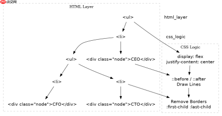
构建基础结构时,必须严格遵循嵌套列表或自定义 div 层级,确保每个父节点包含其所有子节点的容器。这种结构允许 CSS 选择器精准定位父子关系,从而生成连线。关键在于外层容器需要设置 display: flex 和 justify-content: center,以保证顶层节点居中,而子节点容器内部同样使用 Flex 布局来均匀分布兄弟节点。
<div class="tree">
  <ul>
<li>
      <div class="node">CEO</div>
      <ul>
<li>
          <div class="node">CTO</div>
          <ul>
<li><div class="node">Dev Lead</div></li>
            <li><div class="node">QA Lead</div></li>
          </ul>
</li>
        <li>
          <div class="node">CFO</div>
        </li>
      </ul>
</li>
  </ul>
</div>
上述代码展示了标准的嵌套结构。每个 代表一个分支,内部的 .node 用于显示文本内容。这种结构不依赖 JavaScript 动态生成,完全由静态 HTML 构成,便于 SEO 和初始渲染。在实际项目中,可以根据数据源通过模板引擎生成此结构,但前端展示逻辑仅依赖 CSS。
连线绘制与 Flex 布局细节
实现连线的关键在于利用伪元素 ::before 和 ::after。对于每个 ,::before 绘制从父节点下来的垂直线,::after 绘制连接到当前节点的水平线。通过设置 position: absolute 和精确的 top/left 值,可以将线条锚定在节点中心。同时,padding-top 为线条留出空间。


* {
  margin: 0;
  padding: 0;
  box-sizing: border-box;
}

.tree ul {
  padding-top: 20px;
  position: relative;
  transition: all 0.5s;
  display: flex;
  justify-content: center;
}

.tree li {
  float: left; text-align: center;
  list-style-type: none;
  position: relative;
  padding: 20px 5px 0 5px;
  transition: all 0.5s;
}

/* 绘制垂直线 */
.tree li::before, .tree li::after {
  content: '';
  position: absolute;
  top: 0;
  right: 50%;
  border-top: 1px solid #ccc;
  width: 50%;
  height: 20px;
}

.tree li::after {
  right: auto;
  left: 50%;
  border-left: 1px solid #ccc;
}

/* 移除第一个子节点的左侧线和最后一个子节点的右侧线 */
.tree li:only-child::after, .tree li:only-child::before {
  display: none;
}

.tree li:only-child { padding-top: 0; }

.tree li:first-child::before, .tree li:last-child::after {
  border: 0 none;
}

/* 添加垂直连接线到父级 */
.tree li:last-child::before{
  border-right: 1px solid #ccc;
  border-radius: 0 5px 0 0;
}

.tree li:first-child::after{
  border-radius: 5px 0 0 0;
}
这段 CSS 代码构建了完整的树形连线逻辑。.tree li::before 负责从上方垂直到当前节点高度的线,.tree li::after 负责从当前节点向左或向右延伸的水平线。通过 :first-child 和 :last-child 的选择器,去除了边缘多余的线条,使图形更加整洁。节点本身可以通过 .node 类设置背景色、圆角和内边距,使其看起来像卡片。
移动端响应式垂直转换策略
当屏幕宽度较小时,横向布局会导致节点重叠或溢出。此时需要通过媒体查询将 row 切换为 column。同时,连线的方向也需要调整:垂直线变为水平线,水平线变为垂直向下。这种转换使得树形图在手机上呈现为从上到下的垂直列表,符合移动用户的操作习惯。
@media screen and (max-width: 768px) {
  .tree ul {
    flex-direction: column;
    padding-top: 0;
    padding-left: 20px;
  }

  .tree li {
    float: none;
    text-align: left;
    padding: 10px 0 0 0;
    width: calc(100% - 20px);
  }

  /* 重置连线逻辑 */
  .tree li::before, .tree li::after {
    border: 0 none;
  }

  /* 绘制左侧垂直线 */
  .tree li::before {
    border-left: 1px solid #ccc;
    height: 100%;
    top: 0;
    left: 0;
    width: 1px;
  }

  /* 绘制连接节点的短横线 */
  .tree li::after {
    border-top: 1px solid #ccc;
    width: 20px;
    height: 1px;
    top: 10px;
    left: 0;
  }

  .tree li:only-child::before, .tree li:only-child::after {
    display: none;
  }

  .tree li:only-child { padding-top: 0; }

  /* 修正首尾节点 */
  .tree li:first-child::before, .tree li:last-child::after {
    border: 0 none;
  }
  .tree li:last-child::before {
    border-left: 1px solid #ccc;
    border-radius: 0;
  }
}
在媒体查询中,.tree ul 的 flex-direction 被设为 column,使子节点垂直堆叠。连线的绘制逻辑完全重写:::before 现在作为左侧的垂直引导线,::after 作为连接节点标题的短横线。这种设计确保了即使在窄屏设备上,组织结构依然清晰可见,且不会出现横向滚动条。开发者可以直接复制上述代码块到项目中,替换 .node 的内容即可看到效果。
前端入门到VUE实战笔记:立即使用
在学习笔记中,你将探索 前端 的入门与实战技巧!