Home >Web Front-end >CSS Tutorial >CSS3的box-shadow
CSS3的box-shadow
- 高洛峰Original
- 2016-10-20 16:48:291603browse
Basic description:
Outer shadow: box-shadow: X axis Y axis Rpx color;
Property description (corresponding order): Shadow’s Shadow blur value (size) The color of the shadow
Inner shadow: box-shadow: Used for box models such as (div, p, h1, h2, h3, h4, h5, h6, etc.), not used to set text shadow If you set text shadow, please refer to the knowledge point: text-shadow (same principle)
Because it is new Attribute, in order to be compatible with major browsers and support lower versions of these major browsers, when using the box-shadow attribute on mainstream browsers, we need to write the name of the attribute in the form -webkit-box-shadow. Firefox browser needs to be written as-Moz-Box-SHADOW in the form
Oupeng browser-O-BOX-SHADOW IE> 9-BOX-SHADOW
Basic description:
For better understanding Box-Shadow for better understanding Box-Shadow Features, do a few small tests: (For the convenience of nesting styles directly within tags)
Test 1:
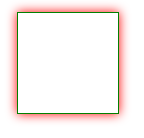
box-shadow: 0 0 10px #f00 (because the X-axis and Y-axis are not moved where the set values are Will work on itself Radius range, color)
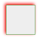
Test 2: box-shadow: 4px 4px 10px #f00; Different from test 1, the X-axis and Y-axis changed positive values (positive values to the right and downwards ) So it became like this
 box-shadow:-4px -4px 10px #f00;The difference from Test 2 is that the X-axis and Y-axis changed to negative values (negative values towards Left up) So it becomes like this
 Test 4:
Look This kind of code will feel very messy, but after seeing the effect picture, you will understand how it is done. All you have to do is change the X-axis and Y-axis positions, color values, and shadow value sizes (separated by commas) and practice more. Just a few times
Related articles
See more- How Can I Reliably Hide `` Elements in `` Menus Using CSS?
- Did you know you can optimize your website&#s load time by with just one line of code?
- Configuring Tailwind as a Design System
- Learn CSS Grid: Simple Guide with Plenty of Examples
- How to Isolate a Div from Global CSS Influence: Using `all: initial` and `all: unset`

