
Home >Web Front-end >HTML Tutorial >DIV+CSS web page standardized layout (2) floating layout
DIV+CSS web page standardized layout (2) floating layout

- WBOYWBOYWBOYWBOYWBOYWBOYWBOYWBOYWBOYWBOYWBOYWBOYWBOriginal
- 2016-09-15 11:15:131327browse
Box model and floating layout
When it comes to the box model, experienced friends must be familiar with it. It is nothing more than content, padding, border, and margin;
We can understand these attributes by transferring them to the boxes (boxes) in our daily life. The boxes we see in our daily life are boxes that can hold things and also have these attributes, so it is called the box pattern.
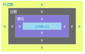
First picture:

The above picture clearly shows the specific performance style of the box model; margin + border + padding + content;
Since the box model is called a box model~ then we can compare it to an LCD screen packaging box (the poster just bought one, so I used it as a metaphor. As everyone knows, this thing requires a lot of padding when it is delivered) When unpacking a courier, the display inside is the content. What about the bubbles? It is the inner margin (padding), the outer shell is (border), and then it is the distance between the box and other boxes (margin). This forms the box model in our css;
The box model in css has many forms of expression: block (block), inline (inline), (inline-block is an inline element expressed in a block form). Setting css display can change the expression of the box, which will be introduced in detail below.
Personally, I think CSS can be understood this way: it specifies the packaging style of the box, the placement of the box, the length, width and height of the box, etc. The browser is like a house, waiting for people to fill it with boxes;
Now, the author will briefly introduce the specific performance of content, padding, border, and margin in CSS, as well as the alternative attributes they bring that seem to be bugs.
1. Content
Content includes text, block boxes, pictures, box models of content boxes, etc... Chestnut:

    <meta charset="UTF-8">
    <title>demohtml</title>


        <style type="text/css">
            .div1{ background: red;}
        </style>
        <div class="div1">
            div标签默认是一个块状(block)盒子
        </div>
The div tag defaults to a block box
block. By observing, we can get that the default width of the block block box is 100%, and the height is stretched to the right of the text, and the text is its (content content); if there is no text, and If the height is not specified, then its height is 0;
block (block), which is usually an external container used to carry required content. Commonly used block-level elements include div, p, h1, header, footer, nav, etc...
inline
Inline elements, as the name suggests, elements within a line, elements within a block, common ones include a tag, i (italic tag), em, span, s (strikethrough), strong (bold), b, etc.The expression of inline elements mainly lies in filling content. By default, it has no top and bottom margins, only left and right margins;
<div class="div1">
            div标签默认是一个块状(block)盒子
           <a href="#">这是一个超级链接</a>
   </div>
We can use display: block; to make it blocky. Block can also use display: inline; to make the block inline;
Due to the length of the article, the author will stop here. Regarding the block and inline portal: the concepts and differences of block, inline and inline-block
2.Padding
The padding specifies the padding distance between the content and the border, chestnut:
<style type="text/css">
            .div2{  padding: 20px; border: 1px solid #000099;}
            .div2 a{ background: red;}
        </style>
        <div class="div2">
            <a href="#">div标签默认是一个块状(block)盒子</a>
        </div>
The div tag defaults to a block box
楼主将div2的内边距设为上下左右各20px,需要注意的是 现在div2的高度是 padding+content+边框,20x2+2= 42px 这在某些时候会产生一些令人疑惑的问题,但是以盒模型的概念,它是正确的;
即 盒子的高度包括内边距 但 css属性设置的是content的高度 比如div3高度设为100px,注意这个时候 div3的实际高度等于 100+40+2=142px
<style type="text/css">
            .div3{  padding: 20px; border: 1px solid #000099; height:100px;}/*注意这个时候 div1的实际高度等于  100+40+2=142px*/
            .div3 a{ background: red;}
        </style>
        <div class="div3">
            <a href="#">div标签默认是一个块状(block)盒子</a>
        </div>
3.边框(border)
border默认为0;你可以随意指定它的某一个边的边框;其属性楼主也就不一一介绍了,再来一个传送门:CSS border边框属性教程(color style)
4.外边距(margin)
外边距规定了盒子与盒子之间的距离,因此它不会被计算到盒子的总体宽高之中,盒子内的盒子的外边距则会影响父级元素的宽度和高度;
margin是用来隔开元素与元素的间距;padding是用来隔开元素与内容的间隔。margin用于布局分开元素使元素与元素互不相干;padding用于元素与内容之间的间隔,让内容(文字)与(包裹)元素之间有一段“呼吸距离”。 这里也是直接给一个传送门吧,写起来这篇博文可就太长了...... css外边距详解
浮动
w3shool对浮动的解释:
浮动的框可以向左或向右移动,直到它的外边缘碰到包含框或另一个浮动框的边框为止。
由于浮动框不在文档的普通流中,所以文档的普通流中的块框表现得就像浮动框不存在一样。
以推箱子游戏为例,将箱子往左推 直到它碰到边界 或者另外一个箱子就会停止下来 看图:

蓝色盒子往左浮动 (float:left) 红色箱子紧跟着往左浮动(float:left;) 橙色箱子往右浮动(float:right;) 蓝色在遇到边界之后,停止在左上角。红色紧跟着左浮动,它遇到了同样是左浮动元素的蓝色,所以它停止在蓝色的结尾。 而橙色方块向右浮动直到遇到边界或者同样右浮动的元素则停止;
浮动元素会脱离当前文档流,以一种特殊的形式存在,因为它不再处于文档流中,所以它不占据空间;
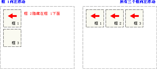
框1向左浮动,因为框1不再存在文档流中,框2被框1遮盖,图2当三个框同时向左浮动时,它们同是float元素,成列状排列;
另外一个特性是:如果包含框宽度小于内部浮动元素的总宽度,浮动元素会向下移动,直到有足够的空间;
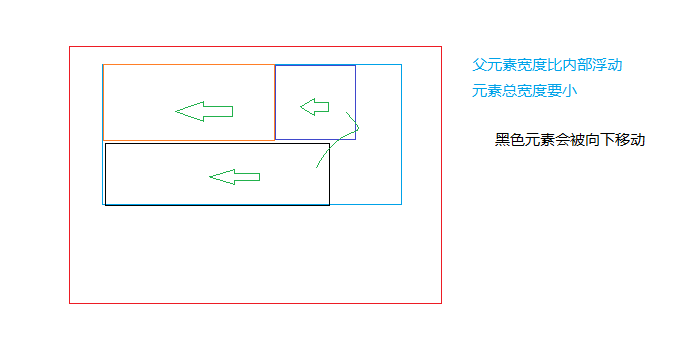
如果浮动元素的高度不同,那么当它们向下移动时可能被其它浮动元素“卡住”:

行框和清理
浮动框旁边的行框被缩短,从而给浮动框留出空间,行框围绕浮动框。
因此,创建浮动框可以使文本围绕图像:
<style type="text/css">
            .div1{height:200px; width: 100px; float: left; background: #ff9000;}
            .div1 a{ background: red;}
            .div2{height:200px; width: 100px; float: left; background: red;}
            .div3{height:200px; width: 100px; float: right; background: #002A80;}
        </style>
        <div class="div1">

        </div>
        <div class="div2">

        </div>
        <div class="div3">

        </div>
        <div class="text">
            这是文本
        </div>

如果要想文本另换一行,与浮动框互不干扰,需要对该框应用 clear 属性。clear 属性的值可以是 left、right、both 或 none,它表示框的哪些边不应该挨着浮动框。
<style type="text/css">
            .div1{height:200px; width: 100px; float: left; background: #ff9000;}
            .div1 a{ background: red;}
            .div2{height:200px; width: 100px; float: left; background: red;}
            .div3{height:200px; width: 100px; float: right; background: #002A80;}
        </style>

        <div class="div1">

        </div>
        <div class="div2">

        </div>
        <div class="div3">

        </div>
        <div style="clear: both;"></div>  //清除上面浮动元素的影响
        <div class="text">
            这是文本
        </div>
什么是CSS清除浮动?
在非IE浏览器(如Firefox)下,当容器的高度为auto,且容器的内容中有浮动(float为left或right)的元素,在这种情况下,容器的高度不能自动伸长以适应内容的高度,使得内容溢出到容器外面而影响(甚至破坏)布局的现象。这个现象叫浮动溢出,为了防止这个现象的出现而进行的CSS处理,就叫CSS清除浮动。
引用W3C的例子,news容器没有包围浮动的元素。
.news {
  background-color: gray;
  border: solid 1px black;
  }

.news img {
  float: left;
  }

.news p {
  float: right;
  }

<div class="news">
<img  src="/static/imghwm/default1.png" data-src="news-pic.jpg" class="lazy" alt="DIV+CSS web page standardized layout (2) floating layout" >
<p>some text</p>
</div>

清除浮动方法
方法一:使用带clear属性的空元素
在浮动元素后使用一个空元素如
,并在CSS中赋予.clear{clear:both;}属性即可清理浮动。亦可使用或
来进行清理。
.news {
  background-color: gray;
  border: solid 1px black;
  }

.news img {
  float: left;
  }

.news p {
  float: right;
  }

.clear {
  clear: both;
  }

<div class="news">
<img  src="/static/imghwm/default1.png" data-src="news-pic.jpg" class="lazy" alt="DIV+CSS web page standardized layout (2) floating layout" >
<p>some text</p>
<div class="clear"></div>
</div>
优点:简单,代码少,浏览器兼容性好。
缺点:需要添加大量无语义的html元素,代码不够优雅,后期不容易维护。
方法二:使用CSS的overflow属性
给浮动元素的容器添加overflow:hidden;或overflow:auto;可以清除浮动,另外在 IE6 中还需要触发 hasLayout ,例如为父元素设置容器宽高或设置 zoom:1。
在添加overflow属性后,浮动元素又回到了容器层,把容器高度撑起,达到了清理浮动的效果。
.news {
  background-color: gray;
  border: solid 1px black;
  overflow: hidden;<br>  *zoom: 1;
  }

.news img {
  float: left;
  }

.news p {
  float: right;
  }

<div class="news">
<img  src="/static/imghwm/default1.png" data-src="news-pic.jpg" class="lazy" alt="DIV+CSS web page standardized layout (2) floating layout" >
<p>some text</p>
</div>
方法三:给浮动的元素的容器添加浮动
给浮动元素的容器也添加上浮动属性即可清除内部浮动,但是这样会使其整体浮动,影响布局,不推荐使用。
方法四:使用邻接元素处理
什么都不做,给浮动元素后面的元素添加clear属性。
.news {
  background-color: gray;
  border: solid 1px black;
  }

.news img {
  float: left;
  }

.news p {
  float: right;
  }

.content{
  clear:both;
  }

<div class="news">
<img  src="/static/imghwm/default1.png" data-src="news-pic.jpg" class="lazy" alt="DIV+CSS web page standardized layout (2) floating layout" >
<p>some text</p>
<div class="content"></div>
</div>
方法五:使用CSS的:after伪元素
结合 :after 伪元素(注意这不是伪类,而是伪元素,代表一个元素之后最近的元素)和 IEhack ,可以完美兼容当前主流的各大浏览器,这里的 IEhack 指的是触发 hasLayout。
给浮动元素的容器添加一个clearfix的class,然后给这个class添加一个:after伪元素实现元素末尾添加一个看不见的块元素(Block element)清理浮动。
.news {
  background-color: gray;
  border: solid 1px black;
  }

.news img {
  float: left;
  }

.news p {
  float: right;
  }

.clearfix:after{
  content: "020";
  display: block;
  height: 0;
  clear: both;
  visibility: hidden;
  }

.clearfix {
  /* 触发 hasLayout */
  zoom: 1;
  }

<div class="news clearfix">
<img  src="/static/imghwm/default1.png" data-src="news-pic.jpg" class="lazy" alt="DIV+CSS web page standardized layout (2) floating layout" >
<p>some text</p>
</div>
Add an invisible space "020" or dot "." at the end of the internal element of the container through CSS pseudo-elements, and assign the clear attribute to clear the float. It should be noted that for IE6 and IE7 browsers, a zoom:1; must be added to the clearfix class to trigger haslayout.
Summary
Through the above example, we can easily find that the methods of clearing floats can be divided into two categories:
The first is to use the clear attribute, including adding an empty div with the clear: both attribute at the end of the floating element to close the element. In fact, the method of using the :after pseudo-element is to add a dot with clear: at the end of the element. Implemented by elements with both attribute.
The second is to trigger the BFC (Block Formatting Contexts, block-level formatting context) of the parent element of the floating element, so that the parent element can contain floating elements. Regarding this point.
Recommended
Use the :after pseudo-element method in the main layout of the web page and use it as the main way to clean up floats; use overflow:hidden; in small modules such as ul (pay attention to possible hidden overflow element problems); if it is a floating element, it can be automatically cleared Internal floats require no special processing; use adjacent elements in the body to clean up previous floats.
Finally, you can use the relatively perfect :after pseudo-element method to clean up the floats, making the document structure clearer.
Reposted from cnblogs Zhang Taifeng http://www.cnblogs.com/ztfjs/p/qdcss.html