
Home >Web Front-end >HTML Tutorial >CSS3: border-radius explained in detail
CSS3: border-radius explained in detail

- WBOYWBOYWBOYWBOYWBOYWBOYWBOYWBOYWBOYWBOYWBOYWBOYWBOriginal
- 2016-09-14 09:24:062499browse
border-radius
Basic grammar:
border-radius: none |
Value range:
If you specify only one value in the border-radius property, 4 rounded corners will be generated.
However, if you want to specify one by one on the four corners, you can use the following rules:
- Four values: The first value is the upper left corner, the second value is the upper right corner, the third value is the lower right corner, and the fourth value is the lower left corner.
- Three values: The first value is the upper left corner, the second value is the upper right corner and the lower left corner, and the third value is the lower right corner
- Two values: The first value is the upper left corner and the lower right corner, the second value is the upper right corner and the lower left corner
- One value: The four fillet values are the same
Next, learn about the specific usage of border-radius through examples:
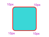
1: When border-radius has only one value, the four corners have the same rounded corner settings, and the effect is the same:
<span style="color: #008080;">1</span> <span style="color: #800000;">.demo1 </span>{
<span style="color: #008080;">2</span> <span style="color: #ff0000;">    width</span>:<span style="color: #0000ff;"> 80px</span>;
<span style="color: #008080;">3</span> <span style="color: #ff0000;">    height</span>:<span style="color: #0000ff;"> 80px</span>;
<span style="color: #008080;">4</span> <span style="color: #ff0000;">    background</span>:<span style="color: #0000ff;"> #3ad7d7</span>;
<span style="color: #008080;">5</span> <span style="color: #ff0000;">    border</span>:<span style="color: #0000ff;"> 2px solid #ff0000</span>;
<span style="color: #008080;">6</span> <span style="color: #ff0000;">    border-radius</span>:<span style="color: #0000ff;"> 10px</span>; /*4个角的值相等*/
<span style="color: #008080;">7</span> }
Effect:
Two: When border-radius has two values, the upper left corner and the lower right corner are the same, and the upper right corner and the lower left corner are the same:
<span style="color: #008080;">1</span> <span style="color: #800000;">.demo2 </span>{
<span style="color: #008080;">2</span> <span style="color: #ff0000;">    width</span>:<span style="color: #0000ff;"> 80px</span>;
<span style="color: #008080;">3</span> <span style="color: #ff0000;">    height</span>:<span style="color: #0000ff;"> 80px</span>;
<span style="color: #008080;">4</span> <span style="color: #ff0000;">    background</span>:<span style="color: #0000ff;"> #3ad7d7</span>;
<span style="color: #008080;">5</span> <span style="color: #ff0000;">    border</span>:<span style="color: #0000ff;"> 2px solid #ff0000</span>;
<span style="color: #008080;">6</span> <span style="color: #ff0000;">    border-radius</span>:<span style="color: #0000ff;"> 5px 10px</span>;
<span style="color: #008080;">7</span> }
Effect:

Three: When border-radius has three values, the upper left takes the first value, the upper right is equal to the lower left and they take the second value, and the lower right takes the third value:
<span style="color: #008080;">1</span> <span style="color: #800000;">.demo3 </span>{
<span style="color: #008080;">2</span> <span style="color: #ff0000;">    width</span>:<span style="color: #0000ff;"> 80px</span>;
<span style="color: #008080;">3</span> <span style="color: #ff0000;">    height</span>:<span style="color: #0000ff;"> 80px</span>;
<span style="color: #008080;">4</span> <span style="color: #ff0000;">    background</span>:<span style="color: #0000ff;"> #3ad7d7</span>;
<span style="color: #008080;">5</span> <span style="color: #ff0000;">    border</span>:<span style="color: #0000ff;"> 2px solid #ff0000</span>;
<span style="color: #008080;">6</span> <span style="color: #ff0000;">    border-radius</span>:<span style="color: #0000ff;"> 5px 10px 15px</span>;
<span style="color: #008080;">7</span> }
Effect:
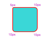
Four: border-radius sets four values. At this time, the first value is taken from the upper left, the second value is taken from the upper right, and the third value is taken from the lower right. The fourth value is taken from the lower left:
<span style="color: #008080;">1</span> <span style="color: #800000;">.demo4 </span>{
<span style="color: #008080;">2</span> <span style="color: #ff0000;">    width</span>:<span style="color: #0000ff;"> 80px</span>;
<span style="color: #008080;">3</span> <span style="color: #ff0000;">    height</span>:<span style="color: #0000ff;"> 80px</span>;
<span style="color: #008080;">4</span> <span style="color: #ff0000;">    background</span>:<span style="color: #0000ff;"> #3ad7d7</span>;
<span style="color: #008080;">5</span> <span style="color: #ff0000;">    border</span>:<span style="color: #0000ff;"> 2px solid #ff0000</span>;
<span style="color: #008080;">6</span> <span style="color: #ff0000;">    border-radius</span>:<span style="color: #0000ff;"> 5px 10px 15px 20px</span>;
<span style="color: #008080;">7</span> }
Effect:

Easy to understand and remember:
As shown in the picture below, starting from the upper left corner are 1, 2, 3, and 4. No matter how many values there are, the numbers start from 1. If there is no value, the diagonal value is taken. Of course, when the value is 1, the four angles are equal. In this way, it can be well understood regardless of whether the horizontal radius and vertical radius are equal. No Error-prone.

Next, let’s take a look at the horizontal and vertical radius subdivided:
Let’s do a small demo first----
<span style="color: #008080;">1</span> <span style="color: #800000;">.demo5 </span>{
<span style="color: #008080;">2</span> <span style="color: #ff0000;">    width</span>:<span style="color: #0000ff;"> 80px</span>;
<span style="color: #008080;">3</span> <span style="color: #ff0000;">    height</span>:<span style="color: #0000ff;"> 80px</span>;
<span style="color: #008080;">4</span> <span style="color: #ff0000;">    background</span>:<span style="color: #0000ff;"> #3ad7d7</span>;
<span style="color: #008080;">5</span> <span style="color: #ff0000;">    border</span>:<span style="color: #0000ff;"> 2px solid #ff0000</span>;
<span style="color: #008080;">6</span> <span style="color: #ff0000;">    border-radius</span>:<span style="color: #0000ff;"> 20px / 40px</span>;  <span style="color: #008000;">/*</span><span style="color: #008000;">水平半径/垂直半径</span><span style="color: #008000;">*/</span>
<span style="color: #008080;">7</span> }
Effect:

You can see that the horizontal and vertical radius values are set separately. They are no longer the same. You can still match the numbers 1, 2, 3, and 4, but the horizontal and vertical radius are separated.
20px / 40px What is in front of the slash ‘/’ is the value of the horizontal radius, and what follows is the value of the vertical radius. Likewise, the horizontal and vertical radii of each corner can also be set differently.
<span style="color: #008080;">1</span> <span style="color: #800000;">.demo6 </span>{
<span style="color: #008080;">2</span> <span style="color: #ff0000;">    width</span>:<span style="color: #0000ff;"> 80px</span>;
<span style="color: #008080;">3</span> <span style="color: #ff0000;">    height</span>:<span style="color: #0000ff;"> 80px</span>;
<span style="color: #008080;">4</span> <span style="color: #ff0000;">    background</span>:<span style="color: #0000ff;"> #3ad7d7</span>;
<span style="color: #008080;">5</span> <span style="color: #ff0000;">    border</span>:<span style="color: #0000ff;"> 2px solid #ff0000</span>;
<span style="color: #008080;">6</span> <span style="color: #ff0000;">    border-radius</span>:<span style="color: #0000ff;"> 10px 20px 15px 30px / 40px 5px 30px 10px</span>;  <span style="color: #008000;">/*</span><span style="color: #008000;">水平半径/垂直半径</span><span style="color: #008000;">*/</span>
<span style="color: #008080;">7</span> }
Effect:

Each corner is set with different horizontal and vertical radii, each with its own style. No matter how you set the value, you can number them one by one starting from the upper left corner. If you don't get the value, take the value in the opposite corner.
Now you can use your imagination to set different radii and create special patterns. I won’t waste space and list them all here.
Use border-radius to draw a circle
Let’s demo first---
1. Borderless circle
<span style="color: #008080;">1</span> <span style="color: #800000;">.demo7 </span>{
<span style="color: #008080;">2</span> <span style="color: #ff0000;">    width</span>:<span style="color: #0000ff;"> 80px</span>;
<span style="color: #008080;">3</span> <span style="color: #ff0000;">    height</span>:<span style="color: #0000ff;"> 80px</span>;
<span style="color: #008080;">4</span> <span style="color: #ff0000;">    background</span>:<span style="color: #0000ff;"> #3ad7d7</span>;
<span style="color: #008080;">5</span>     <span style="color: #008000;">/*</span><span style="color: #008000;">border: 2px solid #ff0000;</span><span style="color: #008000;">*/</span>
<span style="color: #008080;">6</span> <span style="color: #ff0000;">    border-radius</span>:<span style="color: #0000ff;"> 40px</span>;
<span style="color: #008080;">7</span> }
Effect:

For a circle without a border, the width and height only need to be equal, and the border-radius is half of the width and height.
2. Circle with border
For a circle with a border, the width of the border needs to be taken into consideration. Let’s start with a counterexample:
<span style="color: #008080;">1</span> <span style="color: #800000;">.demo8 </span>{
<span style="color: #008080;">2</span> <span style="color: #ff0000;">    width</span>:<span style="color: #0000ff;"> 80px</span>;
<span style="color: #008080;">3</span> <span style="color: #ff0000;">    height</span>:<span style="color: #0000ff;"> 80px</span>;
<span style="color: #008080;">4</span> <span style="color: #ff0000;">    background</span>:<span style="color: #0000ff;"> #3ad7d7</span>;
<span style="color: #008080;">5</span> <span style="color: #ff0000;">    border</span>:<span style="color: #0000ff;"> 5px solid #ff0000</span>;
<span style="color: #008080;">6</span> <span style="color: #ff0000;">    border-radius</span>:<span style="color: #0000ff;"> 40px</span>;
<span style="color: #008080;">7</span> }
效果:

可以看到,忽略了边框的宽度,只设置border-radius为宽高的一半,出来的就不是圆了。
再看一个考虑了边框的demo
<span style="color: #008080;">1</span> <span style="color: #800000;">.demo9 </span>{
<span style="color: #008080;">2</span> <span style="color: #ff0000;">    width</span>:<span style="color: #0000ff;"> 80px</span>;
<span style="color: #008080;">3</span> <span style="color: #ff0000;">    height</span>:<span style="color: #0000ff;"> 80px</span>;
<span style="color: #008080;">4</span> <span style="color: #ff0000;">    background</span>:<span style="color: #0000ff;"> #3ad7d7</span>;
<span style="color: #008080;">5</span> <span style="color: #ff0000;">    border</span>:<span style="color: #0000ff;"> 5px solid #ff0000</span>;
<span style="color: #008080;">6</span> <span style="color: #ff0000;">    border-radius</span>:<span style="color: #0000ff;"> 45px</span>;
<span style="color: #008080;">7</span> }
效果:

结果就显而易见了。所以在画圆的时候还要注意有无边框。
最后附上一个小demo。
<span style="color: #800000;"><!DOCTYPE html>
<html>
<head>
    <style>
        body
        </span>{<span style="color: #ff0000;">
            margin</span>:<span style="color: #0000ff;">30px</span>;<span style="color: #ff0000;">
            background-color</span>:<span style="color: #0000ff;">#ffffff</span>;
        }<span style="color: #800000;">

        div.polaroid
        </span>{<span style="color: #ff0000;">
            position</span>:<span style="color: #0000ff;"> relative</span>;<span style="color: #ff0000;">
            top</span>:<span style="color: #0000ff;"> 50%</span>;<span style="color: #ff0000;">
            left</span>:<span style="color: #0000ff;"> 50%</span>;<span style="color: #ff0000;">
            width</span>:<span style="color: #0000ff;"> 16px</span>;<span style="color: #ff0000;">
            height</span>:<span style="color: #0000ff;"> 16px</span>;<span style="color: #ff0000;">
            background-color</span>:<span style="color: #0000ff;"> white</span>;<span style="color: #ff0000;">
            animation</span>:<span style="color: #0000ff;">localShine 2s linear infinite</span>;<span style="color: #ff0000;">
            border-radius</span>:<span style="color: #0000ff;"> 8px
        </span>}<span style="color: #800000;">

        @keyframes localShine</span>{<span style="color: #ff0000;">
            from {
                box-shadow</span>:<span style="color: #0000ff;">0 0 0 0 #E6E6E6</span>;
            }<span style="color: #800000;">
            to </span>{<span style="color: #ff0000;">
                box-shadow</span>:<span style="color: #0000ff;">0 0 0 6px #cbcbcb</span>;
            }<span style="color: #800000;">
        }

    </style>
</head>
<body>

<div class="polaroid">
</div>

</body>
</html></span>
效果:
