


|
Once you decide to build a website you should already have design standards in place. What do you think should be done next? test! I use the word “test” to test how well your website responds to different screens and browser sizes. Testing is an important step in the responsive web design process. If you know what I’m talking about you need to make your website look good on any type of device. In today’s world, technological advancements and tools have brought users beyond just their laptops or desktops using the web. This is helped by the blazing data speeds offered by telcos. This leaves designers to ensure that the website works well on a variety of devices. Fortunately, this is not a big problem. There are many good free responsive web design testing tools available online that can help you check whether your website design is user-friendly and responsive to various devices. The website should be user-friendly and responsive on various devices available. Creating a responsive/multi-device compatible website design that is smart, flexible, and consistent with the regular web experience will surely lead to success.
Listed below are some great tools and resources that can help you design a website that can adapt to different device sizes and operating systems. No coding knowledge is required to test a responsive site using the tools and resources listed below. The Best Free Responsive Web Design Testing Tools 1. Responsive design bookmarksResponsive Design Bookmarklet is a handy tool for responsive design testing. You just drag the bookmark on the bookmarks bar and it will be applied to your browser. How it works: First, a virtual keyboard is triggered to check how much space the user has when entering data. Trigger CSS refresh later. When you save a CSS file, the changes take effect directly, without the need to refresh the browser you are working in. Finally, close the bookmark and return to the current page. This lets you preview the current page in a size that fits the width of your tablet or smartphone screen.
jResize is a responsive web development tool integrated in jQuery to assist responsive development projects. Frames are embedded into web pages at different widths. So, it's easy to adjust your HTML in the browser. All you have to do is download this cool tool and the dimensions will change when you click on the width you want.
resizeMyBrowser is a responsive web design tool that allows you to choose the browser size you want to test. Users can choose from 15 different preset sizes or enter custom sizes.
Screenqueri.es is a pixel-perfect responsive design testing tool that allows you to test your designs on 30 different devices or windows with custom resolutions.
Response Calculator is a tool that facilitates designers to convert pixels to 100% in a given situation. It helps you perfectly fit PSD pixels into your website. Simply click on your needs.
Screenfly by QuirkTools is an online digital device simulation tool that allows users to preview their responsive website in different devices, such as desktop, tablet, mobile phone or TV. It is easy to use and as mentioned before gives you a variety of options like viewing on different sizes of desktop computer monitors and virtual TV screens. Additionally it has options to enable or disable scrolling or rotating the display.
Responsinator is a cool tool, an online website that allows you to preview your web pages on smartphones and tablets in portrait and landscape modes. In addition, Responsinator can give you a realistic experience of browsing your website on different screens. Just enter the URL and preview on iPhone, iPad, Kindle and other Android phones.
Viewport resizer is a browser-based tool that allows users to test the responsiveness of any website. Users only need to save the bookmark, visit the page they want to test, click on the created bookmark and check how the page performs on all types of screen resolutions.
This is a simple and useful tool that requires you to enter the URL of the site or page you want to test and then select the device you want to test.
Developed by Edward Cant, ReView is a dynamic windowing system that provides an efficient view selection for responsive web pages. Users can choose to 'enter' and 'exit' responsive design states.
Designmodo Responsive Test As the name suggests, this is a responsive website testing tool that helps you test your website in a large number of screen sizes. Simply type the URL to select a device type or enter a custom size. The image below shows a responsive test of our website.
Adobe Edge Inspect CC allows you to preview and inspect your web design on various devices. It has many features such as synchronous browsing, remote inspection, screenshots, edge detection, scalability and so on.
It is a cool online portal or tool that you can use to test your responsive website design. It lets you adjust your website pixel by pixel. This feature allows you to set breakpoints and test how CSS media works on your site.
DimensionsApp is an online emulator for mobile phones and tablets, which can help you test the responsiveness of your website in many devices such as tablets, wide screen devices, mobile phones, etc. Just enter your blog's URL and click on the names of the various devices to see how it will look.
In addition to the tools listed above, do you have any favorite free responsive web design tools? If so, please share it quickly. |


 11 Best PHP URL Shortener Scripts (Free and Premium)Mar 03, 2025 am 10:49 AM
Long URLs, often cluttered with keywords and tracking parameters, can deter visitors. A URL shortening script offers a solution, creating concise links ideal for social media and other platforms. These scripts are valuable for individual websites a
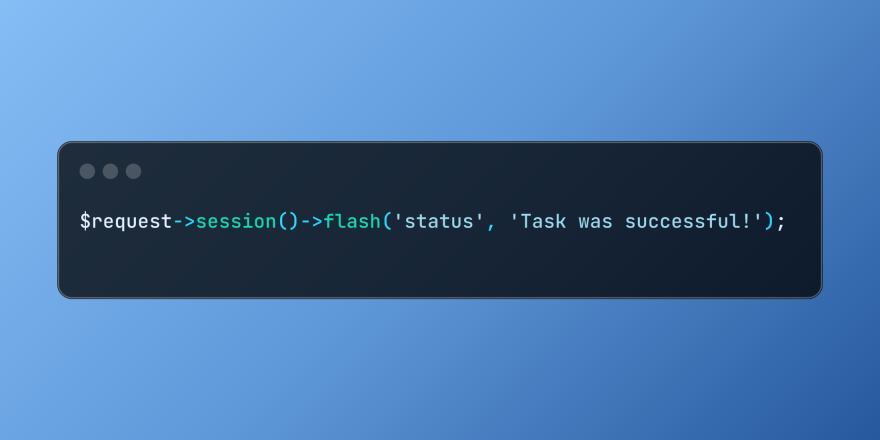 Working with Flash Session Data in LaravelMar 12, 2025 pm 05:08 PM
Laravel simplifies handling temporary session data using its intuitive flash methods. This is perfect for displaying brief messages, alerts, or notifications within your application. Data persists only for the subsequent request by default: $request-
 Build a React App With a Laravel Back End: Part 2, ReactMar 04, 2025 am 09:33 AM
This is the second and final part of the series on building a React application with a Laravel back-end. In the first part of the series, we created a RESTful API using Laravel for a basic product-listing application. In this tutorial, we will be dev
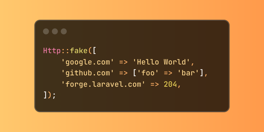 Simplified HTTP Response Mocking in Laravel TestsMar 12, 2025 pm 05:09 PM
Laravel provides concise HTTP response simulation syntax, simplifying HTTP interaction testing. This approach significantly reduces code redundancy while making your test simulation more intuitive. The basic implementation provides a variety of response type shortcuts: use Illuminate\Support\Facades\Http; Http::fake([ 'google.com' => 'Hello World', 'github.com' => ['foo' => 'bar'], 'forge.laravel.com' =>
 cURL in PHP: How to Use the PHP cURL Extension in REST APIsMar 14, 2025 am 11:42 AM
The PHP Client URL (cURL) extension is a powerful tool for developers, enabling seamless interaction with remote servers and REST APIs. By leveraging libcurl, a well-respected multi-protocol file transfer library, PHP cURL facilitates efficient execution of various network protocols, including HTTP, HTTPS, and FTP. This extension offers granular control over HTTP requests, supports multiple concurrent operations, and provides built-in security features.
 12 Best PHP Chat Scripts on CodeCanyonMar 13, 2025 pm 12:08 PM
Do you want to provide real-time, instant solutions to your customers' most pressing problems? Live chat lets you have real-time conversations with customers and resolve their problems instantly. It allows you to provide faster service to your custom
 Announcement of 2025 PHP Situation SurveyMar 03, 2025 pm 04:20 PM
The 2025 PHP Landscape Survey investigates current PHP development trends. It explores framework usage, deployment methods, and challenges, aiming to provide insights for developers and businesses. The survey anticipates growth in modern PHP versio
 Notifications in LaravelMar 04, 2025 am 09:22 AM
In this article, we're going to explore the notification system in the Laravel web framework. The notification system in Laravel allows you to send notifications to users over different channels. Today, we'll discuss how you can send notifications ov


Hot AI Tools

Undresser.AI Undress
AI-powered app for creating realistic nude photos

AI Clothes Remover
Online AI tool for removing clothes from photos.

Undress AI Tool
Undress images for free

Clothoff.io
AI clothes remover

AI Hentai Generator
Generate AI Hentai for free.

Hot Article
Hot Tools

Safe Exam Browser
Safe Exam Browser is a secure browser environment for taking online exams securely. This software turns any computer into a secure workstation. It controls access to any utility and prevents students from using unauthorized resources.

PhpStorm Mac version
The latest (2018.2.1) professional PHP integrated development tool

ZendStudio 13.5.1 Mac
Powerful PHP integrated development environment

SublimeText3 Linux new version
SublimeText3 Linux latest version

Notepad++7.3.1
Easy-to-use and free code editor

