 Web Front-end
 JS Tutorial
 Two very good Bootstrap Icon icon selection components_javascript skills
Two very good Bootstrap Icon icon selection components_javascript skills
1. Bootstrap icon picker component
This component was found when searching on github. At first glance, it looks really good and is based on bootstrap style, so it is more suitable for projects using bootstrap style layout. Since it is on github, there is no doubt that this is an open source component, source code address. Okay, having said all that, let’s take a look at what it looks like.
1. Component effect preview
First initialization

Supports "Previous Page" and "Next Page"

Supports the selection of custom icons

Support fuzzy search icons, for example, we search for camera

Select the icon and put the corresponding style into the text box

2. Component code example
(1) Common usage
This component is based on bootstrap and jquery. The files that need to be referenced are as follows
   <link href="~/Content/bootstrap/css/bootstrap.css" rel="stylesheet" />
 <link href="~/Content/Bootstrap-icon-picker-master/Bootstrap-icon-picker-master/css/icon-picker.css" rel="stylesheet" />

 <script src="~/Scripts/jquery-1.9.1.js"></script>
 <script src="~/Content/Bootstrap-icon-picker-master/Bootstrap-icon-picker-master/js/iconPicker.js"></script>
Place an ordinary input text box on the html page
<input type="text" class="form-control" id="txt_boostrap_icon">
JS initialization
  $(function () {
  //bootstrap icon初始化
  $("#txt_boostrap_icon").iconPicker();
 });
After initialization, you can see the effect as shown above. Isn’t it very simple~~
Then we need to get the selected value, which is no different from the use of ordinary input text boxes. var bootstrap_icon = $("#txt_boostrap_icon").val();
(2) Custom icon
We see that after initialization using the above method, the number of icons is fixed at dozens. What if we need to add some of our own icons to it? Or, we need to use a background image as an icon, what should we do? Don't worry, there is always a way! Let’s take a brief look at its js source code:

There are only more than a hundred lines of code in total, so it is not difficult to understand. Let's focus on the variable icons in the red line above. We observe that what is stored in this array is the collection of all our icons. Let's take a look at the generated html source code.

From this, we wonder if we can customize the style and name it glyphicon-such a style to customize the icon? With this idea in mind, we add two new styles in the css file
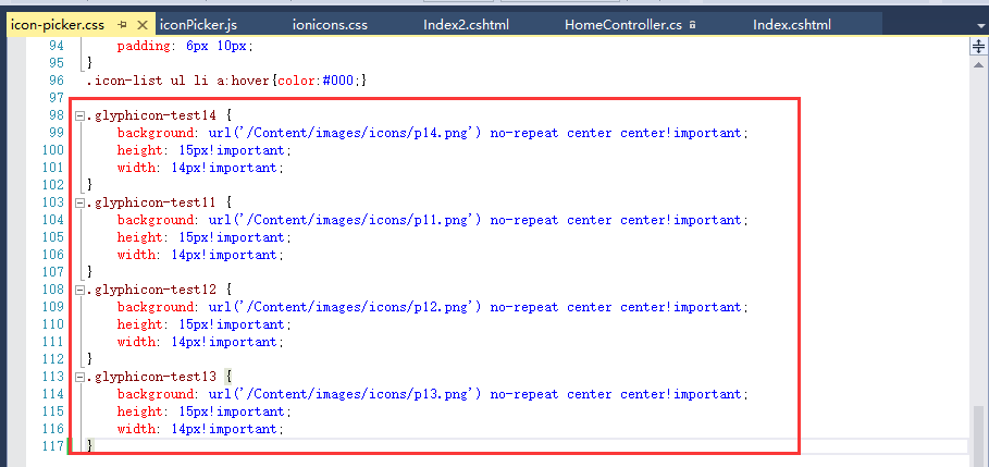
Then add four items test11, test12, test13, test14 to the icons variable
好了,大功告成。接下来就是刷新页面看效果了。

所以这个组件最大的好处就是扩展自己的图标方便,不管是用content写还是使用背景图片都可以无缝对接。杠杠的!
二、jQuery fontIconPicker组件
jquery fonticonpicker是博主是找jquery插件的时候无意中发现的,不发现不要紧,仔细研究后发现这组件真心不错,尤其是界面效果很棒。并且开源,文档全,功能丰富。
1、组件效果预览
初始化的时候有自定义了四种主题(博主更偏爱第一种bootstrap风格的)


支持分页

鼠标上上面效果

支持模糊搜索

支持自定义每页显示的图标个数

选择某个图标后的效果

2、组件代码示例
(1)普通用法
这个组件不需要bootstrap的支持,但是需要jquery的支持,不过我们测试的需要还是将bootstrap.css给引用进来。
<script src="~/Scripts/jquery-1.9.1.js"></script>
 <script src="~/Content/fontIconPicker-2.0.0/jquery.fonticonpicker.js"></script>

 <link href="~/Content/bootstrap/css/bootstrap.css" rel="stylesheet" />
 <link href="~/Content/fontIconPicker-2.0.0/css/jquery.fonticonpicker.css" rel="stylesheet" />
 <link href="~/Content/fontIconPicker-2.0.0/themes/grey-theme/jquery.fonticonpicker.grey.css" rel="stylesheet" />
 <link href="~/Content/fontIconPicker-2.0.0/themes/dark-grey-theme/jquery.fonticonpicker.darkgrey.css" rel="stylesheet" />
 <link href="~/Content/fontIconPicker-2.0.0/themes/bootstrap-theme/jquery.fonticonpicker.bootstrap.css" rel="stylesheet" />
 <link href="~/Content/fontIconPicker-2.0.0/themes/inverted-theme/jquery.fonticonpicker.inverted.css" rel="stylesheet" />
 <link href="~/Content/fontIconPicker-2.0.0/fontIconPicker-2.0.0/demo/fontello-7275ca86/css/fontello.css" rel="stylesheet" />
效果炫,必然引用的文件就多了。
再来看看html准备
1)静态html
<select id="myselect" name="myselect" class="myselect">
    <option value="">No icon</option>
    <option>icon-user</option>
    <option>icon-search</option>
    <option>icon-right-dir</option>
    <option>icon-star</option>
    <option>icon-cancel</option>
    <option>icon-help-circled</option>
    <option>icon-info-circled</option>
    <option>icon-eye</option>
    <option>icon-tag</option>
    <option>icon-bookmark</option>
    <option>icon-heart</option>
    <option>icon-thumbs-down-alt</option>
    <option>icon-upload-cloud</option>
    <option>icon-phone-squared</option>
    <option>icon-cog</option>
    <option>icon-wrench</option>
    <option>icon-volume-down</option>
    <option>icon-down-dir</option>
    <option>icon-up-dir</option>
    <option>icon-left-dir</option>
    <option>icon-thumbs-up-alt</option>
    </select>
2)如果是动态设置图标,这里只需要放一个空的select即可
<select id="myselect" name="myselect" class="myselect"></select>
JS初始化
1)静态初始化(针对select里面已经写好了option的情况)
$(function () {
 //jquery icon初始化
 $('#myselect').fontIconPicker(); // Load with default options
 });
2)动态初始化(针对空的select标签)
$(function () {
  //jquery icon初始化
  $('#myselect').fontIconPicker({
  theme: 'fip-bootstrap',//四种主题风格:fip-grey, fip-darkgrey, fip-bootstrap, fip-inverted
  source: ["icon-music", "icon-search", "icon-mail", "icon-mail-alt", "icon-heart", "icon-heart-empty", "icon-star", "icon-star-empty", "icon-star-half", "icon-star-half-alt", "icon-user", "icon-users", "icon-male", "icon-female", "icon-video", "icon-videocam", "icon-picture", "icon-camera", "icon-camera-alt", "icon-th-large", "icon-th", "icon-th-list", "icon-ok", "icon-ok-circled", "icon-ok-circled2", "icon-ok-squared", "icon-cancel", "icon-cancel-circled", "icon-cancel-circled2", "icon-plus", "icon-plus-circled", "icon-plus-squared", "icon-plus-squared-small", "icon-minus", "icon-minus-circled", "icon-minus-squared", "icon-minus-squared-alt", "icon-minus-squared-small", "icon-help", "icon-help-circled", "icon-info-circled", "icon-info", "icon-home", "icon-link", "icon-unlink", "icon-link-ext", "icon-link-ext-alt", "icon-attach", "icon-lock", "icon-lock-open", "icon-lock-open-alt", "icon-pin", "icon-eye", "icon-eye-off", "icon-tag", "icon-tags", "icon-bookmark", "icon-bookmark-empty", "icon-flag", "icon-flag-empty", "icon-flag-checkered", "icon-thumbs-up", "icon-thumbs-down", "icon-thumbs-up-alt", "icon-thumbs-down-alt", "icon-download", "icon-upload", "icon-download-cloud", "icon-upload-cloud", "icon-reply", "icon-reply-all", "icon-forward", "icon-quote-left", "icon-quote-right", "icon-code", "icon-export", "icon-export-alt", "icon-pencil", "icon-pencil-squared", "icon-edit", "icon-print", "icon-retweet", "icon-keyboard", "icon-gamepad", "icon-comment", "icon-chat", "icon-chat-empty", "icon-bell", "icon-bell-alt", "ion-android-alert", "ion-android-apps"],
  emptyIcon: true,//是否显示空
  emptyIconValue: "none",//空值
  iconsPerPage: 30, //每页显示图标的个数,默认20
  hasSearch: true,//是否显示试试框,默认true

  });
 });
其实也很简单,就那么几个可以设置的参数,代码里面已经写了相应的注释,这里就不做过多讲解。
同样,获取选中的值,可以直接使用jquery的val()即可。
(2)自定义图标
看了上面bootstrap icon的自定义图标,你是否也在想,这个组件也能支持自定义就好了。呵呵,博主也是这样想得。行不行呢?我们先来试一试。
1)使用背景图片的图标尝试,结果失败
首先直接在页面上面定义一个使用背景图片的样式
<style type="text/css">
 .glyphicon-test13 {
  background: url('/Content/images/icons/p13.png') no-repeat center center!important;
  height: 15px!important;
  width: 14px!important;
 }
</style>
Then put "glyphicon-test13" at the end of the array corresponding to the initialization source, and it seems you're done. Let’s refresh the interface and take a look

Contrary to expectations, the icon background image cannot be displayed properly. Why is this? Curiosity is here again, let’s review the elements:

It turns out that this component generates an i tag, which is different from the span above. span can be used as a container, but can only be used as an italic tag. So this attempt failed. But you are not convinced. You said that the i tag is not a container and has no actual placeholder, right? Can we write multiple spaces into i?

You can see that after adding spaces to the i tag, the image can indeed be displayed. It seems that the problem is perfectly solved! But, but, don't be too happy too early, it still won't work when you select it, because there is still an empty i tag in the selection. So in general, this method can be used as a reference idea. There will be time later to see if the source code can be appropriately modified to implement this function. At this stage, custom background images are not supported!
2) Try using icons written in css and the result is successful
Since customizing background images does not work, what if we customize the icon, that is, if we write the icon in this way: before{content:""}, is it okay? The answer is yes. We found a website dedicated to icons, went there to download the icon package, and referenced it to the page of our project.

We randomly select two "ion-android-archive" and "ion-android-arrow-back" and put them at the end of the array corresponding to the initialization source. Refresh the interface

After selection

3. Comparison
The above are examples of the use of two icon selection components. By comparison, this component actually has its own pros and cons.
1. From the perspective of interface effect, the second one (jquery fontIconPicker) is better-looking than the first one (Bootstrap icon picker), with a more dazzling interface and a better user experience. This is not controversial.
2. From the perspective of lightweight components, the first type is better than the second type. Obviously, the second type references so much css, which will definitely lead to more or less failure of the component. Bloated.
3. From the perspective of convenience of use, the first one is simpler to use and easier to expand; the second API is more comprehensive, has more customizable items, and is flexible to use, but there are currently some custom background images question.
Okay, that’s it for this article. If your project happens to need to use this kind of icon selection component, you can try it out.
 JavaScript Engines: Comparing ImplementationsApr 13, 2025 am 12:05 AM
Different JavaScript engines have different effects when parsing and executing JavaScript code, because the implementation principles and optimization strategies of each engine differ. 1. Lexical analysis: convert source code into lexical unit. 2. Grammar analysis: Generate an abstract syntax tree. 3. Optimization and compilation: Generate machine code through the JIT compiler. 4. Execute: Run the machine code. V8 engine optimizes through instant compilation and hidden class, SpiderMonkey uses a type inference system, resulting in different performance performance on the same code.
 Beyond the Browser: JavaScript in the Real WorldApr 12, 2025 am 12:06 AM
JavaScript's applications in the real world include server-side programming, mobile application development and Internet of Things control: 1. Server-side programming is realized through Node.js, suitable for high concurrent request processing. 2. Mobile application development is carried out through ReactNative and supports cross-platform deployment. 3. Used for IoT device control through Johnny-Five library, suitable for hardware interaction.
 Building a Multi-Tenant SaaS Application with Next.js (Backend Integration)Apr 11, 2025 am 08:23 AM
I built a functional multi-tenant SaaS application (an EdTech app) with your everyday tech tool and you can do the same. First, what’s a multi-tenant SaaS application? Multi-tenant SaaS applications let you serve multiple customers from a sing
 How to Build a Multi-Tenant SaaS Application with Next.js (Frontend Integration)Apr 11, 2025 am 08:22 AM
This article demonstrates frontend integration with a backend secured by Permit, building a functional EdTech SaaS application using Next.js. The frontend fetches user permissions to control UI visibility and ensures API requests adhere to role-base
 JavaScript: Exploring the Versatility of a Web LanguageApr 11, 2025 am 12:01 AM
JavaScript is the core language of modern web development and is widely used for its diversity and flexibility. 1) Front-end development: build dynamic web pages and single-page applications through DOM operations and modern frameworks (such as React, Vue.js, Angular). 2) Server-side development: Node.js uses a non-blocking I/O model to handle high concurrency and real-time applications. 3) Mobile and desktop application development: cross-platform development is realized through ReactNative and Electron to improve development efficiency.
 The Evolution of JavaScript: Current Trends and Future ProspectsApr 10, 2025 am 09:33 AM
The latest trends in JavaScript include the rise of TypeScript, the popularity of modern frameworks and libraries, and the application of WebAssembly. Future prospects cover more powerful type systems, the development of server-side JavaScript, the expansion of artificial intelligence and machine learning, and the potential of IoT and edge computing.
 Demystifying JavaScript: What It Does and Why It MattersApr 09, 2025 am 12:07 AM
JavaScript is the cornerstone of modern web development, and its main functions include event-driven programming, dynamic content generation and asynchronous programming. 1) Event-driven programming allows web pages to change dynamically according to user operations. 2) Dynamic content generation allows page content to be adjusted according to conditions. 3) Asynchronous programming ensures that the user interface is not blocked. JavaScript is widely used in web interaction, single-page application and server-side development, greatly improving the flexibility of user experience and cross-platform development.
 Is Python or JavaScript better?Apr 06, 2025 am 12:14 AM
Python is more suitable for data science and machine learning, while JavaScript is more suitable for front-end and full-stack development. 1. Python is known for its concise syntax and rich library ecosystem, and is suitable for data analysis and web development. 2. JavaScript is the core of front-end development. Node.js supports server-side programming and is suitable for full-stack development.


Hot AI Tools

Undresser.AI Undress
AI-powered app for creating realistic nude photos

AI Clothes Remover
Online AI tool for removing clothes from photos.

Undress AI Tool
Undress images for free

Clothoff.io
AI clothes remover

AI Hentai Generator
Generate AI Hentai for free.

Hot Article

Hot Tools

MinGW - Minimalist GNU for Windows
This project is in the process of being migrated to osdn.net/projects/mingw, you can continue to follow us there. MinGW: A native Windows port of the GNU Compiler Collection (GCC), freely distributable import libraries and header files for building native Windows applications; includes extensions to the MSVC runtime to support C99 functionality. All MinGW software can run on 64-bit Windows platforms.

DVWA
Damn Vulnerable Web App (DVWA) is a PHP/MySQL web application that is very vulnerable. Its main goals are to be an aid for security professionals to test their skills and tools in a legal environment, to help web developers better understand the process of securing web applications, and to help teachers/students teach/learn in a classroom environment Web application security. The goal of DVWA is to practice some of the most common web vulnerabilities through a simple and straightforward interface, with varying degrees of difficulty. Please note that this software

EditPlus Chinese cracked version
Small size, syntax highlighting, does not support code prompt function

SublimeText3 Linux new version
SublimeText3 Linux latest version

SublimeText3 Chinese version
Chinese version, very easy to use


