

 Web Front-endHTML TutorialA circular navigation menu implemented in pure css3_html/css_WEB-ITnose
I have introduced several navigation menus to you before, and today I want to bring you a circular navigation menu implemented in pure CSS3. The navigation is relatively new, with the list icon in the middle. When you click the list icon, the items are distributed around the list chart. Form a ring. The renderings are as follows:
Online preview Source code download
Implemented code.
html code:
<div class="container"> <h1 id="Cool-Open-Close-menu-in-full-CSS"> Cool Open/Close menu in full CSS</h1> <input type="checkbox" id="menu_opener_id" class="menu_opener"> <label for="menu_opener_id" class="menu_opener_label"> </label> <div class="barre_hamburger"> </div> <a href="#" class="link_one link_general"></a><a href="#" class="link_two link_general"> </a><a href="#" class="link_three link_general"></a><a href="#" class="link_four link_general"> </a></input> </div>
css code:
body { background: #34495e; } .container { width: 550px; display: block; margin: auto; position: relative; } h1 { text-align: center; font-family: 'Roboto' , sans-serif; font-weight: 400; color: #f1c40f; } .menu_opener { display: none; } .menu_opener:checked ~ .link_one { top: 65px; } .menu_opener:checked ~ .link_two { left: 385px; } .menu_opener:checked ~ .link_three { top: 385px; } .menu_opener:checked ~ .link_four { left: 65px; } .menu_opener:checked ~ .barre_hamburger { opacity: 0; } .menu_opener:checked ~ .menu_opener_label:after { transform: rotate(45deg); top: 70px; } .menu_opener:checked ~ .menu_opener_label:before { transform: rotate(-45deg); top: 70px; } .menu_opener_label { background: #f1c40f; width: 150px; height: 150px; display: block; cursor: pointer; border-radius: 50%; position: absolute; top: 200px; left: 200px; z-index: 10; } .menu_opener_label:after { position: absolute; top: 50px; left: 50px; background: #000; content: ""; width: 50px; height: 10px; -webkit-transition: all 0.4s ease; transition: all 0.4s ease; } .menu_opener_label:before { position: absolute; top: 90px; left: 50px; background: #000; content: ""; width: 50px; height: 10px; -webkit-transition: all 0.4s ease; transition: all 0.4s ease; } .barre_hamburger { width: 50px; height: 10px; position: absolute; top: 270px; left: 250px; background: #000; z-index: 20; -webkit-transition: all 0.4s ease; transition: all 0.4s ease; } .link_general { width: 100px; height: 100px; display: block; border-radius: 50%; position: absolute; top: 225px; left: 225px; background: #ecf0f1; -webkit-transition: all 0.4s ease; transition: all 0.4s ease; } .link_one { background: url("home.png") #f1c40f no-repeat center center; } .link_two { background: url("mail.png") #f1c40f no-repeat center center; } .link_three { background: url("set.png") #f1c40f no-repeat center center; } .link_four { background: url("start.png") #f1c40f no-repeat center center; }

 足球导航语音包在哪个导航软件Nov 09, 2022 pm 04:33 PM
足球导航语音包在“高德导航”软件中,是高德地图车机版导航语音包的其中一种,内容为黄健翔足球解说版本的导航语音。设置方法:1、打开高德地图软件;2、点击进入“更多工具”-“导航语音”选项;3、找到“黄健翔热血语音”,点击“下载”;4、在弹出的页面,点击“使用语音”即可。

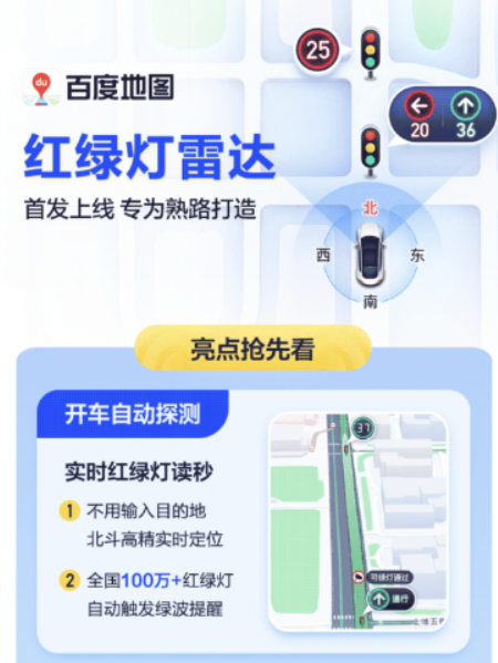 百度地图 App 最新版本 18.8.0 发布,首次引入红绿灯雷达功能,并新增实时停车推荐功能Aug 06, 2023 pm 06:05 PM
百度地图App安卓版/iOS版均已发布18.8.0版本,首次引入红绿灯雷达功能,业内领先据官方介绍,开启红绿灯雷达后,支持开车自动探测红绿灯,不用输入目的地,北斗高精可以实时定位,全国100万+红绿灯自动触发绿波提醒。除此之外,新功能还提供全程静音导航,使图区更简洁,关键信息一目了然,且无语音播报,使驾驶员更加专注驾驶百度地图于2020年10月上线红绿灯倒计时功能,支持实时读秒预判,导航会在接近红绿灯路口时,自动展示倒计时剩余秒数,让用户时刻掌握前方路况。截至2022年12月31日,红绿灯倒计时
 css3如何实现鼠标点击图片放大Apr 25, 2022 pm 04:52 PM
实现方法:1、使用“:active”选择器选中鼠标点击图片的状态;2、使用transform属性和scale()函数实现图片放大效果,语法“img:active {transform: scale(x轴放大倍数,y轴放大倍数);}”。
 css3动画效果有变形吗Apr 28, 2022 pm 02:20 PM
css3中的动画效果有变形;可以利用“animation:动画属性 @keyframes ..{..{transform:变形属性}}”实现变形动画效果,animation属性用于设置动画样式,transform属性用于设置变形样式。
 高德地图推出升级版驾车 ETA 服务:实时解析当前路况,预估到达时间更精准Apr 30, 2024 am 08:37 AM
本站4月29日消息,高德地图官宣推出升级版的驾车ETA(本站注:ETA即预估到达时间,指的是用户在当前时刻出发按照给定路线前往目的地预计需要的时长)服务,该服务旨在帮助用户的路线规划时长和路况预估更为精准,辅助用户进行出行决策。该地图应用是最新升级的高德地图App,引入了“超大规模图卷积神经网络模型”,该模型可以更好地捕捉和学习交通流动规律,支持城市道路网络、高速公路系统,能以高精度刻画交通状况的时空动态变化。在此外,全新版本的地图还进一步融合了iTransformer时序预测模型,支持实时解析
 css3线性渐变可以实现三角形吗Apr 25, 2022 pm 02:47 PM
css3线性渐变可以实现三角形;只需创建一个45度的线性渐变,设置渐变色为两种固定颜色,一个是三角形的颜色,另一个为透明色即可,语法“linear-gradient(45deg,颜色值,颜色值 50%,透明色 50%,透明色 100%)”。
 uniapp中如何实现页面跳转和导航Oct 20, 2023 pm 02:07 PM
uniapp中如何实现页面跳转和导航uniapp是一款支持一次编码多端发布的前端框架,它基于Vue.js,开发者可以使用uniapp快速开发移动端应用。在uniapp中,实现页面跳转和导航是非常常见的需求。本文将介绍uniapp中如何实现页面跳转和导航,并提供具体的代码示例。一、页面跳转使用uniapp提供的方法进行页面跳转uniapp提供了一组方法用于实现


Hot AI Tools

Undresser.AI Undress
AI-powered app for creating realistic nude photos

AI Clothes Remover
Online AI tool for removing clothes from photos.

Undress AI Tool
Undress images for free

Clothoff.io
AI clothes remover

AI Hentai Generator
Generate AI Hentai for free.

Hot Article
Hot Tools

EditPlus Chinese cracked version
Small size, syntax highlighting, does not support code prompt function

ZendStudio 13.5.1 Mac
Powerful PHP integrated development environment

Safe Exam Browser
Safe Exam Browser is a secure browser environment for taking online exams securely. This software turns any computer into a secure workstation. It controls access to any utility and prevents students from using unauthorized resources.

Dreamweaver Mac version
Visual web development tools

VSCode Windows 64-bit Download
A free and powerful IDE editor launched by Microsoft

