


Bootstrap uses some HTML5 elements and CSS properties, so it needs to use the HTML5 document type.
<!DOCTYPE html>
<html lang="zh-CN">
 ...
</html>
In order to make the website developed by Bootstrap mobile-friendly and ensure proper drawing and touch screen scaling, you need to add the viewport meta tag to the head of the web page, as shown below:
<meta name="viewport" content="width=device-width, //视口宽度为设备宽度
          initial-scale=1.0, //缩放程度
          maximum-scale=1.0, //最大缩放级别(可选)
          user-scalable=no">//禁止页面缩放(可选)
Bootstrap uses Normalize to establish cross-browser consistency. Normalize.css is a small CSS file that provides better cross-browser consistency in the default styling of HTML elements.
About layout
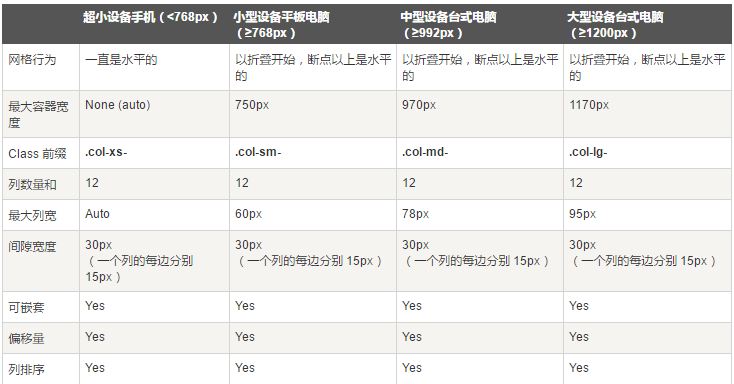
Bootstrap provides a responsive, mobile-first fluid grid system that is automatically divided into up to 12 columns as the screen or viewport size increases.
img-responsive is used for img elements
container element used to wrap content on the page
-
The
- row needs to be placed in the container and is used to create horizontal groups of columns.
- Predefined grid classes, such as .row and .col-xs-4, can be used to quickly create grid layouts.
- Rows and columns can be nested into each other, and the adaptation after nesting is based on the parent element, not the device width
-
To create three equal columns, use three col-xs-4, or 12 col-xs-1 for 12 columns.
<div class="container">
 <div class="row">
  <div class="col-xs-6 col-md-2 col-md-offset-1"></div>
  <div class="col-xs-6 col-md-3"></div>
  <div class="col-xs-6 col-md-3"></div>
  <div class="col-xs-6 col-md-3"></div>
 </div>
 <div class="row">...</div>
</div>
<div class="container">....
<!--以上代码在手机上就是两行两列,在电脑上是一行四列,其中第一列前面有空白,比其它列宽度小三分之一-->
//可使用.col-md-push-* 和 .col-md-pull-* 这种类设定显示,col-md-push-6按照我个人的理解,是在左面浮动了6列,然后再插入元素,col-md-pull-3则是在右边浮动了3列,然后从右往左插入元素
- Media queries are very fancy "conditional CSS rules". It only works with some CSS based on certain specified conditions. If those conditions are met, the corresponding style is applied.
@media (min-width: @screen-sm-min) and (max-width: @screen-sm-max) { ... }
//For all devices with min-width: @screen-sm-min, if the width of the screen is smaller than @screen-sm-max, some processing will be done.
About typesetting
-
About text
<small>本行内容是在标签内</small><br>
<strong>本行内容是在标签内</strong><br>
<em>本行内容是在标签内,并呈现为斜体</em><br>
<p class="text-left">向左对齐文本</p>
<p class="text-center">居中对齐文本</p>
<p class="text-right">向右对齐文本</p>
<p class="text-muted">本行内容是减弱的</p>灰
<p class="text-primary">本行内容带有一个 primary class</p>蓝
<p class="text-success">本行内容带有一个 success class</p>绿
<p class="text-info">本行内容带有一个 info class</p>深蓝
<p class="text-warning">本行内容带有一个 warning class</p>黄
<p class="text-danger">本行内容带有一个 danger class</p>红
Bootstrap defines the style of the element as a dashed border that appears at the bottom of the text, with the full text appearing when the mouse is hovered over it (as long as you add text for the title attribute). To get a smaller font size for text, add .initialism to .
<abbr title="World Wide Web">WWW</abbr><br>
<abbr title="Real Simple Syndication" class="initialism">RSS</abbr>
- Using the tag, you can display contact information on your web page.
- Use the
tag as a quote
<blockquote>这是一个带有源标题的引用。<small>Someone famous in Source Title</small></blockquote>
- list-unstyled is used for unstyled list ul, list-inline is used for horizontal list ul
- pre-scrollable makes pre scrollable
-
displays code inline, <pre class="brush:php;toolbar:false"> displays multiple lines of code</pre>
About the form


By wrapping any .table in a .table-responsive class, you can make the table scroll horizontally to fit on small devices (less than 768px). You won't see any difference when viewing on large devices larger than 768px wide.
<div class="table-responsive">
 <table class="table">
  <caption>响应式表格布局</caption>
  <thead>
   <tr>
   <th>产品</th>
   <th>付款日期</th>
   <th>状态</th>
   </tr>
  </thead>
  <tbody>
   <tr>
   <td>产品1</td>
   <td>23/11/2013</td>
   <td>待发货</td>
   </tr>
  </tbody>
 </table>
</div>
About the form
- Add the attribute role="form" to the form and the basic form structure of Bootstrap will be applied. At this time, the default is a vertical form
- Put the labels and controls in a with class .form-group. This is necessary to obtain optimal spacing.
- Add class .form-control to all text elements ,
<input type="text" class="form-control" placeholder="文本输入"/>
<textarea class="form-control" rows="3"></textarea>
<label for="name">可多选的选择列表</label>
  <select multiple class="form-control">
   <option>1</option>
   <option>2</option>
   <option>3</option>
   <option>4</option>
   <option>5</option>
  </select>
- 在form加上类calss=form-inline,那么表单元素就会变成内联的
- 在form加上类class=form-horizontal,那么表单元素就会变成水平的
1)设置表单控件padding和margin值
2)改变“form-group”的表现形式,类似于网格系统的“row”。
3)向标签添加 class .control-label。
- 复选框和单选框
1)对一系列复选框和单选框使用 .checkbox-inline 或 .radio-inline class,控制它们显示在同一行上。
- 当您需要在一个水平表单内的表单标签后放置纯文本时,请在
上使用 class .form-control-static。
- 禁用的输入框 input,如果您想要禁用一个输入框 input,只需要简单地添加 disabled 属性
- 对
- Bootstrap 包含了错误、警告和成功消息的验证样式。只需要对父元素简单地添加适当的 class(.has-warning、 .has-error 或 .has-success)即可使用验证状态。
- .input-lg 和.input-sm可以改变输入框的高度样式
-
help-block Bootstrap 表单控件可以在输入框 input 上有一个块级帮助文本。为了添加一个占用整个宽度的内容块,请在 后使用 .help-block。
<input class="form-control" type="text" placeholder="">
 <span class="help-block">一个较长的帮助文本块,超过一行,
 需要扩展到下一行。本实例中的帮助文本总共有两行。</span>
关于按钮
 <button type="button" class="btn btn-default">默认按钮</button>

<!-- 提供额外的视觉效果,标识一组按钮中的原始动作 -->
<button type="button" class="btn btn-primary">原始按钮</button>

<!-- 表示一个成功的或积极的动作 -->
<button type="button" class="btn btn-success">成功按钮</button>

<!-- 信息警告消息的上下文按钮 -->
<button type="button" class="btn btn-info">信息按钮</button>

<!-- 表示应谨慎采取的动作 -->
<button type="button" class="btn btn-warning">警告按钮</button>

<!-- 表示一个危险的或潜在的负面动作 -->
<button type="button" class="btn btn-danger">危险按钮</button>

<!-- 并不强调是一个按钮,看起来像一个链接,但同时保持按钮的行为 -->
<button type="button" class="btn btn-link">链接按钮</button>
按钮的大小
<p>
 <button type="button" class="btn btn-primary btn-lg">
  大的原始按钮
 </button>
</p>
<p>
 <button type="button" class="btn btn-primary">
  默认大小的原始按钮
 </button>
</p>
<p>
 <button type="button" class="btn btn-primary btn-sm">
  小的原始按钮
 </button>
</p>
<p>
 <button type="button" class="btn btn-primary btn-xs">
  特别小的原始按钮
 </button>
</p>
<p>
 <button type="button" class="btn btn-primary btn-lg btn-block">
  块级的原始按钮
 </button>
</p>
- class为active表示激活按钮
- class为disabled表示禁用按钮
在a和input上使用按钮class也能弄成按钮的样子,但是考虑到跨浏览器的问题还是在button上比较好。
关于图片
关于图片的样式除了之前提到的img-responsive用于图片的自适应之外还有以下三个样式:
- .img-rounded 圆角图片
- .img-circle 圆形图片
- .img-thumbnail 缩略图功能
关于其它样式类
- .pull-left左浮动
- .pull-right右浮动
- center-block内容居中
- .clearfix清除浮动
- .caret显示下拉式
-
.close关闭图标
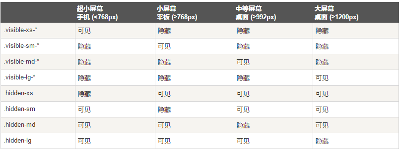
关于不同设备

以上就是Bootstarp中CSS的使用方法,希望大家会喜欢。
- Add class .form-control to all text elements ,

 The Future of Python and JavaScript: Trends and PredictionsApr 27, 2025 am 12:21 AM
The future trends of Python and JavaScript include: 1. Python will consolidate its position in the fields of scientific computing and AI, 2. JavaScript will promote the development of web technology, 3. Cross-platform development will become a hot topic, and 4. Performance optimization will be the focus. Both will continue to expand application scenarios in their respective fields and make more breakthroughs in performance.
 Python vs. JavaScript: Development Environments and ToolsApr 26, 2025 am 12:09 AM
Both Python and JavaScript's choices in development environments are important. 1) Python's development environment includes PyCharm, JupyterNotebook and Anaconda, which are suitable for data science and rapid prototyping. 2) The development environment of JavaScript includes Node.js, VSCode and Webpack, which are suitable for front-end and back-end development. Choosing the right tools according to project needs can improve development efficiency and project success rate.
 Is JavaScript Written in C? Examining the EvidenceApr 25, 2025 am 12:15 AM
Yes, the engine core of JavaScript is written in C. 1) The C language provides efficient performance and underlying control, which is suitable for the development of JavaScript engine. 2) Taking the V8 engine as an example, its core is written in C, combining the efficiency and object-oriented characteristics of C. 3) The working principle of the JavaScript engine includes parsing, compiling and execution, and the C language plays a key role in these processes.
 JavaScript's Role: Making the Web Interactive and DynamicApr 24, 2025 am 12:12 AM
JavaScript is at the heart of modern websites because it enhances the interactivity and dynamicity of web pages. 1) It allows to change content without refreshing the page, 2) manipulate web pages through DOMAPI, 3) support complex interactive effects such as animation and drag-and-drop, 4) optimize performance and best practices to improve user experience.
 C and JavaScript: The Connection ExplainedApr 23, 2025 am 12:07 AM
C and JavaScript achieve interoperability through WebAssembly. 1) C code is compiled into WebAssembly module and introduced into JavaScript environment to enhance computing power. 2) In game development, C handles physics engines and graphics rendering, and JavaScript is responsible for game logic and user interface.
 From Websites to Apps: The Diverse Applications of JavaScriptApr 22, 2025 am 12:02 AM
JavaScript is widely used in websites, mobile applications, desktop applications and server-side programming. 1) In website development, JavaScript operates DOM together with HTML and CSS to achieve dynamic effects and supports frameworks such as jQuery and React. 2) Through ReactNative and Ionic, JavaScript is used to develop cross-platform mobile applications. 3) The Electron framework enables JavaScript to build desktop applications. 4) Node.js allows JavaScript to run on the server side and supports high concurrent requests.
 Python vs. JavaScript: Use Cases and Applications ComparedApr 21, 2025 am 12:01 AM
Python is more suitable for data science and automation, while JavaScript is more suitable for front-end and full-stack development. 1. Python performs well in data science and machine learning, using libraries such as NumPy and Pandas for data processing and modeling. 2. Python is concise and efficient in automation and scripting. 3. JavaScript is indispensable in front-end development and is used to build dynamic web pages and single-page applications. 4. JavaScript plays a role in back-end development through Node.js and supports full-stack development.
 The Role of C/C in JavaScript Interpreters and CompilersApr 20, 2025 am 12:01 AM
C and C play a vital role in the JavaScript engine, mainly used to implement interpreters and JIT compilers. 1) C is used to parse JavaScript source code and generate an abstract syntax tree. 2) C is responsible for generating and executing bytecode. 3) C implements the JIT compiler, optimizes and compiles hot-spot code at runtime, and significantly improves the execution efficiency of JavaScript.


Hot AI Tools

Undresser.AI Undress
AI-powered app for creating realistic nude photos

AI Clothes Remover
Online AI tool for removing clothes from photos.

Undress AI Tool
Undress images for free

Clothoff.io
AI clothes remover

Video Face Swap
Swap faces in any video effortlessly with our completely free AI face swap tool!

Hot Article
Hot Tools

mPDF
mPDF is a PHP library that can generate PDF files from UTF-8 encoded HTML. The original author, Ian Back, wrote mPDF to output PDF files "on the fly" from his website and handle different languages. It is slower than original scripts like HTML2FPDF and produces larger files when using Unicode fonts, but supports CSS styles etc. and has a lot of enhancements. Supports almost all languages, including RTL (Arabic and Hebrew) and CJK (Chinese, Japanese and Korean). Supports nested block-level elements (such as P, DIV),

Dreamweaver CS6
Visual web development tools

VSCode Windows 64-bit Download
A free and powerful IDE editor launched by Microsoft

Atom editor mac version download
The most popular open source editor

Safe Exam Browser
Safe Exam Browser is a secure browser environment for taking online exams securely. This software turns any computer into a secure workstation. It controls access to any utility and prevents students from using unauthorized resources.

