
 Web Front-endJS Tutorialjs fully compatible with highlightable secondary buffer folding menu_navigation menu
The most commonly used layout in the backend or OA system is often a full-screen layout, usually a layout with three rows and two columns at the top, middle and bottom, with a header, footer, left menu and an ifame frame page on the right. Therefore, the foldable secondary menu is often used. This example is to implement such a more general fully compatible and highlightable secondary buffer folding menu.
Features:
Fully compatible, browser test: IE5.5, IE6, IE7, IE8, FF3.0, Google, Safari 4.0, Opera9.0.
Html structure is elegant and concise, without redundant tags, which is conducive to program loop output.
Style and structure are separated, and you can modify different styles in the style sheet.
The currently selected item is highlighted, and both the first-level menu and the second-level menu can be highlighted.
Collapse layers are gracefully buffered with animation.
Most suitable for backend and some OA system interfaces.
Disadvantages:
Does not support anti-refresh. This function should not be of much use in the background application system, so this function has not been added.
The buffering effect does not appear in IE6. For IE6, the effect will be weakened.
Let’s take a look at the screenshots of the effect first: 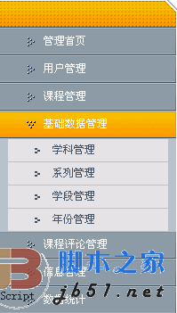
Let’s briefly talk about some simple ideas and problems encountered in making such a menu.
Generally, I create an effect. My production process is usually to first draw the content of the HTML structure layer, then write the style, and then add some icing on the cake effects, such as JS special effects and so on. I don’t know what process model the experts have.
Structural layer:
The idea of the structural layer is generally based on a perceptual understanding, usually there is a rendering, based on which the most concise HTML structure. As shown in the picture above, the first impression that comes into view is to use an unordered list of UL, but... this is a two-level nested list. This is the first issue we need to consider.
So the structure should look like this:
Yes when there is a secondary menu A nested UL structure, when there is no secondary menu, is as follows:
Of course, you can also use the dl-dt-dd ordered list method to create this nested structure, depending on your actual situation.
With the original structure layer, you need to add some necessary hooks for CSS and JS to control styles and effects. I have always opposed the method of adding a lot of class names, which will increase the page size. Volume, so the simplest approach is to apply one or two necessary class names to the parent container, and then use the child (group) selector to set various personalized settings in the style sheet. In the above structure, how many class names would you think of using to define all styles?
My approach is to use only three class names to control all style display. One is the top-level UL, defined as class="menu", the other is the container of the second-level menu, that is, the nested UL defines a class="level2", and finally the first-level menu item li defines a class="level1" , with these three hooks, you can manipulate the style of the entire structure.
Presentation layer:
The settings of the style sheet are very simple. The only thing to note is that in order to facilitate JS to control the display and hiding of the secondary menu and record the highlight status of the currently selected item, so I don't use the hover pseudo-class to realize the sliding in and out effect of the mouse, but use JS to simulate it. The key code to control the style with JS is as follows:
Level menu style
/*Level menu three-state style, for JS calling*/
.menu li.level1 a{display:block;line-height:31px;height:31px;padding-left:50px ; font-size:12px;color:#fff;background:url(../images/menubg.gif) no-repeat left top;}
.menu li.level1 a.hove{background-position:left - 31px;}
.menu li.level1 a.cur{background-position:left -62px;}
Secondary menu style
/*Second-level menu three-state style, for JS calling*/
.menu li.level1 a{display:block;line-height:31px;height:31px;padding-left:50px; font-size:12px;color:#fff;background:url(../images/menubg.gif) no-repeat left top;}
.menu li.level1 a.hove{background-position:left -31px ;}
.menu li.level1 a.cur{background-position:left -62px;}
Behavioral layer:
Because as mentioned earlier, we are in the style The table does not define the three-state effect of the menu, so we need to bind onmouseover, onmouseout and onclick events to each menu item to simulate this effect. In the structure layer, we did not define the ID of this total container, but only defined a class name, so we added an extended getElementsByClassName() method in JS (thanks to my friend Situ Zhengmei) to obtain this object based on the class name. Use loop closures to bind these three events.
I won’t explain the detailed code one by one. The comments in the Demo are very clear. Please download it to your local computer to browse.
If you have any questions, please post and discuss in this blog. I wish you a happy use!
Online demo addresshttp://demo.jb51.net/js/caidan_js/demo.html
Package download addresshttp://www.jb51.net/jiaoben/ 27308.html

 Replace String Characters in JavaScriptMar 11, 2025 am 12:07 AM
Detailed explanation of JavaScript string replacement method and FAQ This article will explore two ways to replace string characters in JavaScript: internal JavaScript code and internal HTML for web pages. Replace string inside JavaScript code The most direct way is to use the replace() method: str = str.replace("find","replace"); This method replaces only the first match. To replace all matches, use a regular expression and add the global flag g: str = str.replace(/fi
 Custom Google Search API Setup TutorialMar 04, 2025 am 01:06 AM
This tutorial shows you how to integrate a custom Google Search API into your blog or website, offering a more refined search experience than standard WordPress theme search functions. It's surprisingly easy! You'll be able to restrict searches to y
 8 Stunning jQuery Page Layout PluginsMar 06, 2025 am 12:48 AM
Leverage jQuery for Effortless Web Page Layouts: 8 Essential Plugins jQuery simplifies web page layout significantly. This article highlights eight powerful jQuery plugins that streamline the process, particularly useful for manual website creation
 Build Your Own AJAX Web ApplicationsMar 09, 2025 am 12:11 AM
So here you are, ready to learn all about this thing called AJAX. But, what exactly is it? The term AJAX refers to a loose grouping of technologies that are used to create dynamic, interactive web content. The term AJAX, originally coined by Jesse J
 What is 'this' in JavaScript?Mar 04, 2025 am 01:15 AM
Core points This in JavaScript usually refers to an object that "owns" the method, but it depends on how the function is called. When there is no current object, this refers to the global object. In a web browser, it is represented by window. When calling a function, this maintains the global object; but when calling an object constructor or any of its methods, this refers to an instance of the object. You can change the context of this using methods such as call(), apply(), and bind(). These methods call the function using the given this value and parameters. JavaScript is an excellent programming language. A few years ago, this sentence was
 Improve Your jQuery Knowledge with the Source ViewerMar 05, 2025 am 12:54 AM
jQuery is a great JavaScript framework. However, as with any library, sometimes it’s necessary to get under the hood to discover what’s going on. Perhaps it’s because you’re tracing a bug or are just curious about how jQuery achieves a particular UI
 10 Mobile Cheat Sheets for Mobile DevelopmentMar 05, 2025 am 12:43 AM
This post compiles helpful cheat sheets, reference guides, quick recipes, and code snippets for Android, Blackberry, and iPhone app development. No developer should be without them! Touch Gesture Reference Guide (PDF) A valuable resource for desig
 How do I create and publish my own JavaScript libraries?Mar 18, 2025 pm 03:12 PM
Article discusses creating, publishing, and maintaining JavaScript libraries, focusing on planning, development, testing, documentation, and promotion strategies.


Hot AI Tools

Undresser.AI Undress
AI-powered app for creating realistic nude photos

AI Clothes Remover
Online AI tool for removing clothes from photos.

Undress AI Tool
Undress images for free

Clothoff.io
AI clothes remover

AI Hentai Generator
Generate AI Hentai for free.

Hot Article
Hot Tools

Dreamweaver CS6
Visual web development tools

Dreamweaver Mac version
Visual web development tools

mPDF
mPDF is a PHP library that can generate PDF files from UTF-8 encoded HTML. The original author, Ian Back, wrote mPDF to output PDF files "on the fly" from his website and handle different languages. It is slower than original scripts like HTML2FPDF and produces larger files when using Unicode fonts, but supports CSS styles etc. and has a lot of enhancements. Supports almost all languages, including RTL (Arabic and Hebrew) and CJK (Chinese, Japanese and Korean). Supports nested block-level elements (such as P, DIV),

Notepad++7.3.1
Easy-to-use and free code editor

Zend Studio 13.0.1
Powerful PHP integrated development environment

