Bootstrap Modals are created using custom Jquery plugins. It can be used to create modal windows to enrich user experience, or to add practical functions to users. You can use Popovers and Tooltips in Modals.
1. What is a modal window?
This is the effect:
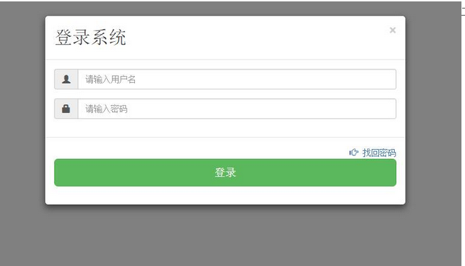
2. Composition
Header (including title and close button)
Middle (main content)
Bottom (mainly for placing operation buttons)
The corresponding layout in the html code is: use the div container element, use the modal, modal-dialog, and modal-cotent styles respectively, and use three header, body, and footer of the pop-up window in the modal-content. Style: modal-header, modal-body, modal-footer, as shown below:

3. Implementation code
<style>
.modal {//该样式是做背景容器的,100%充满全屏,还有当内容很多时,k可以在modal里进行滚动操作
position: fixed;//固定布局的
top: 0;
right: 0; //设置上下左右都为0,表示充满全屏
bottom: 0;
left: 0;
z-index: 1050;//提升z-index,防止其他元素溢出
display: none;//默认不显示
overflow: hidden;
-webkit-overflow-scrolling: touch;//支持移动设备上,触摸进行移动
outline: 0;//消除虚边框
}
.modal-dialog {
position: relative;//相对与Modal元素,进行相对定位
width: auto;//宽度自适应
margin: 10px;//外边距10像素
}
.modal-content {主要对弹窗进行边框,边距,背景色,阴影的处理
position: relative;//
background-color: #fff;
-webkit-background-clip: padding-box;//背景的裁剪区域设置从padding区域向外
background-clip: padding-box;
border: 1px solid #999;
border: 1px solid rgba(0, 0, 0, .2);//透明度设置
border-radius: 6px;
outline: 0;//取消轮廓显示
-webkit-box-shadow: 0 3px 9px rgba(0, 0, 0, .5);
box-shadow: 0 3px 9px rgba(0, 0, 0, .5);
}
.modal-header {//弹窗的头部设置
min-height: 16.42857143px;//最小高度设置
padding: 15px;
border-bottom: 1px solid #e5e5e5;//底部设细线,与modal-body区分
}
.modal-header .close {//关闭按钮
margin-top: -2px;
}
.modal-title {
margin: 0;
line-height: 1.42857143;//头部内部的标题样式
}
.modal-body {//中间内容区域
position: relative;
padding: 15px;
}
.modal-footer {//底部设置
padding: 15px;
text-align: right;//居右对齐,一般都是按钮
border-top: 1px solid #e5e5e5;
}
</style>
<body>
<!-- <button data-toggle="modal" data-target="#popucss" class="btn btn-success" >单击弹出模态窗口</button> --><!-- //触发元素(使用声明式语法)
//弹窗主要内容 --><!-- //下面写id的是js使用方法(使用声明式语法)
//弹窗主要内容 -->
<button id="dianji" class="btn btn-success">单击弹出模态窗口</button>
<!-- 弹窗主要内容 -->
<div class="modal" id="dianjiji"><!-- 第一部分 -->
<div class="modal-dialog"><!-- 第二部分 -->
<div class="modal-content"><!-- 第三部分,主要部分 -->
<div class="modal-header">
<button type="button" class="close" data-dismiss="modal">
<span aria-hidden="true">×</span> <span class="sr-only">Close</span>
</button>
<h2 id="登录系统">登录系统 </h2>
</div>
<div class="modal-body">
<p>弹窗里的具体内容,hhh ajbh </p>
</div>
<div class="modal-footer">
<button type="button"
id="login" class="btn btn-success ">登录</button>
<button type="button"
id="login" class="btn btn-success ">取消</button>
</div>
</div>
</div>
</div>
<script src="./bootstrap-3.3.5/dist/js/jquery.min.js"></script>
<script src="./bootstrap-3.3.5/dist/js/bootstrap.min.js"></script>
<script src="./bootstrap-3.3.5/dist/js/modal.js"></script>
<script>
$(function() {
$("#dianji").click(function() {
$("#dianjiji").modal("show");
});
})

Four. Usage in Js:
(1) Declarative syntax
data-toggle, data-target, set on the trigger element, the value of data-toggle must be modal, the value of dat-target is: css selector
(2) javascript usage:
1) Use attribute control: background Boolean value is true, then when the background (excluding the pop-up window itself) is clicked, the pop-up window will be closed, otherwise, vice versa.
keyboard 布尔值 值为true,则按esc时,关闭弹窗,否则反之。
$("#dianjiji").modal({
backdrop:true,
keyboard:false,
show:true;
})
2) Use parameter control: toggle $("#mymodal").modal("toggle"), when triggered, the status of the bounce window will be triggered,
Show $(“#mymodal”).modal(“show”), when triggered, displays the pop-up window
Hide $("#mymodal").modal("hide"), when triggered, close
3) Usage control:
Show.bs.modal 在show方法调用时立即触发
Shown.bs.modal 该事件在模态弹窗完全显示给用户之后,触发
Hide.bs.modal 在hide方法调用时,立即触发
Hiden.bs.modal 该事件在模态弹窗隐藏之后触发
使用方法
$(“#mymodal”).on(‘方法名',function(e){
//处理代码。。。
})
About the learning summary of Boostrap modal window, the editor will introduce it to you here. I hope it will be helpful to you!
 Replace String Characters in JavaScriptMar 11, 2025 am 12:07 AM
Detailed explanation of JavaScript string replacement method and FAQ This article will explore two ways to replace string characters in JavaScript: internal JavaScript code and internal HTML for web pages. Replace string inside JavaScript code The most direct way is to use the replace() method: str = str.replace("find","replace"); This method replaces only the first match. To replace all matches, use a regular expression and add the global flag g: str = str.replace(/fi
 How do I create and publish my own JavaScript libraries?Mar 18, 2025 pm 03:12 PM
Article discusses creating, publishing, and maintaining JavaScript libraries, focusing on planning, development, testing, documentation, and promotion strategies.
 How do I optimize JavaScript code for performance in the browser?Mar 18, 2025 pm 03:14 PM
The article discusses strategies for optimizing JavaScript performance in browsers, focusing on reducing execution time and minimizing impact on page load speed.
 How do I debug JavaScript code effectively using browser developer tools?Mar 18, 2025 pm 03:16 PM
The article discusses effective JavaScript debugging using browser developer tools, focusing on setting breakpoints, using the console, and analyzing performance.
 jQuery Matrix EffectsMar 10, 2025 am 12:52 AM
Bring matrix movie effects to your page! This is a cool jQuery plugin based on the famous movie "The Matrix". The plugin simulates the classic green character effects in the movie, and just select a picture and the plugin will convert it into a matrix-style picture filled with numeric characters. Come and try it, it's very interesting! How it works The plugin loads the image onto the canvas and reads the pixel and color values: data = ctx.getImageData(x, y, settings.grainSize, settings.grainSize).data The plugin cleverly reads the rectangular area of the picture and uses jQuery to calculate the average color of each area. Then, use
 How to Build a Simple jQuery SliderMar 11, 2025 am 12:19 AM
This article will guide you to create a simple picture carousel using the jQuery library. We will use the bxSlider library, which is built on jQuery and provides many configuration options to set up the carousel. Nowadays, picture carousel has become a must-have feature on the website - one picture is better than a thousand words! After deciding to use the picture carousel, the next question is how to create it. First, you need to collect high-quality, high-resolution pictures. Next, you need to create a picture carousel using HTML and some JavaScript code. There are many libraries on the web that can help you create carousels in different ways. We will use the open source bxSlider library. The bxSlider library supports responsive design, so the carousel built with this library can be adapted to any
 Enhancing Structural Markup with JavaScriptMar 10, 2025 am 12:18 AM
Key Points Enhanced structured tagging with JavaScript can significantly improve the accessibility and maintainability of web page content while reducing file size. JavaScript can be effectively used to dynamically add functionality to HTML elements, such as using the cite attribute to automatically insert reference links into block references. Integrating JavaScript with structured tags allows you to create dynamic user interfaces, such as tab panels that do not require page refresh. It is crucial to ensure that JavaScript enhancements do not hinder the basic functionality of web pages; even if JavaScript is disabled, the page should remain functional. Advanced JavaScript technology can be used (
 How to Upload and Download CSV Files With AngularMar 10, 2025 am 01:01 AM
Data sets are extremely essential in building API models and various business processes. This is why importing and exporting CSV is an often-needed functionality.In this tutorial, you will learn how to download and import a CSV file within an Angular


Hot AI Tools

Undresser.AI Undress
AI-powered app for creating realistic nude photos

AI Clothes Remover
Online AI tool for removing clothes from photos.

Undress AI Tool
Undress images for free

Clothoff.io
AI clothes remover

AI Hentai Generator
Generate AI Hentai for free.

Hot Article

Hot Tools

SublimeText3 Chinese version
Chinese version, very easy to use

DVWA
Damn Vulnerable Web App (DVWA) is a PHP/MySQL web application that is very vulnerable. Its main goals are to be an aid for security professionals to test their skills and tools in a legal environment, to help web developers better understand the process of securing web applications, and to help teachers/students teach/learn in a classroom environment Web application security. The goal of DVWA is to practice some of the most common web vulnerabilities through a simple and straightforward interface, with varying degrees of difficulty. Please note that this software

VSCode Windows 64-bit Download
A free and powerful IDE editor launched by Microsoft

SublimeText3 English version
Recommended: Win version, supports code prompts!

SAP NetWeaver Server Adapter for Eclipse
Integrate Eclipse with SAP NetWeaver application server.


