


So how is this achieved? This article will quote Wutu Bang’s follow-screen scrolling code to explain this effect in detail.
1. Original code
The following is Wutu Bang’s screen scrolling code. Its scope is the sidebars on both sides of Wutu Bang’s web page, and the hidden bar on the right after double-clicking the screen. .
var $catalogueOffsetTop = $('aside#catalogue').offset().top;
var $archiveOffestTop = $('aside#archive').offset().top;
var $archiveOffestLeft = $('aside#archive').offset().left;
$(window).bind('scroll resize',function(){
// #right-area的跟随屏幕滚动效果
if($('#right-area').height() $('#right-area').stop(true,true).animate({'top': $(document).scrollTop() 'px'},800);
}else if($('#right-area').height() > $(window).height() && $('#right-area').height() // 这段范围内是最关键的,允许滑动
if(($(document).scrollTop() $(window).height()) $('#right-area').stop(true,true).css('top','0');
}else if(($(document).scrollTop() $(window).height()) $right_top = $(document).scrollTop() $(window).height() - $('#right-area').height();
$('#right-area').stop(true,true).animate({'top': $right_top 'px'},800);
}else{
$right_top = $(document).height() - $('#right-area').height();
$('#right-area').stop(true,true).css({'top': $right_top 'px'});
//alert($(document).scrollTop() $(window).height() - $(document).height());
}
}else if($('#right-area').height() >= $(document).height()){
$('#right-area').height($(document).height()).stop(true,true).css({'overflow':'hidden','overflow-y':'scroll'});
}
if($(document).scrollLeft() == 0){ // 只有在屏幕处于左侧的时候才进行下面的跟随滚动,同时需要注意下面的if($(window).width() > 1024),是为了防止在小屏幕下还发生这种变化
// aside#catalogue的上下滑动
if($('aside#catalogue').outerHeight() if($(document).scrollTop() $('aside#catalogue').css({'position':'static','top':$catalogueOffsetTop});
if($(window).width() > 1024)$('#main').css({'padding-left':'0'});
}else{
$('aside#catalogue').css({'position':'fixed','top':'0'});
if($(window).width() > 1024)$('#main').css({'padding-left':$('aside#catalogue').outerWidth() 5 'px'});
}
}else if($('aside#catalogue').height() >= $(window).height() && $('aside#catalogue').outerHeight() if(($(document).scrollTop() $(window).height()) $('aside#catalogue').css({'position':'static','top':$catalogueOffsetTop});
if($(window).width() > 1024)$('#main').css({'padding-left':'0'});
}else if(($(document).scrollTop() $(window).height()) $catalogue_top = $(window).height() - $('aside#catalogue').outerHeight() - 20;
$('aside#catalogue').css({'position':'fixed','top': $catalogue_top 'px'});
if($(window).width() > 1024)$('#main').css({'padding-left':$('aside#catalogue').outerWidth() 5 'px'});
}else{
$catalogue_top = $(window).height() - $('aside#catalogue').outerHeight() - 20 - ($(document).height() - $('footer').offset().top);
$('aside#catalogue').css({'position':'fixed','top':$catalogue_top 'px'});
if($(window).width() > 1024)$('#main').css({'padding-left':$('aside#catalogue').outerWidth() 5 'px'});
}
}
// aside#archive的上下滑动
if($('aside#archive').outerHeight() if($(document).scrollTop() $('aside#archive').css({'position':'static','top':$archiveOffestTop,'left':$archiveOffestLeft 'px'});
}else{
$('aside#archive').css({'position':'fixed','top':'0','left':$archiveOffestLeft 'px'});
}
}else if($('aside#archive').height() >= $(window).height() && $('aside#archive').outerHeight() if(($(document).scrollTop() $(window).height()) $('aside#archive').css({'position':'static','top':$archiveOffestTop,'left':$archiveOffestLeft 'px'});
}else if(($(document).scrollTop() $(window).height()) $catalogue_top = $(window).height() - $('aside#archive').outerHeight();
$('aside#archive').css({'position':'fixed','top': $catalogue_top 'px','left':$archiveOffestLeft 'px'});
}else{
$catalogue_top = $(window).height() - $('aside#archive').outerHeight() - ($(document).height() - $('footer').offset().top);
$('aside#archive').css({'position':'fixed','top':$catalogue_top 'px','left':$archiveOffestLeft 'px'});
}
}
}else{ // 如果屏幕不处于左侧,就让这两个跟随归位
$('aside#catalogue').css({'position':'static','top':$catalogueOffsetTop});
$('#main').css({'padding-left':'0'});
$('aside#archive').css({'position':'static','top':$archiveOffestTop,'left':$archiveOffestLeft 'px'});
}
}).scroll().resize();
There are a lot of related codes on the Internet, there are even 7 lines of code to solve this problem, and there are even universal plug-ins to achieve this Effect. However, they are all too general. Different websites have different particularities, and more considerations need to be made in some details.
2. Choose how to follow the screen scrolling
There are three options:
1. Use position:absolute; and then dynamically assign the top value;
2. Use position:fixed; and then dynamically assign the top value;
3. Dynamically assign padding-top or margin-top;
The first two use postion elements Arrange the position of the element. Like float, position drags the element out of the normal text flow. The padding or margin method is achieved by controlling the margin of the element. Which one is better?
Using position:absolute; will cause jitter when scrolling (not in Firefox). When using padding-top, elements with backgrounds will look ugly and jitter will occur. Using position:fixed is not supported. IE6, I have not tried using margin-top, it should cause jitter. This code selects position:fixed, which is the only solution that does not cause jitter, but this effect will not occur under IE6.
3. Situations to consider
The reason why Wutu Gang wants to explain the code of this site is because there is no detailed analysis of the code on the Internet, and many issues are not considered arrive.
1. Compare the height of the element to be followed with the height of the screen
All the codes on the Internet consider the situation that the height of the area is less than the height of the window, so the code is very simple. When the area height is equal to and greater than the window height, we have new considerations.
2. If the height of the area exceeds the window, when will it start to follow the scrolling?
It depends on what we want to show the user, if it is an advertisement, if it is a paragraph of text, if it is a list. My design is that when the screen scrolls down, but all the elements to be displayed have not been fully displayed, no effect will be performed. When the screen scrolls to the bottom critical point of the element, the effect is triggered. When scrolling down again, the element's The bottom edge is aligned with the bottom edge of the screen, so that the lower part of the element is always rendered within the screen. Of course, your design will naturally differ for different web pages. You may also design it so that there is no effect when scrolling down. When you scroll to an ad, the ad will be aligned with the top of the screen and scroll.
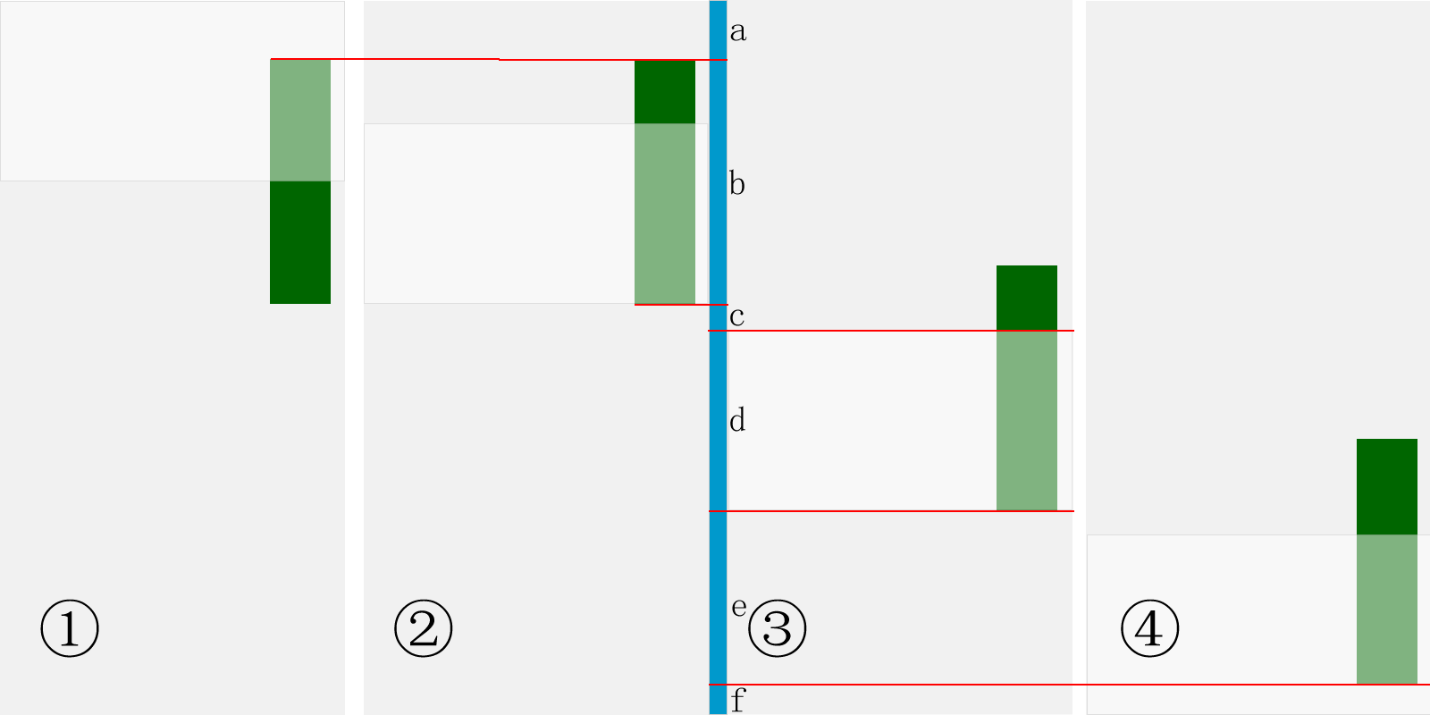
Figure 1 Follow the screen scrolling logic design
Let’s take a look at this design idea from Figure 1. The green part in the picture is the area to be scrolled, the gray part is the entire web page, and the light gray part is the screen (the area that can be seen). We simulate downward scrolling by moving the light gray screen downwards. Stage ① is the initial stage. At this time, the web page operates as it was initially without any action. At stage ②, the screen scrolls down to a critical point, that is, it follows the lowest end of the scrolling area. Stage ③ is after scrolling past the critical point, the element begins to scroll with the screen. We can see that the bottom of the element is aligned with the bottom of the screen, and the top of the element is no longer visible. In the fourth stage, the screen scrolls to the bottom. It can be imagined that there is some copyright information at the bottom of the web page. The elements cannot follow the scroll to the bottom to cover this information, so the red line will no longer follow the scroll.
This is a schematic diagram of the screen scrolling down. When the screen scrolls up, this is the reverse of this sequence. But there is another consideration. When the screen is scrolling up, it achieves an effect similar to the initial state when scrolling down. That is, the critical point is the top of the green area in ④ at this time. When scrolling up, the top of the screen is aligned with the top of the element. Due to technical difficulties, Wutu Gang did not achieve this effect.
3. Calculation of numbers and quantities
When scrolling, we must grasp which quantities change and which do not change. Find changes in the changes and find changes in the changes. In short, you must keep your mind clear and understand how to calculate various height relationships.
In Figure 1, I used a blue vertical line to assist in height calculation, used a red line to indicate the position of the screen and elements, and divided the blue vertical line into a, b, c, d, Six paragraphs e and f. So what are the changing quantitative relationships between them? (We define the elements in the green area as #myDiv, and the bottom including the copyright information as #footer)
a b c d e f=$(document).height();//Document height, fixed value
a= $('#myDiv').offset().top;//The initial value from the top of #myDiv to the top of the document, with scrolling, $('#myDiv').offset(). top will change
b=$('#myDiv').height();//The height of the element, fixed value
a b c=$(window).scrollTop()=$ (docment).scrollTop();//The position of the scroll bar, that is, the distance from the top of the document to the top of the current screen, is constantly changing
d=$(window).height();//Height of the screen , fixed value
f=$('#footer').height();//Height of #footer, fixed value
a b c d e=$('#footer').offset( ).top=$(document).height()-$('#footer').height();//The distance from the top of #footer to the top of the document, fixed value, but it should be noted that $('#footer ').offset().top $('#footer').height() is not necessarily equal to $(document).height(). You have to check whether there is no blank space under #footer.
During the entire change process, the only changed values are $(window).scrollTop()=$(docment).scrollTop() and $('#myDiv').offset().top , so we need to grasp the quantitative relationship between addition and subtraction between these values, and make logical judgments and assignments.
4. When is the value obtained?
You can see that I obtained it before the scroll event.
var $catalogueOffsetTop = $('aside#catalogue').offset().top;
var $archiveOffestTop = $('aside #archive').offset().top;
var $archiveOffestLeft = $('aside#archive').offset().left;
It is because they occur in the scroll event will change over time, so it must be stored in a variable in advance.
4. Special considerations for special situations
Before writing so much code, I once thought about writing a code that can be used universally. However, things are not that simple. In Utu Gang, the three areas to be rolled all have special characteristics, so their event logic must be carefully considered and carefully assigned.
1. Whether the elements are free and arbitrary
Because the area that appears when Wu Tu Bang double-clicks the screen and slides to the right is free, and there is no blocking information at the top and bottom, so our processing is more convenient. , there is no need to obtain the initial value of the top distance and consider leaving a space when scrolling to the bottom. But you still have to consider point 2 below, the comparison of screen and element height.
As for the scrolling of the sidebar, we have to consider that there is still a distance from the top of the sidebar to the top of the document, and there is also copyright information at the bottom. The rolled position must be accurately calculated based on the value obtained above, and then combined with the value obtained in css.
2. Determine the relationship between the height of the element and the height of the screen
When the height of the element is small, our processing is relatively simple. We only need to align the top of the element with the top of the screen, and above Combining the first point, a different situation will also arise: if there is still some distance between the top of the element and the top of the document, we cannot start to align it with the top of the screen as soon as the screen scrolls, but must scroll to the critical point of its top. time to start.
When the height of the element is greater than the height of the screen, we need to make a more complex judgment, and the first point is to judge when to start following the scroll: only when the bottom of the screen is aligned with the bottom of the element, The element starts scrolling with the screen.
But there is another situation, that is, the height of the element exceeds the height we want. We can use overflow to process the element. At this time, we compare the height of the element with some fixed values in the page. handle this aspect. Wutu Bang handles overflow by comparing the relationship between the height and the bottom of the right element:
......
}else if($('#right-area').height() >= ($('footer').offset().top $('footer').height())){
$('#right-area').height($('footer').offset().top $('footer').height() ).stop(true,true).css({'overflow':'hidden','overflow-y':'scroll'});
}
3. Within your own web page Changes in special circumstances
Wutubang has a series of problems because it can still scroll left and right. When position:fixed, the distance between elements in the left and right directions does not have a fixed value, so when scrolling left or right, the elements will Cover the scrolled screen, so I judged $(document).scrollLeft() and performed some processing.
In addition, Wutu Bang is also an adaptive web design website, which displays different effects on screens of different widths. The characteristic of js is that it still works when the screen changes. Therefore, I also added Determination of screen width.
Summary
Regarding the issue of following the scrolling of the screen, the original idea is very simple, that is, dynamically changing the position or distance through the three solutions listed in this article. However, it is necessary to grasp the specific details. Well, you must have a grasp of each value in dynamic changes. At the same time, combined with your own web page, you have a good design and plan for the dynamic effects under different situations, which is also a key link to achieve scrolling with the screen.

 Python vs. JavaScript: Community, Libraries, and ResourcesApr 15, 2025 am 12:16 AM
Python and JavaScript have their own advantages and disadvantages in terms of community, libraries and resources. 1) The Python community is friendly and suitable for beginners, but the front-end development resources are not as rich as JavaScript. 2) Python is powerful in data science and machine learning libraries, while JavaScript is better in front-end development libraries and frameworks. 3) Both have rich learning resources, but Python is suitable for starting with official documents, while JavaScript is better with MDNWebDocs. The choice should be based on project needs and personal interests.
 From C/C to JavaScript: How It All WorksApr 14, 2025 am 12:05 AM
The shift from C/C to JavaScript requires adapting to dynamic typing, garbage collection and asynchronous programming. 1) C/C is a statically typed language that requires manual memory management, while JavaScript is dynamically typed and garbage collection is automatically processed. 2) C/C needs to be compiled into machine code, while JavaScript is an interpreted language. 3) JavaScript introduces concepts such as closures, prototype chains and Promise, which enhances flexibility and asynchronous programming capabilities.
 JavaScript Engines: Comparing ImplementationsApr 13, 2025 am 12:05 AM
Different JavaScript engines have different effects when parsing and executing JavaScript code, because the implementation principles and optimization strategies of each engine differ. 1. Lexical analysis: convert source code into lexical unit. 2. Grammar analysis: Generate an abstract syntax tree. 3. Optimization and compilation: Generate machine code through the JIT compiler. 4. Execute: Run the machine code. V8 engine optimizes through instant compilation and hidden class, SpiderMonkey uses a type inference system, resulting in different performance performance on the same code.
 Beyond the Browser: JavaScript in the Real WorldApr 12, 2025 am 12:06 AM
JavaScript's applications in the real world include server-side programming, mobile application development and Internet of Things control: 1. Server-side programming is realized through Node.js, suitable for high concurrent request processing. 2. Mobile application development is carried out through ReactNative and supports cross-platform deployment. 3. Used for IoT device control through Johnny-Five library, suitable for hardware interaction.
 Building a Multi-Tenant SaaS Application with Next.js (Backend Integration)Apr 11, 2025 am 08:23 AM
I built a functional multi-tenant SaaS application (an EdTech app) with your everyday tech tool and you can do the same. First, what’s a multi-tenant SaaS application? Multi-tenant SaaS applications let you serve multiple customers from a sing
 How to Build a Multi-Tenant SaaS Application with Next.js (Frontend Integration)Apr 11, 2025 am 08:22 AM
This article demonstrates frontend integration with a backend secured by Permit, building a functional EdTech SaaS application using Next.js. The frontend fetches user permissions to control UI visibility and ensures API requests adhere to role-base
 JavaScript: Exploring the Versatility of a Web LanguageApr 11, 2025 am 12:01 AM
JavaScript is the core language of modern web development and is widely used for its diversity and flexibility. 1) Front-end development: build dynamic web pages and single-page applications through DOM operations and modern frameworks (such as React, Vue.js, Angular). 2) Server-side development: Node.js uses a non-blocking I/O model to handle high concurrency and real-time applications. 3) Mobile and desktop application development: cross-platform development is realized through ReactNative and Electron to improve development efficiency.
 The Evolution of JavaScript: Current Trends and Future ProspectsApr 10, 2025 am 09:33 AM
The latest trends in JavaScript include the rise of TypeScript, the popularity of modern frameworks and libraries, and the application of WebAssembly. Future prospects cover more powerful type systems, the development of server-side JavaScript, the expansion of artificial intelligence and machine learning, and the potential of IoT and edge computing.


Hot AI Tools

Undresser.AI Undress
AI-powered app for creating realistic nude photos

AI Clothes Remover
Online AI tool for removing clothes from photos.

Undress AI Tool
Undress images for free

Clothoff.io
AI clothes remover

AI Hentai Generator
Generate AI Hentai for free.

Hot Article
Hot Tools

SublimeText3 Linux new version
SublimeText3 Linux latest version

SAP NetWeaver Server Adapter for Eclipse
Integrate Eclipse with SAP NetWeaver application server.

VSCode Windows 64-bit Download
A free and powerful IDE editor launched by Microsoft

Dreamweaver Mac version
Visual web development tools

Atom editor mac version download
The most popular open source editor

