
Home >Backend Development >Python Tutorial >Introducing Python's Matplotlib Library
Introducing Python's Matplotlib Library

- Joseph Gordon-LevittOriginal
- 2025-02-27 09:26:10430browse
Producing publication-ready graphs is crucial for researchers. While various tools exist, achieving visually appealing results can be challenging. This tutorial demonstrates how Python's matplotlib library simplifies this process, generating high-quality figures with minimal code.
As the matplotlib website states: "matplotlib is a Python 2D plotting library producing publication-quality figures in various formats across platforms." It's versatile, usable in scripts, shells, web applications, and various GUI toolkits.
This guide covers matplotlib installation and basic plotting examples. For deeper Python data handling skills, consider exploring relevant online courses (links omitted for brevity).
Installing matplotlib
Installation is straightforward. Using pip (other methods exist, see the matplotlib installation page for details):
<code class="language-bash">curl -O https://bootstrap.pypa.io/get-pip.py
python get-pip.py
pip install matplotlib</code>
Basic Plotting Examples
We'll use matplotlib.pyplot, offering a MATLAB-like interface.
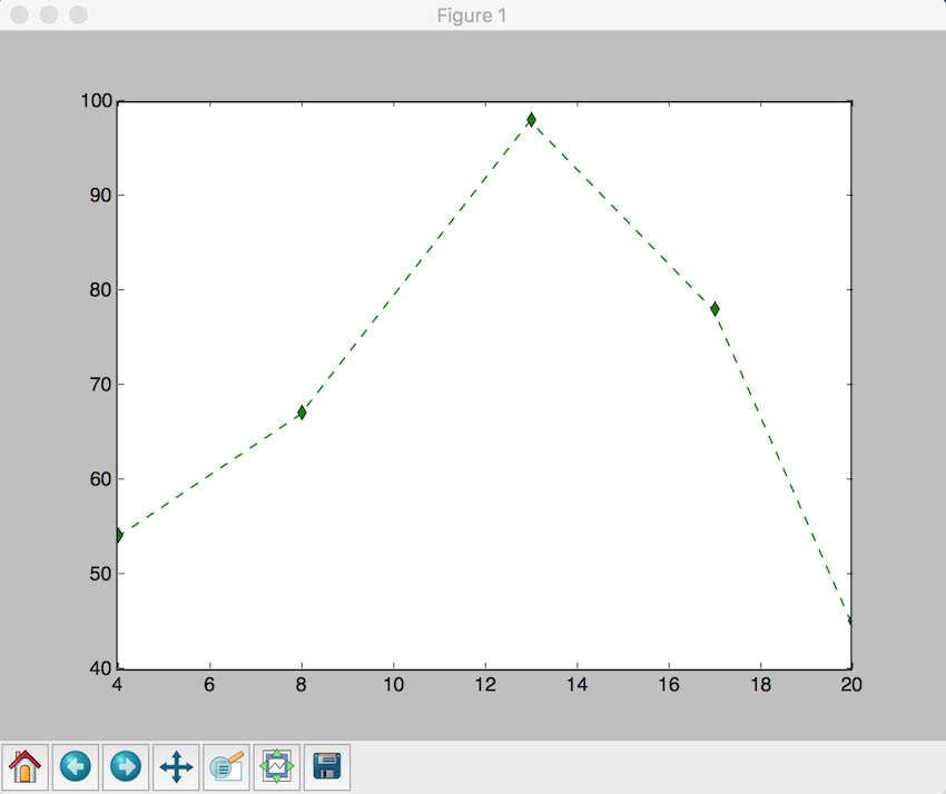
1. Line Plot
Consider plotting the points: x = (4, 8, 13, 17, 20), y = (54, 67, 98, 78, 45).
<code class="language-python">import matplotlib.pyplot as plt
plt.plot([4, 8, 13, 17, 20], [54, 67, 98, 78, 45], 'g--d') # Green dashed line with diamond markers
plt.show()</code>
Let's visualize New York City's average rainfall:
<code class="language-python">month = ["Jan", "Feb", "Mar", "Apr", "May", "Jun", "Jul", "Aug", "Sep", "Oct", "Nov", "Dec"]
rainfall = [83, 81, 97, 104, 107, 91, 102, 102, 102, 79, 102, 91]
plt.plot(month, rainfall)
plt.xlabel("Month")
plt.ylabel("Rainfall (mm)")
plt.title("Average Rainfall in New York City")
plt.show()</code>

2. Scatter Plot
To illustrate the relationship between two datasets:
<code class="language-python">x = [2, 4, 6, 7, 9, 13, 19, 26, 29, 31, 36, 40, 48, 51, 57, 67, 69, 71, 78, 88]
y = [54, 72, 43, 2, 8, 98, 109, 5, 35, 28, 48, 83, 94, 84, 73, 11, 464, 75, 200, 54]
plt.xlabel('x-axis')
plt.ylabel('y-axis')
plt.title('Scatter Plot')
plt.grid(True)
plt.scatter(x, y, c='green')
plt.show()</code>

3. Histogram
Histograms visualize data frequency distribution:
<code class="language-python">x = [2, 4, 6, 5, 42, 543, 5, 3, 73, 64, 42, 97, 63, 76, 63, 8, 73, 97, 23, 45, 56, 89, 45, 3, 23, 2, 5, 78, 23, 56, 67, 78, 8, 3, 78, 34, 67, 23, 324, 234, 43, 544, 54, 33, 223, 443, 444, 234, 76, 432, 233, 23, 232, 243, 222, 221, 254, 222, 276, 300, 353, 354, 387, 364, 309]
num_bins = 6
n, bins, patches = plt.hist(x, num_bins, facecolor='green')
plt.xlabel('X-Axis')
plt.ylabel('Y-Axis')
plt.title('Histogram')
plt.show()</code>

Conclusion
matplotlib empowers researchers to create visually appealing and publication-ready graphs efficiently. Its ease of use and extensive customization options make it a valuable tool for data visualization. Explore the matplotlib documentation and examples for further capabilities.
The above is the detailed content of Introducing Python's Matplotlib Library. For more information, please follow other related articles on the PHP Chinese website!