


Some months ago, I wrote an article about MixItUp, a popular jQuery plugin for filtering and sorting. In today’s article, I’ll show you how to build your own simple filterable component with jQuery and CSS animations.
Without further ado, let’s get started!
Key Takeaways
- The tutorial demonstrates how to create a filterable component using jQuery and CSS animations, starting with setting up the HTML structure with filter buttons and elements to be filtered, grouped into categories.
- The CSS setup involves assigning the ‘active’ class to the filter button corresponding with the active filter category, using flexbox to create the layout for the target elements, and defining two different CSS keyframe animations to reveal the elements.
- The jQuery setup involves writing code to handle click events on filter buttons, removing the ‘active’ class from all buttons and assigning it only to the selected one, retrieving and evaluating the value of the button’s data-filter attribute, and using CSS animations to show or hide elements based on the selected filter.
- The tutorial also shows how to modify the code to animate the elements sequentially, using the each() method to iterate through the target elements and the delay method to set the amount of milliseconds each element should wait before fading in.
Setting Up the HTML
As a first step, I’ll show you the HTML structure of the component. Consider the following markup:
<span><span><span><div> class<span>="cta filter"</span>>
  <span><span><span><a> class<span>="all active"</span> data-filter<span>="all"</span> href<span>="#"</span> role<span>="button"</span>></a></span>Show All<span><span></span>></span>
</span>  <span><span><span><a> class<span>="green"</span> data-filter<span>="green"</span> href<span>="#"</span> role<span>="button"</span>></a></span>Show Green Boxes<span><span></span>></span>
</span>  <span><span><span><a> class<span>="blue"</span> data-filter<span>="blue"</span> href<span>="#"</span> role<span>="button"</span>></a></span>Show Blue Boxes<span><span></span>></span>
</span>  <span><span><span><a> class<span>="red"</span> data-filter<span>="red"</span> href<span>="#"</span> role<span>="button"</span>></a></span>Show Red Boxes<span><span></span>></span>
</span><span><span><span></span></span></span></span></span></span></span>
</div></span>></span>
</span>
<span><span><span><div> class<span>="boxes"</span>>
  <span><span><span><a> class<span>="red"</span> data-category<span>="red"</span> href<span>="#"</span>></a></span>Box1<span><span></span>></span>
</span>  <span><span><span><a> class<span>="green"</span> data-category<span>="green"</span> href<span>="#"</span>></a></span>Box2<span><span></span>></span>
</span>  <span><span><span><a> class<span>="blue"</span> data-category<span>="blue"</span> href<span>="#"</span>></a></span>Box3<span><span></span>></span>
</span>
 <span><!-- other anchor/boxes here ... -->
</span>
<span><span><span></span></span></span></span></span></span>
</div></span>></span></span>
Notice that I’ve set up some pretty basic markup. Here’s an explanation of it:
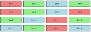
- First, I’ve defined the filter buttons and the elements that I want to filter (we’ll call them target elements).
- Next, I’ve grouped the target elements into three categories (blue, green, and red) and I gave them the data-category attribute. The value of this attribute determines the category that each element belongs to.
- I’ve also assigned the data-filter attribute to the filter buttons. The value of this attribute specifies the desired filter category. For instance, the button with the data-filter="red" attribute/value will only show the elements that belong to the red category. On the other hand, the button with data-filter="all" will show all the elements.
Now that you’ve had an overview of the required HTML, we can move on to explore the CSS.
Setting Up the CSS
Each time a filter category is active, its corresponding filter button receives the active class. By default, the button with the data-filter="all" attribute gets this class.
Here are the associated styles:
<span><span>.filter a</span> {
</span>  <span>position: relative;
</span><span>}
</span>
<span><span>.filter a.active:before</span> {
</span>  <span>content: '';
</span>  <span>position: absolute;
</span>  <span>left: 0;
</span>  <span>top: 0;
</span>  <span>display: inline-block;
</span>  <span>width: 0;
</span>  <span>height: 0;
</span>  <span>border-style: solid;
</span>  <span>border-width: 15px 15px 0 0;
</span>  <span>border-color: #333 transparent transparent transparent;
</span><span>}</span>
In addition, I’m going to use flexbox to create the layout for the target elements.
See the related styles below:
<span><span><span><div> class<span>="cta filter"</span>>
  <span><span><span><a> class<span>="all active"</span> data-filter<span>="all"</span> href<span>="#"</span> role<span>="button"</span>></a></span>Show All<span><span></span>></span>
</span>  <span><span><span><a> class<span>="green"</span> data-filter<span>="green"</span> href<span>="#"</span> role<span>="button"</span>></a></span>Show Green Boxes<span><span></span>></span>
</span>  <span><span><span><a> class<span>="blue"</span> data-filter<span>="blue"</span> href<span>="#"</span> role<span>="button"</span>></a></span>Show Blue Boxes<span><span></span>></span>
</span>  <span><span><span><a> class<span>="red"</span> data-filter<span>="red"</span> href<span>="#"</span> role<span>="button"</span>></a></span>Show Red Boxes<span><span></span>></span>
</span><span><span><span></span></span></span></span></span></span></span>
</div></span>></span>
</span>
<span><span><span><div> class<span>="boxes"</span>>
  <span><span><span><a> class<span>="red"</span> data-category<span>="red"</span> href<span>="#"</span>></a></span>Box1<span><span></span>></span>
</span>  <span><span><span><a> class<span>="green"</span> data-category<span>="green"</span> href<span>="#"</span>></a></span>Box2<span><span></span>></span>
</span>  <span><span><span><a> class<span>="blue"</span> data-category<span>="blue"</span> href<span>="#"</span>></a></span>Box3<span><span></span>></span>
</span>
 <span><!-- other anchor/boxes here ... -->
</span>
<span><span><span></span></span></span></span></span></span>
</div></span>></span></span>
Lastly, I’m defining two different CSS keyframe animations that I’ll use later on to reveal the elements:
<span><span>.filter a</span> {
</span>  <span>position: relative;
</span><span>}
</span>
<span><span>.filter a.active:before</span> {
</span>  <span>content: '';
</span>  <span>position: absolute;
</span>  <span>left: 0;
</span>  <span>top: 0;
</span>  <span>display: inline-block;
</span>  <span>width: 0;
</span>  <span>height: 0;
</span>  <span>border-style: solid;
</span>  <span>border-width: 15px 15px 0 0;
</span>  <span>border-color: #333 transparent transparent transparent;
</span><span>}</span>
With the markup and CSS in place, we can start building the JavaScript/jQuery.
Setting Up the jQuery
Have a look at the code below, after which I’ll explain what’s happening:
<span><span>.boxes</span> {
</span>  <span>display: flex;
</span>  <span>flex-wrap: wrap;
</span><span>}
</span>
<span><span>.boxes a</span> {
</span>  <span>width: 23%;
</span>  <span>border: 2px solid #333;
</span>  <span>margin: 0 1% 20px 1%;
</span>  <span>line-height: 60px;
</span><span>}</span>
Each time a filter button is clicked, the following happens:
- The active class is removed from all buttons and assigned only to the selected button.
- The value of the button’s data-filter attribute is retrieved and evaluated.
- If the value of data-filter is all, all elements should appear. To do so, I first hide them and then, when all elements become hidden, I show them using the rotate-right or zoom-in CSS animations.
- If the value is not all, the target elements of the corresponding category should appear. To do so, I first hide all elements and then, when all of them become hidden, I show only the elements of the associated category using the rotate-right or zoom-in CSS animations.
At this point, it’s important to clarify one thing. Notice the syntax for the fadeOut() method in the above code. It looks as follows:
<span><span>@keyframes zoom-in</span> {
</span>  <span>0% {
</span>   <span>transform: scale(.1);
</span>  <span>}
</span>  <span>100% {
</span>    <span>transform: none;
</span>  <span>}
</span><span>}
</span>
<span><span>@keyframes rotate-right</span> {
</span>  <span>0% {
</span>    <span>transform: translate(-100%) rotate(-100deg);
</span>  <span>}
</span>  <span>100% {
</span>    <span>transform: none;
</span>  <span>}
</span><span>}
</span>
<span><span>.is-animated</span> {
</span>  <span>animation: .6s zoom-in;
</span>  // <span>animation: .6s rotate-right;
</span><span>}</span>
You’re probably more familiar with this syntax though:
<span>var $filters = $('.filter [data-filter]'),
</span>    $boxes <span>= $('.boxes [data-category]');
</span>
$filters<span>.on('click', function(e) {
</span>  e<span>.preventDefault();
</span>  <span>var $this = $(this);
</span>  $filters<span>.removeClass('active');
</span>  $<span>this.addClass('active');
</span>
  <span>var $filterColor = $this.attr('data-filter');
</span>
  <span>if ($filterColor == 'all') {
</span>    $boxes<span>.removeClass('is-animated')
</span>      <span>.fadeOut().promise().done(function() {
</span>        $boxes<span>.addClass('is-animated').fadeIn();
</span>      <span>});
</span>  <span>} else {
</span>    $boxes<span>.removeClass('is-animated')
</span>      <span>.fadeOut().promise().done(function() {
</span>        $boxes<span>.filter('[data-category = "' + $filterColor + '"]')
</span>          <span>.addClass('is-animated').fadeIn();
</span>      <span>});
</span>  <span>}
</span><span>});</span>
These declarations have different meanings:
- In the first case, the callback is executed only after all target elements become hidden. You can learn more info about this approach by visiting the promise() section of jQuery’s docs.
- In the second case, the callback is fired multiple times. Specifically, it’s executed each time an element becomes hidden.
The demo below uses the zoom-in animation:
See the Pen A sorting/filtering component with CSS and jQuery (with zoom animation) by SitePoint (@SitePoint) on CodePen.
And this demo uses the rotate-right animation:
See the Pen A sorting/filtering component with CSS and jQuery (with rotate animation) by SitePoint (@SitePoint) on CodePen.
Of course, the aforementioned CSS animations are optional. If you don’t like these specific animations, feel free to remove them and reveal the elements using only jQuery’s fadeIn() method.
Now that you understand how the component works, I’ll show you how to create a different variation of it.
Animating Elements Sequentially
Until now, you may have noticed that all elements appear at the same time. I’ll now modify the code to show them sequentially:
<span><span><span><div> class<span>="cta filter"</span>>
  <span><span><span><a> class<span>="all active"</span> data-filter<span>="all"</span> href<span>="#"</span> role<span>="button"</span>></a></span>Show All<span><span></span>></span>
</span>  <span><span><span><a> class<span>="green"</span> data-filter<span>="green"</span> href<span>="#"</span> role<span>="button"</span>></a></span>Show Green Boxes<span><span></span>></span>
</span>  <span><span><span><a> class<span>="blue"</span> data-filter<span>="blue"</span> href<span>="#"</span> role<span>="button"</span>></a></span>Show Blue Boxes<span><span></span>></span>
</span>  <span><span><span><a> class<span>="red"</span> data-filter<span>="red"</span> href<span>="#"</span> role<span>="button"</span>></a></span>Show Red Boxes<span><span></span>></span>
</span><span><span><span></span></span></span></span></span></span></span>
</div></span>></span>
</span>
<span><span><span><div> class<span>="boxes"</span>>
  <span><span><span><a> class<span>="red"</span> data-category<span>="red"</span> href<span>="#"</span>></a></span>Box1<span><span></span>></span>
</span>  <span><span><span><a> class<span>="green"</span> data-category<span>="green"</span> href<span>="#"</span>></a></span>Box2<span><span></span>></span>
</span>  <span><span><span><a> class<span>="blue"</span> data-category<span>="blue"</span> href<span>="#"</span>></a></span>Box3<span><span></span>></span>
</span>
 <span><!-- other anchor/boxes here ... -->
</span>
<span><span><span></span></span></span></span></span></span>
</div></span>></span></span>
The code above looks similar to the previous one but there are a few distinct differences:
- First, I use the each() method to iterate through the target elements. Plus, as it loops, I’m getting the index of the current element (which is zero-based) and multiplying it by a number (e.g. 200). The derived number is passed as an argument to the delay method. This number indicates the amount of milliseconds that each element should wait before fading in.
- Next, I use the finish() method to stop the currently-running animations for the selected elements under specific cases. To understand its usage, here’s a scenario: Click on a filter button and then, before all elements appear, click on the button again. You’ll notice that all elements disappear. Similarly, run this test again after removing the two instances of this method. In such a case, you’ll see that the elements receive some undesired effects. Sometimes calling this method properly can be tricky. For this example, I had to experiment a bit until I found where I should place it.
The demo below animates the filtered elements sequentially using the zoom-in animation:
See the Pen Sequential filtering/sorting component with CSS & jQuery by SitePoint (@SitePoint) on CodePen.
The demo below animates the filtered elements sequentially using the rotate-right animation:
See the Pen Sequential filtering/sorting with CSS and jQuery by SitePoint (@SitePoint) on CodePen.
Conclusion
This same component could be built without jQuery and may have better performance, but the ability to use jQuery’s fadeIn() and fadeOut() methods allows for simpler code that takes advantage of certain features available to jQuery.
Let me know in the comments if you have a different solution, or a way to improve the code.
Frequently Asked Questions (FAQs) about Building a Filtering Component with CSS Animations & jQuery
How can I add more filters to the component?
Adding more filters to the component is quite straightforward. You need to define the new filter in your CSS and then add the corresponding functionality in your jQuery code. For instance, if you want to add a ‘grayscale’ filter, you would first define it in your CSS like this:
.filter-grayscale {
filter: grayscale(100%);
}
Then, in your jQuery code, you would add a new case to your switch statement to handle the new filter:
switch(filter) {
// existing cases...
case 'grayscale':
$container.addClass('filter-grayscale');
break;
// ...
}
Remember to add a button or some other UI element that allows the user to activate the new filter.
Can I use this filtering component with other JavaScript libraries?
Yes, you can use this filtering component with other JavaScript libraries. jQuery is designed to be compatible with other libraries. You just need to make sure that there are no conflicts between the different libraries. If there are conflicts, you can use jQuery’s noConflict() method to avoid them. This method releases the hold on the `= shortcut identifier, which allows other libraries to use it. You can then use jQuery’s full name to call its methods.
How can I animate the transition between filters?
Animating the transition between filters can be achieved by using CSS transitions. You need to add a transition property to the element you want to animate. This property specifies the CSS property to transition, the duration of the transition, the timing function, and the delay before the transition starts. For example, if you want to animate the transition of the filter property over 1 second, you would add the following CSS:
.container {
transition: filter 1s;
}
Then, when you change the filter using jQuery, the transition will be animated.
Can I use this filtering component on multiple elements on the same page?
Yes, you can use this filtering component on multiple elements on the same page. You just need to make sure that each element has a unique ID or class that you can use to select it with jQuery. Then, you can apply the filtering component to each element individually.
How can I make the filters responsive?
Making the filters responsive involves adjusting the CSS and jQuery code based on the size of the viewport. You can use CSS media queries to apply different styles for different viewport sizes. In your jQuery code, you can use the $(window).resize() method to execute code when the window is resized. You can then adjust the filters based on the new size of the window.
Can I use CSS animations without jQuery?
Yes, you can use CSS animations without jQuery. CSS animations are a feature of CSS and do not require any JavaScript. However, jQuery can make it easier to manage and control animations, especially if you have complex animations or if you want to animate elements in response to user actions.
How can I add a custom filter?
Adding a custom filter involves defining a new CSS class with the desired filter effect and then adding the corresponding functionality in your jQuery code. The process is similar to adding more filters, as described in the answer to question 1.
Can I use this filtering component with dynamic content?
Yes, you can use this filtering component with dynamic content. You just need to make sure that the filtering component is applied to the content after it has been loaded. You can do this by calling the filtering component in the callback function of your AJAX request or in the $(document).ready() function if you are loading the content when the page loads.
How can I optimize the performance of the filtering component?
Optimizing the performance of the filtering component can involve several strategies. One strategy is to minimize the number of DOM manipulations. Each time you add or remove a class with jQuery, it causes the browser to recalculate the layout, which can be expensive. To minimize this, you can group your changes together and make them all at once. Another strategy is to use CSS transitions instead of jQuery animations, as CSS transitions are generally more performant.
Can I use this filtering component with a backend database?
Yes, you can use this filtering component with a backend database. You would need to make an AJAX request to the server to retrieve the data from the database, and then use jQuery to apply the filtering component to the data. This would allow you to filter data based on criteria stored in the database.
The above is the detailed content of Building a Filtering Component with CSS Animations & jQuery. For more information, please follow other related articles on the PHP Chinese website!

 Flexbox vs Grid: should I learn them both?May 10, 2025 am 12:01 AM
Yes,youshouldlearnbothFlexboxandGrid.1)Flexboxisidealforone-dimensional,flexiblelayoutslikenavigationmenus.2)Gridexcelsintwo-dimensional,complexdesignssuchasmagazinelayouts.3)Combiningbothenhanceslayoutflexibilityandresponsiveness,allowingforstructur
 Orbital Mechanics (or How I Optimized a CSS Keyframes Animation)May 09, 2025 am 09:57 AM
What does it look like to refactor your own code? John Rhea picks apart an old CSS animation he wrote and walks through the thought process of optimizing it.
 CSS Animations: Is it hard to create them?May 09, 2025 am 12:03 AM
CSSanimationsarenotinherentlyhardbutrequirepracticeandunderstandingofCSSpropertiesandtimingfunctions.1)Startwithsimpleanimationslikescalingabuttononhoverusingkeyframes.2)Useeasingfunctionslikecubic-bezierfornaturaleffects,suchasabounceanimation.3)For
 @keyframes CSS: The most used tricksMay 08, 2025 am 12:13 AM
@keyframesispopularduetoitsversatilityandpowerincreatingsmoothCSSanimations.Keytricksinclude:1)Definingsmoothtransitionsbetweenstates,2)Animatingmultiplepropertiessimultaneously,3)Usingvendorprefixesforbrowsercompatibility,4)CombiningwithJavaScriptfo
 CSS Counters: A Comprehensive Guide to Automatic NumberingMay 07, 2025 pm 03:45 PM
CSSCountersareusedtomanageautomaticnumberinginwebdesigns.1)Theycanbeusedfortablesofcontents,listitems,andcustomnumbering.2)Advancedusesincludenestednumberingsystems.3)Challengesincludebrowsercompatibilityandperformanceissues.4)Creativeusesinvolvecust
 Modern Scroll Shadows Using Scroll-Driven AnimationsMay 07, 2025 am 10:34 AM
Using scroll shadows, especially for mobile devices, is a subtle bit of UX that Chris has covered before. Geoff covered a newer approach that uses the animation-timeline property. Here’s yet another way.
 Revisiting Image MapsMay 07, 2025 am 09:40 AM
Let’s run through a quick refresher. Image maps date all the way back to HTML 3.2, where, first, server-side maps and then client-side maps defined clickable regions over an image using map and area elements.
 State of Devs: A Survey for Every DeveloperMay 07, 2025 am 09:30 AM
The State of Devs survey is now open to participation, and unlike previous surveys it covers everything except code: career, workplace, but also health, hobbies, and more.


Hot AI Tools

Undresser.AI Undress
AI-powered app for creating realistic nude photos

AI Clothes Remover
Online AI tool for removing clothes from photos.

Undress AI Tool
Undress images for free

Clothoff.io
AI clothes remover

Video Face Swap
Swap faces in any video effortlessly with our completely free AI face swap tool!

Hot Article
Hot Tools

mPDF
mPDF is a PHP library that can generate PDF files from UTF-8 encoded HTML. The original author, Ian Back, wrote mPDF to output PDF files "on the fly" from his website and handle different languages. It is slower than original scripts like HTML2FPDF and produces larger files when using Unicode fonts, but supports CSS styles etc. and has a lot of enhancements. Supports almost all languages, including RTL (Arabic and Hebrew) and CJK (Chinese, Japanese and Korean). Supports nested block-level elements (such as P, DIV),

EditPlus Chinese cracked version
Small size, syntax highlighting, does not support code prompt function

PhpStorm Mac version
The latest (2018.2.1) professional PHP integrated development tool

Dreamweaver CS6
Visual web development tools

Notepad++7.3.1
Easy-to-use and free code editor

