


Key Points
- Smooth mobile animation requires attention to the synthesis steps in the critical rendering path (CRP), and use attributes such as
transformandopacityto avoid increasing the burden on previous steps. - Avoid using
left,top,right,bottom,transformattributes for animation transitions, they will cause unsmooth animations; use attributes that affect the synthesis step to let the browser start the animation at the beginning of the animation Determine the layer stability before. -
will-changeTo achieve a stable frame rate of 60 frames per second, use the GPU to render the animation, and promote the element to another layer through the attribute, avoiding the browser handling layout rendering or drawing.
This article was originally published in OutSystems. Thanks to the partners who support SitePoint.
It's easy to make animations in mobile apps. It's also easy to animate correctly in mobile apps if you follow the following tips… Although everyone uses CSS3 animations on mobile devices these days, many people use them incorrectly. Best practices are often overlooked by developers. This is because people don’t understand why these practices exist and why they are so strongly supported. The equipment specifications are very wide. Therefore, if the code is not optimized, it will provide a sub-standard experience to most users. Remember: some high-end flagship devices are powerful, but most people in the world use devices that are like an abacus with an LCD screen compared to these high-performance devices. We want to help you take advantage of the power of CSS3 correctly. To do this, we need to understand something first.
Understanding the timeline
What does the browser do when rendering and processing elements? This timeline is called the key rendering path:
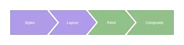
To achieve smooth animation, we need to focus on changing the properties that affect the synthesis step, rather than increasing the burden on the previous step.
-
Style
The browser starts to calculate the style to be applied to the element - recalculate the style.
-
Layout
, , . leftIn the next steps, the browser generates the shape and position of each element—the layout. Here, the browser sets page properties such as width and height, and for example its margins ortop,right,bottom, -
Draw
, etc. The browser fills the pixels of each element into the layer. It refers to these properties: box-shadow,border-radius,color,background-color, -
Composition
attributes. This is where you want to perform animations, because this is when the browser draws all the layers onto the screen. transformModern browsers can animate four style attributes well, usingopacityand-
transform: translateX(n) translateY(n) translateZ(n);Position — -
transform: scale(n);Zoom — -
transform: rotate(ndeg);Rotation — -
opacity: n;Opacity —
-


 The browser fills the pixels of each element into the layer. It refers to these properties:
  This is where you want to perform animations, because this is when the browser draws all the layers onto the screen.
 How to achieve 60 frames per second
app-menuRemember this, it's time to roll up your sleeves and work hard. Let's start with HTML. We will create a very simple structure and put our layout in a
<div>
  <div></div>
  <div>
    <div></div>
  </div>
</div>

Wrong method
.app-menu {
  left: -300px;
  transition: left 300ms linear;
}

.app-menu-open .app-menu {
  left: 0px;
  transition: left 300ms linear;
}
leftDid you see the properties we changed? Use top, right, bottom,
attributes for transition should be avoided. These do not create smooth animations because they force the browser to perform layout passes every time, which affects the child elements of all elements. The result is this: 
This animation is not smooth enough. We used the DevTools timeline to check what was happening behind the scenes, and the results are as follows: 
The green area indicates the time it takes to render the animation. This data shows irregular frame rates and slow performance. "The green bar means FPS. The high bar means the animation is rendered at 60 FPS. The low bar means below 60 FPS. So ideally you want the green bar to always stay high throughout the timeline. The red bar also means stuttering, So another way to measure progress is to eliminate these red bars. ” Thanks Kayce Basques!
Using Transform.app-menu {
-webkit-transform: translateX(-100%);
transform: translateX(-100%);
transition: transform 300ms linear;
}
.app-menu-open .app-menu {
-webkit-transform: none;
transform: none;
transition: transform 300ms linear;
}
transform
Attributes affect the synthesis step, not the layout. Here we inform the browser that our layers are stable before the animation starts, so there are fewer obstacles when rendering the animation. 
This is how the timeline reflects:

The results start to get better, the frame rate seems to be stable, so the animation runs smoother.
Run animation in GPU
Then, let's take it to the next level. To really make it run smoothly, we will use the GPU to render the animation.
<div>
<div></div>
<div>
<div></div>
</div>
</div>
Although some browsers still need translateZ() or translate3d() as fallback, the will-change attribute is the future. This property promotes the element to another layer, so the browser does not have to consider layout rendering or drawing.

See how smooth it is? The timeline confirms this:

The frame rate of the animation is more constant and the animation rendering speed is faster. But there is still a long frame running at the beginning: there is a bit of a bottleneck at the beginning. Remember the HTML structure we created at the beginning? Let's see how we control app-menudiv:
.app-menu {
left: -300px;
transition: left 300ms linear;
}
.app-menu-open .app-menu {
left: 0px;
transition: left 300ms linear;
}
Ahhh! We're causing a problem here by adding classes to layoutdiv. This forces the browser to regenerate our style tree – which affects rendering performance.
Solution of buttery smooth at 60 frames per second
What if we create the menu outside the viewport area? Putting the menu in the quarantine area will ensure that we only affect the elements we want to animation. Therefore, we recommend using the following HTML structure:
.app-menu {
  -webkit-transform: translateX(-100%);
  transform: translateX(-100%);
  transition: transform 300ms linear;
}
.app-menu-open .app-menu {
  -webkit-transform: none;
  transform: none;
  transition: transform 300ms linear;
}
Now we have to control the status of the menu in a slightly different way. We will use the transitionend function in JavaScript to manipulate animations in classes that are deleted at the end of the animation.
.app-menu {
  -webkit-transform: translateX(-100%);
  transform: translateX(-100%);
  transition: transform 300ms linear;
  will-change: transform;
}
Let's put everything together and check the results. Here is a complete CSS3 enabled example, everything is in the right place:
function toggleClassMenu() {
  var layout = document.querySelector(".layout");
  if(!layout.classList.contains("app-menu-open")) {
    layout.classList.add("app-menu-open");
  } else {
    layout.classList.remove("app-menu-open");
  }
}
var oppMenu = document.querySelector(".menu-icon");
oppMenu.addEventListener("click", toggleClassMenu, false);

What does the timeline show us?

It's all green strips, baby. Want to see a practical example? Click here. (The actual link should be inserted here)
(The FAQ section about mobile animation should be added here, the content is consistent with the FAQs section in the original document)
The above is the detailed content of Achieve 60 FPS Mobile Animations with CSS3. For more information, please follow other related articles on the PHP Chinese website!

 Flexbox vs Grid: should I learn them both?May 10, 2025 am 12:01 AM
Yes,youshouldlearnbothFlexboxandGrid.1)Flexboxisidealforone-dimensional,flexiblelayoutslikenavigationmenus.2)Gridexcelsintwo-dimensional,complexdesignssuchasmagazinelayouts.3)Combiningbothenhanceslayoutflexibilityandresponsiveness,allowingforstructur
 Orbital Mechanics (or How I Optimized a CSS Keyframes Animation)May 09, 2025 am 09:57 AM
What does it look like to refactor your own code? John Rhea picks apart an old CSS animation he wrote and walks through the thought process of optimizing it.
 CSS Animations: Is it hard to create them?May 09, 2025 am 12:03 AM
CSSanimationsarenotinherentlyhardbutrequirepracticeandunderstandingofCSSpropertiesandtimingfunctions.1)Startwithsimpleanimationslikescalingabuttononhoverusingkeyframes.2)Useeasingfunctionslikecubic-bezierfornaturaleffects,suchasabounceanimation.3)For
 @keyframes CSS: The most used tricksMay 08, 2025 am 12:13 AM
@keyframesispopularduetoitsversatilityandpowerincreatingsmoothCSSanimations.Keytricksinclude:1)Definingsmoothtransitionsbetweenstates,2)Animatingmultiplepropertiessimultaneously,3)Usingvendorprefixesforbrowsercompatibility,4)CombiningwithJavaScriptfo
 CSS Counters: A Comprehensive Guide to Automatic NumberingMay 07, 2025 pm 03:45 PM
CSSCountersareusedtomanageautomaticnumberinginwebdesigns.1)Theycanbeusedfortablesofcontents,listitems,andcustomnumbering.2)Advancedusesincludenestednumberingsystems.3)Challengesincludebrowsercompatibilityandperformanceissues.4)Creativeusesinvolvecust
 Modern Scroll Shadows Using Scroll-Driven AnimationsMay 07, 2025 am 10:34 AM
Using scroll shadows, especially for mobile devices, is a subtle bit of UX that Chris has covered before. Geoff covered a newer approach that uses the animation-timeline property. Here’s yet another way.
 Revisiting Image MapsMay 07, 2025 am 09:40 AM
Let’s run through a quick refresher. Image maps date all the way back to HTML 3.2, where, first, server-side maps and then client-side maps defined clickable regions over an image using map and area elements.
 State of Devs: A Survey for Every DeveloperMay 07, 2025 am 09:30 AM
The State of Devs survey is now open to participation, and unlike previous surveys it covers everything except code: career, workplace, but also health, hobbies, and more.


Hot AI Tools

Undresser.AI Undress
AI-powered app for creating realistic nude photos

AI Clothes Remover
Online AI tool for removing clothes from photos.

Undress AI Tool
Undress images for free

Clothoff.io
AI clothes remover

Video Face Swap
Swap faces in any video effortlessly with our completely free AI face swap tool!

Hot Article
Hot Tools

SublimeText3 Mac version
God-level code editing software (SublimeText3)

SecLists
SecLists is the ultimate security tester's companion. It is a collection of various types of lists that are frequently used during security assessments, all in one place. SecLists helps make security testing more efficient and productive by conveniently providing all the lists a security tester might need. List types include usernames, passwords, URLs, fuzzing payloads, sensitive data patterns, web shells, and more. The tester can simply pull this repository onto a new test machine and he will have access to every type of list he needs.

PhpStorm Mac version
The latest (2018.2.1) professional PHP integrated development tool

Zend Studio 13.0.1
Powerful PHP integrated development environment

SublimeText3 Linux new version
SublimeText3 Linux latest version

