TL;DR
In this short post, you will learn about how I recreated a fully functional, real-time, notification inbox component that replicates Notion’s built-in notifications capability by using only Chakra UI for the design and Novu for the notifications.
This is how it looks:

The link to the source code and the deployed version of this app are at the end of the post.
As a daily Notion user, I really appreciate their notifications experience, and it’s a huge part of why I use their app so heavily. I was curious—how could I recreate an inbox similar to Notion's sleek notification system? Turns out, it's quite straightforward, thanks to Novu's in-app notification component.
Novu recently launched their full-stack notification component—a stateful, embeddable React component or widget that's customizable and ready to go.
Here’s how you can add it to your React app in just a few simple steps:
-
Install the Novu package
$ npm install @novu/react
-
Import the component
import { Inbox } from "@novu/react"; -
Initialize the component in your app
function Novu() {
  return (
    <Inbox
      applicationIdentifier="YOUR_APPLICATION_IDENTIFIER"
      subscriberId="YOUR_SUBSCRIBER_ID"
    />
  );
}
That’s it! You’ve now got a fully functional in-app inbox component.
Out of the box, it looks pretty awesome:

Not to brag, but Novu’s Inbox also happens to be the most flexible and customizable out there. Check out how to style it, and even experiment for yourself.
If you're interested in the tech behind it, Novu's Co-Founder Dima Grossman wrote a great post on how and why they built it.
Styling your Inbox like Notion
Want your inbox to look like Notion’s notification panel? Not a problem! You can easily wrap and customize Novu’s notifications to fit Notion’s clean, minimal aesthetic.

How I did it
Instead of just importing the Inbox component from @novu/react, I brought in the Notification and Notifications components for full control over rendering each item.
import { Inbox, Notification, Notifications } from "@novu/react";
What’s inside a notification?
Before we start customizing, here's the structure of a notification object:
interface Notification = {
  id: string;
  subject?: string;
  body: string;
  to: Subscriber;
  isRead: boolean;
  isArchived: boolean;
  createdAt: string;
  readAt?: string | null;
  archivedAt?: string | null;
  avatar?: string;
  primaryAction?: Action;
  secondaryAction?: Action;
  channelType: ChannelType;
  tags?: string[];
  data?: Record<string unknown>;
  redirect?: Redirect;
};
</string>
Armed with this, I used Chakra UI (because wrangling Tailwind classes is exhausting) to design each notification item.
Custom inbox item component
Here’s how I created a Notion-inspired notification item:
const InboxItem = ({ notification }: { notification: Notification }) => {
    const [isHovered, setIsHovered] = useState(false);
    const notificationType = notification.tags?.[0];

    return (
        <box p="{2}" bg="white" position="relative" onmouseenter="{()"> setIsHovered(true)}
            onMouseLeave={() => setIsHovered(false)}
        >
            <flex align="flex-start" position="relative">
                <vstack spacing="{0}" position="absolute" top="0" right="0">
                    {isHovered && (
                        <box bg="white" display="flex" gap="{1}">
                            {notification.isRead ? (
                                <iconbutton aria-label="Mark as unread" icon="{<PiNotificationFill"></iconbutton>}
                                    onClick={() => notification.unread()}
                                    size="sm"
                                    variant="ghost"
                                />
                            ) : (
                                <iconbutton aria-label="Mark as read" icon="{<FaRegCheckSquare"></iconbutton>}
                                    onClick={() => notification.read()}
                                    size="sm"
                                    variant="ghost"
                                />
                            )}
                            {notification.isArchived ? (
                                <iconbutton aria-label="Unarchive" icon="{<PiNotificationFill"></iconbutton>}
                                    onClick={() => notification.unarchive()}
                                    size="sm"
                                    variant="ghost"
                                />
                            ) : (
                                <iconbutton aria-label="Archive" icon="{<FiArchive"></iconbutton>}
                                    onClick={() => notification.archive()}
                                    size="sm"
                                    variant="ghost"
                                />
                            )}
                        </box>
                    )}
                </vstack>

                <box position="relative" display="flex" alignitems="center" mr="8px" height="26px">
                    {!notification.isRead && (
                        <box>
                            <box width="8px" height="8px" bg="blue.500" borderradius="full"></box>
                        </box>
                    )}
                    {notification.avatar !== undefined && (
                        <avatar width="24px" height="24px" marginleft="8px" name="{notification.to.firstName}" src="%7Bnotification.avatar" undefined></avatar>
                    )}
                </box>

                <vstack align="start" spacing="8px" flex="1" mt="3px">
                    <flex justify="space-between" width="100%">
                        <text fontsize="14px" color="gray.800" fontweight="600">
                            {notification.subject}
                        </text>
                        <text fontsize="xs" color="gray.400">
                            {formatTime(notification.createdAt)}
                        </text>
                    </flex>

                    {notificationType !== "Mention" &&
                        notificationType !== "Comment" &&
                        notificationType !== "Invite" && (
                            <text fontsize="14px" color="gray.800">
                                {notification.body}
                            </text>
                        )}

                    {(notificationType === "Mention" ||
                        notificationType === "Comment") && (
                            <button variant="ghost" size="sm" lefticon="{<GrDocumentText"></button>}
                                _hover={{ bg: "rgba(0, 0, 0, 0.03)" }}
                                pl="2px"
                                pr="5px"
                                height="25px"
                            >
                                <text fontsize="14px" color="gray.800" fontweight="500" backgroundimage="linear-gradient(to right, rgba(55, 53, 47, 0.16) 0%, rgba(55, 53, 47, 0.16) 100%)" backgroundrepeat="repeat-x" backgroundsize="100% 1px" backgroundposition="0 100%" mr="-2px">
                                    {notification.body}
                                </text>

                        )}

                    {notificationType === "Invite" && (
                        <button variant="outline" size="md" _hover="{{" bg: padding="12px" height="50px" fontsize="14px" width="100%" borderradius="8px" textalign="left" border="1px solid rgba(227, 226, 224, 0.5)" justifycontent="space-between">
                            {notification.body}
                        </button>
                    )}

                    {notificationType === "Comment" && (
                        <box>
                            <text fontsize="12px" color="rgb(120, 119, 116)" fontweight="400">
                                John Doe
                            </text>
                            <text fontsize="14px" color="rgb(55, 53, 47)" fontweight="400">
                                This is a notification Comment made by John Doe and posted on
                                the page Top Secret Project
                            </text>
                        </box>
                    )}

                    <hstack spacing="{3}">
                        {notification.primaryAction && (
                            <button variant="outline" size="xs" colorscheme="gray" borderradius="md" bordercolor="gray.300" _hover="{{" bg: paddingright="8px" paddingleft="8px" lineheight="26px" height="26px">
                                {notification.primaryAction.label}
                            </button>
                        )}
                        {notification.secondaryAction && (
                            <button variant="ghost" size="xs" colorscheme="gray" borderradius="md" bordercolor="gray.300" _hover="{{" bg: paddingright="8px" paddingleft="8px" lineheight="26px" height="26px">
                                {notification.secondaryAction.label}
                            </button>
                        )}
                    </hstack>
                </vstack>
            </flex>
        </box>
    );
};
Notification object keys
As you can see in the code, I utilized the following notification keys:
- notification.tags
- notification.isRead
- notification.isArchived
- notification.to.firstName
- notification.avatar
- notification.subject
- notification.createdAt
- notification.body
- notification.primaryAction
- notification.primaryAction.label
- notification.secondaryAction
- notification.secondaryAction.label
The notification.data object can contain any practical piece of information that your application logic would like to associate with a user or subscriber. This flexible structure allows you to tailor notifications to specific use cases and provide richer, more contextual information to your users.
Examples of using notification.data:
-
E-commerce order updates:
notification.data = { orderId: "ORD-12345", status: "shipped", trackingNumber: "1Z999AA1234567890", estimatedDelivery: "2023-09-25" }; -
Social media interactions:
notification.data = { postId: "post-789", interactionType: "like", interactingUser: "johndoe", interactionTime: "2023-09-22T14:30:00Z" }; -
Financial transactions:
notification.data = {
  transactionId: "TRX-98765",
  amount: 150.75,
  currency: "USD",
  merchantName: "Coffee Shop",
  category: "Food & Drink"
};
By utilizing the notification.data object, you can create more informative and actionable notifications that seamlessly integrate with your application's specific requirements.
This flexibility allows you to provide users with precisely the information they need, enhancing their experience and the overall effectiveness of your notification system.
Using hooks for notification management
If you've examined the code closely, you may have noticed the use of four key hooks to manage notification states:
- notification.unread()
- notification.read()
- notification.unarchive()
- notification.archive()
The novu/react package exposes these hooks, offering enhanced flexibility for managing notification states. It's important to note that these hooks not only update the local state but also synchronize changes with the backend.
These hooks provide a seamless way to:
- Mark notifications as read or unread
- Archive or unarchive notifications
By utilizing these hooks, you can create more interactive and responsive notification systems in your applications.
I've implemented Notion-inspired sidebar navigation to enhance the similarity to the Notion theme. This design choice aims to capture the essence and aesthetics of Notion's interface, creating a familiar and intuitive environment for users.
For the icons, I've leveraged the versatile react-icons library, which offers a wide range of icon sets to choose from.
$ npm install react-icons
import { FiArchive, FiSearch, FiHome, FiInbox, FiSettings, FiChevronDown } from "react-icons/fi";
import { FaRegCheckSquare, FaUserFriends } from "react-icons/fa";
import { PiNotificationFill } from "react-icons/pi";
import { BsFillFileTextFill, BsTrash } from "react-icons/bs";
import { AiOutlineCalendar } from "react-icons/ai";
import { GrDocumentText } from "react-icons/gr";

const AppContainer = () => {
    const borderColor = useColorModeValue("gray.200", "gray.700");
    const [isInboxOpen, setIsInboxOpen] = useState(true);

    const toggleInbox = () => {
        setIsInboxOpen(!isInboxOpen);
    };

    return (
        <flex width="100vw" height="100vh" bg="gray.100" overflow="hidden" justifycontent="center" alignitems="center" style="{{" fontfamily: blinkmacsystemfont ui variable display helvetica color emoji arial sans-serif symbol>
            <box width="80%" height="80%" bg="white" borderradius="lg" boxshadow="xl" overflow="hidden">
                <flex height="100%">
                    {/* Sidebar */}
                    <box width="240px" bg="rgb(247, 247, 245)" padding="8px" display="flex" flexdirection="column" bordercolor="{borderColor}" borderrightwidth="1px">
                        <flex alignitems="center" mb="4px" padding="0.6rem">
                            <text fontsize="1.25rem" fontweight="bold" color="rgb(55, 53, 47)">
                                <icon as="{NotionIcon}" sx="{{" width: height: marginright: display:></icon>{" "}
                                Workspace
                            </text>
                            <iconbutton aria-label="User Settings" icon="{<FiChevronDown"></iconbutton>}
                                variant="ghost"
                                size="sm"
                            />
                        </flex>

                        <vstack align="stretch" spacing="{1}" mb="15px">
                            <sidebaritem icon="{FiSearch}" label="Search"></sidebaritem>
                            <sidebaritem icon="{FiHome}" label="Home"></sidebaritem>
                            <sidebaritem icon="{FiInbox}" label="Inbox" isactive="{isInboxOpen}" onclick="{toggleInbox}"></sidebaritem>
                            <sidebaritem icon="{FiSettings}" label="Settings & members"></sidebaritem>
                        </vstack>

                        <text fontsize="xs" fontweight="bold" color="gray.500" mb="{2}">
                            Favorites
                        </text>
                        <vstack align="stretch" spacing="{1}" mb="15px">
                            <sidebaritem icon="{FiHome}" label="Teamspaces"></sidebaritem>
                            <sidebaritem icon="{BsFillFileTextFill}" label="Shared"></sidebaritem>
                        </vstack>

                        <text fontsize="xs" fontweight="bold" color="gray.500" mb="{2}">
                            Private
                        </text>
                        <vstack align="stretch" spacing="{1}" mb="15px">
                            <sidebaritem icon="{AiOutlineCalendar}" label="Calendar"></sidebaritem>
                            <sidebaritem icon="{FaUserFriends}" label="Templates"></sidebaritem>
                            <sidebaritem icon="{BsTrash}" label="Trash"></sidebaritem>
                        </vstack>
                    </box>

// ... (rest of the code)
</flex></box></flex>
Another important aspect was time formatting to match how Notion does it:
function formatTime(timestamp: number | string | Date): string {
const date = new Date(timestamp);
const now = new Date();
const diffInSeconds = Math.floor((now.getTime() - date.getTime()) / 1000);
const secondsInMinute = 60;
const secondsInHour = secondsInMinute * 60;
const secondsInDay = secondsInHour * 24;
const secondsInWeek = secondsInDay * 7;
const secondsInYear = secondsInDay * 365;
if (diffInSeconds
Now that we have covered all the pieces, here is the complete code:
'use client'
import React, { useState } from 'react';
import {
Box,
Flex,
Text,
IconButton,
VStack,
Avatar,
HStack,
Link,
Icon,
useColorModeValue,
Button,
Heading,
} from "@chakra-ui/react";
import { FiArchive, FiSearch, FiHome, FiInbox, FiSettings, FiChevronDown } from "react-icons/fi";
import { FaRegCheckSquare, FaUserFriends } from "react-icons/fa";
import { PiNotificationFill } from "react-icons/pi";
import { BsFillFileTextFill, BsTrash } from "react-icons/bs";
import { AiOutlineCalendar } from "react-icons/ai";
import { GrDocumentText } from "react-icons/gr";
import { Inbox, Notification, Notifications } from "@novu/react";
import { NotionIcon } from "../icons/Notion";
const subscriberId = process.env.NEXT_PUBLIC_SUBSCRIBERID;
const applicationIdentifier = process.env.NEXT_PUBLIC_NOVU_CLIENT_APP_ID;
const AppContainer = () => {
const borderColor = useColorModeValue("gray.200", "gray.700");
const [isInboxOpen, setIsInboxOpen] = useState(true);
const toggleInbox = () => {
setIsInboxOpen(!isInboxOpen);
};
return (
{/* Sidebar */}
Favorites
Private
{/* Main Content Area */}
{/* Injected Content Behind the Inbox */}
Notion Inbox Notification Theme
Checkout the deployed version now
{/* Inbox Popover */}
{isInboxOpen && (
(
)}
);
};
// Sidebar Item Component
interface SidebarItemProps {
icon: React.ElementType;
label: string;
isActive?: boolean;
external?: boolean;
onClick?: () => void;
}
const SidebarItem: React.FC = ({
icon,
label,
isActive = false,
external = false,
onClick,
}) => {
return (
{label}
);
};
const InboxItem = ({ notification }: { notification: Notification }) => {
const [isHovered, setIsHovered] = useState(false);
const notificationType = notification.tags?.[0];
return (
<box p="{2}" bg="white" position="relative" onmouseenter="{()"> setIsHovered(true)}
onMouseLeave={() => setIsHovered(false)}
>
<flex align="flex-start" position="relative">
<vstack spacing="{0}" position="absolute" top="0" right="0">
{isHovered && (
<box bg="white" display="flex" gap="{1}">
{notification.isRead ? (
<iconbutton aria-label="Mark as unread" icon="{<PiNotificationFill"></iconbutton>}
onClick={() => notification.unread()}
size="sm"
variant="ghost"
/>
) : (
<iconbutton aria-label="Mark as read" icon="{<FaRegCheckSquare"></iconbutton>}
onClick={() => notification.read()}
size="sm"
variant="ghost"
/>
)}
{notification.isArchived ? (
<iconbutton aria-label="Unarchive" icon="{<PiNotificationFill"></iconbutton>}
onClick={() => notification.unarchive()}
size="sm"
variant="ghost"
/>
) : (
<iconbutton aria-label="Archive" icon="{<FiArchive"></iconbutton>}
onClick={() => notification.archive()}
size="sm"
variant="ghost"
/>
)}
</box>
)}
</vstack>
<box position="relative" display="flex" alignitems="center" mr="8px" height="26px">
{!notification.isRead && (
<box>
<box width="8px" height="8px" bg="blue.500" borderradius="full"></box>
</box>
)}
{notification.avatar !== undefined && (
<avatar width="24px" height="24px" marginleft="8px" name="{notification.to.firstName}" src="%7Bnotification.avatar" undefined></avatar>
)}
</box>
<vstack align="start" spacing="8px" flex="1" mt="3px">
<flex justify="space-between" width="100%">
<text fontsize="14px" color="gray.800" fontweight="600">
{notification.subject}
</text>
<text fontsize="xs" color="gray.400">
{formatTime(notification.createdAt)}
</text>
</flex>
{notificationType !== "Mention" &&
notificationType !== "Comment" &&
notificationType !== "Invite" && (
<text fontsize="14px" color="gray.800">
{notification.body}
</text>
)}
{(notificationType === "Mention" ||
notificationType === "Comment") && (
<button variant="ghost" size="sm" lefticon="{<GrDocumentText"></button>}
_hover={{ bg: "rgba(0, 0, 0, 0.03)" }}
pl="2px"
pr="5px"
height="25px"
>
<text fontsize="14px" color="gray.800" fontweight="500" backgroundimage="linear-gradient(to right, rgba(55, 53, 47, 0.16) 0%, rgba(55, 53, 47, 0.16) 100%)" backgroundrepeat="repeat-x" backgroundsize="100% 1px" backgroundposition="0 100%" mr="-2px">
{notification.body}
</text>
)}
{notificationType === "Invite" && (
<button variant="outline" size="md" _hover="{{" bg: padding="12px" height="50px" fontsize="14px" width="100%" borderradius="8px" textalign="left" border="1px solid rgba(227, 226, 224, 0.5)" justifycontent="space-between">
{notification.body}
</button>
)}
{notificationType === "Comment" && (
<box>
<text fontsize="12px" color="rgb(120, 119, 116)" fontweight="400">
John Doe
</text>
<text fontsize="14px" color="rgb(55, 53, 47)" fontweight="400">
This is a notification Comment made by John Doe and posted on
the page Top Secret Project
</text>
</box>
)}
<hstack spacing="{3}">
{notification.primaryAction && (
<button variant="outline" size="xs" colorscheme="gray" borderradius="md" bordercolor="gray.300" _hover="{{" bg: paddingright="8px" paddingleft="8px" lineheight="26px" height="26px">
{notification.primaryAction.label}
</button>
)}
{notification.secondaryAction && (
<button variant="ghost" size="xs" colorscheme="gray" borderradius="md" bordercolor="gray.300" _hover="{{" bg: paddingright="8px" paddingleft="8px" lineheight="26px" height="26px">
{notification.secondaryAction.label}
</button>
)}
</hstack>
</vstack>
</flex>
</box>
);
};
function formatTime(timestamp: number | string | Date): string {
const date = new Date(timestamp);
const now = new Date();
const diffInSeconds = Math.floor((now.getTime() - date.getTime()) / 1000);
const secondsInMinute = 60;
const secondsInHour = secondsInMinute * 60;
const secondsInDay = secondsInHour * 24;
const secondsInWeek = secondsInDay * 7;
const secondsInYear = secondsInDay * 365;
if (diffInSeconds
Ready to get customizing? Here’s the source code for the Notion Inbox theme. You can also see and play with it live in our Inbox playground. I also did the same for a Reddit notifications example. Two totally different experiences, but powered by the same underlying component and notifications infrastructure.
The above is the detailed content of How to Build a Notion-Like Notification Inbox with Chakra UI and Novu. For more information, please follow other related articles on the PHP Chinese website!
 Replace String Characters in JavaScriptMar 11, 2025 am 12:07 AM
Detailed explanation of JavaScript string replacement method and FAQ This article will explore two ways to replace string characters in JavaScript: internal JavaScript code and internal HTML for web pages. Replace string inside JavaScript code The most direct way is to use the replace() method: str = str.replace("find","replace"); This method replaces only the first match. To replace all matches, use a regular expression and add the global flag g: str = str.replace(/fi
 Custom Google Search API Setup TutorialMar 04, 2025 am 01:06 AM
This tutorial shows you how to integrate a custom Google Search API into your blog or website, offering a more refined search experience than standard WordPress theme search functions. It's surprisingly easy! You'll be able to restrict searches to y
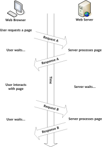 Build Your Own AJAX Web ApplicationsMar 09, 2025 am 12:11 AM
So here you are, ready to learn all about this thing called AJAX. But, what exactly is it? The term AJAX refers to a loose grouping of technologies that are used to create dynamic, interactive web content. The term AJAX, originally coined by Jesse J
 Example Colors JSON FileMar 03, 2025 am 12:35 AM
This article series was rewritten in mid 2017 with up-to-date information and fresh examples. In this JSON example, we will look at how we can store simple values in a file using JSON format. Using the key-value pair notation, we can store any kind
 10 jQuery Syntax HighlightersMar 02, 2025 am 12:32 AM
Enhance Your Code Presentation: 10 Syntax Highlighters for Developers Sharing code snippets on your website or blog is a common practice for developers. Choosing the right syntax highlighter can significantly improve readability and visual appeal. T
 8 Stunning jQuery Page Layout PluginsMar 06, 2025 am 12:48 AM
Leverage jQuery for Effortless Web Page Layouts: 8 Essential Plugins jQuery simplifies web page layout significantly. This article highlights eight powerful jQuery plugins that streamline the process, particularly useful for manual website creation
 10 JavaScript & jQuery MVC TutorialsMar 02, 2025 am 01:16 AM
This article presents a curated selection of over 10 tutorials on JavaScript and jQuery Model-View-Controller (MVC) frameworks, perfect for boosting your web development skills in the new year. These tutorials cover a range of topics, from foundatio
 What is 'this' in JavaScript?Mar 04, 2025 am 01:15 AM
Core points This in JavaScript usually refers to an object that "owns" the method, but it depends on how the function is called. When there is no current object, this refers to the global object. In a web browser, it is represented by window. When calling a function, this maintains the global object; but when calling an object constructor or any of its methods, this refers to an instance of the object. You can change the context of this using methods such as call(), apply(), and bind(). These methods call the function using the given this value and parameters. JavaScript is an excellent programming language. A few years ago, this sentence was


Hot AI Tools

Undresser.AI Undress
AI-powered app for creating realistic nude photos

AI Clothes Remover
Online AI tool for removing clothes from photos.

Undress AI Tool
Undress images for free

Clothoff.io
AI clothes remover

AI Hentai Generator
Generate AI Hentai for free.

Hot Article

Hot Tools

WebStorm Mac version
Useful JavaScript development tools

MinGW - Minimalist GNU for Windows
This project is in the process of being migrated to osdn.net/projects/mingw, you can continue to follow us there. MinGW: A native Windows port of the GNU Compiler Collection (GCC), freely distributable import libraries and header files for building native Windows applications; includes extensions to the MSVC runtime to support C99 functionality. All MinGW software can run on 64-bit Windows platforms.

Dreamweaver CS6
Visual web development tools

Atom editor mac version download
The most popular open source editor

SublimeText3 English version
Recommended: Win version, supports code prompts!


