I’ve used ChatGPT for all kinds of experiments, from creating a powerlifting routine to getting photoshoot ideas. However, two years after its initial release, the user interface (UI) could do with a huge upgrade. Here are my biggest recommendations.
1 Folders
As someone who likes to keep all aspects of life as organized as possible, I find it frustrating that you can’t create folders in ChatGPT. While you can access previous chats in the left-hand toolbar, the ChatGPT starts to get messy when you use it more often.
I don’t know what this would look like, but I’d love ChatGPT to have a homepage similar to Google Drive or OneDrive, where you can access all of your folders. It would be much easier to browse and group relevant chats and custom GPTs.

2 Tags and Categories
As someone who uses WordPress and other content management systems (CMS) almost daily, I can attest to the power of tags and categories. They make things much easier to navigate, especially when your portfolio increases. Tags and categories are also two of the best tools you’ll find in to-do list apps and other forms of software.
In my ideal world, ChatGPT would let you create your own tags and categories. However, it could also have some preset versions to help if you don’t know where to start. Even if folders weren’t introduced, this would—in my opinion—lead to a huge quality-of-life improvement.
3 A Better Menu
Minimal is good in UI design, but let’s be honest—ChatGPT’s menu has significant room for improvement. It’s a bit too basic, with your GPTs appearing at the top of the left-hand toolbar and your chats showing up below that. Yes, ChatGPT has bigger problems—but this is, again, a small enhancement that I would like to see at some point.
Let me make this very clear: I definitely don’t want a complex menu bar. That would actually be a huge problem and make the app unusable. But some extra features, like moving the option to create your GPT to the left-hand toolbar, would be very much welcomed.
4 Nesting
What would arguably be better than a menu overhaul is if ChatGPT gave you the option to nest conversations. With this feature, I wouldn’t mind the absence of folders, tags, and categories anywhere near as much.
In simple terms, nesting is putting different aspects together in a logical order. For example, when I created my blog using WordPress, I nested different categories under overarching menu items (e.g., New York City goes under the US umbrella). It’s also possible to use native CSS nesting in web apps.

Ideally, ChatGPT would let you create overarching nested categories and drag and (preferably subfolders within these). Another request would be to have color coding, but it’s unnecessary.
5 An “Add to Favorites” Option
I’m a big fan of Notion. I use the app to take notes and manage my life because you can pin your favorite pages. The fact that it’s very easy to get started with Notion also helps. Another small UI improvement that I think ChatGPT could really use is an option to add pin chats.

You can keep your Custom GPTs at the top of the menu toolbar, but this isn’t the case with ChatGPT conversations. You can keep them close to the top by reopening and adding to them, but it’s not the same. Similarly, archiving conversations is not the best way to deal with this.
Other apps, such as WhatsApp, also let you pin components close to the top of the screen. Hopefully, ChatGPT will follow suit.
6 A Conversation Search Bar
You’re probably noticing by now that most of my UI improvement suggestions are simply about making ChatGPT easier to navigate. A search bar would be incredibly helpful for finding old conversations; you’ll find such features in Apple Notes, instant messaging apps, and email tools.

The search bar wouldn’t need to be fancy; it just has to make it easy to find old notes via keywords. I’d expect this to be introduced at some point, but the sooner, the better.
7 Dimensions for DALL-E Images
DALL-E’s editing tools need a lot of work as it is, but truth be told, I don’t actually care so much about those. What does irk me, however, is that it almost never listens to me when I want an image resized. Each time I ask it to change the dimensions, DALL-E changes the entire image without making these dimensions any different.

Ideally, DALL-E should have a simple resizing feature like most photo editing apps do. It could have a couple of common preset options, like 4:5 and 16:9. Alongside that, you’d ideally be able to choose your own dimensions. This would make it much easier to share what’s created in DALL-E than importing the image to a whole new platform.
8 Conversation Templates
You’ll find several ChatGPT prompts on GitHub and can also get better results by avoiding common ChatGPT prompt mistakes. However, the average user would have a much more enjoyable time on the app if they had some templates to get started with. Yes, you get some starting prompts—but there are nowhere near as many as there should be.

If this worked properly, I envision a section appearing in the toolbar on the left. ChatGPT could also have a template marketplace like Notion and Canva. It would be great if you could create and save your own conversation templates.
9 A Trash Folder to Recover Deleted Conversations
Another simple addition to the ChatGPT UI, which I’m certain millions of people would welcome, is the ability to recover deleted conversations from a Trash folder. You can archive chats, but let’s be honest—most people will delete chats they don’t need at the moment. Frustratingly, your chats are gone forever when you do that.
A Trash folder that works like the one in the iPhone Photos app, where you can retrieve files for up to 30 days, would be perfect. Notion also has a similar feature. In addition to retrieving files, ChatGPT could offer the choice to delete conversations and GPTs permanently.
ChatGPT has been hugely successful since launching in late 2022, but its interface makes it clear that this was the minimum viable product. Now is the time to build on its initial success by adding quality-of-life improvements that will make the app much better for both free and paid members. Hopefully, we’ll see some of these improvements arrive sooner rather than later.
The above is the detailed content of I Use ChatGPT Daily: Here Are 10 UI Improvements It Really Needs. For more information, please follow other related articles on the PHP Chinese website!
 Let's Dance: Structured Movement To Fine-Tune Our Human Neural NetsApr 27, 2025 am 11:09 AM
Scientists have extensively studied human and simpler neural networks (like those in C. elegans) to understand their functionality. However, a crucial question arises: how do we adapt our own neural networks to work effectively alongside novel AI s
 New Google Leak Reveals Subscription Changes For Gemini AIApr 27, 2025 am 11:08 AM
Google's Gemini Advanced: New Subscription Tiers on the Horizon Currently, accessing Gemini Advanced requires a $19.99/month Google One AI Premium plan. However, an Android Authority report hints at upcoming changes. Code within the latest Google P
 How Data Analytics Acceleration Is Solving AI's Hidden BottleneckApr 27, 2025 am 11:07 AM
Despite the hype surrounding advanced AI capabilities, a significant challenge lurks within enterprise AI deployments: data processing bottlenecks. While CEOs celebrate AI advancements, engineers grapple with slow query times, overloaded pipelines, a
 MarkItDown MCP Can Convert Any Document into Markdowns!Apr 27, 2025 am 09:47 AM
Handling documents is no longer just about opening files in your AI projects, it’s about transforming chaos into clarity. Docs such as PDFs, PowerPoints, and Word flood our workflows in every shape and size. Retrieving structured
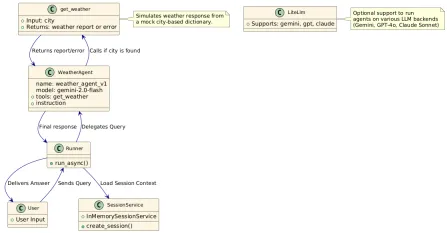 How to Use Google ADK for Building Agents? - Analytics VidhyaApr 27, 2025 am 09:42 AM
Harness the power of Google's Agent Development Kit (ADK) to create intelligent agents with real-world capabilities! This tutorial guides you through building conversational agents using ADK, supporting various language models like Gemini and GPT. W
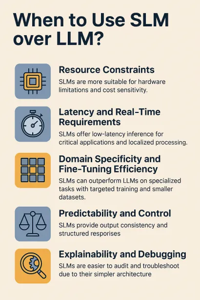 Use of SLM over LLM for Effective Problem Solving - Analytics VidhyaApr 27, 2025 am 09:27 AM
summary: Small Language Model (SLM) is designed for efficiency. They are better than the Large Language Model (LLM) in resource-deficient, real-time and privacy-sensitive environments. Best for focus-based tasks, especially where domain specificity, controllability, and interpretability are more important than general knowledge or creativity. SLMs are not a replacement for LLMs, but they are ideal when precision, speed and cost-effectiveness are critical. Technology helps us achieve more with fewer resources. It has always been a promoter, not a driver. From the steam engine era to the Internet bubble era, the power of technology lies in the extent to which it helps us solve problems. Artificial intelligence (AI) and more recently generative AI are no exception
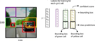 How to Use Google Gemini Models for Computer Vision Tasks? - Analytics VidhyaApr 27, 2025 am 09:26 AM
Harness the Power of Google Gemini for Computer Vision: A Comprehensive Guide Google Gemini, a leading AI chatbot, extends its capabilities beyond conversation to encompass powerful computer vision functionalities. This guide details how to utilize
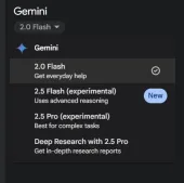 Gemini 2.0 Flash vs o4-mini: Can Google Do Better Than OpenAI?Apr 27, 2025 am 09:20 AM
The AI landscape of 2025 is electrifying with the arrival of Google's Gemini 2.0 Flash and OpenAI's o4-mini. These cutting-edge models, launched weeks apart, boast comparable advanced features and impressive benchmark scores. This in-depth compariso


Hot AI Tools

Undresser.AI Undress
AI-powered app for creating realistic nude photos

AI Clothes Remover
Online AI tool for removing clothes from photos.

Undress AI Tool
Undress images for free

Clothoff.io
AI clothes remover

Video Face Swap
Swap faces in any video effortlessly with our completely free AI face swap tool!

Hot Article

Hot Tools

SublimeText3 English version
Recommended: Win version, supports code prompts!

ZendStudio 13.5.1 Mac
Powerful PHP integrated development environment

Safe Exam Browser
Safe Exam Browser is a secure browser environment for taking online exams securely. This software turns any computer into a secure workstation. It controls access to any utility and prevents students from using unauthorized resources.

SublimeText3 Chinese version
Chinese version, very easy to use
EditPlus Chinese cracked version
Small size, syntax highlighting, does not support code prompt function


