Bootstrap, from Twitter, is currently the most popular front-end framework. Bootstrap is based on HTML, CSS, and JAVASCRIPT. It is simple and flexible, making web development faster.
Learning points:
1. Path component
2. Pagination component
3. Label component
4. Badge component
In this lesson we will mainly study the four component functions of Bootstrap: path component, paging component, label component and badge component.
1. Path component
The path component is also called breadcrumb navigation.
//面包屑导航
<ol class="breadcrumb">
<li>
<a href="#">首页</a>
</li>
<li>
<a href="#">产品列表</a>
</li>
<li class="active">
韩版 2015 年羊绒毛衣
</li>
</ol>
2. Pagination component
The paging component can provide the function of displaying pages.
//默认分页 <ul class="pagination"> <li> <a href="#">«</a> </li> <li> <a href="#">1</a> </li> <li> <a href="#">2</a> </li> <li> <a href="#">3</a> </li> <li> <a href="#">4</a> </li> <li> <a href="#">5</a> </li> <li> <a href="#">»</a> </li> </ul> //首选项和禁用 <li class="active"><a href="#">1</a></li> <li class="disabled"><a href="#">2</a></li> //设置尺寸,四种 lg、默认、sm 和 xs <ul class="pagination pagination-lg"> //翻页效果 <ul class="pager"> <li> <a href="#">上一页</a> </li> <li> <a href="#">下一页</a> </li> </ul> //对齐翻页链接 <ul class="pager"> <li class="previous"> <a href="#">上一页</a> </li> <li class="next"> <a href="#">下一页</a> </li> </ul> //翻页项禁用 <li class="previous disabled"><a href="#">上一页</a></li>
3. Tags
//在文本后面带上标签
<h3 id="标签-span-class-label-label-default-new-span">标签 <span class="label label-default">new</span></h3>
//不同色调的标签
<h3 id="标签-span-class-label-label-primary-new-span">标签 <span class="label label-primary">new</span></h3>
<h3 id="标签-span-class-label-label-success-new-span">标签 <span class="label label-success">new</span></h3>
<h3 id="标签-span-class-label-label-info-new-span">标签 <span class="label label-info">new</span></h3>
<h3 id="标签-span-class-label-label-warning-new-span">标签 <span class="label label-warning">new</span></h3>
<h3 id="标签-span-class-label-label-danger-new-span">标签 <span class="label label-danger">new</span></h3>
4. Badge
//未读信息数量徽章
<a href="#">信息 <span class="badge">10</span></a>
//按钮中使用徽章
<button class="btn btn-success">
提交 <span class="badge">3</span>
</button>
//激活状态自动适配色调
<ul class="nav nav-pills">
<li class="active">
<a href="#">首页 <span class="badge">2</span></a>
</li>
<li>
<a href="#">资讯</a>
</li>
</ul>
The above is the path pagination label and badge components of Bootstrap components introduced by the editor to you. I hope it will be helpful to everyone!
 Replace String Characters in JavaScriptMar 11, 2025 am 12:07 AM
Detailed explanation of JavaScript string replacement method and FAQ This article will explore two ways to replace string characters in JavaScript: internal JavaScript code and internal HTML for web pages. Replace string inside JavaScript code The most direct way is to use the replace() method: str = str.replace("find","replace"); This method replaces only the first match. To replace all matches, use a regular expression and add the global flag g: str = str.replace(/fi
 Build Your Own AJAX Web ApplicationsMar 09, 2025 am 12:11 AM
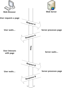
So here you are, ready to learn all about this thing called AJAX. But, what exactly is it? The term AJAX refers to a loose grouping of technologies that are used to create dynamic, interactive web content. The term AJAX, originally coined by Jesse J
 10 jQuery Fun and Games PluginsMar 08, 2025 am 12:42 AM
10 fun jQuery game plugins to make your website more attractive and enhance user stickiness! While Flash is still the best software for developing casual web games, jQuery can also create surprising effects, and while not comparable to pure action Flash games, in some cases you can also have unexpected fun in your browser. jQuery tic toe game The "Hello world" of game programming now has a jQuery version. Source code jQuery Crazy Word Composition Game This is a fill-in-the-blank game, and it can produce some weird results due to not knowing the context of the word. Source code jQuery mine sweeping game
 How do I create and publish my own JavaScript libraries?Mar 18, 2025 pm 03:12 PM
Article discusses creating, publishing, and maintaining JavaScript libraries, focusing on planning, development, testing, documentation, and promotion strategies.
 jQuery Parallax Tutorial - Animated Header BackgroundMar 08, 2025 am 12:39 AM
This tutorial demonstrates how to create a captivating parallax background effect using jQuery. We'll build a header banner with layered images that create a stunning visual depth. The updated plugin works with jQuery 1.6.4 and later. Download the
 Getting Started With Matter.js: IntroductionMar 08, 2025 am 12:53 AM
Matter.js is a 2D rigid body physics engine written in JavaScript. This library can help you easily simulate 2D physics in your browser. It provides many features, such as the ability to create rigid bodies and assign physical properties such as mass, area, or density. You can also simulate different types of collisions and forces, such as gravity friction. Matter.js supports all mainstream browsers. Additionally, it is suitable for mobile devices as it detects touches and is responsive. All of these features make it worth your time to learn how to use the engine, as this makes it easy to create a physics-based 2D game or simulation. In this tutorial, I will cover the basics of this library, including its installation and usage, and provide a
 Auto Refresh Div Content Using jQuery and AJAXMar 08, 2025 am 12:58 AM
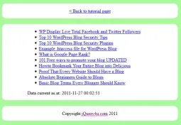
This article demonstrates how to automatically refresh a div's content every 5 seconds using jQuery and AJAX. The example fetches and displays the latest blog posts from an RSS feed, along with the last refresh timestamp. A loading image is optiona
 How do I optimize JavaScript code for performance in the browser?Mar 18, 2025 pm 03:14 PM
The article discusses strategies for optimizing JavaScript performance in browsers, focusing on reducing execution time and minimizing impact on page load speed.


Hot AI Tools

Undresser.AI Undress
AI-powered app for creating realistic nude photos

AI Clothes Remover
Online AI tool for removing clothes from photos.

Undress AI Tool
Undress images for free

Clothoff.io
AI clothes remover

AI Hentai Generator
Generate AI Hentai for free.

Hot Article

Hot Tools

Safe Exam Browser
Safe Exam Browser is a secure browser environment for taking online exams securely. This software turns any computer into a secure workstation. It controls access to any utility and prevents students from using unauthorized resources.

SublimeText3 Mac version
God-level code editing software (SublimeText3)

Atom editor mac version download
The most popular open source editor

PhpStorm Mac version
The latest (2018.2.1) professional PHP integrated development tool

VSCode Windows 64-bit Download
A free and powerful IDE editor launched by Microsoft


