 Web Front-end
 HTML Tutorial
 Improved hyperlink effects in web design and production_HTML/Xhtml_web page production
Improved hyperlink effects in web design and production_HTML/Xhtml_web page production
Hyperlinks allow visitors to jump from one page to another, or from one site to another. However, this frequent jump can make people anxious.
To help users browse with confidence, links should be absolutely clear and explicit.
To help users browse the page better, hyperlinks must be absolutely clear and explicit.
Principles
Principles
1. Text hyperlinks should be clearly distinguishable from normal text.
2. Any mouseover behavior should have a highlighting effect. 3.Hyperlink content should be as short as possible, yet long enough to identify either: The specific content of the hyperlink must be concise and concise (short and precise):
·
Where you'll go [ Jump Forward address
] · What you'll get [
What content do you want to get] · What you want to happen [Hope What effect
] 4. Hyperlinks with different targets should be clearly distinguishable. Hyperlinks pointing to different targets must be clearly distinguishable. 🎜>5. Hyperlinks should give an indication of any unanticipated consequences, e.g.: Explain the special situations that will occur after clicking a hyperlink, such as:
· Links to files [ Link to a file ]
· Links that open or close windows [ Clicking on the link will open or close the window ]
What do you make a link?
Think about the purpose of making this hyperlink
Hyperlink content example: Amapproved.com
Example of hyperlink content: Amapproved.com
A site for locating approved Aston Martins, and it's good on the whole. This is the search results screen. Guess how you get from search results to see the details on a particular vehicle? The only link is the vehicle model (in the Vehicle summary column).
This case is Aston Martins [Aston Martin] Car’s website. It can be said that its overall appearance design is classic. This is a search results display page. So now, imagine how you can access detailed information about the vehicle through search results. The only hyperlink here is about " in "Vehicle summary column [Vehicle basic list]" >vehicle model[Vehicle model]”.
The first, and biggest problem, is that you can't distinguish the hyperlinks, breaking Principle 1. You don't know where to click to get more information: you have to guess.
The biggest problem you face first is that you can’t tell which one is a hyperlink. This violates Law 1, which is: you don’t know where to click to get more information, so you have to think about it first

The second problem is: The links look the same although they point to completely different targets (each one is a different used Aston Martin). This breaks Principle 4. Because all the links on this page have the same content (the vehicle model), it's even less obvious that they might be the link. "
Aston Martin"), but they look almost the same, which violates the above rule 4; plus all The links all contain the same content (vehicle model [vehicle type]), which makes the hyperlink less obvious. If I click on "Aston Martin DB7 GT", I would expect to get general information about the Aston Martin DB7 GT car. This breaks Principle 3, because the link is not accurately describing what I'll get if I click it.
If I click on the link "
Aston Martin DB7 GT", I hope to get information about "Aston Martin DB7 General information about GT” type cars. However, I found a discrepancy between the information I ultimately obtained and the description of the link. Then, this violates the law 3. What should they do?
How should the website be improved? The "thing you get" is the information about a particular car. The thing that represents the particular car is the entire table row. There is no other unique identifier for the car (mileage, price etc. aren' t necessarily unique). Therefore, the whole row should be the clickable hyperlink. (It would also be helpful if the row changed color/tone on mouseover). "thing you get [The information you get]" should be related to a car Information that represents a specific model should occupy the entire table column; at the same time, because there is no confirmation object containing specific model information (such as mileage, price, etc.), the entire column of the table must be used as a clickable hyperlink object. (It will be easier to identify if the color change effect occurs when the mouse is moved over the hyperlink).
Expressing size in hyperlinks
Describes the size of hyperlink objects
It's quite common to find computers putting out this kind of information to set user's expectations when linking to a file:
When linking to a file, we usually find hyperlinks Include a description of the file size to help users decide whether to click on the file link.
For example: PDF (46,764 bytes)
Thinking about the user's goals, what they need is to know roughly how long the download will take: will it be a few seconds, or minutes? That's generally as accurate as it needs to be. Need to know how long the download will take: seconds, or minutes? Therefore, we should describe it as accurately as possible.
What should it be?
How should the above file size be described? There's no benefit at all in showing more than two significant figures in file sizes. Above should be 47KB. Also, only ever use kilobytes or megabytes for file sizes online. (Good, useful file sizes to 2 significant figures run: 4.7KB, 47KB, 470KB, 4.7MB etc.)
It is best to describe the file size in no more than two significant figures. The above file size should be written as
47KB. Therefore, whenever possible, files should be described on the web using kilobytes (kb) or megabytes (mb) . (Our recommended 2 digit description method is as follows: 4.7KB, 47KB, 470KB, 4.7MB, etc.) Formatting hyperlinks
Defining formats for hyperlinks
If we have to differentiate text hyperlinks from other text, should this be done with color or formatting such as underlining/emboldening? Blue hyperlink in grayscale: with and without underline.
If we have to differentiate text hyperlinks from other text, should this be done with color or formatting such as underlining/emboldening? We should use a different color for the hyperlink part than the normal text, or underline or bold the hyperlink text.
The de facto convention has been that hyperlinks are rendered in blue with underlines, that they turn red when clicked, and that visited links are purple.
The default hyperlink action corresponds The color changes are: initially, the hyperlink is blue and underlined; when clicked, it will turn red; visited hyperlinks will be displayed in purple.
The most readable way to render most text is black on a white background, and making text hyperlinks blue (#
#00f
 It's appropriate to ask if differentiating by color alone will work for people who are colourblind. The image above is a screen capture of this page, totally desaturated. It shows that, even without colour, there is sufficient tonal difference between black and blue to make the hyperlink clear. The underlined version is a little bit clearer, but showing underline on hover would serve a similar purpose.
Also you have to consider if you rely solely on color If the hyperlink status is changed to distinguish it, can the color blind people accept it? It’s best to ask them if they can identify the colors. The picture above is a screenshot of the page. From the picture above, you can see that even without using the color change effect of the hyperlink, the hyperlink can be clearly identified using only black and blue. Underlining a hyperlink will help users identify the hyperlink; or having an underline appear when the mouse passes over the hyperlink can achieve the same effect.
Should hypelinks be underlined? Should hyperlinks be underlined?
 Underlining works okay for occasional inline links.
It makes the link stand out a little more than color alone. To highlight the role of hyperlinks.
In this example, the underlining works well to distinguish article titles from the sub-title. level title.
I think underlining becomes unhelpful when there are numerous inline links in paragraphs, in lists of links, and when there are lots of sets of links on a page. If in paragraphs , there are too many hyperlinks in the link list or on the page, then underlining these links will not have any prominent effect.
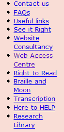
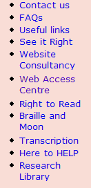
Here are a couple of examples of collections of hyperlinks, showing the original (underlined) and the same with underlines removed.
Comparison of the effects of the following two sets of hyperlinks. The hyperlink on the left contains underlines, while the hyperlinks on the right do not contain underlines, as follows:


Notice how it's quicker and easier to read the non-underlined blocks of text. for quick and easy reading.


In this second example, I have also adjusted the line spacing to make the related words clearer. to make it look clearer.
Consistency
Consistency
It is important that hyperlink formats behave consistently across pages.
It is also important that hyperlink formats behave consistently across pages.
Obviously, where some text links are on different backgrounds, such as in navigation bars, they may need to use special colors or treatments.
Obviously, when the hyperlink is on a different background, such as inside the navigation bar, then we will use special colors and effects for it.

The above snippets are taken from the Guardian Online homepage
The above snippets are taken from the Guardian Online ’s home page.
While most links look similar (#036, mainly not underlined, there are several very different styles applied on the hover, when the mouse pointer moves over the active link.
above The hyperlink format looks basically the same (font color #036, the hyperlink is basically not underlined, and the effects produced when the mouse passes over the hyperlink are different). >
The psychological effect is disconcerting: you are left doubting whether all links will do similar things (i.e. go to another page on this site), or whether you might be taken unexpectedly somewhere else. I think that this schizophrenic behavior weakens the brand experience, as well as diminishing usability.
From a psychological point of view, such effect processing will make people feel uneasy; at the same time, you will have doubts about it: whether the link used This is all true (including other pages); does it link to an unexpected place? I believe that this schizophrenic approach will weaken users' image of the site's brand and, at the same time, make the site less usable.
There is no good reason to treat all the hyperlinks differently. The third example also breaks the second principle, because its color change makes it weaker, less noticeable, which is not 'highlighting'.
We cannot use different effects for all hyperlinks. The third case above violates the second rule; because different color changes make the super unfocused and cannot play a prominent role at all
Conclusion
Conclusion
On balance, it seems that the predominant convention in the industry is to keep #00f
I think that this provides the best balance of functionality when applied consistently to inline hyperlinks and grouped hyperlinks. The same effect variation can maintain the best balance in its functionality.
 What is the difference between an HTML tag and an HTML attribute?May 14, 2025 am 12:01 AM
HTMLtagsdefinethestructureofawebpage,whileattributesaddfunctionalityanddetails.1)Tagslike,,andoutlinethecontent'splacement.2)Attributessuchassrc,class,andstyleenhancetagsbyspecifyingimagesources,styling,andmore,improvingfunctionalityandappearance.
 The Future of HTML: Evolution and TrendsMay 13, 2025 am 12:01 AM
The future of HTML will develop in a more semantic, functional and modular direction. 1) Semanticization will make the tag describe the content more clearly, improving SEO and barrier-free access. 2) Functionalization will introduce new elements and attributes to meet user needs. 3) Modularity will support component development and improve code reusability.
 Why are HTML attributes important for web development?May 12, 2025 am 12:01 AM
HTMLattributesarecrucialinwebdevelopmentforcontrollingbehavior,appearance,andfunctionality.Theyenhanceinteractivity,accessibility,andSEO.Forexample,thesrcattributeintagsimpactsSEO,whileonclickintagsaddsinteractivity.Touseattributeseffectively:1)Usese
 What is the purpose of the alt attribute? Why is it important?May 11, 2025 am 12:01 AM
The alt attribute is an important part of the tag in HTML and is used to provide alternative text for images. 1. When the image cannot be loaded, the text in the alt attribute will be displayed to improve the user experience. 2. Screen readers use the alt attribute to help visually impaired users understand the content of the picture. 3. Search engines index text in the alt attribute to improve the SEO ranking of web pages.
 HTML, CSS, and JavaScript: Examples and Practical ApplicationsMay 09, 2025 am 12:01 AM
The roles of HTML, CSS and JavaScript in web development are: 1. HTML is used to build web page structure; 2. CSS is used to beautify the appearance of web pages; 3. JavaScript is used to achieve dynamic interaction. Through tags, styles and scripts, these three together build the core functions of modern web pages.
 How do you set the lang attribute on the tag? Why is this important?May 08, 2025 am 12:03 AM
Setting the lang attributes of a tag is a key step in optimizing web accessibility and SEO. 1) Set the lang attribute in the tag, such as. 2) In multilingual content, set lang attributes for different language parts, such as. 3) Use language codes that comply with ISO639-1 standards, such as "en", "fr", "zh", etc. Correctly setting the lang attribute can improve the accessibility of web pages and search engine rankings.
 What is the purpose of HTML attributes?May 07, 2025 am 12:01 AM
HTMLattributesareessentialforenhancingwebelements'functionalityandappearance.Theyaddinformationtodefinebehavior,appearance,andinteraction,makingwebsitesinteractive,responsive,andvisuallyappealing.Attributeslikesrc,href,class,type,anddisabledtransform
 How do you create a list in HTML?May 06, 2025 am 12:01 AM
TocreatealistinHTML,useforunorderedlistsandfororderedlists:1)Forunorderedlists,wrapitemsinanduseforeachitem,renderingasabulletedlist.2)Fororderedlists,useandfornumberedlists,customizablewiththetypeattributefordifferentnumberingstyles.


Hot AI Tools

Undresser.AI Undress
AI-powered app for creating realistic nude photos

AI Clothes Remover
Online AI tool for removing clothes from photos.

Undress AI Tool
Undress images for free

Clothoff.io
AI clothes remover

Video Face Swap
Swap faces in any video effortlessly with our completely free AI face swap tool!

Hot Article

Hot Tools

Dreamweaver Mac version
Visual web development tools

SublimeText3 Mac version
God-level code editing software (SublimeText3)

WebStorm Mac version
Useful JavaScript development tools

Atom editor mac version download
The most popular open source editor

DVWA
Damn Vulnerable Web App (DVWA) is a PHP/MySQL web application that is very vulnerable. Its main goals are to be an aid for security professionals to test their skills and tools in a legal environment, to help web developers better understand the process of securing web applications, and to help teachers/students teach/learn in a classroom environment Web application security. The goal of DVWA is to practice some of the most common web vulnerabilities through a simple and straightforward interface, with varying degrees of difficulty. Please note that this software


