Home >Web Front-end >HTML Tutorial >The problem that form elements and prompt text cannot be aligned_HTML/Xhtml_Web page production
The problem that form elements and prompt text cannot be aligned_HTML/Xhtml_Web page production
- PHP中文网Original
- 2016-05-16 16:42:412081browse
In many website pages involving forms, there is a problem that the form elements and the prompt text cannot be aligned. So I decided to study this issue.
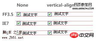
Recent projects involve the production of many forms, especially checkboxes and radios. However, during the front-end development process, it was discovered that the single (multiple) check boxes and the prompt text behind them cannot be aligned without any settings, and there is a big difference between Firefox and IE. Even if vertical-align:middle is set, it is still not perfectly aligned. As shown in the picture below:
So I checked some websites online and found that this problem is common, as shown in the picture below (FF3.5):
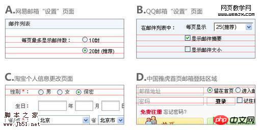
In many website pages involving forms, there is a problem that the form elements and the prompt text cannot be aligned. So I decided to study this issue. First of all, I searched for senior wheatlee's article "Everyone has different opinions on vertical-align". In his article, wheatlee mentioned the following key points about vertical centering:
1. When vertical-align:middle is used, the center of the element is aligned with the center of the surrounding elements.
2. The definition of "center" here is: the picture is of course half the height, and the text should be moved upward 0.5ex based on the baseline, which is the exact center of the lowercase letter "x". However, many browsers often define the unit of ex as 0.5em, so that it is not necessarily the exact center of When I encountered a problem, the first thing I thought of was to verify whether the browser used the same rules for rendering "checkboxes" and images (whether it treated the checkbox as a square image). So I wrote the following code:
<style>
body{font-size:12px;}
</style>
<input style="vertical-align:middle;" name="test" type="checkbox">
<img style="vertical-align:middle;"  src="testpic.gif" />
Test text
The testpic.gif in the code is a black color that is exactly the same size as the check box picture. The display under FF3.5 is as follows:

It turns out that FF3.5 has a problem with the vertical alignment of check boxes and pictures. It is rendered using the same rules, that is, the check box is treated as a square picture (IE is not). According to wheatlee's point of view "when middle, the center of the element is aligned with the center of the surrounding elements", if I enter English characters after the check box, then the center of the check box will be aligned with the center of the lowercase letter x in English. After testing, FF3.5 is basically like this (there will be a certain error in some font sizes, for example, if the font height is an even number, then the center point is sometimes 1px above the general point, sometimes 1px below the half) . As shown in the picture:
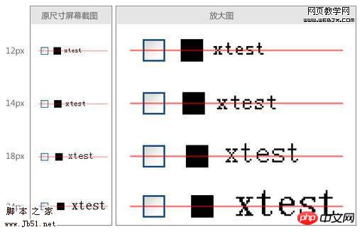 But this is not a good result for Chinese. Because Chinese is a square font, and with the same font size, the height will be much higher than the lowercase x. Therefore, according to the built-in method of the browser, only using vertical-align:middle cannot align Chinese in any case (whether it is only writing Chinese, Chinese first, English first, FF3.5 is based on the lowercase x center method to align). But looking back at wheatlee's article, he said that this lowercase x center-aligned rendering method is for "text". So what if it’s not words…? What would happen if the checkbox is followed by an inline element, such as a label, and the text is written inside it? Will the browser regard this inline element as a "block" and render it according to rules similar to images? If that's the case, we'll have achieved our goal.
But after testing, unfortunately, this is not the case. There is no difference between adding the label and not adding it. This is true for FF3.5/IE6/IE7. Using firebug in FF3.5, it proves that the browser does not align the center point according to the height value of the label. As shown in the picture:
 If you follow the previous assumptions, the red and blue lines should overlap. But the current situation is that they are 1px different. And this 1px is irregular. As the font size is enlarged, it is not constant. It seems that it is not easy to extract the corresponding relationship. So I thought, try adding vertical-align:middle to the label again. The result is as shown below:
Under FF3.5 and IE7, it is very close to the state we want, only 1px missing. Under IE6... I am speechless.
After the above tossing, I came to the same conclusion as wheatlee, that is, there seems to be no pattern in how various browsers handle this problem. Moreover, it seems that every browser's rendering of vertical-align:middle does not fully comply with what the W3C says "Align the vertical midpoint of the box with the baseline of the parent box plus half the x-height of the parent."
But after careful summary and analysis, it seems that the final alignment result is related to the height of the label and the center point of the lowercase x in the current font. Both of them affect the rendering result at the same time (although I don’t understand why this is the case) ). So, now that the current situation is very close to the desired state, is it possible to change the position of the center point of the lowercase x by setting the font, and then "fine-tune" the vertical alignment result?
In the end, through continuous testing, I found that if the first font in the font-family is set to Tahoma, the alignment can be achieved perfectly (fonts such as Verdana can also be used). And it displays normally in FF3.5/IE6/IE7/IE8 and Chrome. The final code is as follows:
Tip: You can modify part of the code before running
Final effect:
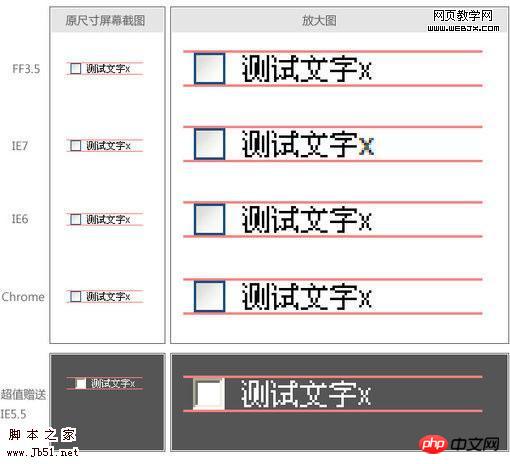
At this point, the problem of alignment of the checkbox and the prompt text has been solved, but what about other form elements? I tested the radio button and found that there was still a problem. The prompt text is still upward. I checked it with firebug and found that the radio element has a left margin of 5px and a top and right margin of 3px by default, but no bottom margin. As shown in the picture:

So, I tried to remove the margins of the radio, and the display was normal after refreshing. (In fact, the checkbox also has margins, but its margins are in four directions and are equal, so it has no effect on vertical alignment.) The following picture is the final display effect and final code of some commonly used form elements. Everyone You can use different browsers to see the actual effect (Note: Since the 12px Chinese text used in the demonstration is actually only 11px high, while the height of text boxes and other elements under IE is 22px, one is an odd number and the other is an even number, so these parts are in IE The center is not aligned anyway, with a difference of 1px. If the height of the text box is manually controlled to an odd number, or the text is set to an even height, the display will be normal):

Tip: You can modify part of the code before running
And I found that not only did the Chinese problem be solved, but if the prompt information is changed to other languages, it can basically be aligned, at least it will not shift too much like at the beginning. Here are screenshots, code and some examples:

Tip: You can modify part of the code first and then run
At this point, my research process comes to an end. However, I still can’t figure out why each browser displays such an effect in the end, and what is the principle behind it. Can you guys explain it when you have time?
The above is the problem of form elements and prompt text not being aligned_HTML/Xhtml_webpage production content. For more related content, please pay attention to the PHP Chinese website (www.php.cn)!

