
- Gemeinschaft
- Lernen
- Tools-Bibliothek
- Freizeit
Heim > Fragen und Antworten > Hauptteil
今天刚刚碰到的 hr要求一个半小时完成
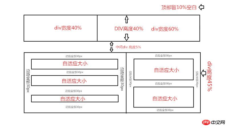
要求p自适应大小
边距都是30px,剩下的p全部自适应屏幕 如果有根据屏幕大小自动变化CSS样式的更好
要求已经写在图上了 有没有萌新前来练手

PHP中文网2017-04-17 14:58:04
<style type="text/css">
<!--
            html,body {
                height: 100%;
            }
            body,
            body * {
                margin: 0;
                padding: 0;
            }
            p {
                box-sizing: border-box;
                -webkit-box-sizing: border-box;
                border: 1px solid #333;
            }
            .header_left,
            .header_right {
                height: 40%;
                float: left;
                margin-top: 10%;
            }
            .header_left {
                width: 40%;
            }
            .header_right {
                width: 60%;
                border-left-style: none;
            }
            .clear {
                clear: both;
                border: none;
            }
            .main {
                margin-top: 5%;
                height: 45%;
                color: red;
                text-align: center;
            }
            .main_left,
            .main_right {
                float: left;
                width: 60%;
                height: 100%;
                border: none;
            }
            .main_right {
                width: 40%;
                border-left: 1px solid #333;
            }
        .main_left_top,
        .main_left_middle,
        .main_left_bottom,
        .main_right_top,
        .main_right_bottom {
         margin: 30px;
        }
-->
        </style>
    <p class="header_left"></p><p class="header_right"></p><p class="clear"></p>
    <p class="main"><p class="main_left">
        <p class="main_left_top">随着内容适应大小</p>
        <p class="main_left_top">随着内容适应大小</p>
        <p class="main_left_bottom">随着内容适应大小</p>
    </p><p class="main_right">
        <p class="main_right_top">随着内容适应大小</p>
        <p class="main_right_bottom">随着内容适应大小</p>
        </p>
        <p class="clear"></p>
    </p>

