
Heim >Web-Frontend >CSS-Tutorial >So zeichnen Sie grundlegende Cartoon-Muster mit HTML und CSS3
So zeichnen Sie grundlegende Cartoon-Muster mit HTML und CSS3

- 不言Original
- 2018-06-20 17:30:082789Durchsuche
In diesem Artikel wird hauptsächlich das Teilen von Beispielen für die Verwendung von CSS3 zum Zeichnen grundlegender Cartoon-Muster vorgestellt. Es muss jedoch zugegeben werden, dass die dafür erforderliche Codemenge nicht sehr gering ist ... nun, Freunde in Not können sich darauf beziehen
Reines HTML+CSS implementiert die Astro Boy-Statue
Hier ist zunächst das endgültige Rendering: 
Darin werden hauptsächlich mehrere Eigenschaften in CSS verwendet: Position – Positionierung; Randradius – Abgerundete Ecken; Gehen wir direkt zum endgültigen Quellcode. Aufgrund der Berücksichtigung der Browser-CSS-Kompatibilität gibt es viel Code.
<!DOCTYPE html>
<html xmlns="http://www.w3.org/1999/xhtml">
<head>
<meta content="text/html; charset=utf-8" http-equiv="Content-Type" />
<title>纯CSS漫画</title>
<style type="text/css">
* {
margin: 0;
padding: 0;
}
.outer-circle {
position: absolute;
top: 32px;
left: 44px;
width: 289px;
height: 289px;
border: 4px solid #75BD4F;
-moz-border-radius: 50%;
-webkit-border-radius: 50%;
border-radius: 50%;
}
.inner-circle {
position: relative;
width: 269px;
height: 269px;
border: 10px solid #F5F910;
-moz-border-radius: 50%;
-webkit-border-radius: 50%;
border-radius: 50%;
background-color: #73BF43;
}
.inner-circle p {
position: absolute;
}
.inner-circle-light {
top: 41px;
left: 35px;
-moz-box-shadow: 26px 26px 29px 37px #fff;
-webkit-box-shadow: 26px 26px 29px 37px #fff;
box-shadow: 26px 26px 29px 37px #fff;
}
.header-top {
top: 11px;
rightright: 2px;
z-index: 100;
width: 180px;
height: 90px;
-moz-border-radius: 90px 90px 0 0;
-webkit-border-radius: 90px 90px 0 0;
border-radius: 90px 90px 0 0;
background-color: #000;
-moz-transform: rotate(32deg);
-ms-transform: rotate(32deg);
-o-transform: rotate(32deg);
-webkit-transform: rotate(32deg);
transform: rotate(32deg);
}
.header-left {
top: -20px;
left: 37px;
width: 114px;
height: 228px;
-moz-border-radius: 228px 0 0 228px;
-webkit-border-radius: 228px 0 0 228px;
border-radius: 228px 0 0 228px;
background-color: #000;
-moz-transform: rotate(26deg);
-ms-transform: rotate(26deg);
-o-transform: rotate(26deg);
-webkit-transform: rotate(26deg);
transform: rotate(26deg);
}
.hair-left-1 {
top: 15px;
left: 53px;
z-index: 55;
width: 85px;
height: 23px;
-webkit-border-top-left-radius: 30px 180px;
border-top-left-radius: 30px 180px;
-webkit-border-bottom-left-radius: 30px 80px;
border-bottom-left-radius: 30px 80px;
background-color: #000;
-moz-transform: rotate(-74deg) skew(-42deg, 23deg);
-ms-transform: rotate(-74deg) skew(-42deg, 23deg);
-o-transform: rotate(-74deg) skew(-42deg, 23deg);
-webkit-transform: rotate(-74deg) skew(-42deg, 23deg);
transform: rotate(-74deg) skew(-42deg, 23deg);
}
.hair-left-2 {
top: -20px;
left: 99px;
z-index: 60;
width: 49px;
height: 37px;
background-color: #000;
-moz-transform: rotate(-51deg) skew(-43deg, 0deg);
-ms-transform: rotate(-51deg) skew(-43deg, 0deg);
-o-transform: rotate(-51deg) skew(-43deg, 0deg);
-webkit-transform: rotate(-51deg) skew(-43deg, 0deg);
transform: rotate(-51deg) skew(-43deg, 0deg);
}
.hair-rightright-1 {
top: 70px;
rightright: 1px;
z-index: 60;
width: 81px;
height: 85px;
-webkit-border-top-rightright-radius: 26px 120px;
border-top-rightright-radius: 26px 120px;
background-color: black;
-moz-transform: rotate(1deg) skew(-51deg, 0deg);
-ms-transform: rotate(1deg) skew(-51deg, 0deg);
-o-transform: rotate(1deg) skew(-51deg, 0deg);
-webkit-transform: rotate(1deg) skew(-51deg, 0deg);
transform: rotate(1deg) skew(-51deg, 0deg);
}
.hair-rightright-2 {
width: 60px;
height: 10px;
-webkit-border-bottom-left-radius: 100%;
border-bottom-left-radius: 100%;
background-color: rgba(0,0,0,0.2);
}
.hair-light-1 {
top: 30px;
rightright: 45px;
z-index: 105;
width: 57px;
height: 17px;
-moz-border-radius: 100%;
-webkit-border-radius: 100%;
border-radius: 100%;
background-color: white;
-moz-transform: rotate(39deg);
-ms-transform: rotate(39deg);
-o-transform: rotate(39deg);
-webkit-transform: rotate(39deg);
transform: rotate(39deg);
}
.hair-light-1-over {
top: 32px;
rightright: 38px;
z-index: 105;
width: 83px;
height: 21px;
-moz-border-radius: 100%;
-webkit-border-radius: 100%;
border-radius: 100%;
background-color: black;
-moz-transform: rotate(41deg);
-ms-transform: rotate(41deg);
-o-transform: rotate(41deg);
-webkit-transform: rotate(41deg);
transform: rotate(41deg);
}
.hair-light-2 {
top: 16px;
rightright: 104px;
z-index: 105;
width: 4px;
height: 2px;
-moz-border-radius: 2px;
-webkit-border-radius: 2px;
border-radius: 2px;
background-color: white;
-moz-transform: rotate(10deg);
-ms-transform: rotate(10deg);
-o-transform: rotate(10deg);
-webkit-transform: rotate(10deg);
transform: rotate(10deg);
}
.ear {
top: 141px;
rightright: 36px;
z-index: 110;
width: 49px;
height: 48px;
border: 2px solid #000;
border-bottom-width: 1px;
-moz-border-radius: 50%;
-webkit-border-radius: 50%;
border-radius: 50%;
background-color: #F6C6B0;
-moz-box-shadow: -4px 0 0 0 #de9876 inset;
-webkit-box-shadow: -4px 0 0 0 #de9876 inset;
box-shadow: -4px 0 0 0 #de9876 inset;
-moz-transform: rotate(56deg) scaleY(1.4);
-ms-transform: rotate(56deg) scaleY(1.4);
-o-transform: rotate(56deg) scaleY(1.4);
-webkit-transform: rotate(56deg) scaleY(1.4);
transform: rotate(56deg) scaleY(1.4);
}
.ear-inner-1 {
top: 22px;
left: 22px;
z-index: 70;
width: 9px;
height: 5px;
border-top: 1px solid #110b00;
-moz-border-radius: 50%;
-webkit-border-radius: 50%;
border-radius: 50%;
-moz-transform: rotate(-6deg);
-ms-transform: rotate(-6deg);
-o-transform: rotate(-6deg);
-webkit-transform: rotate(-6deg);
transform: rotate(-6deg);
}
.ear-inner-2 {
top: 19px;
left: 18px;
width: 14px;
height: 7px;
border-top: 2px solid #110b00;
-moz-border-radius: 50%;
-webkit-border-radius: 50%;
border-radius: 50%;
-moz-box-shadow: 0px 2px 0 0 #de9876 inset;
-webkit-box-shadow: 0px 2px 0 0 #de9876 inset;
box-shadow: 0px 2px 0 0 #de9876 inset;
-moz-transform: rotate(-91deg);
-ms-transform: rotate(-91deg);
-o-transform: rotate(-91deg);
-webkit-transform: rotate(-91deg);
transform: rotate(-91deg);
}
.ear-light {
top: 21px;
rightright: 34px;
z-index: 105;
width: 17px;
height: 6px;
-moz-border-radius: 100%;
-webkit-border-radius: 100%;
border-radius: 100%;
background-color: #FFF;
-moz-transform: rotate(89deg);
-ms-transform: rotate(89deg);
-o-transform: rotate(89deg);
-webkit-transform: rotate(89deg);
transform: rotate(89deg);
}
.ear-over {
bottombottom: -44px;
left: -33px;
z-index: 55;
width: 69px;
height: 59px;
-moz-border-radius: 50%;
-webkit-border-radius: 50%;
border-radius: 50%;
background-color: #f6c6b0;
-moz-transform: rotate(26deg);
-ms-transform: rotate(26deg);
-o-transform: rotate(26deg);
-webkit-transform: rotate(26deg);
transform: rotate(26deg);
}
.face-main {
top: 30px;
left: 35px;
z-index: 50;
width: 180px;
height: 188px;
-moz-border-radius: 90px;
-webkit-border-radius: 90px;
border-radius: 90px;
background-color: #F6C6B0;
-moz-box-shadow: 3px -3px 0 0 #fff inset;
-webkit-box-shadow: 3px -3px 0 0 #fff inset;
box-shadow: 3px -3px 0 0 #fff inset;
}
.face-top {
top: 61px;
rightright: 75px;
z-index: 105;
width: 111px;
height: 46px;
-moz-border-radius: 50% 50% 26px 0;
-webkit-border-radius: 50% 50% 26px 0;
border-radius: 50% 50% 26px 0;
background-color: #f6c6b0;
-moz-transform: rotate(37deg);
-ms-transform: rotate(37deg);
-o-transform: rotate(37deg);
-webkit-transform: rotate(37deg);
transform: rotate(37deg);
}
.face-rightright-1 {
top: 115px;
rightright: 71px;
z-index: 105;
width: 68px;
height: 62px;
-moz-border-radius: 100% 0 0;
-webkit-border-radius: 100% 0 0;
border-radius: 100% 0 0;
background-color: #f6c6b0;
-moz-transform: rotate(99deg);
-ms-transform: rotate(99deg);
-o-transform: rotate(99deg);
-webkit-transform: rotate(99deg);
transform: rotate(99deg);
}
.face-bottombottom-1 {
bottombottom: 42px;
left: 45px;
z-index: 40;
width: 72px;
height: 52px;
-webkit-border-bottom-left-radius: 70px 40px;
-webkit-border-top-left-radius: 14px 11px;
border-top-left-radius: 14px 11px;
border-bottom-left-radius: 70px 40px;
background-color: #000;
}
.face-bottombottom-1-over {
bottombottom: 45px;
left: 48px;
z-index: 55;
width: 69px;
height: 47px;
-webkit-border-bottom-left-radius: 70px 40px;
-webkit-border-top-left-radius: 14px 11px;
border-top-left-radius: 14px 11px;
border-bottom-left-radius: 70px 40px;
background-color: #f6c6b0;
-moz-box-shadow: 3px 0px 0 0 #fff inset;
-webkit-box-shadow: 3px 0px 0 0 #fff inset;
box-shadow: 3px 0px 0 0 #fff inset;
}
.face-bottombottom-2 {
rightright: 97px;
bottombottom: 44px;
z-index: 55;
width: 43px;
height: 31px;
-webkit-border-bottom-rightright-radius: 70px 40px;
border-bottom-rightright-radius: 70px 40px;
background-color: #000;
-moz-transform: rotate(-4deg) skew(-49deg, 0deg);
-ms-transform: rotate(-4deg) skew(-49deg, 0deg);
-o-transform: rotate(-4deg) skew(-49deg, 0deg);
-webkit-transform: rotate(-4deg) skew(-49deg, 0deg);
transform: rotate(-4deg) skew(-49deg, 0deg);
}
.face-bottombottom-2-over {
rightright: 99px;
bottombottom: 46px;
z-index: 56;
width: 43px;
height: 31px;
-webkit-border-bottom-rightright-radius: 70px 40px;
border-bottom-rightright-radius: 70px 40px;
background-color: #f6c6b0;
-moz-box-shadow: -6px 2px 0 0 #de9876 inset;
-webkit-box-shadow: -6px 2px 0 0 #de9876 inset;
box-shadow: -6px 2px 0 0 #de9876 inset;
-moz-transform: rotate(-3deg) skew(-49deg, 0deg);
-ms-transform: rotate(-3deg) skew(-49deg, 0deg);
-o-transform: rotate(-3deg) skew(-49deg, 0deg);
-webkit-transform: rotate(-3deg) skew(-49deg, 0deg);
transform: rotate(-3deg) skew(-49deg, 0deg);
}
.face-light-1 {
rightright: 127px;
bottombottom: 95px;
z-index: 150;
width: 6px;
height: 6px;
-moz-border-radius: 50%;
-webkit-border-radius: 50%;
border-radius: 50%;
background-color: #fff;
}
.face-light-2 {
bottombottom: 82px;
left: 58px;
z-index: 150;
width: 4px;
height: 4px;
-moz-border-radius: 50%;
-webkit-border-radius: 50%;
border-radius: 50%;
background-color: #fff;
}
.chin {
bottombottom: 39px;
left: 111px;
z-index: 70;
width: 11px;
height: 12px;
border: 2px solid #000;
border-top-color: #f6c6b0;
border-left-color: #f6c6b0;
-webkit-border-bottom-rightright-radius: 6px;
border-bottom-rightright-radius: 6px;
background-color: #f6c6b0;
-moz-transform: rotate(34deg) skew(-9deg, 0deg);
-ms-transform: rotate(34deg) skew(-9deg, 0deg);
-o-transform: rotate(34deg) skew(-9deg, 0deg);
-webkit-transform: rotate(34deg) skew(-9deg, 0deg);
transform: rotate(34deg) skew(-9deg, 0deg);
}
.eye-rightright {
top: 97px;
left: 103px;
z-index: 110;
width: 39px;
height: 67px;
border: 1px solid #000;
border-top-width: 2px;
-moz-border-radius: 24px 43px 34px 28px / 34px 71px 34px 81px;
-webkit-border-radius: 24px 43px 34px 28px / 34px 71px 34px 81px;
border-radius: 24px 43px 34px 28px / 34px 71px 34px 81px;
background-color: #F8FAF7;
-moz-box-shadow: 0px 5px 0 0 #d5d9e2 inset;
-webkit-box-shadow: 0px 5px 0 0 #d5d9e2 inset;
box-shadow: 0px 5px 0 0 #d5d9e2 inset;
}
.eye-rightright-inner {
rightright: 0;
bottombottom: 3px;
z-index: 115;
width: 30px;
height: 52px;
-moz-border-radius: 32px 43px 28px 48px / 47px 55px 45px 75px;
-webkit-border-radius: 32px 43px 28px 48px / 47px 55px 45px 75px;
border-radius: 32px 43px 28px 48px / 47px 55px 45px 75px;
background-color: #000;
}
.eye-rightright-light1 {
top: 19px;
rightright: 0;
z-index: 120;
width: 19px;
height: 10px;
-moz-border-radius: 100%;
-webkit-border-radius: 100%;
border-radius: 100%;
background-color: #FFF;
-moz-animation: eye-flash 0.2s linear 0.1s infinite normal;
-o-animation: eye-flash 0.2s linear 0.1s infinite normal;
-webkit-animation: eye-flash 0.2s linear 0.1s infinite normal;
-moz-transform: rotate(41deg);
-ms-transform: rotate(41deg);
-o-transform: rotate(41deg);
-webkit-transform: rotate(41deg);
transform: rotate(41deg);
animation: eye-flash 0.2s linear 0.1s infinite normal;
}
@-webkit-keyframes eye-flash {
0% {
top: 19px;
}
100% {
top: 21px;
}
}
@-moz-keyframes eye-flash {
0% {
top: 19px;
}
100% {
top: 20px;
}
}
@-ms-keyframes eye-flash {
0% {
top: 19px;
}
100% {
top: 20px;
}
}
@keyframes eye-flash {
0% {
top: 19px;
}
100% {
top: 20px;
}
}
.eye-rightright-light2 {
bottombottom: 8px;
left: 9px;
z-index: 120;
width: 14px;
height: 7px;
-webkit-border-bottom-rightright-radius: 100%;
border-bottom-rightright-radius: 100%;
background-color: #FFF;
-moz-transform: rotate(-39deg);
-ms-transform: rotate(-39deg);
-o-transform: rotate(-39deg);
-webkit-transform: rotate(-39deg);
transform: rotate(-39deg);
}
.eye-rightright-eyelash1 {
top: 9px;
left: -3px;
width: 2px;
height: 4px;
background-color: #000;
-moz-transform: rotate(-54deg);
-ms-transform: rotate(-54deg);
-o-transform: rotate(-54deg);
-webkit-transform: rotate(-54deg);
transform: rotate(-54deg);
}
.eye-rightright-eyelash2 {
top: 1px;
left: 1px;
width: 2px;
height: 5px;
background-color: #000;
-moz-transform: rotate(-33deg);
-ms-transform: rotate(-33deg);
-o-transform: rotate(-33deg);
-webkit-transform: rotate(-33deg);
transform: rotate(-33deg);
}
.eye-rightright-eyelash3 {
top: -8px;
left: 8px;
width: 2px;
height: 7px;
background-color: #000;
-moz-transform: rotate(-21deg);
-ms-transform: rotate(-21deg);
-o-transform: rotate(-21deg);
-webkit-transform: rotate(-21deg);
transform: rotate(-21deg);
}
.eye-rightright-eyelash4 {
top: -6px;
left: 21px;
width: 2px;
height: 6px;
background-color: #000;
-moz-transform: rotate(11deg);
-ms-transform: rotate(11deg);
-o-transform: rotate(11deg);
-webkit-transform: rotate(11deg);
transform: rotate(11deg);
}
.eye-rightright-eyelash5 {
top: 1px;
rightright: 8px;
width: 2px;
height: 6px;
background-color: #000;
-moz-transform: rotate(14deg);
-ms-transform: rotate(14deg);
-o-transform: rotate(14deg);
-webkit-transform: rotate(14deg);
transform: rotate(14deg);
}
.eye-left {
top: 114px;
left: 45px;
z-index: 110;
width: 19px;
height: 63px;
border: 1px solid #000;
border-top-width: 2px;
-moz-border-radius: 29px 28px 33px / 97px 111px 40px 90px;
-webkit-border-radius: 29px 28px 33px / 97px 111px 40px 90px;
border-radius: 29px 28px 33px / 97px 111px 40px 90px;
background-color: #F8FAF7;
-moz-box-shadow: 0px 6px 0 0 #d5d9e2 inset;
-webkit-box-shadow: 0px 6px 0 0 #d5d9e2 inset;
box-shadow: 0px 6px 0 0 #d5d9e2 inset;
-moz-transform: rotate(-9deg);
-ms-transform: rotate(-9deg);
-o-transform: rotate(-9deg);
-webkit-transform: rotate(-9deg);
transform: rotate(-9deg);
}
.eye-left-inner {
rightright: 0;
bottombottom: 1px;
z-index: 115;
width: 15px;
height: 46px;
-moz-border-radius: 49px 44px 29px 58px / 143px 83px 45px 122px;
-webkit-border-radius: 49px 44px 29px 58px / 143px 83px 45px 122px;
border-radius: 49px 44px 29px 58px / 143px 83px 45px 122px;
background-color: #000;
}
.eye-left-light1 {
top: 19px;
rightright: 1px;
z-index: 120;
width: 7px;
height: 18px;
-moz-border-radius: 100%;
-webkit-border-radius: 100%;
border-radius: 100%;
background-color: #FFF;
-moz-animation: eye-flash 0.2s linear 0.1s infinite normal;
-o-animation: eye-flash 0.2s linear 0.1s infinite normal;
-webkit-animation: eye-flash 0.2s linear 0.1s infinite normal;
-moz-transform: rotate(-9deg);
-ms-transform: rotate(-9deg);
-o-transform: rotate(-9deg);
-webkit-transform: rotate(-9deg);
transform: rotate(-9deg);
animation: eye-flash 0.2s linear 0.1s infinite normal;
}
.eye-left-light2 {
bottombottom: 6px;
left: 4px;
z-index: 120;
width: 11px;
height: 4px;
-webkit-border-bottom-rightright-radius: 100%;
border-bottom-rightright-radius: 100%;
background-color: #FFF;
-moz-transform: rotate(-45deg);
-ms-transform: rotate(-45deg);
-o-transform: rotate(-45deg);
-webkit-transform: rotate(-45deg);
transform: rotate(-45deg);
}
.eye-left-eyelash1 {
top: 7px;
left: -1px;
width: 2px;
height: 4px;
background-color: #000;
-moz-transform: rotate(-49deg);
-ms-transform: rotate(-49deg);
-o-transform: rotate(-49deg);
-webkit-transform: rotate(-49deg);
transform: rotate(-49deg);
}
.eye-left-eyelash2 {
top: -1px;
left: 2px;
width: 2px;
height: 5px;
background-color: #000;
-moz-transform: rotate(-28deg);
-ms-transform: rotate(-28deg);
-o-transform: rotate(-28deg);
-webkit-transform: rotate(-28deg);
transform: rotate(-28deg);
}
.eye-left-eyelash3 {
top: -6px;
left: 7px;
width: 2px;
height: 5px;
background-color: #000;
-moz-transform: rotate(-4deg);
-ms-transform: rotate(-4deg);
-o-transform: rotate(-4deg);
-webkit-transform: rotate(-4deg);
transform: rotate(-4deg);
}
.eye-left-eyelash4 {
top: -4px;
left: 13px;
width: 2px;
height: 4px;
background-color: #000;
-moz-transform: rotate(25deg);
-ms-transform: rotate(25deg);
-o-transform: rotate(25deg);
-webkit-transform: rotate(25deg);
transform: rotate(25deg);
}
.eye-left-eyelash5 {
top: 3px;
rightright: 0;
width: 2px;
height: 4px;
background-color: #000;
-moz-transform: rotate(41deg);
-ms-transform: rotate(41deg);
-o-transform: rotate(41deg);
-webkit-transform: rotate(41deg);
transform: rotate(41deg);
}
.rightright-eyebrow {
top: 68px;
left: 92px;
z-index: 110;
width: 66px;
height: 36px;
border: 2px solid #000;
border-width: 2px 1px 0px 1px;
-moz-border-radius: 45px 51px 0 0;
-webkit-border-radius: 45px 51px 0 0;
border-radius: 45px 51px 0 0;
background-color: transparent;
-moz-transform: skew(-6deg, 16deg);
-ms-transform: skew(-6deg, 16deg);
-o-transform: skew(-6deg, 16deg);
-webkit-transform: skew(-6deg, 16deg);
transform: skew(-6deg, 16deg);
}
.rightright-eyebrow-over {
top: 21px;
rightright: -5px;
z-index: 115;
width: 13px;
height: 20px;
background-color: #f6c6b0;
}
.left-eyebrow {
top: 89px;
left: 36px;
z-index: 100;
width: 30px;
height: 68px;
border: 2px solid #000;
border-width: 2px 1px 0px 1px;
-moz-border-radius: 100%;
-webkit-border-radius: 100%;
border-radius: 100%;
background-color: transparent;
-moz-transform: rotate(-2deg);
-ms-transform: rotate(-2deg);
-o-transform: rotate(-2deg);
-webkit-transform: rotate(-2deg);
transform: rotate(-2deg);
}
.left-eyebrow-over {
top: 17px;
rightright: -9px;
z-index: 105;
width: 39px;
height: 55px;
-moz-border-radius: 21px 12px 0 17px;
-webkit-border-radius: 21px 12px 0 17px;
border-radius: 21px 12px 0 17px;
background-color: #f6c6b0;
-moz-transform: rotate(-13deg);
-ms-transform: rotate(-13deg);
-o-transform: rotate(-13deg);
-webkit-transform: rotate(-13deg);
transform: rotate(-13deg);
}
.nose {
top: 172px;
left: 63px;
z-index: 115;
width: 21px;
height: 16px;
border: 2px solid #000;
-moz-border-radius: 50%;
-webkit-border-radius: 50%;
border-radius: 50%;
-moz-box-shadow: 3px 1px 0 0 #fff inset;
-webkit-box-shadow: 3px 1px 0 0 #fff inset;
box-shadow: 3px 1px 0 0 #fff inset;
}
.nose-over {
top: -1px;
rightright: -11px;
z-index: 115;
width: 19px;
height: 14px;
background-color: #f6c6b0;
-moz-transform: rotate(31deg);
-ms-transform: rotate(31deg);
-o-transform: rotate(31deg);
-webkit-transform: rotate(31deg);
transform: rotate(31deg);
}
.nose-tip {
top: -7px;
left: 13px;
width: 2px;
height: 6px;
background-color: #000;
-moz-transform: rotate(14deg);
-ms-transform: rotate(14deg);
-o-transform: rotate(14deg);
-webkit-transform: rotate(14deg);
transform: rotate(14deg);
}
.mouth {
bottombottom: 61px;
left: 72px;
z-index: 110;
width: 46px;
height: 47px;
border: 2px solid #000;
border-width: 0 1px 2px 0;
-moz-border-radius: 32px 29px 23px 48px / 47px 82px 52px 75px;
-webkit-border-radius: 32px 29px 23px 48px / 47px 82px 52px 75px;
border-radius: 32px 29px 23px 48px / 47px 82px 52px 75px;
background-color: #92222E;
-moz-transform: rotate(1deg) skew(0deg, 39deg);
-ms-transform: rotate(1deg) skew(0deg, 39deg);
-o-transform: rotate(1deg) skew(0deg, 39deg);
-webkit-transform: rotate(1deg) skew(0deg, 39deg);
transform: rotate(1deg) skew(0deg, 39deg);
}
.mouth-over-1 {
bottombottom: 0;
left: -4px;
z-index: 115;
width: 37px;
height: 58px;
border-right: 1px solid #000;
-moz-border-radius: 38px 13px 10px 77px / 47px 82px 52px 73px;
-webkit-border-radius: 38px 13px 10px 77px / 47px 82px 52px 73px;
border-radius: 38px 13px 10px 77px / 47px 82px 52px 73px;
background-color: #f6c6b0;
-moz-transform: rotate(38deg) skew(0deg, 6deg);
-ms-transform: rotate(38deg) skew(0deg, 6deg);
-o-transform: rotate(38deg) skew(0deg, 6deg);
-webkit-transform: rotate(38deg) skew(0deg, 6deg);
transform: rotate(38deg) skew(0deg, 6deg);
}
.mouth-over-2 {
bottombottom: 38px;
left: 30px;
z-index: 150;
width: 7px;
height: 19px;
background-color: #f6c6b0;
-moz-transform: rotate(-233deg);
-ms-transform: rotate(-233deg);
-o-transform: rotate(-233deg);
-webkit-transform: rotate(-233deg);
transform: rotate(-233deg);
}
.mouth-over-3 {
bottombottom: -9px;
left: 11px;
z-index: 115;
width: 27px;
height: 9px;
border-top: 2px solid #000;
-moz-border-radius: 100%;
-webkit-border-radius: 100%;
border-radius: 100%;
background-color: #f6c6b0;
-moz-transform: rotate(-4deg);
-ms-transform: rotate(-4deg);
-o-transform: rotate(-4deg);
-webkit-transform: rotate(-4deg);
transform: rotate(-4deg);
}
.mouth-over-4 {
bottombottom: -6px;
left: -1px;
z-index: 150;
width: 7px;
height: 15px;
background-color: #f6c6b0;
-moz-transform: rotate(-226deg);
-ms-transform: rotate(-226deg);
-o-transform: rotate(-226deg);
-webkit-transform: rotate(-226deg);
transform: rotate(-226deg);
}
.mouth-tip {
bottombottom: 39px;
left: 41px;
z-index: 120;
width: 2px;
height: 3px;
background-color: #000;
-moz-transform: rotate(-51deg);
-ms-transform: rotate(-51deg);
-o-transform: rotate(-51deg);
-webkit-transform: rotate(-51deg);
transform: rotate(-51deg);
}
.mouth-inner {
bottombottom: 50px;
left: 107px;
z-index: 115;
width: 10px;
height: 18px;
-moz-border-radius: 10px 0 4px 6px / 8px 2px 8px 9px;
-webkit-border-radius: 10px 0 4px 6px / 8px 2px 8px 9px;
border-radius: 10px 0 4px 6px / 8px 2px 8px 9px;
background-color: #ed675c;
-moz-transform: rotate(6deg);
-ms-transform: rotate(6deg);
-o-transform: rotate(6deg);
-webkit-transform: rotate(6deg);
transform: rotate(6deg);
}
.name-lable {
bottombottom: -9px;
left: -8px;
z-index: 150;
width: 280px;
color: #005aa9;
text-align: center;
font-weight: bold;
font-style: italic;
font-size: 50px;
font-family: Times New Roman;
}
.name-lable-light {
top: 30px;
width: 100%;
height: 0;
-moz-box-shadow: 0 0 3px 3px #fff;
-webkit-box-shadow: 0 0 3px 3px #fff;
box-shadow: 0 0 3px 3px #fff;
}
@-webkit-keyframes input-flash {
0% {
border-color: #ccc;
-moz-box-shadow: inset 0 1px 1px rgba(0,0,0,0.075);
-webkit-box-shadow: inset 0 1px 1px rgba(0,0,0,0.075);
box-shadow: inset 0 1px 1px rgba(0,0,0,0.075);
}
100% {
border-color: rgba(82,168,236,0.8);
-moz-box-shadow: inset 0 1px 1px rgba(0,0,0,0.075), 0 0 10px rgba(82,168,236,0.6);
-webkit-box-shadow: inset 0 1px 1px rgba(0,0,0,0.075), 0 0 10px rgba(82,168,236,0.6);
box-shadow: inset 0 1px 1px rgba(0,0,0,0.075), 0 0 10px rgba(82,168,236,0.6);
}
}
@-moz-keyframes input-flash {
0% {
border-color: #ccc;
-moz-box-shadow: inset 0 1px 1px rgba(0,0,0,0.075);
-webkit-box-shadow: inset 0 1px 1px rgba(0,0,0,0.075);
box-shadow: inset 0 1px 1px rgba(0,0,0,0.075);
}
100% {
border-color: rgba(82,168,236,0.8);
-moz-box-shadow: inset 0 1px 1px rgba(0,0,0,0.075), 0 0 10px rgba(82,168,236,0.6);
-webkit-box-shadow: inset 0 1px 1px rgba(0,0,0,0.075), 0 0 10px rgba(82,168,236,0.6);
box-shadow: inset 0 1px 1px rgba(0,0,0,0.075), 0 0 10px rgba(82,168,236,0.6);
}
}
@-ms-keyframes input-flash {
0% {
border-color: #ccc;
-moz-box-shadow: inset 0 1px 1px rgba(0,0,0,0.075);
-webkit-box-shadow: inset 0 1px 1px rgba(0,0,0,0.075);
box-shadow: inset 0 1px 1px rgba(0,0,0,0.075);
}
100% {
border-color: rgba(82,168,236,0.8);
-moz-box-shadow: inset 0 1px 1px rgba(0,0,0,0.075), 0 0 10px rgba(82,168,236,0.6);
-webkit-box-shadow: inset 0 1px 1px rgba(0,0,0,0.075), 0 0 10px rgba(82,168,236,0.6);
box-shadow: inset 0 1px 1px rgba(0,0,0,0.075), 0 0 10px rgba(82,168,236,0.6);
}
}
@keyframes input-flash {
0% {
border-color: #ccc;
-moz-box-shadow: inset 0 1px 1px rgba(0,0,0,0.075);
-webkit-box-shadow: inset 0 1px 1px rgba(0,0,0,0.075);
box-shadow: inset 0 1px 1px rgba(0,0,0,0.075);
}
100% {
border-color: rgba(82,168,236,0.8);
-moz-box-shadow: inset 0 1px 1px rgba(0,0,0,0.075), 0 0 10px rgba(82,168,236,0.6);
-webkit-box-shadow: inset 0 1px 1px rgba(0,0,0,0.075), 0 0 10px rgba(82,168,236,0.6);
box-shadow: inset 0 1px 1px rgba(0,0,0,0.075), 0 0 10px rgba(82,168,236,0.6);
}
}
</style>
</head>
<body>
<p style="width: 400px; height: 359px; position: relative; margin: 50px auto;">
<p class="outer-circle">
<!--外圆-->
<p class="inner-circle">
<!--内圆-->
<p class="inner-circle-light"></p>
<p class="header-top"></p>
<!--头发-->
<p class="hair-left-1"></p>
<p class="hair-left-2"></p>
<p class="hair-light-1"></p>
<p class="hair-light-1-over"></p>
<p class="hair-light-2"></p>
<p class="hair-right-1">
<p class="hair-right-2">
</p>
</p>
<p class="header-left"></p>
<!--脸部-->
<p class="face-main"></p>
<p class="face-light-1"></p>
<p class="face-light-2"></p>
<p class="face-top"></p>
<p class="face-right-1"></p>
<p class="face-bottom-1"></p>
<p class="face-bottom-1-over"></p>
<p class="face-bottom-2"></p>
<p class="face-bottom-2-over"></p>
<p class="chin"></p>
<p class="ear">
<!--耳朵-->
<p class="ear-inner-1"></p>
<p class="ear-inner-2"></p>
<p class="ear-over"></p>
<p class="ear-light"></p>
</p>
<p class="eye-left">
<!--左眼-->
<p class="eye-left-inner"></p>
<p class="eye-left-light1"></p>
<p class="eye-left-light2"></p>
<p class="eye-left-eyelash1"></p>
<p class="eye-left-eyelash2"></p>
<p class="eye-left-eyelash3"></p>
<p class="eye-left-eyelash4"></p>
<p class="eye-left-eyelash5"></p>
</p>
<p class="eye-right">
<!--右眼-->
<p class="eye-right-inner"></p>
<p class="eye-right-light1"></p>
<p class="eye-right-light2"></p>
<p class="eye-right-eyelash1"></p>
<p class="eye-right-eyelash2"></p>
<p class="eye-right-eyelash3"></p>
<p class="eye-right-eyelash4"></p>
<p class="eye-right-eyelash5"></p>
</p>
<p class="right-eyebrow">
<!--右眼眉毛-->
<p class="right-eyebrow-over"></p>
</p>
<p class="left-eyebrow">
<!--左眼眉毛-->
<p class="left-eyebrow-over"></p>
</p>
<p class="nose">
<!--鼻子-->
<p class="nose-tip"></p>
<p class="nose-over"></p>
</p>
<p class="mouth">
<!--嘴巴-->
<p class="mouth-over-1"></p>
<p class="mouth-over-2"></p>
<p class="mouth-over-3"></p>
<p class="mouth-over-4"></p>
<p class="mouth-tip"></p>
</p>
<p class="mouth-inner"></p>
<p class="name-lable">
ASTRO BOY
<p class="name-lable-light"></p>
</p>
</p>
</p>
</p>
</body>
</html>Verwenden Sie CSS3, um eine Jingle-Katze zu zeichnen
Wenn Sie häufig PS oder Flash verwenden, sollten Sie wissen, dass es sehr einfach ist, eine Jingle-Katze zu zeichnen, zumindest ist es so für mich. Es ist jedoch tatsächlich mein erstes Mal, dass ich es mit CSS3 probiere. Für einen Anfänger wie mich ist es wirklich hilfreich lebendig, das macht noch mehr Spaß! OK, bevor wir beginnen, möchte ich Ihnen die Renderings zeigen: 
PS: Ehrlich gesagt finde ich es ziemlich süß, als ich ein Kind war , und plötzlich fühlte ich mich sehr freundlich, sehr kindlich und sah sofort viel jünger aus, haha! Warmes Lächeln
Richten Sie zunächst die HTML-Struktur ein:
<p class="wrapper">
    <!--叮当猫整体-->
    <p class="doraemon">
        <!--头部-->
        <p class="head">
            <!--眼睛-->
            <p class="eyes">
                <p class="eye left">
                    <!--眼珠-->
                    <p class="black bleft"></p>
                </p>
                <p class="eye right">
                    <p class="black bright"></p>
                </p>
            </p>
            <!--脸部-->
            <p class="face">
                <!--白色脸底-->
                <p class="white"></p>
                <!--鼻子-->
                <p class="nose">
                    <!--鼻子高光部分-->
                    <p class="light"></p>
                </p>
                <!--鼻子的竖线-->
                <p class="nose_line"></p>
                <!--嘴巴-->
                <p class="mouth"></p>
                <!--胡须-->
                <p class="whiskers">
                    <p class="whisker rTop r160"></p>
                    <p class="whisker rMiddle"></p>
                    <p class="whisker rBottom r20"></p>
                    <p class="whisker lTop r20"></p>
                    <p class="whisker lMiddle"></p>
                    <p class="whisker lBottom r160"></p>
                </p>
            </p>
        </p>
        <!--脖子和铃铛-->
        <p class="choker">
            <!--铃铛-->
            <p class="bell">
                <p class="bell_line"></p>
                <p class="bell_circle"></p>
                <p class="bell_under"></p>
                <p class="bell_light"></p>
            </p>
        </p>
        <!--身体-->
        <p class="bodys">
            <!--肚子-->
            <p class="body"></p>
            <!--肚兜-->
            <p class="wraps"></p>
            <!--口袋-->
            <p class="pocket"></p>
            <!--遮住一半口袋,使其呈现半圆-->
            <p class="pocket_mask"></p>
        </p>
        <!--右手-->
        <p class="hand_right">
            <!--手臂-->
            <p class="arm"></p>
            <!--手掌-->
            <p class="circle"></p>
            <!--遮住手臂和身子交接处的线-->
            <p class="arm_rewrite"></p>
        </p>
        <!--左手-->
        <p class="hand_left">
            <p class="arm"></p>
            <p class="circle"></p>
            <p class="arm_rewrite"></p>
        </p>
        <!--脚-->
        <p class="foot">
            <p class="left"></p>
            <p class="right"></p>
             <!--双脚之间的缝隙-->
            <p class="foot_rewrite"></p>
        </p>
    </p>
</p>
Am besten studieren Sie die Gesamtstruktur von Jingle Cat sorgfältig, wenn Sie es selbst zeichnen möchten Die Charaktere sind sehr hilfreich und die Ideen werden klarer.
Als nächstes demonstrieren wir anhand von Kopf, Hals, Körper und Füßen. Erstellen Sie zunächst einige grundlegende Stile für den Container-Wrapper und Doraemon als Ganzes. Doraemon legt die Position auf relativ fest, hauptsächlich um die Positionierung von untergeordneten Elementen/Nachfolgeelementen zu erleichtern.
.wrapper{
    margin: 50px 0 0 500px;
}
.doraemon{
    position: relative;
}
Der Stil des Kopfes, da der Kopf von Jingle Cat kein perfekter Kreis ist, es also eine leichte Abweichung in Breite und Höhe gibt, dann verwenden Sie border-radius, um den Kopf von einem Rechteck in einen zu ändern oval, und verwenden Sie dann einen radialen Verlauf: Geben Sie dem Hintergrund einen radialen Verlauf von der oberen rechten Ecke und fügen Sie dann einen Schatten hinzu, um ihn dreidimensionaler zu machen. Hintergrund: #07bbee dient der Kompatibilität mit Browsern niedrigerer Versionen:
.doraemon .head {
            position:relative;
            width: 320px;
            height: 300px;
            border-radius: 150px;
            background: #07bbee;
            background: -webkit-radial-gradient(rightright top,#fff 10%,#07bbee 20%,#10a6ce 75%,#000);
            background: -moz-radial-gradient(rightright top,#fff 10%,#07bbee 20%,#10a6ce 75%,#000);
            background: -ms-radial-gradient(rightright top,#fff 10%,#07bbee 20%,#10a6ce 75%,#000);
            border:2px solid #555;
            box-shadow:-5px 10px 15px rgba(0,0,0,0.45);
}
Mal sehen, wie der Effekt ist: 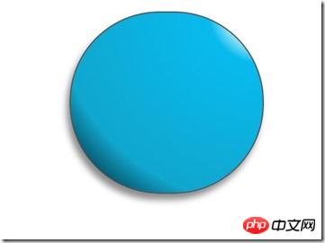
Überrascht, dass Shenmgui so hässlich ist, keine Sorge, lass es langsam zum Leben erwachen:
/*脸部*/
         .doraemon .face {
             position: relative; /*让所有脸部元素可自由定位*/
             z-index: 2;    /*脸在头部背景上面*/
         }
        /*白色脸底*/
        .doraemon .face .white {
            width: 265px;       /*设置宽高*/
            height: 195px;
            border-radius: 150px;
            position: absolute; /*进行绝对定位*/
            top: 75px;
            left: 25px;
            background: #fff;
            /*此放射渐变也是使脸的左下角暗一些,看上去更真实*/
            background: -webkit-radial-gradient(rightright top,#fff 75%,#eee 80%,#999 90%,#444);
            background: -moz-radial-gradient(rightright top,#fff 75%,#eee 80%,#999 90%,#444);
            background: –ms-radial-gradient(rightright top,#fff 75%,#eee 80%,#999 90%,#444);
         }
        /*鼻子*/
         .doraemon .face .nose{
             width:30px;
             height:30px;
             border-radius:15px;
             background:#c93300;
             border:2px solid #000;
             position:absolute;
             top:110px;
             left:140px;
             z-index:3;   /*鼻子在白色脸底下面*/
         }
        /*鼻子上的高光*/
        .doraemon .face .nose .light {
            width:10px;
            height:10px;
            border-radius: 5px;
            box-shadow: 19px 8px 5px #fff;  /*通过阴影实现高光*/
        }
         /*鼻子下的线*/
         .doraemon .face .nose_line{
             width:3px;
             height:100px;
             background:#333;
             position:absolute;
             top:143px;
             left:155px;
             z-index:3;
         }
         /*嘴巴*/
         .doraemon .face .mouth{
             width:220px;
             height:400px;
             /*通过底边框加上圆角模拟微笑嘴巴*/
             border-bottom:3px solid #333;
             border-radius:120px;
             position:absolute;
             top:-160px;
             left:45px;
         }
         /*眼睛*/
        .doraemon .eyes {
            position: relative;
            z-index: 3; /*眼睛在白色脸底下面*/
        }
        /*眼睛共同的样式*/
        .doraemon .eyes .eye{
            width:72px;
            height:82px;
            background:#fff;
            border:2px solid #000;
            border-radius:35px 35px;
            position:absolute;
            top:40px;
        }
        /*眼珠*/
        .doraemon .eyes .eye .black{
            width:14px;
            height:14px;
            background:#000;
            border-radius:7px;
            position:absolute;
            top:40px;
        }
        .doraemon .eyes .left{
            left:82px;
        }
        .doraemon .eyes .rightright {
            left: 156px;
        }
        .doraemon .eyes .eye .bleft {
            left: 50px;
        }
        .doraemon .eyes .eye .bright {
            left: 7px;
        }
Nachdem ich so viele Stile geschrieben habe, was ist das Ergebnis: 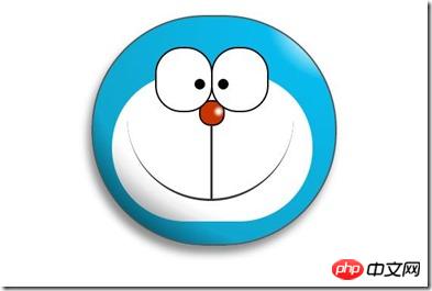
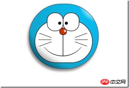
Ich fühle mich unbehaglich, egal wie ich es betrachte, oh ! Wir brauchen noch einen Bart und einen weißen Rand um das Gesicht, fügen wir ihn hinzu:
/*胡须背景,主要用于挡住嘴巴的一部分,不要显得太长*/
        .doraemon .whiskers{
            width:220px;
            height:80px;
            background:#fff;
            border-radius:15px;
            position:absolute;
            top:120px;
            left:45px;
            z-index:2;   /*在鼻子和眼睛下面*/
        }
        /*所有胡子的公用样式*/
        .doraemon .whiskers .whisker {
            width: 60px;
            height: 2px;
            background: #333;
            position: absolute;
            z-index: 2;
        }
        /*右上胡子*/
        .doraemon .whiskers .rTop {
            left: 165px;
            top: 25px;
        }
        /*右中胡子*/
        .doraemon .whiskers .rMiddle {
            left: 167px;
            top: 45px;
        }
        /*右下胡子*/
        .doraemon .whiskers .rBottom {
            left: 165px;
            top: 65px;
        }
        /*左上胡子*/
        .doraemon .whiskers .lTop {
            left: 0;
            top: 25px;
        }
        /*左中胡子*/
        .doraemon .whiskers .lMiddle {
            left: -2px;
            top: 45px;
        }
        /*左下胡子*/
        .doraemon .whiskers .lBottom {
            left: 0;
            top: 65px;
        }
        /*胡子旋转角度*/
        .doraemon .whiskers .r160 {
            -webkit-transform: rotate(160deg);
            -moz-transform: rotate(160deg);
            -ms-transform: rotate(160deg);
            -o-transform: rotate(160deg);
            transform: rotate(160deg);
        }
        .doraemon .whiskers .r20 {
            -webkit-transform: rotate(200deg);
            -moz-transform: rotate(200deg);
            -ms-transform: rotate(200deg);
            -o-transform: rotate(200deg);
            transform: rotate(200deg);
        }
Lächle, das ist es, sieh es dir an Wie bequem! Schlagen Sie, während das Eisen heiß ist, und bearbeiten Sie Hals und Körper:
/*围脖*/
        .doraemon .choker {
            width: 230px;
            height: 20px;
            background: #c40;
            /*线性渐变 让围巾看上去更自然*/
            background: -webkit-gradient(linear,left top,left bottombottom,from(#c40),to(#800400));
            background: -moz-linear-gradient(center top,#c40,#800400);
            background: -ms-linear-gradient(center top,#c40,#800400);
            border: 2px solid #000;
            border-radius: 10px;
            position: relative;
            top: -40px;
            left: 45px;
            z-index: 4;
        }
        /*铃铛*/
        .doraemon .choker .bell {
            width: 40px;
            height: 40px;
            _overflow: hidden; /*IE6 hack*/
            border: 2px solid #000;
            border-radius: 50px;
            background: #f9f12a;
            background: -webkit-gradient(linear, left top, left bottombottom, from(#f9f12a),color-stop(0.5, #e9e11a), to(#a9a100));
            background: -moz-linear-gradient(top, #f9f12a, #e9e11a 75%,#a9a100);
            background: -ms-linear-gradient(top, #f9f12a, #e9e11a 75%,#a9a100);
            box-shadow: -5px 5px 10px rgba(0,0,0,0.25);
            position: absolute;
            top: 5px;
            left: 90px;
        }
        /*双横线*/
        .doraemon .choker .bell_line {
            width: 36px;
            height: 2px;
            background: #f9f12a;
            border: 2px solid #333;
            border-radius: 3px 3px 0 0;
            position: absolute;
            top: 10px;
        }
        /*黑点*/
        .doraemon .choker .bell_circle{
            width:12px;
            height:10px;
            background:#000;
            border-radius:5px;
            position:absolute;
            top:20px;
            left:14px;
        }
        /*黑点下的线*/
        .doraemon .choker .bell_under{
            width: 3px;
            height:15px;
            background:#000;
            position:absolute;
            left: 18px;
            top:27px;
        }
        /*铃铛高光*/
        .doraemon .choker .bell_light{
            width:12px;
            height:12px;
            border-radius:10px;
            box-shadow:19px 8px 5px #fff;
            position:absolute;
            top:-5px;
            left:5px;
            opacity:0.7;
        }
        /*身子*/
        .doraemon .bodys {
            position: relative;
            top: -310px;
        }
        /*肚子*/
        .doraemon .bodys .body {
            width: 220px;
            height: 165px;
            background: #07beea;
            background: -webkit-gradient(linear,rightright top,left top,from(#07beea),color-stop(0.5, #0073b3),color-stop(0.75,#00b0e0), to(#0096be));
            background: -moz-linear-gradient(rightright center,#07beea,#0073b3 50%,#00b0e0 75%,#0096be 100%);
            background: -ms-linear-gradient(rightright center,#07beea,#0073b3 50%,#00b0e0 75%,#0096be 100%);
            border:2px solid #333;
            position:absolute;
            top:265px;
            left:50px;
        }
        /*白色肚兜*/
            .doraemon .bodys .wraps {
                width: 170px;
                height: 170px;
                background: #fff;
                background: -webkit-gradient(linear, rightright top, left bottombottom, from(#fff),color-stop(0.75,#fff),color-stop(0.83,#eee),color-stop(0.90,#999),color-stop(0.95,#444), to(#000));
                background: -moz-linear-gradient(rightright top,#fff,#fff 75%,#eee 83%,#999 90%,#444 95%,#000);
                background: -ms-linear-gradient(rightright top,#fff,#fff 75%,#eee 83%,#999 90%,#444 95%,#000);
                border: 2px solid #000;
                border-radius: 85px;
                position: absolute;
                left: 72px;
                top: 230px;
            }
            /*口袋*/
            .doraemon .bodys .pocket {
                width: 130px;
                height: 130px;
                border-radius: 65px;
                background: #fff;
                background: -webkit-gradient(linear, rightright top, left bottombottom, from(#fff),color-stop(0.70,#fff),color-stop(0.75,#f8f8f8),color-stop(0.80,#eee),color-stop(0.88,#ddd), to(#fff));
                background: -moz-linear-gradient(rightright top, #fff, #fff 70%,#f8f8f8 75%,#eee 80%,#ddd 88%, #fff);
                background: -ms-linear-gradient(rightright top, #fff, #fff 70%,#f8f8f8 75%,#eee 80%,#ddd 88%, #fff);
                border: 2px solid #000;
                position:absolute;
                top: 250px;
                left: 92px;
            }
            /*挡住口袋一半*/
            .doraemon .bodys .pocket_mask {
                width: 134px;
                height: 60px;
                background:#fff;
                border-bottom: 2px solid #000;
                position:absolute;
                top: 259px;
                left: 92px;
           }
Okay, Sie haben Hals und Körper! Oben abgebildet: 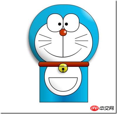
Jetzt sieht es ein bisschen aus wie eine Dekoration, aber das Lächeln ist immer noch so unschuldig. Okay, machen wir schnell die Hände und Füße:
/*左右手*/
            .doraemon .hand_right, .doraemon .hand_left {
                height: 100px;
                width: 100px;
                position: absolute;
                top: 272px;
                left: 248px;
            }
            /*左手*/
            .doraemon .hand_left {
                left: -10px;
            }
            /*手臂公共部分*/
            .doraemon .arm {
                width:80px;
                height:50px;
                background: #07beea;
                background: -webkit-gradient(linear, left top, left bottombottom, from(#07beea),color-stop(0.85,#07beea), to(#555));
                background: -moz-linear-gradient(center top, #07BEEA, #07BEEA 85%, #555);
                background: -ms-linear-gradient(center top, #07BEEA, #07BEEA 85%, #555);
                border: 1px solid #000000;
                box-shadow: -10px 7px 10px rgba(0, 0, 0, 0.35);
                z-index: -1;
                position: relative;
            }
            /*右手手臂*/
            .doraemon .hand_right .arm {
                top: 17px;
                -webkit-transform: rotate(35deg);
                -moz-transform: rotate(35deg);
                -ms-transform: rotate(35deg);
                -o-transform: rotate(35deg);
                transform: rotate(35deg);
            }
            /*左手手臂*/
            .doraemon .hand_left .arm {
                top: 17px;
                background: #0096be;   /*背光一面使用纯色,使其有立体感*/
                box-shadow: 5px -7px 10px rgba(0, 0, 0, 0.25);
                -webkit-transform: rotate(145deg);
                -moz-transform: rotate(145deg);
                -ms-transform: rotate(145deg);
                -o-transform: rotate(145deg);
                transform: rotate(145deg);
            }
            /*圆形手掌公共部分*/
            .doraemon .circle {
                width: 60px;
                height: 60px;
                border-radius: 30px;
                border: 2px solid #000;
                background: #fff;
                background: -webkit-gradient(linear, rightright top, left bottombottom, from(#fff),color-stop(0.5,#fff),color-stop(0.70,#eee),color-stop(0.8,#ddd), to(#999));
                background: -moz-linear-gradient(rightright top, #fff, #fff 50%, #eee 70%, #ddd 80%,#999);
                background: -ms-linear-gradient(rightright top, #fff, #fff 50%, #eee 70%, #ddd 80%,#999);
                position: absolute;
            }
            /*右手手掌*/
            .doraemon .hand_right .circle {
                left: 40px;
                top: 32px;
            }
            /*左手手掌*/
            .doraemon .hand_left .circle {
                left: -20px;
                top: 32px;
            }
            /*手臂和身体结合处,使用背景遮住边框*/
            .doraemon .arm_rewrite {
                height: 45px;
                width: 5px;
                background: #07beea;
                position: relative;
            }
            /*右手结合处*/
            .doraemon .hand_right .arm_rewrite {
                top: -45px;
                left: 22px;
            }
            /*左手结合处*/
            .doraemon .hand_left .arm_rewrite {
                top: -45px;
                left: 60px;
                background: #0096be; /*同理,背光一面使用纯色,使其有立体感*/
            }
            /*脚部*/
            .doraemon .foot {
                width: 280px;
                height: 40px;
                position: relative;
                top: 55px;
                left: 20px;
            }
            /*左右脚共同样式*/
            .doraemon .foot .left, .doraemon .foot .rightright {
                width: 125px;
                height: 30px;
                background: #fff;
                background: -webkit-gradient(linear, rightright top, left bottombottom, from(#fff),color-stop(0.75,#fff),color-stop(0.85,#eee), to(#999));
                background: -moz-linear-gradient(rightright top, #fff, #fff 75%, #eee 85%, #999);
                background: -ms-linear-gradient(rightright top, #fff, #fff 75%, #eee 85%, #999);
                border: 2px solid #333;
                border-radius: 80px 60px 60px 40px;
                box-shadow: -6px 0 10px rgba(0, 0, 0, 0.35);
                position: relative;
            }
            .doraemon .foot .left {
                left: 8px;
                top: 65px;
            }
            .doraemon .foot .rightright {
                top: 31px;
                left: 141px;
            }
            /*双脚之间的缝隙,加阴影使用立体感*/
            .doraemon .foot .foot_rewrite {
                width: 20px;
                height: 10px;
                background: #fff;
                background: -webkit-gradient(linear, rightright top, left bottombottom, from(#666),color-stop(0.83,#fff), to(#fff));
                background: -moz-linear-gradient(rightright top, #666, #fff 83%, #fff);
                background: -ms-linear-gradient(rightright top, #666, #fff 83%, #fff);
                /*制作半圆效果*/
                border: 2px solid #000;
                border-bottom: none;
                border-radius: 40px 40px 0 0;
                position: relative;
                top: -11px;
                left: 130px;
                _left: 127px;
            }
Okay, das endgültige Gesamtergebnis: 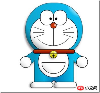
Mal sehen, ob der Effekt derselbe ist wie beim ersten, obwohl es fertig ist kann immer noch gemacht werden Wenn es sich bewegt, wie zum Beispiel die Augen, können wir einen Animationseffekt hinzufügen, um die Augen zu bewegen:
/*眼珠*/
        .doraemon .eyes .eye .black {
            width: 14px;
            height: 14px;
            background: #000;
            border-radius: 7px;
            position: absolute;
            top: 40px;
            -webkit-animation: eyemove 3s linear infinite;
            -moz-animation: eyemove 3s linear infinite;
            -ms-animation: eyemove 3s linear infinite;
            -o-animation: eyemove 3s linear infinite;
            animation: eyemove 3s linear infinite;
        }
        /*让眼睛动起来*/
        @-webkit-keyframes eyemove {
            70%{
                margin:0 0 0 0;
            }
            80% {
                margin: -22px 0 0 0;
            }
            85% {
                margin: -22px 0 0 5px;
            }
            90% {
                margin: -22px 10px 0 0;
            }
            93% {
                margin: -22px 0 0 0;
            }
            96% {
                margin: 0 0 0 0;
            }
        }
        @-moz-keyframes eyemove {
            70% {
                margin: 0 0 0 0;
            }
            80% {
                margin: -22px 0 0 0;
            }
            85% {
                margin: -22px 0 0 5px;
            }
            90% {
                margin: -22px 10px 0 0;
            }
            93% {
                margin: -22px 0 0 0;
            }
            96% {
                margin: 0 0 0 0;
            }
        }
        @-o-keyframes eyemove {
            70% {
                margin: 0 0 0 0;
            }
            80% {
                margin: -22px 0 0 0;
            }
            85% {
                margin: -22px 0 0 5px;
            }
            90% {
                margin: -22px 10px 0 0;
            }
            93% {
                margin: -22px 0 0 0;
            }
            96% {
                margin: 0 0 0 0;
            }
        }
        @keyframes eyemove {
            70% {
                margin: 0 0 0 0;
            }
            80% {
                margin: -22px 0 0 0;
            }
            85% {
                margin: -22px 0 0 5px;
            }
            90% {
                margin: -22px 10px 0 0;
            }
            93% {
                margin: -22px 0 0 0;
            }
            96% {
                margin: 0 0 0 0;
            }
        }
OK, auf diese Weise werden sich die Augen bewegen. Wenn Sie Interesse haben, können Sie es ausprobieren. Plötzlich kann es hier nicht mehr angezeigt werden. Wenn Sie jedoch bessere Animationseffekte ausprobieren können, ist dieser Fall erledigt.
PS: Obwohl dies nur ein Fall ist, hat es mir wirklich geholfen, meinen Horizont zu erweitern, und tatsächlich kann es viel Zeit in Anspruch nehmen, einen solchen Effekt zu erzielen, zumindest für mich im Moment, das ist der Die Schwierigkeit liegt vor allem in der sinnvollen Abstimmung von Layoutpositionierung und Farben, um das Bild realistischer und lebendiger zu machen!
Das Obige ist der gesamte Inhalt dieses Artikels. Ich hoffe, er wird für das Studium aller hilfreich sein. Weitere verwandte Inhalte finden Sie auf der chinesischen PHP-Website.
Verwandte Empfehlungen:
So verwenden Sie das calc()-Attribut in CSS3, um die Größe auszudrücken
So verwenden Sie CSS3 um ein einfaches 3D-Bild eines durchscheinenden Würfels zu erstellen
Das obige ist der detaillierte Inhalt vonSo zeichnen Sie grundlegende Cartoon-Muster mit HTML und CSS3. Für weitere Informationen folgen Sie bitte anderen verwandten Artikeln auf der PHP chinesischen Website!
In Verbindung stehende Artikel
Mehr sehen- Tailwind-Tipp: Verwalten Sie eine lange Liste von Utility-Klassen in einer einzigen Codezeile
- Wie stelle ich die Breite eines festen Elements relativ zu seinem übergeordneten Element ein?
- Wie kann ich Elemente bei Bedarf nur mit CSS anzeigen und ausblenden?
- Wie animiere ich Hintergrundfarben mit jQuery?
- Wie erstelle ich Kontrollkästchen in Dropdown-Menüs?