
Heim >Web-Frontend >CSS-Tutorial >So verwenden Sie CSS, um den Kreiseffekt zu erzielen (CSS Sprites)
So verwenden Sie CSS, um den Kreiseffekt zu erzielen (CSS Sprites)
- jackloveOriginal
- 2018-06-11 14:01:272093Durchsuche
Encircling People-Effekt (CSS Sprites)

<!DOCTYPE HTML PUBLIC "-//W3C//DTD HTML 4.01 Transitional//EN" "http://www.w3.org/TR/html4/loose.dtd">
<html>
<head>
<meta http-equiv="content-type" content="text/html; charset=utf-8">
<title> css sprites </title>
<style type="text/css">
body{font-size:14px;}
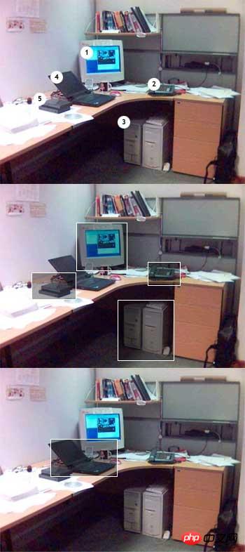
#imgmap{position:relative; width:350px; height:263px; background:url('office.jpg') no-repeat;}
#imgmap .map{position:absolute;}
#imgmap .map span{font-weight:bold; color:#000000; padding:3px; background:#FFFFFF; border:1px solid #CCCCCC;}
#imgmap #d1{top:55px; left:109px;}
#imgmap #d1 a{display:block; width:73px; height:69px; text-decoration:none;}
#imgmap #d1 a:hover{background:url('office.jpg') -109px -317px no-repeat;}
#imgmap #d1 a span{display:none;}
#imgmap #d1 a:hover span{position:absolute; top:-25px; width:95px; display:block;}
#imgmap #d2{top:111px; left:211px;}
#imgmap #d2 a{display:block; width:47px; height:34px; text-decoration:none;}
#imgmap #d2 a:hover{background:url('office.jpg') -211px -373px no-repeat;}
#imgmap #d2 a span{display:none;}
#imgmap #d2 a:hover span{position:absolute; top:-25px; width:60px; display:block;}
#imgmap #d3{top:165px; left:168px;}
#imgmap #d3 a{display:block; width:81px; height:87px; text-decoration:none;}
#imgmap #d3 a:hover{background:url('office.jpg') -168px -427px no-repeat;}
#imgmap #d3 a span{display:none;}
#imgmap #d3 a:hover span{position:absolute; top:-25px; width:80px; display:block;}
#imgmap #d4{top:101px; left:72px; z-index:100;}
#imgmap #d4 a{display:block; width:96px; height:54px; text-decoration:none;}
#imgmap #d4 a:hover{background:url('office.jpg') -72px -625px no-repeat;}
#imgmap #d4 a span{display:none;}
#imgmap #d4 a:hover span{position:absolute; top:-25px; width:70px; display:block;}
#imgmap #d5{top:124px; left:45px;}
#imgmap #d5 a{display:block; width:64px; height:39px; text-decoration:none;}
#imgmap #d5 a:hover{background:url('office.jpg') -45px -386px no-repeat;}
#imgmap #d5 a span{display:none;}
#imgmap #d5 a:hover span{position:absolute; top:-38px; width:107px; display:block;}
</style>
</head>
<body>
<p id="imgmap">
<p class="map" id="d1"><a href="javascript:void(0)"><span>17寸的显示器</span></a></p>
<p class="map" id="d2"><a href="javascript:void(0)"><span>听筒坏了</span></a></p>
<p class="map" id="d3"><a href="javascript:void(0)"><span>白色的机箱</span></a></p>
<p class="map" id="d4"><a href="javascript:void(0)"><span>ThinkPad</span></a></p>
<p class="map" id="d5"><a href="javascript:void(0)"><span>我不知道这玩意是哪里买的</span></a></p>
</p>
</body>
</html>
Beispiel-Hintergrundbild:
In diesem Artikel wird erläutert, wie Sie mit CSS den Kreiseffekt erzielen (CSS Sprites). Weitere verwandte Inhalte finden Sie auf der chinesischen PHP-Website.
Verwandte Empfehlungen:
So führen Sie den AES256-Verschlüsselungsalgorithmus über PHP aus
So senden Sie E-Mails mit Anhängen über PHP
Detaillierte Erläuterung der PHP-Rückgabedatenformatierungsklasse
Das obige ist der detaillierte Inhalt vonSo verwenden Sie CSS, um den Kreiseffekt zu erzielen (CSS Sprites). Für weitere Informationen folgen Sie bitte anderen verwandten Artikeln auf der PHP chinesischen Website!
Stellungnahme:
Der Inhalt dieses Artikels wird freiwillig von Internetnutzern beigesteuert und das Urheberrecht liegt beim ursprünglichen Autor. Diese Website übernimmt keine entsprechende rechtliche Verantwortung. Wenn Sie Inhalte finden, bei denen der Verdacht eines Plagiats oder einer Rechtsverletzung besteht, wenden Sie sich bitte an admin@php.cn
Vorheriger Artikel:HTML und CSS zur Implementierung einer dynamischen Anmeldeseite im HintergrundNächster Artikel:HTML und CSS zur Implementierung einer dynamischen Anmeldeseite im Hintergrund