
Heim >Web-Frontend >CSS-Tutorial >Eine Sammlung von Lösungen für das CSS-Seitenlayout
Eine Sammlung von Lösungen für das CSS-Seitenlayout

- 零到壹度Original
- 2018-04-08 16:24:071774Durchsuche
Ein sehr wichtiger Teil des Frontend-Layouts ist der Aufbau des Seitengerüsts, das auch der grundlegendste Teil ist. Beim Aufbau des Seitenframeworks gibt es zentriertes Layout, mehrspaltiges Layout und globales Layout. Heute werden wir das CSS-Layout in nützlichen Front-End-Informationen zusammenfassen.
Zentriertes Layout
Horizontale Zentrierung
1) Inline-block+text-align verwenden
(1) Prinzip und Verwendung
Prinzip: Ändern Sie zunächst die Unterbox von einem Blockebenenelement in ein Inline-Blockelement und stellen Sie dann das Inline-Blockelement so ein, dass es zentriert ist, um eine horizontale Zentrierung zu erreichen.
Verwendung: Legen Sie display:inline-block für das untergeordnete Feld und text-align:center für das übergeordnete Feld fest.
(2) Codebeispiele
<p class="parent">
    <p class="child>DEMO</p>
</p>
.child{ display:inline-block;
}.parent{ text-align:center;
}(3) Vor- und Nachteile
Vorteile: Kompatibilität Nun, es ist sogar mit ie6 und ie7 kompatibel
Nachteile: Der Text im untergeordneten Element wird auch horizontal zentriert. Sie können text-align:left in .child hinzufügen
2) Tabelle+Rand verwenden
(1) Prinzip und Verwendung
Prinzip: Stellen Sie zunächst die Unterbox auf eine Blockebene ein Tabelle für die Anzeige (ähnlich wie 40db2241f178ab28fb88a73c9da4d82b 和 b4d429308760b6c2d20d6300079ed38e),再通过设置属性,使表格单元格内容垂直居中以达到垂直居中。
用法:先将父框设置为display:table-cell,再设置vertical-align:middle。
(2)代码实例
<p class="parent">
    <p class="child>DEMO</p>
</p>
.parent { display:table-cell; vertical-align:middle;
}(3)优缺点
优点:兼容性较好,ie8以上均支持
2)使用absolute+transform
(1)原理、用法
原理:类似于水平居中时的absolute+transform原理。将子框设置为绝对定位,移动子框,使子框上边距离相对框上边边框的距离为相对框高度的一半,再通过向上移动子框的一半高度以达到垂直居中。当然,在此之前,我们需要设置父框为相对定位,使父框成为子框的相对框。
用法:先将父框设置为position:relative,再设置子框position:absolute,top:50%,transform:translateY(-50%)。
(2)代码实例
<p class="parent">
    <p class="child>DEMO</p>
</p>
.parent { position:relative;
}.child { position:absolute; top:50%; transform:translateY(-50%);
}(3)优缺点
优点:居中元素不会对其他的产生影响
缺点:transform属于css3内容,兼容性存在一定问题,高版本浏览器需要添加一些前缀
3)使用flex+align-items
(1)原理、用法
原理:通过设置CSS3中的布局利器flex中的属性align-times,使子框垂直居中。
用法:先将父框设置为position:flex,再设置align-items:center。
(1)代码实例
<p class="parent">
    <p class="child>DEMO</p>
</p>
.parent { position:flex; align-items:center;
}(3)优缺点
优点:只设置parent
缺点:兼容性存在一定问题
水平垂直居中
1)使用absolute+transform
(1)原理、用法
原理:将水平居中时的absolute+transform和垂直居中时的absolute+transform相结合。详见:水平居中的3)和垂直居中的2)。
见水平居中的3)和垂直居中的2)。
(2)代码实例
<p class="parent">
    <p class="child>DEMO</p>
</p>
.parent { position:relative;
}.child { position:absolute; left:50%; top:50%; transform:tranplate(-50%,-50%);
}(3)优缺点
优点:child元素不会对其他元素产生影响
缺点:兼容性存在一定问题
2)使用inline-block+text-align+table-cell+vertical-align
(1)原理、用法
原理:使用inline-block+text-align水平居中,再用table-cell+vertical-align垂直居中,将二者结合起来。详见:水平居中的1)和垂直居中的1)。
见水平居中的1)和垂直居中的1)。
(2)代码实例
<p class="parent">
    <p class="child>DEMO</p>
</p>
.parent { text-align:center; display:table-cell; vertical-align:middle;
}.child { display:inline-block;
}(3)优缺点
优点:兼容性较好
3)使用flex+justify-content+align-items
(1)原理、用法
原理:通过设置CSS3布局利器flex中的justify-content和align-items,从而达到水平垂直居中。详见:水平居中的4)和垂直居中的3)。
见水平居中的4)和垂直居中的3)。
(2)代码实例
<p class="parent">
    <p class="child>DEMO</p>
</p>
.parent { display:flex; justify-content:center; align-items:center;
}(3)优缺点
优点:只设置了parent
缺点:兼容性存在一定问题
多列布局
定宽+自适应
1)使用float+overflow
(1)原理、用法
原理:通过将左边框脱离文本流,设置右边规定当内容溢出元素框时发生的事情以达到多列布局。
用法:先将左框设置为float:left、width、margin-left,再设置实际的右框overflow:hidden。
(2)代码实例
<p class="parent">
    <p class="left">
        <p>left</p>
    </p>
    <p class="right">
        <p>right</p>
        <p>right</p>
    </p></p>
.left { float:left; width:100px; margin-right:20px;
}.right { overflow:hidden;
}(3)优缺点
优点:简单
缺点:不支持ie6
2)使用float+margin
(1)原理、用法
原理:通过将左框脱离文本流,加上右框向右移动一定的距离,以达到视觉上的多列布局。
用法:先将左框设置为float:left、margin-left,再设置右框margin-left。
(2)代码实例
<p class="parent">
    <p class="left">
        <p>left</p>
    </p>
    <p class="right">
        <p>right</p>
        <p>right</p>
    </p></p>
.left { float:left; width:100px;
}.right { margin-left:120px;
}(3)优缺点
优点:简单,易理解
缺点:兼容性存在一定问题,ie6下有3px的bug。right下的p清除浮动将产生bug
3)使用float+margin(改良版)
(1)原理、用法
原理:在1)的基础之上,通过向右框添加一个父框,再加上设置左、右父框属性使之产生BFC以去除bug。
用法:先将左框设置为float:left、margin-left、position:relative,再设置右父框float:right、width:100%、margin-left,最后设置实际的右框margin-left。
(2)代码实例
<p class="parent">
    <p class="left">
        <p>left</p>
    </p>
    <p class="rigth-fix">
        <p class="right">
            <p>right</p>
            <p>right</p>
        </p>
    </p></p>
.left { float:left; width:100px; position:relative;
}.right-fix { float:right; width:100%; margin-left:-100px;
}.right { margin-left:120px;
}(3)优缺点
优点:简单,易理解
4)使用table
(1)原理、用法
原理:通过将父框设置为表格,将左右边框转化为类似于同一行的td,从而达到多列布局。
用法:先将父框设置为display:table、width:100%、table-layout:fixed,再设置左右框display:table-cell,最后设置左框width、padding-right。
(2)代码实例
<p class="parent">
    <p class="left">
        <p>left</p>
    </p>
    <p class="right">
        <p>right</p>
        <p>right</p>
    </p></p>
.parent { display:table; width:100%; table-layout:fixed;
}.left { width:100px; padding-right:20px;
}.right,.left { display:table-cell;
}5)使用flex
(1)原理、用法
原理:通过设置CSS3布局利器flex中的flex属性以达到多列布局。
用法:先将父框设置为display:flex,再设置左框flex:1,最后设置左框width、margin-right。
(2)代码实例
<p class="parent">
    <p class="left">
        <p>left</p>
    </p>
    <p class="right">
        <p>right</p>
        <p>right</p>
    </p></p>
.parent { display:flex;
}.left { width:100px; margin-right:20px;
}.right { flex:1;
}(3)优缺点
优点:flex很强大
缺点:兼容性存在一定问题,性能存在一定问题
两列定宽+一列自适应
(1)原理、用法
原理:这种情况与两列定宽查不多。
用法:先将左、中框设置为float:left、width、margin-right,再设置右框overflow:hidden。
(2)代码实例
<p class="parent">
    <p class="left">
        <p>left</p>
    </p>
    <p class="center">
        <p>center</p>
    </p>
    <p class="right">
        <p>right</p>
        <p>right</p>
    </p></p>
.left,.center { float:left; width:100px; margin-right:20px;
}.right { overflow:hidden;
}不定宽+自适应
1)使用float+overflow
(1)原理、用法
原理:这种情况与两列定宽查不多。
用法:先将左框设置为float:left、margin-right,再设置右框overflow: hidden,最后设置左框中的内容width。
(2)代码实例
<p class="parent">
    <p class="left">
        <p>left</p>
    </p>
    <p class="right">
        <p>right</p>
        <p>right</p>
    </p></p>
.left{ float: left; margin-right: 20px;
}.right{ overflow: hidden;
}.left p{ width: 200px;
}(3)优缺点
优点:简单
缺点:ie6下兼容性存在一定问题
2)使用table
(1)原理、用法
原理:通过将父框改变为表格,将左右框转换为类似于同一行的td以达到多列布局,设置父框宽度100%,给左框子元素一个固定宽度从而达到自适应。
用法:先将父框设置为display: table、width: 100%,再设置左、右框display: table-cell,最后设置左框width: 0.1%、padding-right以及左框中的内容width。
(2)代码实例
<p class="parent">
    <p class="left">
        <p>left</p>
    </p>
    <p class="right">
        <p>right</p>
        <p>right</p>
    </p></p>
.parent{ display: table; width: 100%;
}.left,.right{ display: table-cell;
}.left{ width: 0.1%; padding-right: 20px;
}.left p{ width:200px;
}(3)优缺点
缺点:ie6 ie7不支持
3)使用flex
(1)原理、用法
原理:通过设置CSS3布局利器flex中的flex属性以达到多列布局,加上给左框中的内容定宽、给右框设置flex达到不定款+自适应。
用法:先将父框设置为display:flex,再设置右框flex:1,最后设置左框margin-right:20px、左框中的内容width。
(2)代码实例
<p class="parent">
    <p class="left">
        <p>left</p>
    </p>
    <p class="right">
        <p>right</p>
        <p>right</p>
    </p></p>
.parent { display:flex;
}.left { margin-right:20px;
}.right { flex:1;
}.left p{ width: 200px;
}(3)优缺点
优点:flex很强大
缺点:兼容性存在一定问题,性能存在一定问题
两列不定宽+一列自适应
(1)原理、用法
原理:这个情况与一列不定宽+一列自适应查不多。
用法:先将左、中框设置为float:left、margin-right,再设置右框overflow:hidden,最后给左中框中的内容设置width。
(2)代码实例
<p class="parent">
    <p class="left">
        <p>left</p>
    </p>
    <p class="center">
        <p>center</p>
    </p>
    <p class="right">
        <p>right</p>
        <p>right</p>
    </p></p>
.left,.center{ float: left; margin-right: 20px;
}.right{ overflow: hidden;
}.left p,.center p{ width: 100px;
}等分布局
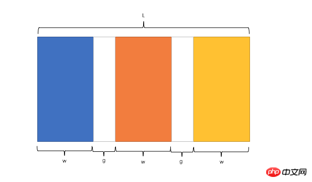
公式转化:l = w * n + g * (n-1) -> l = w * n + g * n - g -> l + g = (w + g) * n
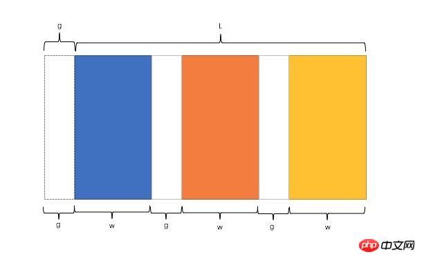
因此,我们需要解决两个问题:
如何让总宽度增加g(即:L+g)
如何让每个宽包含g(即:w+g)
1)使用float
(1)原理、用法
原理:增大父框的实际宽度后,使用CSS3属性box-sizing进行布局的辅助。
用法:先将父框设置为margin-left: -*px,再设置子框float: left、width: 25%、padding-left、box-sizing: border-box。
(2)代码实例
<p class="parent">    <p class="column"><p>1</p></p>
    <p class="column"><p>2</p></p>
    <p class="column"><p>3</p></p>
    <p class="column"><p>4</p></p></p>
.parent{
margin-left: -20px;//l增加g
}
.column{
float: left;
width: 25%;
padding-left: 20px;
box-sizing: border-box;//包含padding区域 w+g
}(3)优缺点
优点:兼容性较好
缺点:ie6 ie7百分比兼容存在一定问题
2)使用table
(1)原理、用法
原理:通过增加一个父框的修正框,增大其宽度,并将父框转换为table,将子框转换为tabel-cell进行布局。
用法:先将父框的修正框设置为margin-left: -*px,再设置父框display: table、width:100%、table-layout: fixed,设置子框display: table-cell、padding-left。
(2)代码实例
<p class="parent-fix">    <p class="parent">
        <p class="column"><p>1</p></p>
        <p class="column"><p>2</p></p>
        <p class="column"><p>3</p></p>
        <p class="column"><p>4</p></p>
    </p></p>
.parent-fix{
margin-left: -20px;//l+g
}
.parent{
display: table;
width:100%;
table-layout: fixed;
}
.column{
display: table-cell;
padding-left: 20px;//w+g}(3)优缺点
优点:结构和块数无关联
缺点:增加了一层
3)使用flex
(1)原理、用法
原理:通过设置CSS3布局利器flex中的flex属性以达到等分布局。
用法:将父框设置为display: flex,再设置子框flex: 1,最后设置子框与子框的间距margin-left。
(2)代码实例
<p class="parent">    <p class="column"><p>1</p></p>
    <p class="column"><p>2</p></p>
    <p class="column"><p>3</p></p>
    <p class="column"><p>4</p></p></p>
.parent{ display: flex;
}.column{ flex: 1;
}.column+.column{ margin-left:20px;
}(3)优缺点
优点:代码量少,与块数无关
缺点:兼容性存在一定问题
定宽+自适应+两块高度一样高
1)使用float
(1)原理、用法
原理:通过过分加大左右子框的高度,辅助超出隐藏,以达到视觉上的等高。
用法:将父框设置overflow: hidden,再设置左右子框padding-bottom: 9999px、margin-bottom: -9999px,最后设置左框float: left、width、margin-right,右框overflow: hidden。
(2)代码实例
<p class="parent">
    <p class="left">
        <p>left</p>
    </p>
    <p class="right">
        <p>right</p>
        <p>right</p>
    </p></p>
p{ background: none!important;
}.left,.right{ background: #444;
}.parent{ overflow: hidden;
}.left,.right{ padding-bottom: 9999px; margin-bottom: -9999px;
}.left{ float: left;
width: 100px; margin-right: 20px;
}.right{ overflow: hidden;
}(3)优缺点
优点:兼容性好
缺点:伪等高,不是真正意义上的等高
2)使用table
(1)原理、用法
原理:将父框转化为tabel,将子框转化为tabel-cell布局,以达到定宽+自适应+两块高度一样高。
用法:先将父框设置为display:table、width:100%、table-layout:fixed,再设置左右框为display:table-cell,最后设置左框width、padding-right。
(2)代码实例
<p class="parent">
    <p class="left">
        <p>left</p>
    </p>
    <p class="right">
        <p>right</p>
        <p>right</p>
    </p></p>
.parent {
display:table;
width:100%;
table-layout:fixed;
}
.left {
width:100px;
padding-right:20px;
}
.right,.left {
display:table-cell;
}3)使用flex
(1)原理、用法
原理:通过设置CSS3布局利器flex中的flex属性以达到定宽+自适应+两块高度一样高。
用法:将父框设置为display: flex,再设置左框width、margin-right,最后设置右框flex:1。
(2)代码实例
<p class="parent">
    <p class="left">
        <p>left</p>
    </p>
    <p class="right">
        <p>right</p>
        <p>right</p>
    </p></p>
.parent {
display:flex;
}
.left {
width:100px;
margin-right:20px;
}
.right {
flex:1;
}(3)优缺点
优点:代码少,flex很强大
缺点:兼容性存在一定问题
4)使用display
(1)原理、用法
原理:通过设置display中的CSS3的-webkit-box属性以达到定宽+自适应+两块高度一样高。
用法:将父框设置为display: -webkit-box、width: 100%,再设置左框width、margin-right,最后设置右框-webkit-box-flex: 1。
(2)代码实例
<p class="parent">
    <p class="left">left</p>
    <p class="right">right </p>
</p>
.parent {
width: 100%;
display: -webkit-box;
}
.left {
width:100px;
margin-right: 20px;
}
.right {
-webkit-box-flex: 1;
}(3)优缺点
缺点:兼容性存在较大的问题
全屏布局
全屏布局的特点
滚动条不是全局滚动条,而是出现在内容区域里,往往是主内容区域
浏览器变大时,撑满窗口
全屏布局的方法
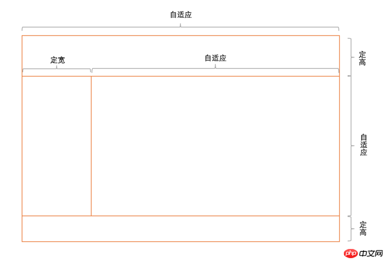
1)使用position
(1)原理、用法
原理:将上下部分固定,中间部分使用定宽+自适应+两块高度一样高。
用法:见实例。
(2)代码实例
<p class="parent">
    <p class="top">top</p>
    <p class="left">left</p>
    <p class="right">
        <p class="inner">right</p>
    </p>
    <p class="bottom">bottom</p>
</p>
html,body,.parent{ margin:0; height:100%; overflow:hidden;
}body{ color:white;
}.top{ position:absolute; top:0; left:0; right:0; height:100px; background:blue;
}.left{ position:absolute; left:0; top:100px; bottom:50px; width:200px; background:red;
}.right{ position:absolute; left:200px; top:100px; bottom:50px; right:0; background:pink; overflow: auto;
}.right .inner{ min-height: 1000px;
}.bottom{ position:absolute; left:0; right:0; bottom:0; height:50px; background: black;
}(3)优缺点
优点:兼容性好,ie6下不支持
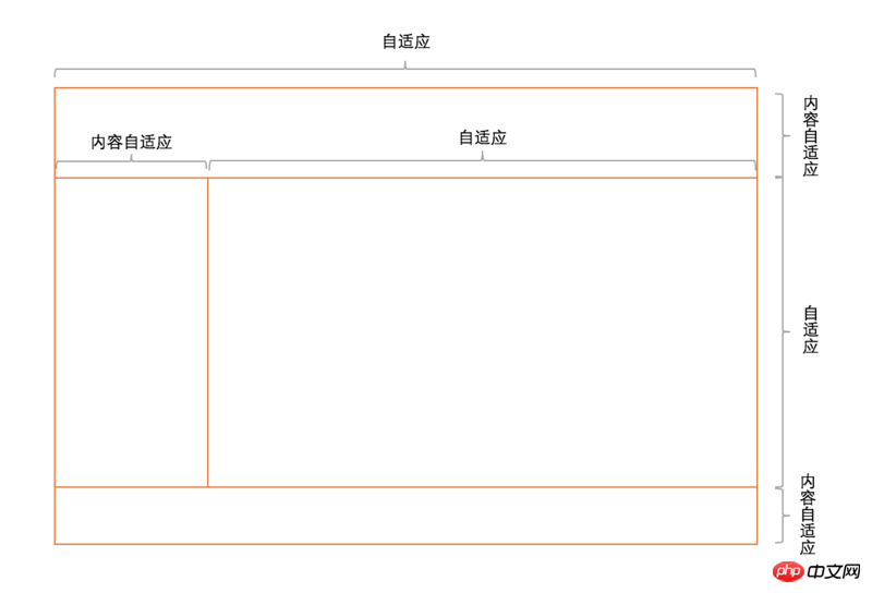
2)使用flex
(1)原理、用法
原理:通过灵活使用CSS3布局利器flex中的flex属性和flex-direction属性以达到全屏布局。
用法:见实例。
(2)代码实例
<p class="parent">
    <p class="top">top</p>
    <p class="middle">
        <p class="left">left</p>
        <p class="right">
            <p class="inner">right</p>
        </p>
    </p>
    <p class="bottom">bottom</p>
</p>
html,body,.parent{ margin:0; height:100%; overflow:hidden;
}body{ color: white;
}
.parent{ display: flex; flex-direction: column;
}.top{ height:100px; background: blue;
}.bottom{ height:50px; background: black;
}.middle{ flex:1; display:flex;
}.left{ width:200px; background: red;
}.right{ flex: 1; overflow: auto; background:pink;
}.right .inner{ min-height: 1000px;
}(3)优缺点
缺点:兼容性差,ie9及ie9以下不兼容
1)使用flex
(1)原理、用法
原理:通过灵活使用CSS3布局利器flex中的flex属性和flex-direction属性以达到全屏布局。
用法:见实例。
(2)代码实例
<p class="parent">
    <p class="top">top</p>
    <p class="middle">
        <p class="left">left</p>
        <p class="right">
            <p class="inner">right</p>
        </p>
    </p>
    <p class="bottom">bottom</p>
</p>
html,body,.parent{ margin:0; height:100%; overflow:hidden;
}body{ color:white;
}
.parent{ display:flex; flex-direction:column;
}.top{ background:blue;
}.bottom{ background:black;
}.middle{ flex:1; display:flex;
}.left{ background: red;
}.right{ flex:1; overflow:auto; background: pink;
}.right .inner{ min-height:1000px;
}全屏布局相关方案的兼容性、性能和自适应一览表
| 方案 | 兼容性 | 性能 | 是否自适应 |
|---|---|---|---|
| Position | 好 | 好 | 部分自适应 |
| Flex | 较差 | 差 | 可自适应 |
| Grid | 差 | 较好 | 可自适应 |
当然,最最最最最后,如果您喜欢这片文章,可以疯狂点赞!!
Das obige ist der detaillierte Inhalt vonEine Sammlung von Lösungen für das CSS-Seitenlayout. Für weitere Informationen folgen Sie bitte anderen verwandten Artikeln auf der PHP chinesischen Website!
In Verbindung stehende Artikel
Mehr sehen- Wie ordne ich Flexbox-Elemente reaktionsschnell neu an und behalte gleichzeitig die Suchmaschinenoptimierung bei?
- HTML vs. Body: Welches Element eignet sich am besten für globale CSS-Stile?
- Wie kann ich die Bildlaufleiste in einem „'-Element ausblenden und gleichzeitig die Funktionalität beibehalten?
- Heute habe ich gelernt
- So verwenden Sie das CSS-Top-Attribut