
Heim >Web-Frontend >js-Tutorial >Bekannte Website-Frontend-Layoutanalyse
Bekannte Website-Frontend-Layoutanalyse
- php中世界最好的语言Original
- 2018-03-19 11:58:074519Durchsuche
Dieses Mal bringe ich Ihnen eine bekannte Website-Front-End-Layout-Analyse. Was sind die Vorsichtsmaßnahmen für die bekannte Website-Front-End-Layout-Analyse? Das Folgende ist ein praktischer Fall, werfen wir einen Blick darauf.
1. Horizontale Zentrierung
Kapitel eins, zwei und drei sind allesamt einfache Strukturen von Eltern+Sohn. Der HTML-Code und die Renderings werden erst im vierten Kapitel veröffentlicht
(1) Text/Inline-Elemente/Inline-Elemente auf Blockebene ▲
Prinzip: text-align steuert nur Inline-Inhalte (Text, Inline-Elemente, Inline-Elemente auf Blockebene) Wie wäre es mit der Ausrichtung relativ zu seinem übergeordneten Blockelement? 🎜>
#parent{
    text-align: center;
}
Nachteile: Nur gültig für Inline-Inhalte; wenn die Breite des untergeordneten Elements größer als die Breite des übergeordneten Elements ist, ist es ungültig Die Breite des untergeordneten Inline-Inhalts ist kleiner als die Breite des Elements, in dem das text-align-Attribut festgelegt ist. Wenn
- (2) Einzelnes Element auf Blockebene ▲ Prinzip: Laut Spezifikation gibt es eine solche Situation: Wenn ein Überschuss vorhanden ist und der linke und rechte Rand auf Auto eingestellt sind, wird der verbleibende Platz gleichmäßig aufgeteilt. Wenn die oberen und unteren Ränder außerdem auf „Automatisch“ eingestellt sind, betragen ihre berechneten Werte 0
Vorteile und Nachteile
Vorteile: Einfach gut; Kompatibilität
#son{
    width: 100px; /*必须定宽*/
    margin: 0 auto;
}
Nachteile: Die Breite muss fest sein und der Wert darf nicht automatisch sein; die Breite muss kleiner als das übergeordnete Element sein, sonst ist sie ungültig
- (3) Mehrere Elemente auf Blockebene
Prinzip: text-align steuert nur, wie Inline-Inhalte (Text, Inline-Elemente, Inline-Elemente auf Blockebene) relativ zu ihrem übergeordneten Blockelement ausgerichtet werden Vor- und Nachteile
Vorteile: einfach, leicht verständlich, sehr gute Kompatibilität
#parent{
    text-align: center;
}
.son{
    display: inline-block; /*改为行内或者行内块级形式,以达到text-align对其生效*/
}
Nachteile: nur gültig für Inline-Inhalte; Attribute werden vererbt und wirken sich auf untergeordnete Inline-Inhalte aus; Blockebene wird in Inline geändert – Blockzeilenumbrüche und Leerzeichen verursachen Elementabstände
- (4) Verwenden Sie zur Implementierung absolute Positionierung ▲ Prinzip: Der Sohn muss mit dem Vater identisch sein, oben, rechts, unten, links. Der Wert ist relativ zur Größe des übergeordneten Elements, und der Rand oder die Transformation ist relativ zu seiner eigenen Größe. Die Kombination wird verwendet, um den Zweck der horizontalen Zentrierung zu erreichen Inline-Elemente können implementiert werden
- Nachteile: mehr Code außerhalb des Dokumentflusses; die Verwendung von margin-left erfordert die Kenntnis des Breitenwerts; die Kompatibilität der Verwendung von transform ist nicht gut (dh9+)
#parent{
    height: 200px;
    width: 200px;  /*定宽*/
    position: relative;  /*父相*/
    background-color: #f00;
}
#son{
    position: absolute;  /*子绝*/
    left: 50%;  /*父元素宽度一半,这里等同于left:100px*/
    transform: translateX(-50%);  /*自身宽度一半,等同于margin-left: -50px;*/
    width: 100px;  /*定宽*/
    height: 100px;
    background-color: #00ff00;
}
Vorteile und Nachteile- Vorteile: leistungsstark; einfach und bequem; leicht zu verstehen
- Nachteile: schlechte PC-Kompatibilität, mobil (Android4.0 +)
#parent{
    display: flex;
    justify-content: center;
}
Für die horizontale Zentrierung sollten wir zunächst überlegen, welche Elemente ihre eigene zentrierende Wirkung haben das fällt mir ein, sollte
sein, aber das gilt nur für Inline-Inhalte. Wenn wir also- verwenden möchten, müssen wir das Unterelement auf
- oder Die zweite Sache ist, zu überlegen, ob wir
- verwenden können, denn das sind alles Dinge, die mit ein oder zwei Codezeilen erledigt werden können. Wenn es nicht funktioniert, verwenden Sie einfach absolute Positionierung, um dies zu erreichen.
- 2. Vertikale Zentrierung
(1) Einzeiliger Text/Inline-Element/Inline-Block-Level-Element ▲text-align:centertext-align:centerKapitel eins, zwei und drei sind allesamt einfache Strukturen von parent+son. Der HTML-Code und die Renderings werden nicht veröffentlicht. , erst nach Kapitel 4 verfügbardisplay: inline;display: inline-block; - Prinzip: Die endgültige Leistung der Zeilenhöhe wird durch Inline erreicht box , und egal wie hoch die Inline-Box einnimmt (ob sie größer oder kleiner als der Text ist), der Platz, den sie einnimmt, ist dieselbe horizontale vertikale Linie wie der Textinhalt.
Vor- und Nachteilemargin: 0 auto; - Vorteile: einfach; gute Verträglichkeit
(2) Mehrzeiliger Text/Inline-Element/Inline-Block-Level-ElementDas Prinzip ist das gleiche wie oben
#parent{
    height: 150px;
    line-height: 150px;  /*与height等值*/
}
Vor- und Nachteile
- Vorteile: einfach; gute Verträglichkeit
- Nachteile: kann nur verwendet werden Für Inline-Inhalte muss die Höhe bekannt sein und wie viele Zeilen letztendlich gerendert werden. Um den Wert der Zeilenhöhe zu berechnen, wird empfohlen, mehrzeiligen Text mit span
vertikal ausrichten
Freundliche Beziehung zur Zeilenhöhe#parent{ /*或者用span把所有文字包裹起来,设置display:inline-block转换成图片的方式解决*/
height: 150px;
line-height: 30px; /*元素在页面呈现为5行,则line-height的值为height/5*/
}
Vor- und Nachteile- Vorteile: einfach; gute Kompatibilität
- Nachteile: Sie müssen die Schriftgröße „0“ hinzufügen, es muss jedoch eine Linie vorhanden sein Pause oder Leerzeichen zwischen html#parent und img.
<p>
    </p><p></p>
(4-1) 使用tabel-cell实现:
原理:CSS Table,使表格内容对齐方式为middle
#parent{
    display: table-cell;
    vertical-align: middle;
}
优缺点
优点:简单;宽高不定;兼容性好(ie8+)
缺点:设置tabl-cell的元素,宽度和高度的值设置百分比无效,需要给它的父元素设置display: table; 才生效;table-cell不感知margin,在父元素上设置table-row等属性,也会使其不感知height;设置float或position会对默认布局造成破坏,可以考虑为之增加一个父p定义float等属性;内容溢出时会自动撑开父元素
(4-2) 使用绝对定位实现:▲
/*原理:子绝父相,top、right、bottom、left的值是相对于父元素尺寸的,然后margin或者transform是相对于自身尺寸的,组合使用达到水平居中的目的*/
#parent{
    height: 150px;
    position: relative;  /*父相*/
}
#son{
    position: absolute;  /*子绝*/
    top: 50%;  /*父元素高度一半,这里等同于top:75px;*/
    transform: translateY(-50%);  /*自身高度一半,这里等同于margin-top:-25px;*/
    height: 50px;
}

/*优缺点
- 优点:使用margin-top兼容性好;不管是块级还是行内元素都可以实现
- 缺点:代码较多;脱离文档流;使用margin-top需要知道高度值;使用transform兼容性不好(ie9+)*/

或

/*原理:当top、bottom为0时,margin-top&bottom会无限延伸占满空间并且平分*/
#parent{position: relative;}
#son{
    position: absolute;
    margin: auto 0;
    top: 0;
    bottom: 0;
    height: 50px;
}

/*优缺点
- 优点:简单;兼容性较好(ie8+)
- 缺点:脱离文档流*/
(4-3) 使用flex实现:
原理:flex设置对齐方式罢了,请查阅文末flex阅读推荐
#parent{
    display: flex;
    align-items: center;
}

或

#parent{display: flex;}
#son{align-self: center;}

或
/*原理:这个尚未搞清楚,应该是flex使margin上下边界无限延伸至剩余空间并平分了*/
#parent{display: flex;}
#son{margin: auto 0;}
优缺点
优点:简单灵活;功能强大
缺点:PC端兼容性不好,移动端(Android4.0+)
(5)任意个元素(flex)
原理:flex设置对齐方式罢了,请查阅文末flex阅读推荐
#parent{
    display: flex;
    align-items: center;
}

或

#parent{
    display: flex;
}
.son{
    align-self: center;
}

或

#parent{
    display: flex;
    flex-direction: column;
    justify-content: center;
}
优缺点
优点:简单灵活;功能强大
缺点:PC端兼容性不好,移动端(Android4.0+)
★本章小结:
对于垂直居中,最先想到的应该就是
line-height了,但是这个只能用于行内内容;其次就是考虑能不能用
vertical-align: middle;,不过这个一定要熟知原理才能用得顺手,建议看下vertical-align和line-height的基友关系 ;然后便是绝对定位,虽然代码多了点,但是胜在适用于不同情况;
移动端兼容性允许的情况下能用flex就用flex
三、水平垂直居中
一,二,三章都是parent+son的简单结构,html代码和效果图就不贴出来了,第四章以后才有
(1)行内/行内块级/图片▲
原理:text-align: center; 控制行内内容相对于块父元素水平居中,然后就是line-height和vertical-align的基友关系使其垂直居中,font-size: 0; 是为了消除近似居中的bug
#parent{
    height: 150px;
    line-height: 150px;  /*行高的值与height相等*/
    text-align: center;
    font-size: 0;   /*消除幽灵空白节点的bug*/
}
#son{
    /*display: inline-block;*/  /*如果是块级元素需改为行内或行内块级才生效*/
    vertical-align: middle;
}
优缺点
优点:代码简单;兼容性好(ie8+)
缺点:只对行内内容有效;需要添加
font-size: 0;才可以完全的垂直居中;不过需要注意html中#parent包裹#son之间需要有换行或空格;熟悉line-height和vertical-align的基友关系较难
(2)table-cell
原理:CSS Table,使表格内容垂直对齐方式为middle,然后根据是行内内容还是块级内容采取不同的方式达到水平居中
#parent{
    height: 150px;
    width: 200px;
    display: table-cell;
    vertical-align: middle;
    /*text-align: center;*/   /*如果是行内元素就添加这个*/
}
#son{
    /*margin: 0 auto;*/    /*如果是块级元素就添加这个*/
    width: 100px;
    height: 50px;
}
优缺点
优点:简单;适用于宽度高度未知情况;兼容性好(ie8+)
缺点:设置tabl-cell的元素,宽度和高度的值设置百分比无效,需要给它的父元素设置
display: table;才生效;table-cell不感知margin,在父元素上设置table-row等属性,也会使其不感知height;设置float或position会对默认布局造成破坏,可以考虑为之增加一个父p定义float等属性;内容溢出时会自动撑开父元素
(3)button作为父元素
原理:button的默认样式,再把需要居中的元素表现形式改为行内或行内块级就好
button#parent{  /*改掉button默认样式就好了,不需要居中处理*/
    height: 150px;
    width: 200px;
    outline: none;
    border: none;
}
#son{
    display: inline-block; /*button自带text-align: center,改为行内水平居中生效*/
}
优缺点
优点:简单方便,充分利用默认样式
缺点:只适用于行内内容;需要清除部分默认样式;水平垂直居中兼容性很好,但是ie下点击会有凹陷效果!
(4)绝对定位
原理:子绝父相,top、right、bottom、left的值是相对于父元素尺寸的,然后margin或者transform是相对于自身尺寸的,组合使用达到几何上的水平垂直居中
#parent{
    position: relative;
}
#son{
    position: absolute;
    top: 50%;
    left: 50%;
    /*定宽高时等同于margin-left:负自身宽度一半;margin-top:负自身高度一半;*/
    transform: translate(-50%,-50%);
}
优缺点
优点:使用margin兼容性好;不管是块级还是行内元素都可以实现
缺点:代码较多;脱离文档流;使用margin需要知道宽高;使用transform兼容性不好(ie9+)
(5)绝对居中
原理:当top、bottom为0时,margin-top&bottom设置auto的话会无限延伸占满空间并且平分;当left、right为0时,margin-left&right设置auto的话会无限延伸占满空间并且平分
#parent{
    position: relative;
}
#son{
    position: absolute;
    margin: auto;
    width: 100px;
    height: 50px;
    top: 0;
    bottom: 0;
    left: 0;
    right: 0;
}
优缺点
优点:无需关注宽高;兼容性较好(ie8+)
缺点:代码较多;脱离文档流
(6)flex
原理:flex设置对齐方式罢了,请查阅文末flex阅读推荐
#parent{
    display: flex;
}
#son{
    margin: auto;
}

或

#parent{
    display: flex;
    justify-content: center;
    align-items: center;
}

或

#parent{
    display: flex;
    justify-content: center;
}
#son{
    align-self: center;
}
优缺点
优点:简单灵活;功能强大
缺点:PC端兼容性不好,移动端(Android4.0+)
(7)视窗居中
原理:vh为视口单位,视口即文档可视的部分,50vh就是视口高度的50/100,设置50vh上边距再
#son{
    /*0如果去掉,则会多出滚动条并且上下都是50vh的margin。如果去掉就给body加上overflow:hidden;*/
    margin: 50vh auto 0;
    transform: translateY(-50%);
}
优缺点
优点:简单;容易理解;两句代码达到屏幕水平垂直居中
缺点:兼容性不好(ie9+,Android4.4+)
★本章小结:
一般情况下,水平垂直居中,我们最常用的就是绝对定位加负边距了,缺点就是需要知道宽高,使用transform倒是可以不需要,但是兼容性不好(ie9+);
其次就是绝对居中,绝对定位设置top、left、right、bottom为0,然后
margin:auto;让浏览器自动平分边距以达到水平垂直居中的目的;如果是行内/行内块级/图片这些内容,可以优先考虑
line-height和vertical-align结合使用,不要忘了还有text-align,这个方法代码其实不多,就是理解原理有点困难,想要熟练应对各种情况还需好好研究;移动端兼容性允许的情况下能用flex就用flex。
四、两列布局
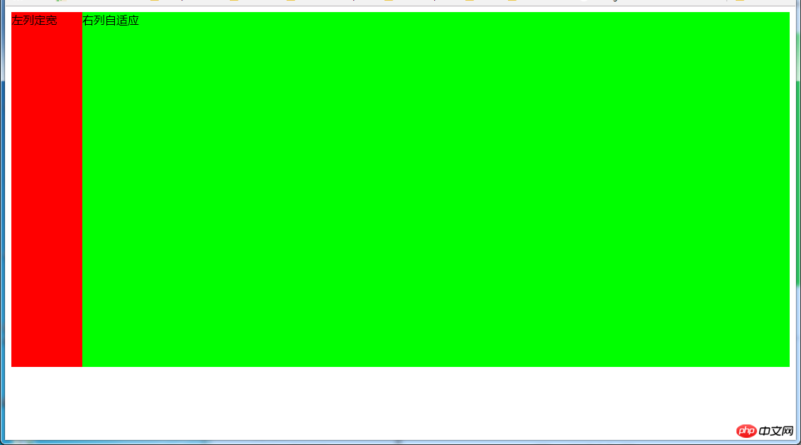
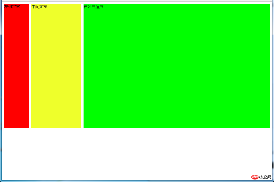
4.1 左列定宽,右列自适应
效果:
(1)利用float+margin实现
html代码:
<p>左列定宽</p>
<p>右列自适应</p>
css代码:
#left {
    background-color: #f00;
    float: left;
    width: 100px;
    height: 500px;
}
#right {
    background-color: #0f0;
    height: 500px;
    margin-left: 100px; /*大于等于#left的宽度*/
}
(2)利用float+margin(fix)实现
html代码:
<p>左列定宽</p>
<p>
    </p><p>右列自适应</p>
css代码:
#left {
    background-color: #f00;
    float: left;
    width: 100px;
    height: 500px;
}
#right-fix {
    float: right;
    width: 100%;
    margin-left: -100px; /*正值大于或等于#left的宽度,才能显示在同一行*/
}
#right{
    margin-left: 100px; /*大于或等于#left的宽度*/
    background-color: #0f0;
    height: 500px;
}
(3)使用float+overflow实现
html代码:
<p>左列定宽</p>
<p>右列自适应</p>
css代码:
#left {
    background-color: #f00;
    float: left;
    width: 100px;
    height: 500px;
}
#right {
    background-color: #0f0;
    height: 500px;
    overflow: hidden; /*触发bfc达到自适应*/
}
优缺点:
优点:代码简单,容易理解,无需关注定宽的宽度,利用bfc达到自适应效果
缺点:浮动脱离文档流,需要手动清除浮动,否则会产生高度塌陷;不支持ie6
(4)使用table实现
html代码:
<p>
    </p><p>左列定宽</p>
    <p>右列自适应</p>
css代码:
#parent{
    width: 100%;
    display: table;
    height: 500px;
}
#left {
    width: 100px;
    background-color: #f00;
}
#right {
    background-color: #0f0;
}
#left,#right{
    display: table-cell;  /*利用单元格自动分配宽度*/
}
优缺点:
优点:代码简单,容易理解,无需关注定宽的宽度,利用单元格自动分配达到自适应效果
缺点:margin失效;设置间隔比较麻烦;不支持ie8-
(5)使用绝对定位实现
html代码:
<p>
    </p><p>左列定宽</p>
    <p>右列自适应</p>
css代码:
#parent{
    position: relative;  /*子绝父相*/
}
#left {
    position: absolute;
    top: 0;
    left: 0;
    background-color: #f00;
    width: 100px;
    height: 500px;
}
#right {
    position: absolute;
    top: 0;
    left: 100px;  /*值大于等于#left的宽度*/
    right: 0;
    background-color: #0f0;
    height: 500px;
}
(6)使用flex实现
html代码:
<p>
    </p><p>左列定宽</p>
    <p>右列自适应</p>
css代码:
#parent{
    width: 100%;
    height: 500px;
    display: flex;
}
#left {
    width: 100px;
    background-color: #f00;
}
#right {
    flex: 1; /*均分了父元素剩余空间*/
    background-color: #0f0;
}
(7)使用Grid实现
html代码:
<p>
    </p><p>左列定宽</p>
    <p>右列自适应</p>
css代码:
#parent {
    width: 100%;
    height: 500px;
    display: grid;
    grid-template-columns: 100px auto;  /*设定2列就ok了,auto换成1fr也行*/
}
#left {
    background-color: #f00;
}
#right {
    background-color: #0f0;
}
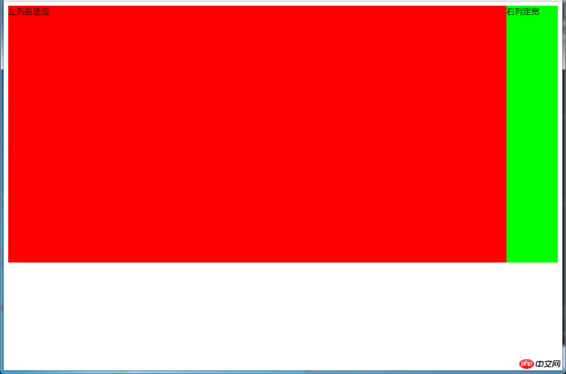
4.2 左列自适应,右列定宽
效果:
(1)使用float+margin实现
html代码:
<p>
    </p><p>左列自适应</p>
    <p>右列定宽</p>
css代码:
#parent{
    height: 500px;
    padding-left: 100px;  /*抵消#left的margin-left以达到#parent水平居中*/
}
#left {
    width: 100%;
    height: 500px;
    float: left;
    margin-left: -100px; /*正值等于#right的宽度*/
    background-color: #f00;
}
#right {
    height: 500px;
    width: 100px;
    float: right;
    background-color: #0f0;
}
(2)使用float+overflow实现
html代码:
<p>
    </p><p>右列定宽</p>
    <p>左列自适应</p>   <!--顺序要换一下-->
css代码:
#left {
    overflow: hidden;  /*触发bfc*/
    height: 500px;
    background-color: #f00;
}
#right {
    margin-left: 10px;  /*margin需要定义在#right中*/
    float: right;
    width: 100px;
    height: 500px;
    background-color: #0f0;
}
优缺点:
优点:代码简单,容易理解,无需关注定宽的宽度,利用bfc达到自适应效果
缺点:浮动脱离文档流,需要手动清除浮动,否则会产生高度塌陷;不支持ie6
(3)使用table实现
html代码:
<p>
    </p><p>左列自适应</p>
    <p>右列定宽</p>
css代码:
#parent{
    width: 100%;
    height: 500px;
    display: table;
}
#left {
    background-color: #f00;
    display: table-cell;
}
#right {
    width: 100px;
    background-color: #0f0;
    display: table-cell;
}
优缺点:
优点:代码简单,容易理解,无需关注定宽的宽度,利用单元格自动分配达到自适应效果
缺点:margin失效;设置间隔比较麻烦;不支持ie8-
(4)使用绝对定位实现
html代码:
<p>
    </p><p>左列自适应</p>
    <p>右列定宽</p>
css代码:
#parent{
    position: relative;  /*子绝父相*/
}
#left {
    position: absolute;
    top: 0;
    left: 0;
    right: 100px;  /*大于等于#rigth的宽度*/
    background-color: #f00;
    height: 500px;
}
#right {
    position: absolute;
    top: 0;
    right: 0;
    background-color: #0f0;
    width: 100px;
    height: 500px;
}
(5)使用flex实现
html代码:
<p>
    </p><p>左列自适应</p>
    <p>右列定宽</p>
css代码:
#parent{
    height: 500px;
    display: flex;
}
#left {
    flex: 1;
    background-color: #f00;
}
#right {
    width: 100px;
    background-color: #0f0;
}
(6)使用Grid实现
html代码:
<p>
    </p><p>左列自适应</p>
    <p>右列定宽</p>
css代码:
#parent {
    height: 500px;
    display: grid;
    grid-template-columns: auto 100px;  /*设定2列,auto换成1fr也行*/
}
#left {
    background-color: #f00;
}
#right {
    background-color: #0f0;
}
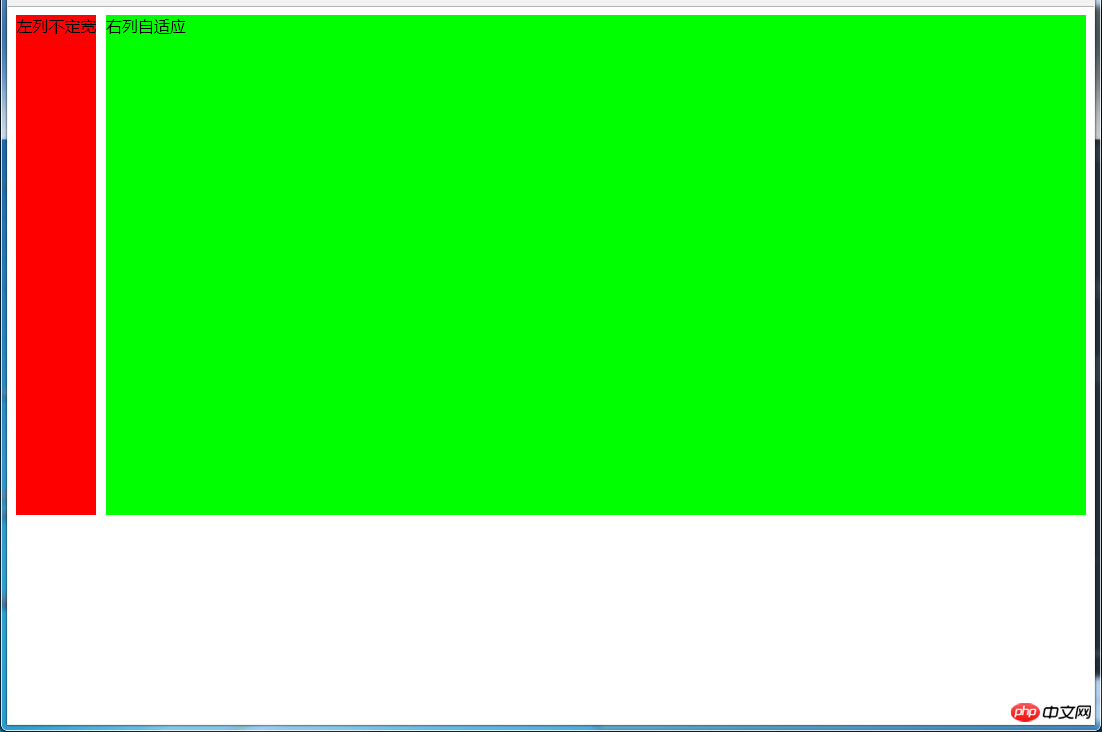
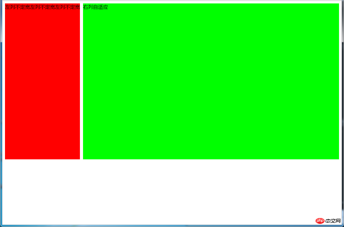
4.3 一列不定,一列自适应
(盒子宽度随着内容增加或减少发生变化,另一个盒子自适应)
效果图:
变化后:
(1)使用float+overflow实现
html代码:
<p>
    </p><p>左列不定宽</p>
    <p>右列自适应</p>
css代码:
#left {
    margin-right: 10px;
    float: left;  /*只设置浮动,不设宽度*/
    height: 500px;
    background-color: #f00;
}
#right {
    overflow: hidden;  /*触发bfc*/
    height: 500px;
    background-color: #0f0;
}
优缺点:
优点:代码简单,容易理解,无需关注宽度,利用bfc达到自适应效果
缺点:浮动脱离文档流,需要手动清除浮动,否则会产生高度塌陷;不支持ie6
(2)使用flex实现
html代码:
<p>
    </p><p>左列不定宽</p>
    <p>右列自适应</p>
css代码:
#parent{
    display: flex;
}
#left { /*不设宽度*/
    margin-right: 10px;
    height: 500px;
    background-color: #f00;
}
#right {
    height: 500px;
    background-color: #0f0;
    flex: 1;  /*均分#parent剩余的部分*/
}
(3)使用Grid实现
html代码:
<p>
    </p><p>左列不定宽</p>
    <p>右列自适应</p>
css代码:
#parent{
    display: grid;
    grid-template-columns: auto 1fr;  /*auto和1fr换一下顺序就是左列自适应,右列不定宽了*/
}
#left {
    margin-right: 10px;
    height: 500px;
    background-color: #f00;
}
#right {
    height: 500px;
    background-color: #0f0;
}
左列自适应,右列不定宽同理(参考4.1和4.3对应代码示例)
五、三列布局
5.1 两列定宽,一列自适应
效果图:
(1)使用float+margin实现
html代码:
<p>
    </p><p>左列定宽</p>
    <p>中间定宽</p>
    <p>右列自适应</p>
css代码:
#parent{
    min-width: 310px; /*100+10+200,防止宽度不够,子元素换行*/
}
#left {
    margin-right: 10px;  /*#left和#center间隔*/
    float: left;
    width: 100px;
    height: 500px;
    background-color: #f00;
}
#center{
    float: left;
    width: 200px;
    height: 500px;
    background-color: #eeff2b;
}
#right {
    margin-left: 320px;  /*等于#left和#center的宽度之和加上间隔,多出来的就是#right和#center的间隔*/
    height: 500px;
    background-color: #0f0;
}
(2)使用float+overflow实现
html代码:
<p>
    </p><p>左列定宽</p>
    <p>中间定宽</p>
    <p>右列自适应</p>
css代码:
#parent{
    min-width: 320px; /*100+10+200+20,防止宽度不够,子元素换行*/
}
#left {
    margin-right: 10px; /*间隔*/
    float: left;
    width: 100px;
    height: 500px;
    background-color: #f00;
}
#center{
    margin-right: 10px; /*在此定义和#right的间隔*/
    float: left;
    width: 200px;
    height: 500px;
    background-color: #eeff2b;
}
#right {
    overflow: hidden;  /*触发bfc*/
    height: 500px;
    background-color: #0f0;
}
优缺点:
优点:代码简单,容易理解,无需关注定宽的宽度,利用bfc达到自适应效果
缺点:浮动脱离文档流,需要手动清除浮动,否则会产生高度塌陷;不支持ie6
(3)使用table实现
html代码:
<p>
    </p><p>左列定宽</p>
    <p>中间定宽</p>
    <p>右列自适应</p>
css代码:
#parent {
    width: 100%;
    height: 520px; /*抵消上下间距10*2的高度影响*/
    margin: -10px 0;  /*抵消上下边间距10的位置影响*/
    display: table;
    /*左右两边间距大了一点,子元素改用padding设置盒子间距就没有这个问题*/
    border-spacing: 10px;  /*关键!!!设置间距*/
}
#left {
    display: table-cell;
    width: 100px;
    background-color: #f00;
}
#center {
    display: table-cell;
    width: 200px;
    background-color: #eeff2b;
}
#right {
    display: table-cell;
    background-color: #0f0;
}
优缺点:
优点:代码简单,容易理解,无需关注定宽的宽度,利用单元格自动分配达到自适应效果
缺点:margin失效;设置间隔比较麻烦;不支持ie8-
(4)使用flex实现
html代码:
<p>
    </p><p>左列定宽</p>
    <p>中间定宽</p>
    <p>右列自适应</p>
css代码:
#parent {
    height: 500px;
    display: flex;
}
#left {
    margin-right: 10px;  /*间距*/
    width: 100px;
    background-color: #f00;
}
#center {
    margin-right: 10px;  /*间距*/
    width: 200px;
    background-color: #eeff2b;
}
#right {
    flex: 1;  /*均分#parent剩余的部分达到自适应*/
    background-color: #0f0;
}
(5)使用Grid实现
html代码:
<p>
    </p><p>左列定宽</p>
    <p>中间定宽</p>
    <p>右列自适应</p>
css代码:
#parent {
    height: 500px;
    display: grid;
    grid-template-columns: 100px 200px auto; /*设置3列,固定第一第二列的宽度,第三列auto或者1fr*/
}
#left {
    margin-right: 10px;  /*间距*/
    background-color: #f00;
}
#center {
    margin-right: 10px;  /*间距*/
    background-color: #eeff2b;
}
#right {
    background-color: #0f0;
}
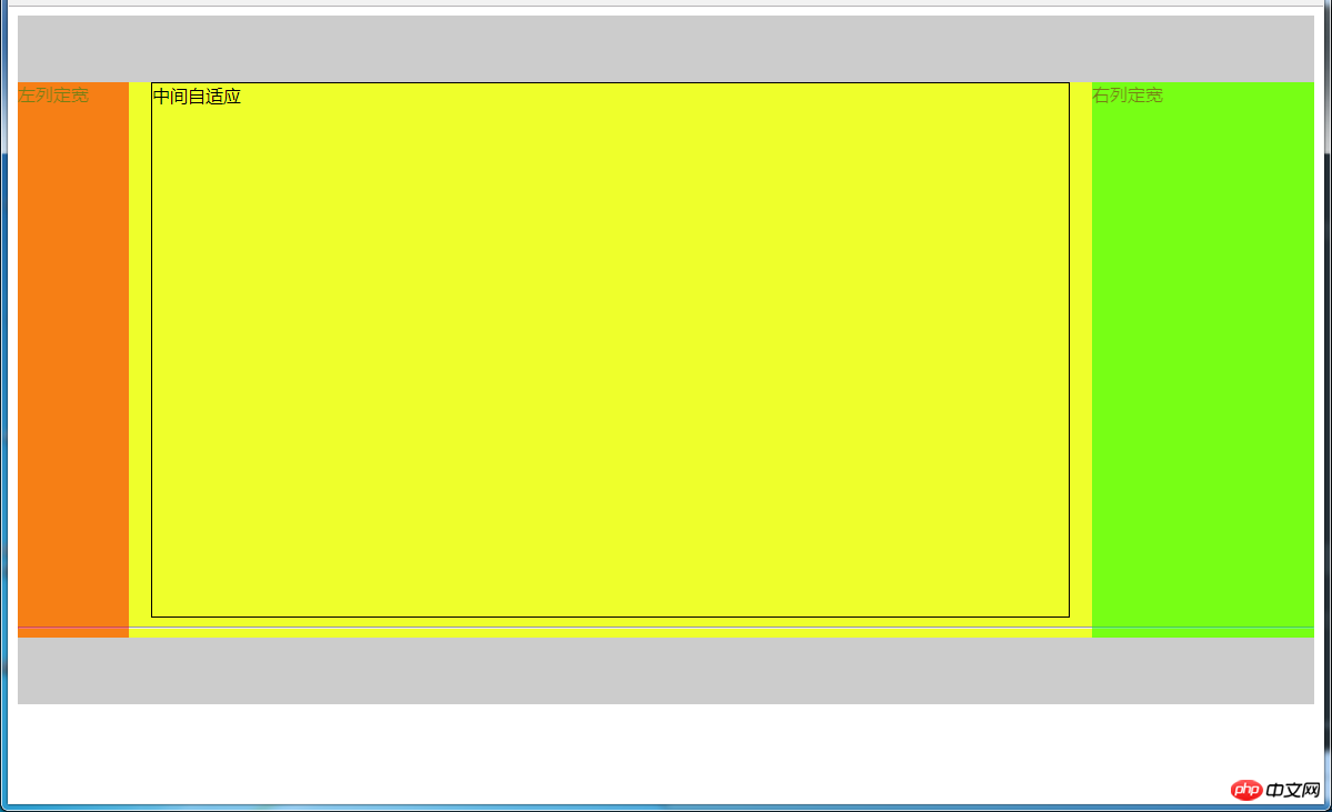
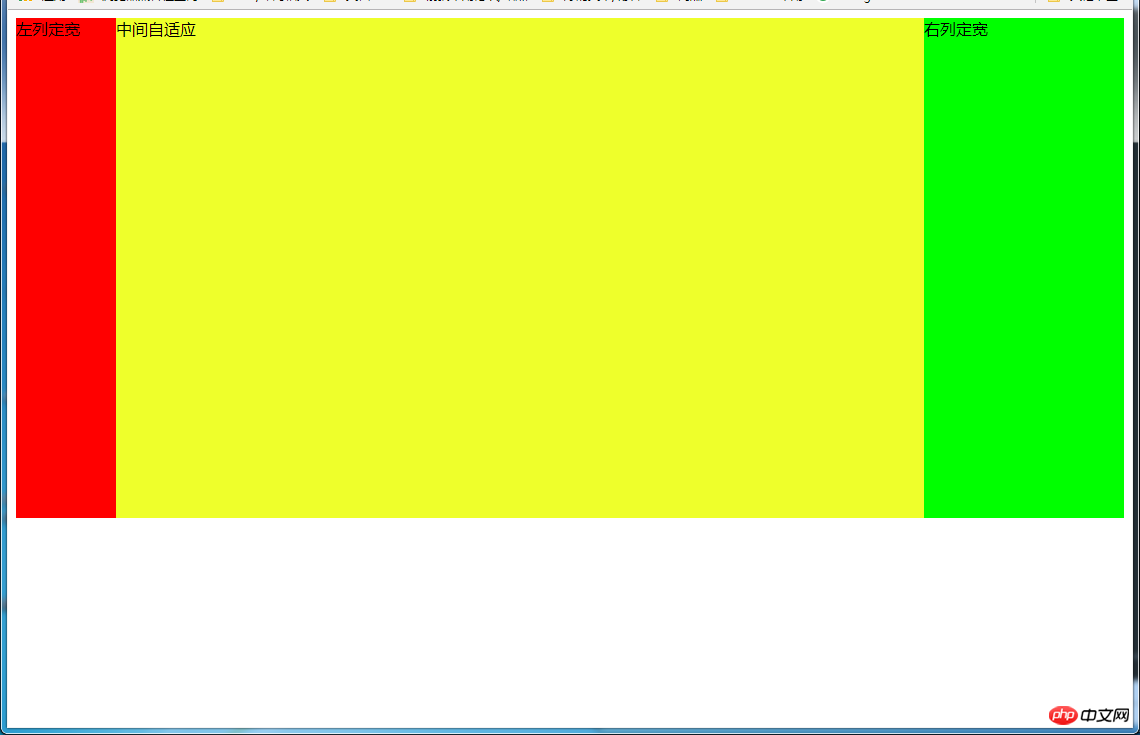
5.2 两侧定宽,中间自适应
5.2.1 双飞翼布局方法
效果图:
html代码:
<p></p>
<!--中间栏需要放在前面-->
<p>
    </p><p>
        </p><p>中间自适应</p>
        <hr>  <!--方便观察原理-->

    <p>左列定宽</p>
    <p>右列定宽</p>

<p></p>
css代码:
#header {
    height: 60px;
    background-color: #ccc;
}
#left {
    float: left;
    width: 100px;
    height: 500px;
    margin-left: -100%; /*调整#left的位置,值等于自身宽度*/
    background-color: #f00;
    opacity: 0.5;
}
#center {
    height: 500px;
    float: left;
    width: 100%;
    background-color: #eeff2b;
}
#center_inbox{
    height: 480px;
    border: 1px solid #000;
    margin: 0 220px 0 120px;  /*关键!!!左右边界等于左右盒子的宽度,多出来的为盒子间隔*/
}
#right {
    float: left;
    width: 200px;
    height: 500px;
    margin-left: -200px;  /*使right到指定的位置,值等于自身宽度*/
    background-color: #0f0;
    opacity: 0.5;
}
#footer {
    clear: both;  /*注意清除浮动!!*/
    height: 60px;
    background-color: #ccc;
}
5.2.2 圣杯布局方法
效果图:
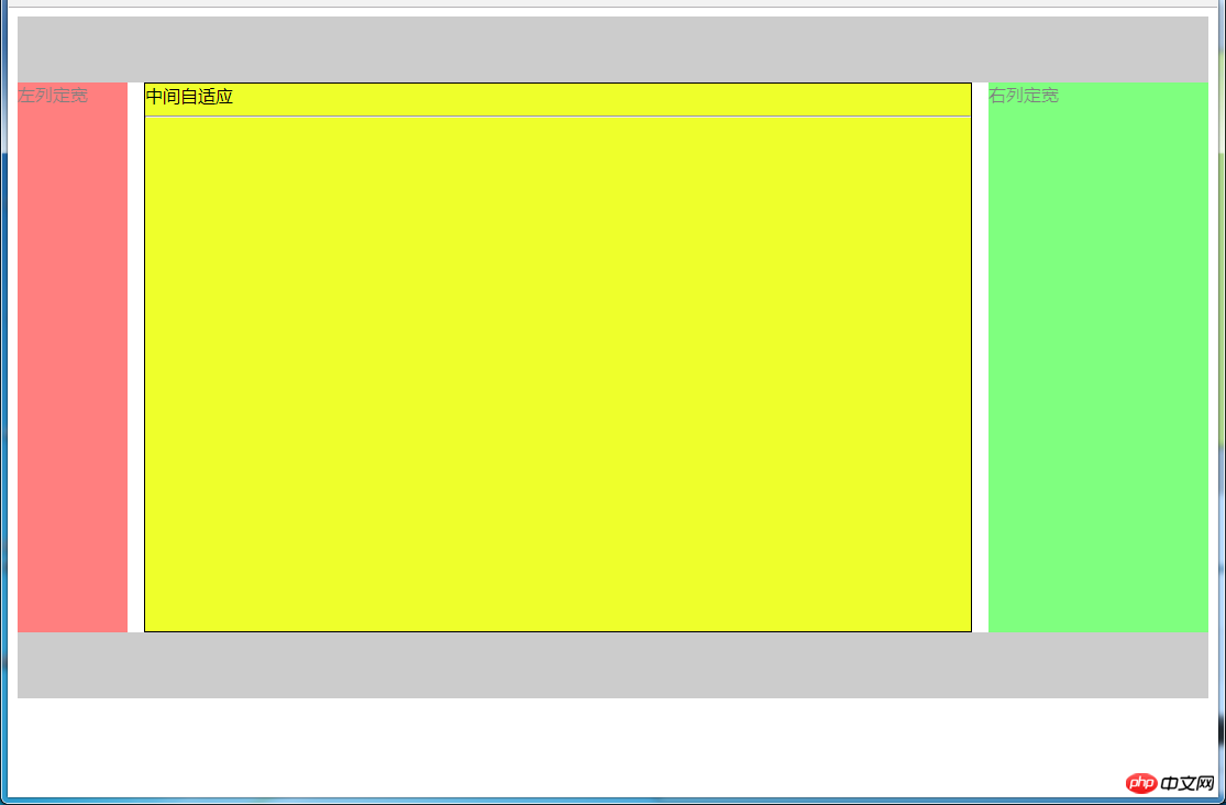
html代码:
<p></p>
<p>
    <!--#center需要放在前面-->
    </p><p>中间自适应
        </p><hr>

    <p>左列定宽</p>
    <p>右列定宽</p>

<p></p>
css代码:
#header{
    height: 60px;
    background-color: #ccc;
}
#parent {
    box-sizing: border-box;
    height: 500px;
    padding: 0 215px 0 115px;  /*为了使#center摆正,左右padding分别等于左右盒子的宽,可以结合左右盒子相对定位的left调整间距*/
}
#left {
    margin-left: -100%;  /*使#left上去一行*/
    position: relative;
    left: -115px;  /*相对定位调整#left的位置,正值大于或等于自身宽度*/
    float: left;
    width: 100px;
    height: 500px;
    background-color: #f00;
    opacity: 0.5;
}
#center {
    float: left;
    width: 100%;  /*由于#parent的padding,达到自适应的目的*/
    height: 500px;
    box-sizing: border-box;
    border: 1px solid #000;
    background-color: #eeff2b;
}
#right {
    position: relative;
    left: 215px; /*相对定位调整#right的位置,大于或等于自身宽度*/
    width: 200px;
    height: 500px;
    margin-left: -200px;  /*使#right上去一行*/
    float: left;
    background-color: #0f0;
    opacity: 0.5;
}
#footer{
    height: 60px;
    background-color: #ccc;
}
5.2.3 使用Grid实现
效果图:
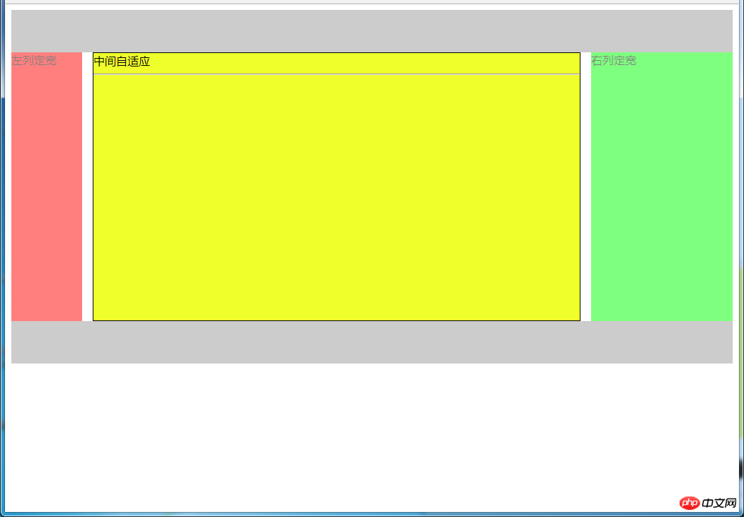
html代码:
<p> </p><p></p>中间自适应
左列定宽
右列定宽
css代码:
#parent {
    height: 500px;
    display: grid;
    grid-template-columns: 100px auto 200px; /*设定3列*/
    grid-template-rows: 60px auto 60px; /*设定3行*/
    /*设置网格区域分布*/
    grid-template-areas:
        "header header header"
        "leftside main rightside"
        "footer footer footer";
}
#header {
    grid-area: header; /*指定在哪个网格区域*/
    background-color: #ccc;
}
#left {
    grid-area: leftside;
    background-color: #f00;
    opacity: 0.5;
}
#center {
    grid-area: main; /*指定在哪个网格区域*/
    margin: 0 15px; /*设置间隔*/
    border: 1px solid #000;
    background-color: #eeff2b;
}
#right {
    grid-area: rightside; /*指定在哪个网格区域*/
    background-color: #0f0;
    opacity: 0.5;
}
#footer {
    grid-area: footer; /*指定在哪个网格区域*/
    background-color: #ccc;
}
5.2.4 其他方法
效果图:
(1)使用table实现
html代码:
<p>
    </p><p>左列定宽</p>
    <p>中间自适应</p>
    <p>右列定宽</p>
css代码:
#parent {
    width: 100%;
    height: 500px;
    display: table;
}
#left {
    display: table-cell;
    width: 100px;
    background-color: #f00;
}
#center {
    display: table-cell;
    background-color: #eeff2b;
}
#right {
    display: table-cell;
    width: 200px;
    background-color: #0f0;
}
优缺点:
优点:代码简洁,容易理解;
缺点:margin失效,采用border-spacing表格两边的间隔无法消除;不支持ie8-
(2)使用flex实现
html代码:
<p>
    </p><p>左列定宽</p>
    <p>中间自适应</p>
    <p>右列定宽</p>
css代码:
#parent {
    height: 500px;
    display: flex;
}
#left {
    width: 100px;
    background-color: #f00;
}
#center {
    flex: 1;  /*均分#parent剩余的部分*/
    background-color: #eeff2b;
}
#right {
    width: 200px;
    background-color: #0f0;
}
(3)使用position实现
html代码:
<p>
    </p><p>左列定宽</p>
    <p>中间自适应</p>
    <p>右列定宽</p>
css代码:
#parent {
    position: relative; /*子绝父相*/
}
#left {
    position: absolute;
    top: 0;
    left: 0;
    width: 100px;
    height: 500px;
    background-color: #f00;
}
#center {
    height: 500px;
    margin-left: 100px; /*大于等于#left的宽度,或者给#parent添加同样大小的padding-left*/
    margin-right: 200px;  /*大于等于#right的宽度,或者给#parent添加同样大小的padding-right*/
    background-color: #eeff2b;
}
#right {
    position: absolute;
    top: 0;
    right: 0;
    width: 200px;
    height: 500px;
    background-color: #0f0;
}
优缺点:
优点:容易理解,兼容性比较好
缺点:需手动计算宽度确定边距;脱离文档流;代码繁多
六、多列布局
6.1 等宽布局
6.1.1 四列等宽
(1)使用float实现
效果图:
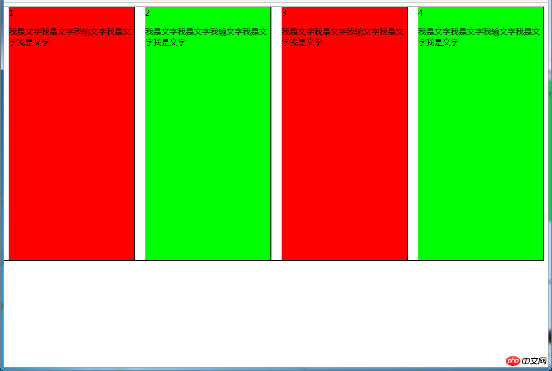
html代码:
<p>
    </p><p>1 </p><p>我是文字我是文字我输文字我是文字我是文字</p>
    <p>2 </p><p>我是文字我是文字我输文字我是文字我是文字</p>
    <p>3 </p><p>我是文字我是文字我输文字我是文字我是文字</p>
    <p>4 </p><p>我是文字我是文字我输文字我是文字我是文字</p>
css代码:
#parent {
    margin-left: -20px; /*使整体内容看起来居中,抵消padding-left的影响*/
}
.column{
    padding-left: 20px;  /*盒子的边距*/
    width: 25%;
    float: left;
    box-sizing: border-box;
    border: 1px solid #000;
    background-clip: content-box; /*背景色从内容开始绘制,方便观察*/
    height: 500px;
}
.column:nth-child(odd){
    background-color: #f00;
}
.column:nth-child(even){
    background-color: #0f0;
}
优缺点:
优点:代码简单,容易理解;兼容性较好
缺点:需要手动清除浮动,否则会产生高度塌陷
(2)使用table实现
效果图:
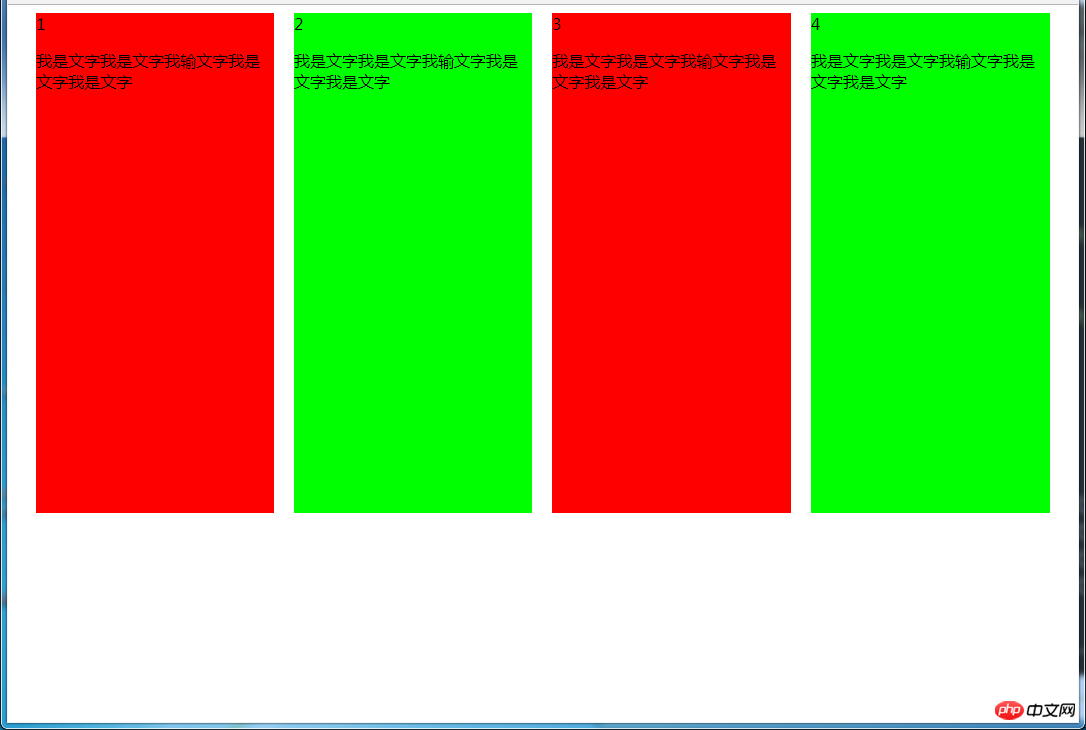
html代码:
<p>
    </p><p>1 </p><p>我是文字我是文字我输文字我是文字我是文字</p>
    <p>2 </p><p>我是文字我是文字我输文字我是文字我是文字</p>
    <p>3 </p><p>我是文字我是文字我输文字我是文字我是文字</p>
    <p>4 </p><p>我是文字我是文字我输文字我是文字我是文字</p>
css代码:
#parent {
    height: 540px;  /*抵消上下边20*2间距的高度影响*/
    display: table;
    margin: -20px 0;  /*抵消上下边20*2间距的位置影响*/
    /*两边离页面间距较大,改用子元素设置padding来当成间隔就不会有这样的问题*/
    border-spacing: 20px;  /*设置间距*/
}
.column{
    display: table-cell;
}
.column:nth-child(odd){
    background-color: #f00;
}
.column:nth-child(even){
    background-color: #0f0;
}
优缺点:
优点:代码简单,容易理解;无需关注宽度,单元格自动等分
缺点:margin失效;设置间隔比较麻烦;不支持ie8-
(3)使用flex实现
效果图:

html代码:
<p>
    </p><p>1 </p><p>我是文字我是文字我输文字我是文字我是文字</p>
    <p>2 </p><p>我是文字我是文字我输文字我是文字我是文字</p>
    <p>3 </p><p>我是文字我是文字我输文字我是文字我是文字</p>
    <p>4 </p><p>我是文字我是文字我输文字我是文字我是文字</p>
css代码:
#parent {
    margin-left: -15px;  /*使内容看起来居中*/
    height: 500px;
    display: flex;
}
.column{
    flex: 1; /*一起平分#parent*/
    margin-left: 15px; /*设置间距*/
}
.column:nth-child(odd){
    background-color: #f00;
}
.column:nth-child(even){
    background-color: #0f0;
}
多列等宽
效果图:
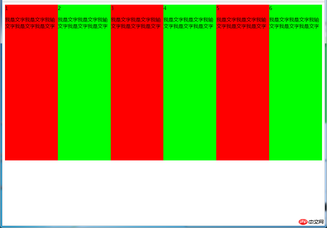
(1)使用float实现
html代码:
<p>
    </p><p>1 </p><p>我是文字我是文字我输文字我是文字我是文字</p>
    <p>2 </p><p>我是文字我是文字我输文字我是文字我是文字</p>
    <p>3 </p><p>我是文字我是文字我输文字我是文字我是文字</p>
    <p>4 </p><p>我是文字我是文字我输文字我是文字我是文字</p>
    <p>5 </p><p>我是文字我是文字我输文字我是文字我是文字</p>
    <p>6 </p><p>我是文字我是文字我输文字我是文字我是文字</p>
css代码:
#parent {
    height: 500px;
}
.column{
    float: left;  /*添加浮动*/
    width: 16.66666666666667%;  /*100÷列数,得出百分比*/
    height: 500px;
}
.column:nth-child(odd){
    background-color: #f00;
}
.column:nth-child(even){
    background-color: #0f0;
}
优缺点:
优点:代码简单,容易理解;兼容性较好
缺点:需要手动清除浮动,否则会产生高度塌陷
(2)使用table实现
html代码
<p>
    </p><p>1 </p><p>我是文字我是文字我输文字我是文字我是文字</p>
    <p>2 </p><p>我是文字我是文字我输文字我是文字我是文字</p>
    <p>3 </p><p>我是文字我是文字我输文字我是文字我是文字</p>
    <p>4 </p><p>我是文字我是文字我输文字我是文字我是文字</p>
    <p>5 </p><p>我是文字我是文字我输文字我是文字我是文字</p>
    <p>6 </p><p>我是文字我是文字我输文字我是文字我是文字</p>
css代码:
#parent {
    width: 100%;
    height: 500px;
    display: table;
}
.column{
    display: table-cell; /*无需关注列数,单元格自动平分*/
}
.column:nth-child(odd){
    background-color: #f00;
}
.column:nth-child(even){
    background-color: #0f0;
}
优缺点:
优点:代码简单,容易理解;无需关注宽度。单元格自动等分
缺点:margin失效;设置间隔比较麻烦;不兼容ie8-
(3)使用flex实现
html代码:
<p>
    </p><p>1 </p><p>我是文字我是文字我输文字我是文字我是文字</p>
    <p>2 </p><p>我是文字我是文字我输文字我是文字我是文字</p>
    <p>3 </p><p>我是文字我是文字我输文字我是文字我是文字</p>
    <p>4 </p><p>我是文字我是文字我输文字我是文字我是文字</p>
    <p>5 </p><p>我是文字我是文字我输文字我是文字我是文字</p>
    <p>6 </p><p>我是文字我是文字我输文字我是文字我是文字</p>
css代码:
#parent {
    height: 500px;
    display: flex;
}
.column{
    flex: 1;  /*无需关注列数,一起平分#parent*/
}
.column:nth-child(odd){
    background-color: #f00;
}
.column:nth-child(even){
    background-color: #0f0;
}
(4)使用Grid实现
html代码:
<p>
    </p><p>1 </p><p>我是文字我是文字我输文字我是文字我是文字</p>
    <p>2 </p><p>我是文字我是文字我输文字我是文字我是文字</p>
    <p>3 </p><p>我是文字我是文字我输文字我是文字我是文字</p>
    <p>4 </p><p>我是文字我是文字我输文字我是文字我是文字</p>
    <p>5 </p><p>我是文字我是文字我输文字我是文字我是文字</p>
    <p>6 </p><p>我是文字我是文字我输文字我是文字我是文字</p>
css代码:
#parent {
    height: 500px;
    display: grid;
    grid-template-columns: repeat(6,1fr);  /*6就是列数*/
}
.column{}
.column:nth-child(odd){
    background-color: #f00;
}
.column:nth-child(even){
    background-color: #0f0;
}
6.2 九宫格布局
效果图:
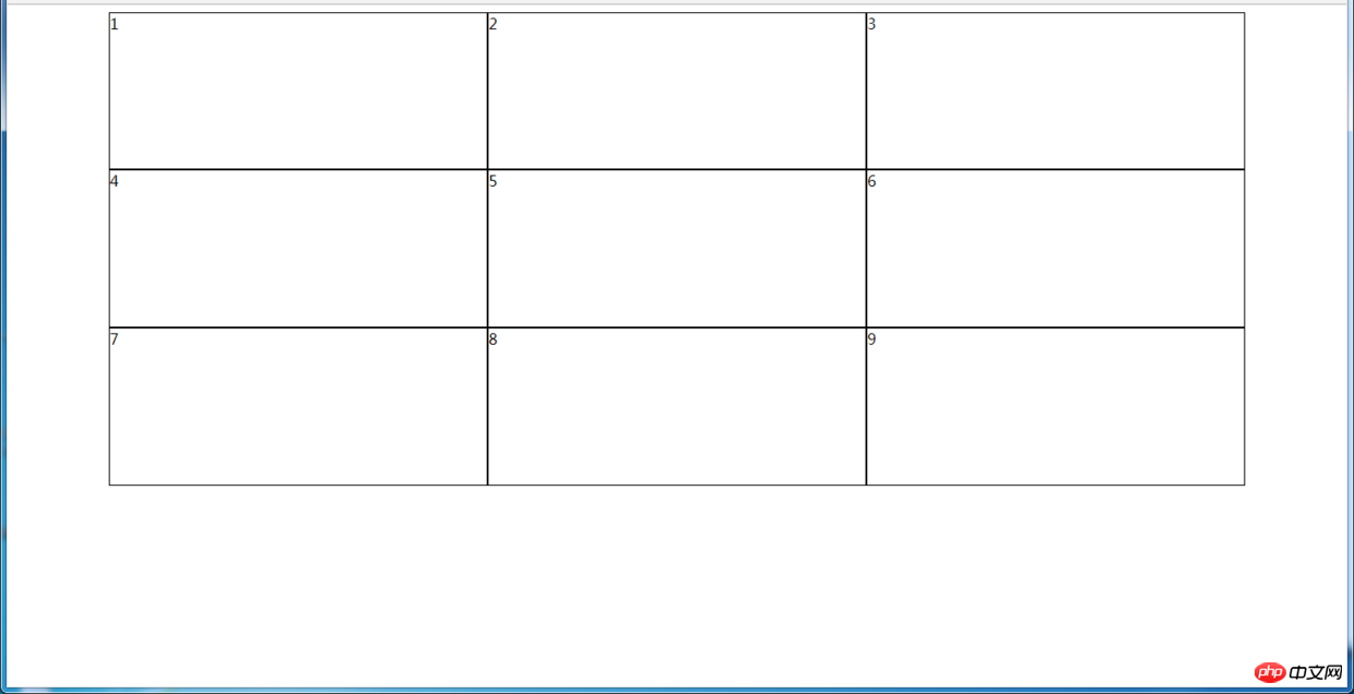
(1)使用table实现
html代码:
<p>
    </p><p>
        </p><p>1</p>
        <p>2</p>
        <p>3</p>

    <p>
        </p><p>4</p>
        <p>5</p>
        <p>6</p>

    <p>
        </p><p>7</p>
        <p>8</p>
        <p>9</p>
css代码:
#parent {
    width: 1200px;
    height: 500px;
    margin: 0 auto;
    display: table;
}
.row {
    display: table-row;
}
.item {
    border: 1px solid #000;
    display: table-cell;
}
优缺点:
优点:代码简洁,容易理解;
缺点:margin失效,采用border-spacing表格两边的间隔无法消除;不支持ie8-
(2)使用flex实现
html代码:
<p>
    </p><p>
        </p><p>1</p>
        <p>2</p>
        <p>3</p>

    <p>
        </p><p>4</p>
        <p>5</p>
        <p>6</p>

    <p>
        </p><p>7</p>
        <p>8</p>
        <p>9</p>
css代码:
#parent {
    width: 1200px;
    height: 500px;
    margin: 0 auto;
    display: flex;
    flex-direction: column;
}
.row {
    display: flex;
    flex: 1;
}
.item {
    flex: 1;
    border: 1px solid #000;
}
(3)使用Grid实现
CSS Grid非常强大,可以实现各种各样的三维布局,可查阅本文结尾的阅读推荐
html代码:
<p>
    </p><p>1</p>
    <p>2</p>
    <p>3</p>
    <p>4</p>
    <p>5</p>
    <p>6</p>
    <p>7</p>
    <p>8</p>
    <p>9</p>
css代码:
#parent {
    width: 1200px;
    height: 500px;
    margin: 0 auto;
    display: grid;
    grid-template-columns: repeat(3, 1fr); /*等同于1fr 1fr 1fr,此为重复的合并写法*/
    grid-template-rows: repeat(3, 1fr);  /*等同于1fr 1fr 1fr,此为重复的合并写法*/
}
.item {
    border: 1px solid #000;
}
6.3 栅格系统
优缺点:
优点:代码简洁,容易理解;提高页面内容的流动性,能适应多种设备;
(1)用Less生成
/*生成栅格系统*/
@media screen and (max-width: 768px){
  .generate-columns(12);     /*此处设置生成列数*/
  .generate-columns(@n, @i: 1) when (@i <p>编译后的CSS代码:</p><pre class="brush:php;toolbar:false">@media screen and (max-width: 768px) {
  .column-xs-1 {  width: 8.33333333%;  }
  .column-xs-2 {  width: 16.66666667%;  }
  .column-xs-3 {  width: 25%;  }
  .column-xs-4 {  width: 33.33333333%;  }
  .column-xs-5 {  width: 41.66666667%;  }
  .column-xs-6 {  width: 50%;  }
  .column-xs-7 {  width: 58.33333333%;  }
  .column-xs-8 {  width: 66.66666667%;  }
  .column-xs-9 {  width: 75%;  }
  .column-xs-10 {  width: 83.33333333%;  }
  .column-xs-11 {  width: 91.66666667%;  }
  .column-xs-12 {  width: 100%;  }
}
@media screen and (min-width: 768px) {
  .column-sm-1 {  width: 8.33333333%;  }
  .column-sm-2 {  width: 16.66666667%;  }
  .column-sm-3 {  width: 25%;  }
  .column-sm-4 {  width: 33.33333333%;  }
  .column-sm-5 {  width: 41.66666667%;  }
  .column-sm-6 {  width: 50%;  }
  .column-sm-7 {  width: 58.33333333%;  }
  .column-sm-8 {  width: 66.66666667%;  }
  .column-sm-9 {  width: 75%;  }
  .column-sm-10 {  width: 83.33333333%;  }
  .column-sm-11 {  width: 91.66666667%;  }
  .column-sm-12 {  width: 100%;  }
}
p[class^="column-xs-"]{
    float: left;
}
p[class^="column-sm-"]{
    float: left;
}
七、全屏布局
效果图:
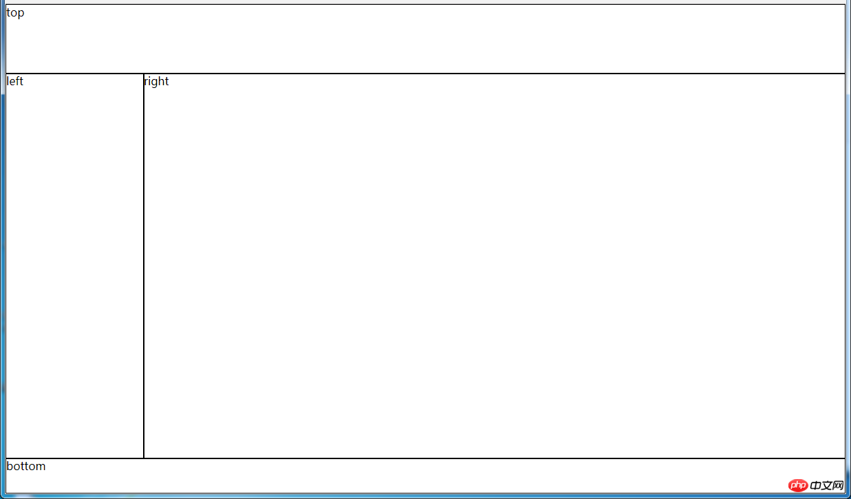
(1)使用绝对定位实现
html代码:
<p>
    </p><p>top</p>
    <p>left</p>
    <p>right</p>
    <p>bottom</p>
css代码:
html, body, #parent {height: 100%;overflow: hidden;}
#parent > p {
    border: 1px solid #000;
}
#top {
    position: absolute;
    top: 0;
    left: 0;
    right: 0;
    height: 100px;
}
#left {
    position: absolute;
    top: 100px;  /*值大于等于#top的高度*/
    left: 0;
    bottom: 50px;  /*值大于等于#bottom的高度*/
    width: 200px;
}
#right {
    position: absolute;
    overflow: auto;
    left: 200px;  /*值大于等于#left的宽度*/
    right: 0;
    top: 100px;  /*值大于等于#top的高度*/
    bottom: 50px;  /*值大于等于#bottom的高度*/
}
#bottom {
    position: absolute;
    left: 0;
    right: 0;
    bottom: 0;
    height: 50px;
}
优缺点:
优点:容易理解
缺点:代码繁多;需要计算好各个盒子的宽高;
(2)使用flex实现
html代码:
<p>
    </p><p>top</p>
    <p>
        </p><p>left</p>
        <p>right</p>

    <p>bottom</p>
css代码:
*{
    margin: 0;
    padding: 0;
}
html,body,#parent{
    height:100%;
}
#parent {
    display: flex;
    flex-direction: column;
}
#top {
    height: 100px;
}
#bottom {
    height: 50px;
}
#middle {
    flex: 1;
    display: flex;
}
#left {
    width: 200px;
}
#right {
    flex: 1;
    overflow: auto;
}
(3)使用Grid实现
html代码:
<p>
    </p><p>top</p>
    <p>left</p>
    <p>right</p>
    <p>bottom</p>
css代码:
*{
    margin: 0;
    padding: 0;
}
html, body, #parent {
    height: 100%;
}
#parent {
    width: 100%;
    height: 100%;
    display: grid;
    /*分成2列,第一列宽度200px,第二列1fr平分剩余的部分,此处换成auto也行*/
    grid-template-columns: 200px 1fr;
    /*分成3行,第一行高度100px,第二行auto为自适应,此处换成1fr也行,第3行高度为50px*/
    grid-template-rows: 100px auto 50px;
    /*定义网格区域分布*/
    grid-template-areas:
        "header header"
        "aside main"
        "footer footer";
}
#parent>p{
    border: 1px solid #000;
}
#top{
    grid-area: header;  /*指定在哪个网格区域*/
}
#left{
    grid-area: aside;  /*指定在哪个网格区域*/
}
#right{
    grid-area: main;  /*指定在哪个网格区域*/
}
#bottom{
    grid-area: footer;  /*指定在哪个网格区域*/
}
八、网站实例布局分析:
由于方法众多,分析的时候想到哪种用哪种了,只要IE9和谷歌上表现一致,我就不一一测试其他浏览器了,如果有什么问题或意见,请留言!
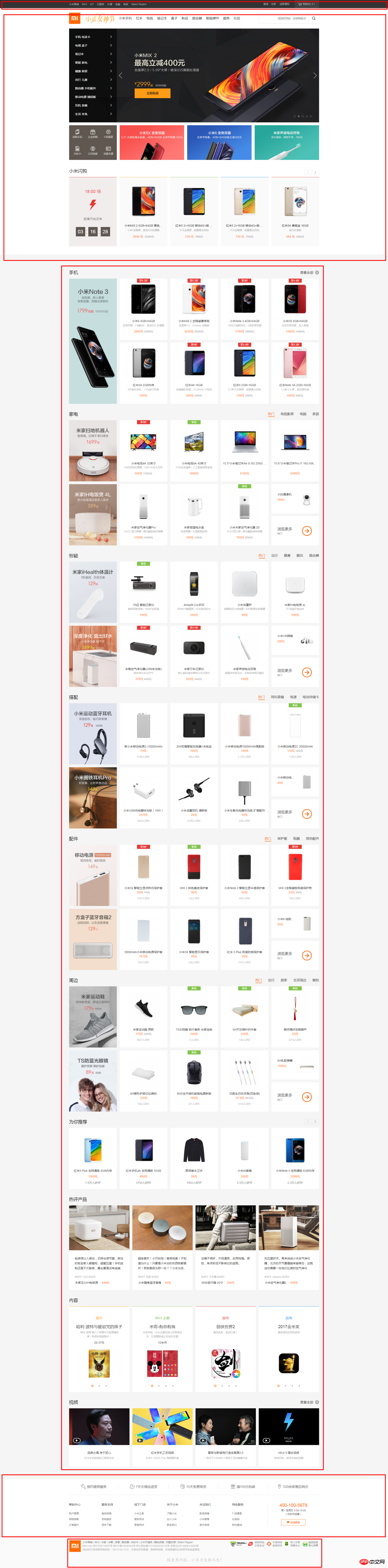
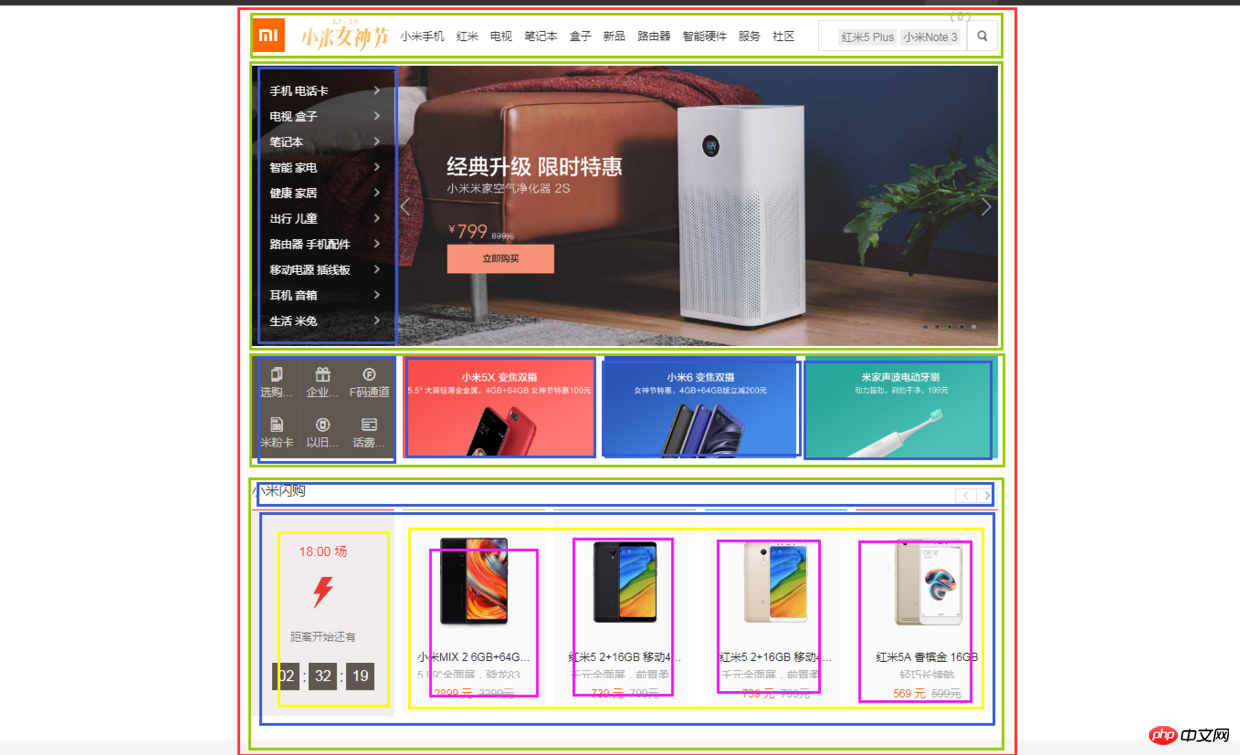
8.1 小米官网
https://www.mi.com/
8.1.1 兼容IE9+的方法
(1)页面整体
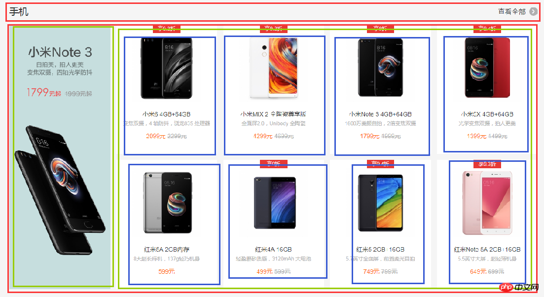
整个页面我们可以分成顶、上、中、下、底五个结构,如图所示:
html代码:
<p></p>
<p></p>
<p></p>
<p></p>
<p></p>
css代码:
*{  /*为了方便,就这样清空默认样式了*/
    margin: 0;
    padding: 0;
    box-sizing: border-box;
    list-style: none;
}
body{
    background-color: #f5f5f5;
}
.header{
    margin-bottom: 20px;
    height: 40px;
    background-color: #333;
}
.top{
    height: 1210px;
    background-color: #fff;
}
.center{
    width: 1226px;
    margin: 0 auto;
    margin-bottom: 60px;
    height: 1791px;
    background-color: #fff;
}
.bottom{
    height: 274px;
    background-color: #fff;
}
.footer{
    margin: 0 auto;
    width: 1226px;
    height: 166px;
    border: 1px solid #000;
}
(2)局部——header
header部分首先是一个水平居中的内容,内容盒子可以分成左右两个部分,如图所示:

html代码:
<p>
    </p><p>
        </p><p></p>
        <p></p>
css代码:
.container{  /*后面会继续用到*/
    width: 1226px;
    height: 100%;
    margin: 0 auto;
    border: 1px solid #f00;
}
.header-left{
    width: 380px;
    height: 100%;
    float: left;
    background-color: #0f0;
}
.header-rigth{
    width: 260px;
    height: 100%;
    float: right;
    background-color: #0f0;
}
(3)局部——top
top部分先有一个水平居中的内容,再就是内容由上到下可以分成四个部分,然后每个部分再细分......说不下去了,直接上图:
html代码:
<p>
    </p><p>
        </p><p></p>
        <p>
            </p><p></p>

        <p>
            </p><p></p>
            <p>
                </p>
css代码:
.top {
    height: 1210px;
    background-color: #fff;
}
.top-nav {
    height: 100px;
    background-color: #f00;
}
.top-slider {
    margin-bottom: 14px;
    position: relative;
    height: 460px;
    background-color: #00f;
}
.slider-navbar {
    position: absolute;
    top: 0;
    left: 0;
    width: 234px;
    height: 100%;
    background-color: black;
    opacity: .5;
}
.top-recommend {
    margin-bottom: 26px;
    height: 170px;
    background-color: #0f0;
}
.recommend-left {
    float: left;
    height: 100%;
    width: 234px;
    background-color: skyblue;
}
.recommend-right {
    float: right;
    width: 978px;
    height: 100%;
    border: 1px solid #000;
}
.recommend-right > ul {
    height: 100%;
}
.recommend-right > ul li {
    float: left;
    width: 316px;
    height: 100%;
    background-color: deepskyblue;
}
.recommend-right > ul li + li {
    margin-left: 14px;
}
.top-flashsale {
    height: 438px;
    background-color: #ff4455;
}
.flashsale-title {
    height: 58px;
    background-color: purple;
}
.flashsale-content {
    border: 1px solid #000;
    padding-bottom: 40px;
    height: 380px;
}
.content-timer {
    margin-right: 14px;
    float: left;
    width: 234px;
    height: 100%;
    background-color: #fff;
}
.content-shops {
    overflow: hidden;
    height: 100%;
    background-color: #6effb1;
}
.content-shops > li {
    float: left;
    width: 234px;
    height: 100%;
    background-color: #fff;
}
.content-shops > li+li {
    margin-left: 12.5px;
}
(4)局部——center
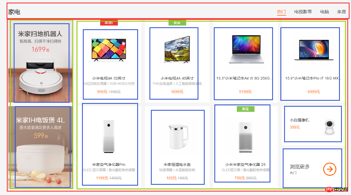
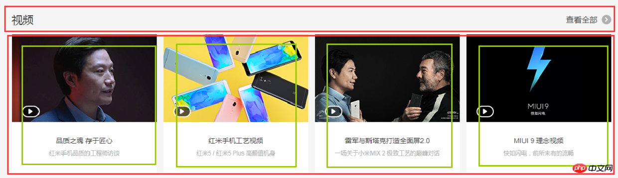
center部分都是一些单元格展示,有很多类似的模块,就挑几个来实现了,直接看图吧:
html代码:
<p>
    </p><p>
        </p><p></p>
        <p>
            </p><p></p>
css代码:
.center {
    margin: 0 auto;
    margin-bottom: 60px;
    padding-top: 60px;
    width: 1226px;
    height: 1791px;
    background-color: #fff;
}
.center-phone{
    margin-bottom: 8px;
    height: 686px;
    background-color: yellow;
}
.phone-title{
    height: 58px;
    background-color: black;
}
.phone-content{
    height: 628px;
    background-color: pink;
}
.phone-left{
    margin-right: 14px;
    float: left;
    width: 234px;
    height: 100%;
    background-color: darkseagreen;
}
.phone-right{
    overflow: hidden;
    height: 100%;
    background-color: #ccc;
}
.phone-right>li{
    margin-bottom: 28px;
    padding-left: 14px;
    float: left;
    width: 25%;
    height: 300px;
    border: 1px solid #000;
    background-color: #f00;
    background-clip: content-box;
}
.phone-right>li:nth-child(1),
.phone-right>li:nth-child(5){
    margin-left: 0;
}
.center-household{
    margin-bottom: 8px;
    height: 686px;
    background-color: yellow;
}
.household-title{
    height: 58px;
    background-color: black;
}
.household-content{
    height: 614px;
}
.household-content>li{
    position: relative;
    margin-left: 14px;
    margin-bottom: 28px;
    float: left;
    width: 234px;
    height: 300px;
    background-color: #d7d7d7;
}
.household-content>li:nth-child(1),
.household-content>li:nth-child(6){
    margin-left: 0;
}
.household-content>li:last-child p:first-child{
    position: absolute;
    top: 0;
    left: 0;
    right: 0;
    height: 143px;
    border: 1px solid #000;
}
.household-content>li:last-child p:last-child{
    position: absolute;
    bottom: 0;
    left: 0;
    right: 0;
    height: 143px;
    border: 1px solid #000;
}
.center-video{
    height: 343px;
    background-color: pink;
}
.video-title{
    height: 58px;
    background-color: black;
}
.video-content{
    height: 285px;
}
.video-content>li{
    float: left;
    width: 296px;
    height: 100%;
    border: 1px solid #000;
}
.video-content>li+li{
    margin-left: 14px;
}
(5)局部——bottom
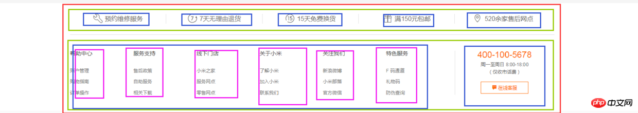
bottom部分首先是一个水平居中的内容,然后内容可以划分为上下两部分,每个部分都是浮动的li,如图:
html代码:
<p>
    </p><p>
        </p><p>
            </p>
css代码:
.bottom {
    height: 274px;
    background-color: #fff;
}
.bottom-service{
    height: 80px;
    background-color: seagreen;
}
.bottom-service>ul{
    height: 100%;
}
.bottom-service>ul li{
    position: relative;
    padding: 0 50px;
    float: left;
    width: 20%;
    height: 100%;
    background-color: goldenrod;
    background-clip: content-box;
}
.bottom-service>ul li+li::before{
    position: absolute;
    top: 28px;
    left: 0;
    content: '';
    width: 1px;
    height: 24px;
    background-color: #999;
}
.bottom-links{
    height: 192px;
    background-color: #8545e0;
}
.links-left{
    float: left;
    width: 960px;
    height: 100%;
    background-color: yellow;
}
.links-left>ul{
    height: 100%;
}
.links-left>ul li{
    padding-right: 60px;
    float: left;
    width: 16.666666666666667%;
    height: 100%;
    border: 1px solid #000;
    background-color: #ff0000;
    background-clip: content-box;
}
.links-right{
    float: right;
    width: 252px;
    height: 100%;
    background-color: yellow;
}
(6)局部——footer
footer划分如图:
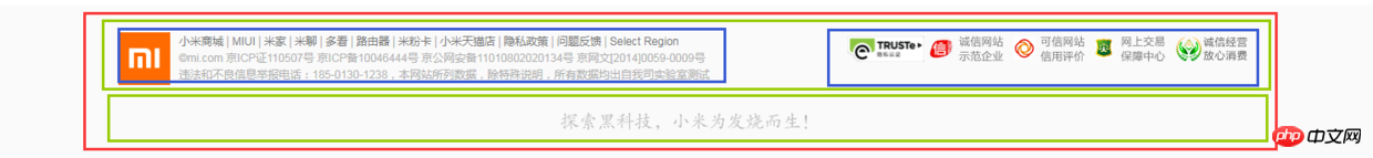
html代码:
<p>
    </p><p>
        </p><p></p>
        <p></p>
css代码:
.footer {
    margin: 0 auto;
    padding: 30px 0;
    width: 1226px;
    height: 166px;
    border: 1px solid #000;
}
.footer-info{
    height: 57px;
    background-color: #6effb1;
}
.info-left{
    float: left;
    width: 630px;
    height: 100%;
    border: 1px solid #000;
}
.info-right{
    float: right;
    width: 436px;
    height: 100%;
    border: 1px solid #000;
}
.footer-slogan{
    margin-top: 30px;
    height: 19px;
    background-color: #8545e0;
}
(7)全部代码(优化后)
html代码:
<p>
    </p><p>
        </p><p></p>
        <p></p>


<p>
    </p><p>
        </p><p></p>
        <p>
            </p><p></p>

        <p>
            </p><p></p>
            <p>
                </p>
css代码:
/*-------------------抽取公共样式-----------------*/
* { /*为了方便,就这样清空默认样式了*/
    margin: 0;
    padding: 0;
    box-sizing: border-box;
    list-style: none;
}
body {
    background-color: #f5f5f5;
}
.container {  /*水平居中的内容盒子*/
    width: 1226px;
    height: 100%;
    margin: 0 auto;
    border: 1px solid #f00;
}
.common-title {
    height: 58px;
    background-color: #000;
}
.fl {float: left;}
.fr {float: right;}
.recommend-right,
.flashsale-content,
.phone-right > li,
.household-content > li:last-child > p,
.video-content > li,
.links-left > ul li,
.footer,
.info-left,
.info-right {border: 1px solid #000;}  /*添加边框样式只是为了方便观察,不是布局必须,可删*/


/*-----header部分-----*/
.header {
    margin-bottom: 20px;
    height: 40px;
    background-color: #333;
}
.header-left {
    width: 380px;
    height: 100%;
    background-color: #0f0;
}
.header-rigth {
    width: 260px;
    height: 100%;
    background-color: #0f0;
}


/*--------top部分--------*/
.top {
    /*height: 1210px;*/
    background-color: #fff;
}
.top-nav {
    height: 100px;
    background-color: #f00;
}
.top-slider {
    margin-bottom: 14px;
    position: relative; /*父相*/
    height: 460px;
    background-color: #00f;
}
.slider-navbar {
    position: absolute; /*子绝*/
    top: 0;
    left: 0;
    width: 234px;
    height: 100%;
    background-color: black;
    opacity: .5;
}
.top-recommend {
    margin-bottom: 26px;
    height: 170px;
    background-color: #0f0;
}
.recommend-left {
    height: 100%;
    width: 234px;
    background-color: skyblue;
}
.recommend-right {
    width: 978px;
    height: 100%;
}
.recommend-right > ul {height: 100%;}
.recommend-right > ul li {
    float: left; /*三列等宽,浮动布局*/
    width: 316px;
    height: 100%;
    background-color: deepskyblue;
}
.recommend-right > ul li + li { margin-left: 14px;}  /*设置浮动间隔*/
.top-flashsale {
    height: 438px;
    background-color: #ff4455;
}
.flashsale-title {}
.flashsale-content {
    padding-bottom: 40px;
    height: 380px;
}
.content-timer {
    margin-right: 14px;
    width: 234px;
    height: 100%;
    background-color: #fff;
}
.content-shops {
    overflow: hidden; /*触发bfc,以达到自适应*/
    height: 100%;
    background-color: #6effb1;
}
.content-shops > li {
    float: left; /*四列等宽,浮动布局*/
    width: 234px;
    height: 100%;
    background-color: #fff;
}
.content-shops > li + li {margin-left: 12.5px;}  /*设置浮动间隔*/


/*--------center部分--------*/
.module-box {  /*类似的模块*/
    margin-bottom: 8px;
    height: 686px;
}
.center {
    margin: 0 auto;
    margin-bottom: 60px;
    padding-top: 60px;
    width: 1226px;
    /*height: 1791px;*/
    background-color: #fff;
}
.center-phone {background-color: yellow;}
.phone-title {}
.phone-content {
    height: 628px;
    background-color: pink;
}
.phone-left {
    width: 234px;
    height: 100%;
    background-color: darkseagreen;
}
.phone-right {
    overflow: hidden; /*触发bfc以达到自适应*/
    height: 100%;
    background-color: #ccc;
}
.phone-right > li {
    margin-bottom: 28px; /*设置下边距*/
    padding-left: 14px; /*用padding模拟盒子间隔*/
    float: left; /*四列等宽,浮动布局*/
    width: 25%;
    height: 300px;
    background-color: #f00;
    background-clip: content-box; /*背景色从content开始绘起*/
}
.center-household {background-color: yellow;}
.household-title {}
.household-content {height: 614px;}
.household-content > li {
    position: relative; /*父相*/
    margin-left: 14px; /*设置浮动间隔*/
    margin-bottom: 28px; /*设置下边距*/
    float: left; /*五列等宽,浮动布局*/
    width: 234px;
    height: 300px;
    background-color: #d7d7d7;
}
.household-content > li:nth-child(1),
.household-content > li:nth-child(6) {margin-left: 0; }  /*消除每行第一个的间隔*/
.household-content > li:last-child p:first-child {
    position: absolute; /*子绝*/
    top: 0;
    left: 0;
    right: 0;
    height: 143px;
}
.household-content > li:last-child p:last-child {
    position: absolute; /*子绝*/
    bottom: 0;
    left: 0;
    right: 0;
    height: 143px;
}
.center-video {
    height: 343px;
    background-color: pink;
}
.video-title {}
.video-content {height: 285px;}
.video-content > li {
    float: left; /*四列等宽,浮动布局*/
    width: 296px;
    height: 100%;
}
.video-content > li + li {margin-left: 14px; }   /*设定浮动间隔*/


/*--------bottom部分--------*/
.bottom {
    /*height: 274px;*/
    background-color: #fff;
}
.bottom-service {
    height: 80px;
    background-color: seagreen;
}
.bottom-service > ul {height: 100%;}
.bottom-service > ul li {
    position: relative; /*父相*/
    padding: 0 50px; /*用padding模拟盒子间隔*/
    float: left; /*五列等宽,浮动布局*/
    width: 20%;
    height: 100%;
    background-color: goldenrod;
    background-clip: content-box; /*背景色从content开始绘起*/
}
.bottom-service > ul li + li::before { /*用伪元素模拟分割线*/
    position: absolute; /*子绝*/
    top: 28px;
    left: 0;
    content: ''; /*伪元素必须有content*/
    width: 1px;
    height: 24px;
    background-color: #999;
}
.bottom-links {
    height: 192px;
    background-color: #8545e0;
}
.links-left {
    width: 960px;
    height: 100%;
    background-color: yellow;
}
.links-left > ul {height: 100%;}
.links-left > ul li {
    padding-right: 60px;
    float: left; /*六列等宽,浮动布局*/
    width: 16.666666666666667%;
    height: 100%;
    background-color: #ff0000;
    background-clip: content-box; /*背景色从content开始绘起*/
}
.links-right {
    width: 252px;
    height: 100%;
    background-color: yellow;
}


/*--------footer部分---------*/
.footer {
    margin: 0 auto;
    padding: 30px 0;
    width: 1226px;
    height: 166px;
}
.footer-info {
    height: 57px;
    background-color: #6effb1;
}
.info-left {
    width: 630px;
    height: 100%;
}
.info-right {
    width: 436px;
    height: 100%;
}
.footer-slogan {
    margin-top: 30px;
    height: 19px;
    background-color: #8545e0;
}
以上就是优化后的代码了,由于在下才疏学浅,所用方法不敢保证是最简单的,优化也肯定不是最优的,仅仅是的我的一种思路而已,各位参考参考就好。
8.1.2 Flexbox+Grid搭配用法(未来...)
html代码:
<p>
    </p><p>
        </p><p></p>
        <p></p>
css代码:
/*-------------------抽取公共样式-----------------*/
* { /*为了方便,就这样清空默认样式了*/
    margin: 0;
    padding: 0;
    list-style: none;
}
body {
    background-color: #f5f5f5;
    display: grid;
    /*整体布局 设置网格列,设置网格行,再设定网格区域*/
    grid-template-columns: 1fr 1226px 1fr;
    grid-template-rows: 40px 20px auto auto 274px 166px;
    grid-template-areas:
        "header header header"
        ". . ."
        "top top top"
        ". center ."
        "bottom bottom bottom"
        ". footer .";
}
.container { /*水平居中的内容盒子*/
    width: 1226px;
    height: 100%;
    margin: 0 auto;
    border: 1px solid #f00;
}
.top-recommend-right,
.top-flashsale-timer,
.top-flashsale-shops li,
.center-phone-content > p,
.center-household-content .row,
.household-content-item:last-of-type p,
.center-video-content li,
.service-item,
.links-left-item,
.info-left,
.info-right,
.info-right {border: 1px solid #000;}  /*添加边框样式只是为了方便观察,不是布局必须,可删*/


/*-----header部分-----*/
.header {
    grid-area: header; /*指定网格区域*/
    background-color: #333;
}
.header .container {
    display: flex;
    justify-content: space-between;
}
.header-left {
    width: 380px;
    background-color: #0f0;
}
.header-rigth {
    width: 260px;
    background-color: #0f0;
}


/*--------top部分--------*/
.top {
    grid-area: top; /*指定网格区域*/
    background-color: #fff;
}
.top .container {
    display: grid;
    /*top部分布局 设置网格行,设置网格列,再设定网格区域*/
    grid-template-rows: 100px 460px 14px 170px 26px 58px 340px 40px;
    grid-template-columns: auto 14px 978px;
    grid-template-areas:
        "top-nav top-nav top-nav"
        "top-slider top-slider top-slider"
        ". . ."
        "recommend-left . recommend-right"
        ". . ."
        "flashsale-title flashsale-title flashsale-title"
        "flashsale-timer . flashsale-shops"
        ". . .";
}
.top-nav {
    grid-area: top-nav;
    background-color: #f00;
}
.top-slider {
    position: relative;
    grid-area: top-slider;
    background-color: #00f;
}
.top-slider .slider-navbar {
    position: absolute;
    top: 0;
    left: 0;
    bottom: 0;
    width: 234px;
    background-color: black;
    opacity: .5;
}
.top-recommend-left {
    grid-area: recommend-left;
    background-color: skyblue;
}
.top-recommend-right {grid-area: recommend-right;}
.top-recommend-right > ul {
    display: flex;
    justify-content: space-between;
    height: 100%;
}
.top-recommend-right li {
    width: 316px;
    background-color: deepskyblue;
}
.top-flashsale-title {
    grid-area: flashsale-title;
    background-color: #000;
}
.top-flashsale-timer {
    grid-area: flashsale-timer;
    background-color: #fff;
}
.top-flashsale-shops {
    display: flex;
    justify-content: space-between;
    grid-area: flashsale-shops;
    background-color: #6effb1;
}
.top-flashsale-shops li {width: 234px;}


/*--------center部分--------*/
.center {
    margin-bottom: 60px;  /*边距可以在网格分区的时候考虑进去,把边距设成一行或一列,不要放内容就好了*/
    padding-top: 60px;
    grid-area: center; /*指定网格区域*/
    display: flex;
    flex-direction: column;
    background-color: #fff;
}
.center-phone-title {
    height: 58px;
    background-color: black;
}
.center-phone-content {
    margin-bottom: 8px;
    display: grid;
    /*这里用flex分格更好,代码更少更简洁*/
    grid-template-columns: repeat(5, 1fr);
    grid-template-rows: repeat(2, 1fr);
    grid-template-areas:
        "big1 normal2 normal3 normal4 normal5"
        "big1 normal6 normal7 normal8 normal9";
    grid-gap: 14px; /*网格间隔*/
    height: 628px;
    background-color: pink;
}
.phone-content-item1 {grid-area: big1;}
.phone-content-item2 {grid-area: normal2;}
.phone-content-item3 {grid-area: normal3;}
.phone-content-item4 {grid-area: normal4;}
.phone-content-item5 {grid-area: normal5;}
.phone-content-item6 {grid-area: normal6;}
.phone-content-item7 {grid-area: normal7;}
.phone-content-item8 {grid-area: normal8;}
.phone-content-item9 {grid-area: normal9;}
.center-household-title {
    height: 58px;
    background-color: black;
}
.center-household-content {
    margin-bottom: 8px;
    display: flex;
    flex-direction: column;
    height: 614px;
    background-color: pink;
}
.center-household-content .row {
    display: flex;
    justify-content: space-between;
    flex: 1;
}
.row .household-content-item {
    display: flex;
    flex-direction: column;
    justify-content: space-between;
    width: 234px;
    background-color: #fff;
}
.household-content-item:last-of-type p {height: 143px;}
.center-video-title {
    height: 58px;
    background-color: black;
}
.center-video-content {
    display: flex;
    justify-content: space-between;
    height: 285px;
    background-color: pink;
}
.center-video-content li {width: 296px;}


/*--------bottom部分--------*/
.bottom {
    grid-area: bottom; /*指定网格区域*/
    background-color: #fff;
}
.bottom .container {
    display: grid;
    grid-template-columns: auto 252px;
    grid-template-rows: 80px auto;
    grid-template-areas: "service service" "links-left links-right";
}
.container .bottom-service {
    display: flex;
    grid-area: service;
    background-color: seagreen;
}
.service-item {flex: 1;}
.container .bottom-links-left {
    display: flex;
    grid-area: links-left;
    background-color: yellow;
}
.links-left-item {flex: 1;}
.container .bottom-links-right {
    grid-area: links-right;
    background-color: yellowgreen;
}


/*--------footer部分---------*/
.footer {
    padding: 30px 0;
    grid-area: footer; /*指定网格区域*/
}
.footer-info {
    display: flex;
    justify-content: space-between;
    height: 57px;
    background-color: #6effb1;
}
.info-left {width: 630px;}
.info-right {width: 436px;}
.footer-slogan {
    margin-top: 30px;
    height: 19px;
    background-color: #8545e0;
}
九、其他补充:
9.1 移动端viewport
设置viewport:
<meta>
阅读推荐:
解读 viewport—网页自适应移动 app 神器
https://juejin.im/entry/58e750a02f301e0062367ded
9.2 媒体查询
代码示例:
@media (max-width: 767px) { ...css代码... }
@media (min-width: 768px) and (max-width: 991px) { ...css代码... }
@media (min-width: 992px) and (max-width: 1199px) { ...css代码... }
@media (min-width: 1200px) { ...css代码... }
相信看了本文案例你已经掌握了方法,更多精彩请关注php中文网其它相关文章!
推荐阅读:
Das obige ist der detaillierte Inhalt vonBekannte Website-Frontend-Layoutanalyse. Für weitere Informationen folgen Sie bitte anderen verwandten Artikeln auf der PHP chinesischen Website!
In Verbindung stehende Artikel
Mehr sehen- Eine eingehende Analyse der Bootstrap-Listengruppenkomponente
- Detaillierte Erläuterung des JavaScript-Funktions-Curryings
- Vollständiges Beispiel für die Generierung von JS-Passwörtern und die Erkennung der Stärke (mit Download des Demo-Quellcodes)
- Angularjs integriert WeChat UI (weui)
- Wie man mit JavaScript schnell zwischen traditionellem Chinesisch und vereinfachtem Chinesisch wechselt und wie Websites den Wechsel zwischen vereinfachtem und traditionellem Chinesisch unterstützen – Javascript-Kenntnisse