
Heim >Web-Frontend >js-Tutorial >Verwenden Sie HTML+CSS, um Animationseffekte zu erzielen
Verwenden Sie HTML+CSS, um Animationseffekte zu erzielen
- 一个新手Original
- 2017-10-10 10:04:592913Durchsuche
Legen Sie den internen Adapter in
Hand, also den CSS-Stil:
<!DOCTYPE html><html><head lang="en">
    <meta charset="UTF-8">
    <title></title>
    <style>

        /*全局适配器{外边距:0; 内边距:0}*/
        *{          margin: 0px; padding: 0px}        /*标签适配器{宽度   高度        居中显示}*/
        body{width: 1024px; height: 100%; margin: 0 auto}        /*“Baidu图片”*/
        /*ID适配器{宽度        高度            居中显示     内边距:上   右 下   左*/
        #title{width: 220px; height: 80px; margin: 0 auto; padding: 100px 0 50px 0}        /*输入框整体样式*/
        /*nav适配{    宽       高           居中显示        背景颜色:      白色}*/
        #nav{width: 430px; height: 35px; margin: 0 auto; background-color: white; }
        /*输入框*/
        /*nav适配下的input标签{宽     高          边框:0      浮动:左             动画持续时间:0.4s}*/
        #nav input{width: 300px; height: 35px; border: 0px; float: left; transition:All 0.4s ease-in-out;}
        /*nav适配下的input标签:滑动效果{放大1.5倍}*/
        #nav input:hover{transform: scale(1.5)}        /*nav适配下的img标签{宽     高      浮动:左    外边距:上下 左右           动画持续时间:0.4s}*/
        #nav img{width: 20px;height: 20px; float: left; margin: 7px 5px; transition:All 0.4s ease-in-out;}
        /*nav适配下的img标签:滑动效果{放大1.2倍)}*/
        #nav img:hover{transform: scale(1.2)}        /*“百度一下按钮”{宽    高           颜色              背景颜色:浅蓝色        浮动:右         左右居中             上下居中             动画持续时间:0.4s}*/
        #baidu{width: 100px; height: 35px; color: white; background-color: dodgerblue; float: right; text-align: center; line-height: 35px; transition:All 0.4s ease-in-out;}
        /*“百度一下按钮”滑动效果{放大2倍    颜色}*/
        #baidu:hover{transform: scale(2); color: red}        /*十张图片放在一个p中*/
        /*p的适配{ 宽            定位:相对    距离左边的宽度 距离上边的宽度}*/
        #main{ width: 780px; position: relative; left: 130px; top: 50px}        /*要实现的图片滑动小效果*/
        /*class适配器{动画持续时间:1s}*/
        .img1{ transition:All 1s ease-in-out;}
        /*class适配器滑动效果{旋转(360度)}        顺时针方向*/
        .img1:hover{transform: rotate(360deg)}        /*class适配器{动画持续时间:1s}*/
        .img2{ transition:All 1s ease-in-out;}
        /*class适配器滑动效果{旋转(360度)}        逆时针方向*/
        .img2:hover{transform: rotate(-360deg)}        /*class适配器{动画持续时间:1s}*/
        .img3{ transition:All 1s ease-in-out;}
        /*class适配器滑动效果{放大1.5倍}*/
        .img3:hover{transform: scale(1.5)}        /*class适配器{动画持续时间:1s}*/
        .img4{ transition:All 1s ease-in-out;}
        /*class适配器滑动效果{倾斜50度}             顺时针方向*/
        .img4:hover{transform: skew(-50deg)}    </style></head>
Platzieren Sie den auf der Seite anzuzeigenden Inhalt im Textkörper:
<!--/*背景图片*/--><body background="20120921215232_Ay5mx.jpeg">
    <!--/*“Baidu知道”图片*/-->
    <p id="title"><img  src="title.jpg" / alt="Verwenden Sie HTML+CSS, um Animationseffekte zu erzielen" ></p>
    <p id="nav">
        <p id="float">
            <!--/*文本框*/-->
            <input type="text">
            <!--/*相机图片*/-->
            <img  src="xiangji.jpg" alt="Verwenden Sie HTML+CSS, um Animationseffekte zu erzielen" >
        </p>
        <!--/*百度一下按钮*/-->
        <p class="float" id="baidu" >百度一下</p>
    </p>
    <!--/*十张小图片*/-->
    <p id="main">
        <!--/*第一行五张图片*/-->
        <p>
            <img  src="img1-1.jpg" class="img1" / alt="Verwenden Sie HTML+CSS, um Animationseffekte zu erzielen" >
            <img  src="img1-2.jpg" / alt="Verwenden Sie HTML+CSS, um Animationseffekte zu erzielen" >
            <img  src="img1-3.jpg" / alt="Verwenden Sie HTML+CSS, um Animationseffekte zu erzielen" >
            <img  src="img1-4.jpg" / alt="Verwenden Sie HTML+CSS, um Animationseffekte zu erzielen" >
            <img  src="img1-5.jpg" / alt="Verwenden Sie HTML+CSS, um Animationseffekte zu erzielen" >
        </p>
        <!--/*第二行五张图片*/-->
        <p>
            <img  src="img2-1.jpg" class="img2" / alt="Verwenden Sie HTML+CSS, um Animationseffekte zu erzielen" >
            <img  src="img2-2.jpg" / alt="Verwenden Sie HTML+CSS, um Animationseffekte zu erzielen" >
            <img  src="img2-3.jpg" class="img3" / alt="Verwenden Sie HTML+CSS, um Animationseffekte zu erzielen" >
            <img  src="img2-4.jpg" class="img4" / alt="Verwenden Sie HTML+CSS, um Animationseffekte zu erzielen" >
            <img  src="img2-5.jpg" / alt="Verwenden Sie HTML+CSS, um Animationseffekte zu erzielen" >
        </p>
    </p></body></html>
Schnittstellenrendering: 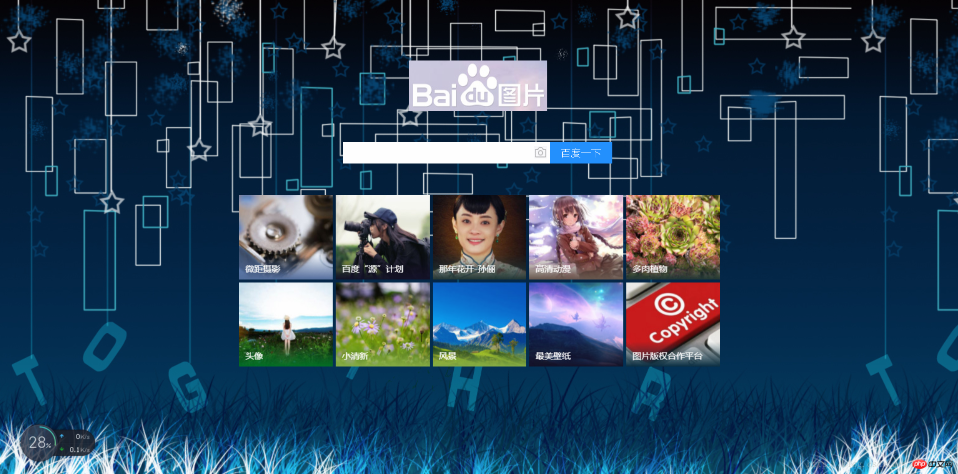
Das obige ist der detaillierte Inhalt vonVerwenden Sie HTML+CSS, um Animationseffekte zu erzielen. Für weitere Informationen folgen Sie bitte anderen verwandten Artikeln auf der PHP chinesischen Website!
Stellungnahme:
Der Inhalt dieses Artikels wird freiwillig von Internetnutzern beigesteuert und das Urheberrecht liegt beim ursprünglichen Autor. Diese Website übernimmt keine entsprechende rechtliche Verantwortung. Wenn Sie Inhalte finden, bei denen der Verdacht eines Plagiats oder einer Rechtsverletzung besteht, wenden Sie sich bitte an admin@php.cn
Vorheriger Artikel:So erhalten Sie HTTP-Informationen in der Navigationsleiste über JavaScriptNächster Artikel:So erhalten Sie HTTP-Informationen in der Navigationsleiste über JavaScript
In Verbindung stehende Artikel
Mehr sehen- Eine eingehende Analyse der Bootstrap-Listengruppenkomponente
- Detaillierte Erläuterung des JavaScript-Funktions-Curryings
- Vollständiges Beispiel für die Generierung von JS-Passwörtern und die Erkennung der Stärke (mit Download des Demo-Quellcodes)
- Angularjs integriert WeChat UI (weui)
- Wie man mit JavaScript schnell zwischen traditionellem Chinesisch und vereinfachtem Chinesisch wechselt und wie Websites den Wechsel zwischen vereinfachtem und traditionellem Chinesisch unterstützen – Javascript-Kenntnisse