
Heim >Web-Frontend >HTML-Tutorial >Grafik- und Textbeispiele für das flexible CSS3-Box-Layout
Grafik- und Textbeispiele für das flexible CSS3-Box-Layout

- 零下一度Original
- 2017-06-29 11:26:402360Durchsuche
-
Durch die Verwendung des adaptiven Fenster-Flexible-Box-Layouts
kann die Gesamtbreite des Div an die Browserbreite angepasst werden und kann sich ändern, wenn sich der Browser ändert.
1 <!DOCTYPE html> 2 <html lang="zh-CN"> 3 <head> 4 <meta http-equiv="content-type" content="text/html; charset=utf-8"> 5 <meta http-equiv="x-ua-compatible" content="IE=edge"> 6 <meta name="viewport" content="width=device-width, initial-scale=1, maximum-scale=1, user-scalable=no"> 7 <title>测试</title> 8 <style> 9 /*弹性盒布局*/10 #container{11 display: -webkit-box;12 display: -moz-box;13 }14 #left-sidebar{15 width: 200px;16 padding: 20px;17 background-color: orange;18 }19 #content{20 -moz-box-flex: 1;21 -webkit-box-flex: 1;22 padding: 20px;23 background-color: yellow;24 }25 #right-sidebar{26 width: 200px;27 padding: 20px;28 background-color: limegreen;29 }30 #left-sidebar, #content, #right-sidebar{31 box-sizing: border-box;32 }33 </style>34 </head>35 <body>36 <div id="container">37 <div id="left-sidebar">示例文字,页面中比较长的示例文字。示例文字,页面中比较长的示例文字。示例文字,页面中比较长的示例文字。示例文字,页面中比较长的示例文字。示例文字,页面中比较长的示例文字。</div>38 <div id="content">示例文字,页面中比较长的示例文字。示例文字,页面中比较长的示例文字。示例文字,页面中比较长的示例文字。示例文字,页面中比较长的示例文字。示例文字,页面中比较长的示例文字。</div>39 <div id="right-sidebar">示例文字,页面中比较长的示例文字。示例文字,页面中比较长的示例文字。示例文字,页面中比较长的示例文字。示例文字,页面中比较长的示例文字。示例文字,页面中比较长的示例文字。</div>40 </div>41 </body>42 </html> -
Anzeigereihenfolge von Elementen ändern
box-ordinal-group kann die Anzeigereihenfolge von ändern jedes Element.
1 <!DOCTYPE html> 2 <html lang="zh-CN"> 3 <head> 4 <meta http-equiv="content-type" content="text/html; charset=utf-8"> 5 <meta http-equiv="x-ua-compatible" content="IE=edge"> 6 <meta name="viewport" content="width=device-width, initial-scale=1, maximum-scale=1, user-scalable=no"> 7 <title>测试</title> 8 <style> 9 /*弹性盒布局*/10 #container{11 display: -webkit-box;12 display: -moz-box;13 }14 #left-sidebar{15 -moz-box-ordinal-group: 2;16 -webkit-box-ordinal-group: 2;17 width: 200px;18 padding: 20px;19 background-color: orange;20 }21 #content{22 -moz-box-ordinal-group: 1;23 -webkit-box-ordinal-group: 1;24 -moz-box-flex: 1;25 -webkit-box-flex: 1;26 padding: 20px;27 background-color: yellow;28 }29 #right-sidebar{30 -moz-box-ordinal-group: 3;31 -webkit-box-ordinal-group: 3;32 width: 200px;33 padding: 20px;34 background-color: limegreen;35 }36 #left-sidebar, #content, #right-sidebar{37 box-sizing: border-box;38 }39 </style>40 </head>41 <body>42 <div id="container">43 <div id="left-sidebar">示例文字,页面中比较长的示例文字。示例文字,页面中比较长的示例文字。示例文字,页面中比较长的示例文字。示例文字,页面中比较长的示例文字。示例文字,页面中比较长的示例文字。</div>44 <div id="content">示例文字,页面中比较长的示例文字。示例文字,页面中比较长的示例文字。示例文字,页面中比较长的示例文字。示例文字,页面中比较长的示例文字。示例文字,页面中比较长的示例文字。</div>45 <div id="right-sidebar">示例文字,页面中比较长的示例文字。示例文字,页面中比较长的示例文字。示例文字,页面中比较长的示例文字。示例文字,页面中比较长的示例文字。示例文字,页面中比较长的示例文字。</div>46 </div>47 </body>48 </html> -
Anordnungsrichtung von Elementen ändern
Verwenden Sie box-orient, um die Anordnungsrichtung mehrerer Elemente zu ändern Elemente.
1 <!DOCTYPE html> 2 <html lang="zh-CN"> 3 <head> 4 <meta http-equiv="content-type" content="text/html; charset=utf-8"> 5 <meta http-equiv="x-ua-compatible" content="IE=edge"> 6 <meta name="viewport" content="width=device-width, initial-scale=1, maximum-scale=1, user-scalable=no"> 7 <title>测试</title> 8 <style> 9 /*弹性盒布局*/10 #container{11 display: -webkit-box;12 display: -moz-box;13 -moz-box-orient: vertical;14 -webkit-box-orient: vertical;15 }16 #left-sidebar{17 -moz-box-ordinal-group: 2;18 -webkit-box-ordinal-group: 2;19 width: 200px;20 padding: 20px;21 background-color: orange;22 }23 #content{24 -moz-box-ordinal-group: 1;25 -webkit-box-ordinal-group: 1;26 -moz-box-flex: 1;27 -webkit-box-flex: 1;28 padding: 20px;29 background-color: yellow;30 }31 #right-sidebar{32 -moz-box-ordinal-group: 3;33 -webkit-box-ordinal-group: 3;34 width: 200px;35 padding: 20px;36 background-color: limegreen;37 }38 #left-sidebar, #content, #right-sidebar{39 box-sizing: border-box;40 }41 </style>42 </head>43 <body>44 <div id="container">45 <div id="left-sidebar">示例文字,页面中比较长的示例文字。示例文字,页面中比较长的示例文字。示例文字,页面中比较长的示例文字。示例文字,页面中比较长的示例文字。示例文字,页面中比较长的示例文字。</div>46 <div id="content">示例文字,页面中比较长的示例文字。示例文字,页面中比较长的示例文字。示例文字,页面中比较长的示例文字。示例文字,页面中比较长的示例文字。示例文字,页面中比较长的示例文字。</div>47 <div id="right-sidebar">示例文字,页面中比较长的示例文字。示例文字,页面中比较长的示例文字。示例文字,页面中比较长的示例文字。示例文字,页面中比较长的示例文字。示例文字,页面中比较长的示例文字。</div>48 </div>49 </body>50 </html> -
Adaptive Elementbreite und -höhe
Bei Verwendung des Box-Layouts gilt jedoch die Höhe des Elements Die Breite lässt sich bis zu einem gewissen Grad anpassen, es verbleibt jedoch immer ein großer Leerraum im Container.
-
Verwenden Sie das Flexbox-Layout, um Leerräume zu beseitigen
Verwenden Sie das Flexbox-Layout, um das verbleibende Leerraumproblem des Box-Layouts zu beseitigen.
1 <!DOCTYPE html> 2 <html lang="zh-CN"> 3 <head> 4 <meta http-equiv="content-type" content="text/html; charset=utf-8"> 5 <meta http-equiv="x-ua-compatible" content="IE=edge"> 6 <meta name="viewport" content="width=device-width, initial-scale=1, maximum-scale=1, user-scalable=no"> 7 <title>测试</title> 8 <style> 9 *{10 box-sizing: border-box;11 margin: 0;12 }13 html, body{14 width: 100%;15 height: 100%;16 }17 /*弹性盒布局*/18 #container{19 display: -webkit-box;20 display: -moz-box;21 -moz-box-orient: vertical;22 -webkit-box-orient: vertical;23 border: 2px solid black;24 width: 100%;25 height: 100%;26 }27 #left-sidebar{28 -moz-box-ordinal-group: 2;29 -webkit-box-ordinal-group: 2;30 width: 200px;31 padding: 20px;32 background-color: orange;33 }34 #content{35 -moz-box-ordinal-group: 1;36 -webkit-box-ordinal-group: 1;37 -moz-box-flex: 1;38 -webkit-box-flex: 1;39 padding: 20px;40 background-color: yellow;41 }42 #right-sidebar{43 -moz-box-ordinal-group: 3;44 -webkit-box-ordinal-group: 3;45 width: 200px;46 padding: 20px;47 background-color: limegreen;48 }49 </style>50 </head>51 <body>52 <div id="container">53 <div id="left-sidebar">示例文字,页面中比较长的示例文字。示例文字,页面中比较长的示例文字。示例文字,页面中比较长的示例文字。示例文字,页面中比较长的示例文字。示例文字,页面中比较长的示例文字。</div>54 <div id="content">示例文字,页面中比较长的示例文字。示例文字,页面中比较长的示例文字。示例文字,页面中比较长的示例文字。示例文字,页面中比较长的示例文字。示例文字,页面中比较长的示例文字。</div>55 <div id="right-sidebar">示例文字,页面中比较长的示例文字。示例文字,页面中比较长的示例文字。示例文字,页面中比较长的示例文字。示例文字,页面中比较长的示例文字。示例文字,页面中比较长的示例文字。</div>56 </div>57 </body>58 </html> -
Box-Flex-Attribut für mehrere Elemente verwenden
Wenn jedes div-Element ein Box-Flex-Attribut hat , dann sind die Breite und Höhe jedes Elements gleich 1/n der Breite und Höhe des Containers. Der leere Teil des Containers wird entsprechend dem Box-Flex-Eigenschaftswert zugewiesen.

Beispielcode:1 <!DOCTYPE html> 2 <html lang="zh-CN"> 3 <head> 4 <meta http-equiv="content-type" content="text/html; charset=utf-8"> 5 <meta http-equiv="x-ua-compatible" content="IE=edge"> 6 <meta name="viewport" content="width=device-width, initial-scale=1, maximum-scale=1, user-scalable=no"> 7 <title>测试</title> 8 <style> 9 *{10 box-sizing: border-box;11 margin: 0;12 }13 html, body{14 width: 100%;15 height: 100%;16 }17 /*弹性盒布局*/18 #container{19 display: -webkit-box;20 display: -moz-box;21 -moz-box-orient: vertical;22 -webkit-box-orient: vertical;23 border: 2px solid black;24 width: 100%;25 height: 100%;26 }27 #left-sidebar{28 -moz-box-ordinal-group: 2;29 -webkit-box-ordinal-group: 2;30 -moz-box-flex: 1;31 -webkit-box-flex: 1;32 padding: 20px;33 background-color: orange;34 }35 #content{36 -moz-box-ordinal-group: 1;37 -webkit-box-ordinal-group: 1;38 -moz-box-flex: 2;39 -webkit-box-flex: 2;40 padding: 20px;41 background-color: yellow;42 }43 #right-sidebar{44 -moz-box-ordinal-group: 3;45 -webkit-box-ordinal-group: 3;46 -moz-box-flex: 1;47 -webkit-box-flex: 1;48 padding: 20px;49 background-color: limegreen;50 }51 </style>52 </head>53 <body>54 <div id="container">55 <div id="left-sidebar">示例文字,页面中比较长的示例文字。示例文字,页面中比较长的示例文字。示例文字,页面中比较长的示例文字。示例文字,页面中比较长的示例文字。示例文字,页面中比较长的示例文字。</div>56 <div id="content">示例文字,页面中比较长的示例文字。示例文字,页面中比较长的示例文字。示例文字,页面中比较长的示例文字。示例文字,页面中比较长的示例文字。示例文字,页面中比较长的示例文字。</div>57 <div id="right-sidebar">示例文字,页面中比较长的示例文字。示例文字,页面中比较长的示例文字。示例文字,页面中比较长的示例文字。示例文字,页面中比较长的示例文字。示例文字,页面中比较长的示例文字。</div>58 </div>59 </body>60 </html> -
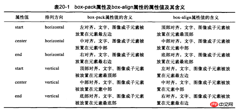
Geben Sie die horizontale und vertikale Ausrichtung an
Sie können das Box-Pack-Attribut und das Box-Align-Attribut verwenden, um die horizontale oder vertikale Ausrichtung von Text und Bildern im Element festzulegen.
Beispielcode:
1 <!DOCTYPE html> 2 <html lang="zh-CN"> 3 <head> 4 <meta http-equiv="content-type" content="text/html; charset=utf-8"> 5 <meta http-equiv="x-ua-compatible" content="IE=edge"> 6 <meta name="viewport" content="width=device-width, initial-scale=1, maximum-scale=1, user-scalable=no"> 7 <title>测试</title> 8 <style> 9 *{10 box-sizing: border-box;11 margin: 0;12 }13 html, body{14 width: 100%;15 height: 100%;16 }17 /*弹性盒布局*/18 #container{19 display: -webkit-box;20 display: -moz-box;21 -moz-box-align: center;22 -webkit-box-align: center;23 -moz-box-pack: center;24 -webkit-box-pack: center;25 -moz-box-orient: vertical;26 -webkit-box-orient: vertical;27 border: 2px solid black;28 width: 50%;29 height: 50%;30 }31 #content{32 display: -webkit-box;33 display: -moz-box;34 -moz-box-align: center;35 -webkit-box-align: center;36 -moz-box-pack: center;37 -webkit-box-pack: center;38 -moz-box-orient: vertical;39 -webkit-box-orient: vertical;40 width: 50%;41 height: 50%;42 padding: 20px;43 background-color: yellow;44 }45 </style>46 </head>47 <body>48 <div id="container">49 <div id="content">示例文字。</div>50 </div>51 </body>52 </html>

Das obige ist der detaillierte Inhalt vonGrafik- und Textbeispiele für das flexible CSS3-Box-Layout. Für weitere Informationen folgen Sie bitte anderen verwandten Artikeln auf der PHP chinesischen Website!