
Heim >Web-Frontend >H5-Tutorial >Beispiele für die Verwendung von CSS+HTML5
Beispiele für die Verwendung von CSS+HTML5

- PHP中文网Original
- 2017-06-21 15:54:012495Durchsuche
1.HTML5Grundlagen
Dokumenttyp
<!DOCTYPE HTML PUBLIC ><!DOCTYPE html>
Spielen Sie Video und Audio mit den Tags video und audio

 <video controls>
         <source src="video/video.webm" type="video/webm"/>
         <source src="video/video.mp4" type="video/mp4"/>
     </video>
2.Flexible Box
box-sizing:border-box/content-box(Standardwert)
3 .Abgerundeter Rand
Randradius:Obere linke Ecke, obere rechte Ecke, untere rechte Ecke, untere linke Ecke.
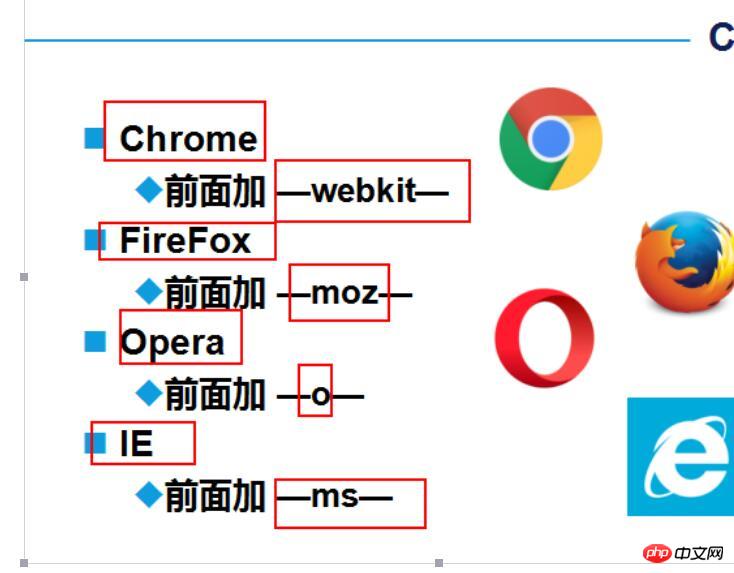
- clip-path
- shape-outside
- Pseudoelementkoordination
-
Gradient Gradientborder-radius borderWir können viele geometrische Formen erstellen. Außer den häufigsten Rechtecken und Kreisen (- ) sind hier einige andere geometrische Formen:
transform
border-radius
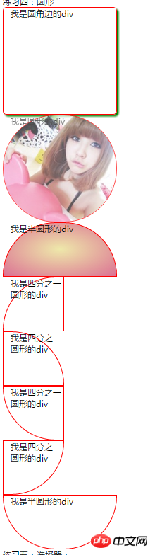
//01圆角边的css #circle{
width: 300px;
height: 300px;
border: 1px solid red;
border-radius: 10px;
box-shadow: 5px 5px 5px green;
}<div id="circle">我是圆角边的div</div>//02圆形的css加图片#circleshape{
width: 300px;
height: 300px;
border: 1px solid red;
border-radius: 150px;
background: url("img/001.jpg") 0px 0px no-repeat;
background-size: cover;
opacity: 0.7;
transition: all 5s;
}
#circleshape:hover{
transform: rotate(300deg) scale(1.5);
transition: all 5s linear;
}<div id="circleshape">我是圆形的div</div>//03半圆形的CSS #halfcircle{
width: 300px;
height: 150px;
border: 1px solid red;
border-radius: 150px 150px 0px 0px;
background:linear-gradient(to top,pink,palegreen);
background:radial-gradient(palegoldenrod,palevioletred);
}<div id="halfcircle">我是半圆形的div</div>//04四分之一圆形 #halfcircles{
width: 150px;
height: 150px;
border: 1px solid red;
border-radius: 150px 0px 0px 0px;
}<div id="halfcircles">我是四分之一圆形的div</div>
#halfcircless{
width: 150px;
height: 150px;
border: 1px solid red;
border-radius: 0px 150px 0px 0px;
}<div id="halfcircless">我是四分之一圆形的div</div>
#halfcirclesss{
width: 150px;
height: 150px;
border: 1px solid red;
border-radius: 0px 0px 0px 150px;
}<div id="halfcirclesss">我是四分之一圆形的div</div>#halfcirclessss{
width: 150px;
height: 150px;
border: 1px solid red;
border-radius: 0px 0px 150px 0px;
}<div id="halfcirclessss">我是四分之一圆形的div</div>
#halfcircl{
width: 300px;
height: 150px;
border: 1px solid red;
border-radius: 0px 0px 150px 150px;
}<div id="halfcircl">我是半圆形的div</div>//05:三角形 .traingle {
width: 0;
height: 0;
border-left: 50px solid transparent;
border-right: 50px solid transparent;
border-bottom: 100px solid yellowgreen;
}<div class="traingle ">我的三角形,我是div</div>//06:切角:多重线性渐变实现切角。 .notching {
width: 40px;
height: 40px;
padding: 40px;
background: linear-gradient(135deg, transparent 15px, yellowgreen 0) top left,
linear-gradient(-135deg, transparent 15px, yellowgreen 0) top right,
linear-gradient(-45deg, transparent 15px, yellowgreen 0) bottom right,
linear-gradient(45deg, transparent 15px, yellowgreen 0) bottom left;
background-size: 50% 50%;
background-repeat: no-repeat;
}<div class="notching">我是切角,我是div</div>//07:椭圆形 .ellipse {
width: 120px;
height: 160px;
background-color: yellowgreen;
border-radius: 50% 50% 50% 50% / 60% 60% 40% 40%;
}<div class="ellipse">我是椭圆形,我是div</div>08:梯形:伪元素加旋转透视实现梯形
.trapezoid{
position: relative;
width: 60px;
padding: 60px;
}
.trapezoid::before{
content:"";
position: absolute;
top: 0; right: 0; bottom: 0; left: 0;
transform: perspective(20px) scaleY(1.3) rotateX(5deg);
transform-origin: bottom;
background: yellowgreen;
}<div class="trapezoid">我是上面短的梯形,我是div</div>.trapezoids {
position: relative;
width: 60px;
border-top: 60px solid yellowgreen;
border-left: 40px solid transparent;
border-right: 40px solid transparent;
}<div class="trapezoids">我是下面短的梯形,我是div</div>//09.五边形:梯形加上三角形,很容易就组合成一个五边形,这里需要借助一个伪元素实现:.pentagon {
position: relative;
width: 60px;
border-bottom: 60px solid yellowgreen;
border-left: 40px solid transparent;
border-right: 40px solid transparent;
}
.pentagon::before {
content:"";
position: absolute;
top: 60px;
left: -40px;
border-top: 60px solid yellowgreen;
border-left: 70px solid transparent;
border-right: 70px solid transparent;
}//10六边形看看上面的梯形,如果两个反方向且底边同样大小的梯形,叠加在一起,是不是就能得到一个六边形呢
.pentagon {
position: relative;
width: 60px;
border-bottom: 60px solid yellowgreen;
border-left: 40px solid transparent;
border-right: 40px solid transparent;
}
.pentagon::before {
content: "";
position: absolute;
width: 60px;
height: 0px;
top: 60px;
left: -40px;
border-top: 60px solid yellowgreen;
border-left: 40px solid transparent;
border-right: 40px solid transparent;
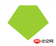
}//11:八边形六边形都解决了,八边形也不在话下,一个矩形加上两个梯形,可以合成一个八边形。
.octagon {
position: relative;
width: 40px;
height: 100px;
background: yellowgreen;
}
.octagon::before {
content: "";
height: 60px;
position: absolute;
top: 0;
left: 40px;
border-left: 30px solid yellowgreen;
border-top: 20px solid transparent;
border-bottom: 20px solid transparent;
}
.octagon::after {
content: "";
height: 60px;
position: absolute;
top: 0;
left: -30px;
border-right: 30px solid yellowgreen;
border-top: 20px solid transparent;
border-bottom: 20px solid transparent;
}//12:五角星好的,探索完多边形,我们继续探索X角星。
先来看看五角星,要怎么实现呢?当然是直接打出来啦 -- ★☆
.star {
margin: 50px 0;
position: relative;
width: 0;
border-right: 100px solid transparent;
border-bottom: 70px solid yellowgreen;
border-left: 100px solid transparent;
transform: rotate(35deg) scale(.6);
}
.star:before {
content: '';
position: absolute;
border-bottom: 80px solid yellowgreen;
border-left: 30px solid transparent;
border-right: 30px solid transparent;
top: -45px;
left: -65px;
transform: rotate(-35deg);
}
.star:after {
content: '';
position: absolute;
top: 3px;
left: -105px;
border-right: 100px solid transparent;
border-bottom: 70px solid yellowgreen;
border-left: 100px solid transparent;
transform: rotate(-70deg);
}//12:六角星六角星呢?想象一下,一个向上的三角形 ▲,叠加上一个向下的三角形 ▼,就可以得到一个六边形:
.sixstar {
position: relative;
width: 0;
border-left: 50px solid transparent;
border-right: 50px solid transparent;
border-bottom: 100px solid yellowgreen;
}
.sixstar:after {
content: "";
position: absolute;
border-left: 50px solid transparent;
border-right: 50px solid transparent;
border-top: 100px solid yellowgreen;
top: 30px;
left: -50px;
}//13:八角星八角星呢?八个角那么多呢。其实使用两个矩形进行旋转拼接就可以了。
.eightstar {
position: relative;
width: 100px;
height: 100px;
background-color: yellowgreen;
transform: rotate(30deg);
}
.eightstar::before {
content: "";
position: absolute;
top: 0;
left: 0;
width: 100px;
height: 100px;
transform: rotate(45deg);
background-color: yellowgreen;
}//14:十二角星好。最后多角星再来一个十二级角星。在八角星的基础上,再增加一个矩形,就能得到十二角啦。也就是要过第一个伪元素。
.twelvestar {
position: relative;
width: 100px;
height: 100px;
margin-bottom: 100px!important;
background-color: yellowgreen;
transform: rotate(30deg);
}
.twelvestar::before {
content: "";
position: absolute;
top: 0;
left: 0;
width: 100px;
height: 100px;
transform: rotate(30deg);
background-color: yellowgreen;
}
.twelvestar::after {
content: "";
position: absolute;
top: 0;
left: 0;
width: 100px;
height: 100px;
transform: rotate(60deg);
background-color: yellowgreen;
}
Das obige ist der detaillierte Inhalt vonBeispiele für die Verwendung von CSS+HTML5. Für weitere Informationen folgen Sie bitte anderen verwandten Artikeln auf der PHP chinesischen Website!
Stellungnahme:
Der Inhalt dieses Artikels wird freiwillig von Internetnutzern beigesteuert und das Urheberrecht liegt beim ursprünglichen Autor. Diese Website übernimmt keine entsprechende rechtliche Verantwortung. Wenn Sie Inhalte finden, bei denen der Verdacht eines Plagiats oder einer Rechtsverletzung besteht, wenden Sie sich bitte an admin@php.cn
Vorheriger Artikel:Einführung in Beispiele für HTML5-TextstileNächster Artikel:Einführung in Beispiele für HTML5-Textstile
In Verbindung stehende Artikel
Mehr sehen- Das Vollbild-Bildlauf-Plug-in AlloyTouch erstellt in 30 Sekunden eine flüssige H5-Seite
- Tatsächlicher HTML5-Kampf und Analyse von Touch-Ereignissen (Touchstart, Touchmove und Touchend)
- Ausführliche Erläuterung der Beispiele für Bildzeichnungen in HTML5 Canvas 9
- Reguläre Ausdrücke und neue HTML5-Elemente
- So kombinieren Sie NodeJS und HTML5, um mehrere Dateien per Drag-and-Drop auf den Server hochzuladen