
Heim >Web-Frontend >HTML-Tutorial >Beispielcode für Formulare im Bootstrap
Beispielcode für Formulare im Bootstrap

- 零下一度Original
- 2017-06-24 14:31:082128Durchsuche
1. Grundformular: Für das Grundformular hat Bootstrap nicht viel angepasstes Effektdesign vorgenommen, sondern nur die Feldsatz-, Legenden- und Beschriftungs-Tags im Formular angepasst.


fieldset {
min-width: 0;
padding: 0;
margin: 0;
border: 0;
}
legend {
display: block;
width: 100%;
padding: 0;
margin-bottom: 20px;
font-size: 21px;
line-height: inherit;
color: #333;
border: 0;
border-bottom: 1px solid #e5e5e5;
}

label {
display: inline-block;
margin-bottom: 5px;
font-weight: bold;
}2. Horizontaler Formularklassenname „form-horizontal“


.form-horizontal .control-label,
.form-horizontal .radio,
.form-horizontal .checkbox,
.form-horizontal .radio-inline,
.form-horizontal .checkbox-inline {
padding-top: 7px;
margin-top: 0;
margin-bottom: 0;
}
.form-horizontal .radio,
.form-horizontal .checkbox {
min-height: 27px;
}
.form-horizontal .form-group {
margin-right: -15px;
margin-left: -15px;
}
.form-horizontal .form-control-static {
padding-top: 7px;
}
@media (min-width: 768px) {
.form-horizontal .control-label {
text-align: right;
  }
}
.form-horizontal .has-feedback .form-control-feedback {
top: 0;
right: 15px;
}

3. Inline-Formularklassenname „form-inline“


Formularsteuerung
1. Eingabefeldeingabe: Um den Steuerelementstil in verschiedenen Formularstilen korrekt zu machen, müssen Sie den Klassennamen „form-control“ hinzufügen. Jedes Formularsteuerelement kann unten hinzugefügt werden.


nbsp;html>


    <meta>
    <title>表单控件——输入框input</title>
    <link>

Typtyp: Textschaltfläche Kontrollkästchen Datum DatumUhrzeit DatumUhrzeit-Lokal IMG-Datei ausgeblendet Monat Nummer Passwort Funkbereich zurücksetzen Suche senden Tel. Zeit URL Woche ausgeblendet
2 -down Auswahlfeld auswählen: Die Auswahl mehrerer Zeilen setzt den Wert des Mehrfachattributs auf mehrere


3.内联表单 类名“form-inline”


ea:添加了类名“form-control”类名,则无需设置cols属性。


示例
4.复选框checkbox和单选择按钮radio:水平排列加类名“checkbox-inline”||类名“radio-inline”


4.复选框checkbox和单选择按钮radio:水平排列加类名“checkbox-inline”||类名“radio-inline”


nbsp;html>


    <meta>
    <title>表单控件——表单控件大小</title>
    <link>


.radio,
.checkbox {
display: block;
min-height: 20px;
padding-left: 20px;
margin-top: 10px;
margin-bottom: 10px;
}
.radio label,
.checkbox label {
display: inline;
font-weight: normal;
cursor: pointer;
}
.radio input[type="radio"],
.radio-inline input[type="radio"],
.checkbox input[type="checkbox"],
.checkbox-inline input[type="checkbox"] {
float: left;
margin-left: -20px;
}
.radio + .radio,
.checkbox + .checkbox {
margin-top: -5px;
}

.radio-inline,
.checkbox-inline {
display: inline-block;
padding-left: 20px;
margin-bottom: 0;
font-weight: normal;
vertical-align: middle;
cursor: pointer;
}
.radio-inline + .radio-inline,
.checkbox-inline + .checkbox-inline {
margin-top: 0;
margin-left: 10px;
}5.控件大小:类名input-sm:让控件比正常大小更小;类名input-lg:让控件比正常大小更大;宽度配合Bootstrap的网格系统


.input-sm {
height: 30px;
padding: 5px 10px;
font-size: 12px;
line-height: 1.5;
border-radius: 3px;
}
select.input-sm {
height: 30px;
line-height: 30px;
}
textarea.input-sm,
select[multiple].input-sm {
height: auto;
}
.input-lg {
height: 46px;
padding: 10px 16px;
font-size: 18px;
line-height: 1.33;
border-radius: 6px;
}
select.input-lg {
height: 46px;
line-height: 46px;
}
textarea.input-lg,
select[multiple].input-lg {
height: auto;
}6.表单控件状态(焦点状态):类名form-control


.form-control:focus {
border-color: #66afe9;
outline: 0;
  -webkit-box-shadow: inset 0 1px 1pxrgba(0,0,0,.075), 0 0 8px rgba(102, 175, 233, .6);
box-shadow: inset 0 1px 1pxrgba(0,0,0,.075), 0 0 8px rgba(102, 175, 233, .6);
}7.表单控件状态(禁用状态):form-control别忘记加①在需要禁用的表单控件上加上“disabled”;②fieldset设置了disabled属性,整个域都将处于被禁用状态。


.form-control[disabled],
.form-control[readonly],
fieldset[disabled] .form-control {
cursor: not-allowed;
background-color: #eee;
opacity: 1;
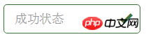
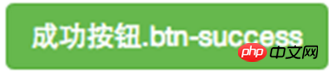
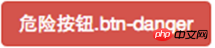
}8.表单控件状态(验证状态):1、.has-warning:警告状态(黄色) 2、.has-error:错误状态(红色) 3、.has-success:成功状态(绿色)


 :需要类名has-feedback +
9.表单提示信息:"help-block" 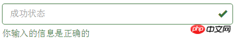


.help-block {
display: block;
margin-top: 5px;
margin-bottom: 10px;
color: #737373;
}按钮
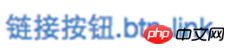
建议使用button或a标签来制作按钮
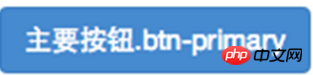
1.基本按钮:类名“btn”


.btn {
display: inline-block;
padding: 6px 12px;
margin-bottom: 0;
font-size: 14px;
font-weight: normal;
line-height: 1.42857143;
text-align: center;
white-space: nowrap;
vertical-align: middle;
cursor: pointer;
  -webkit-user-select: none;
     -moz-user-select: none;
      -ms-user-select: none;
user-select: none;
background-image: none;
border: 1px solid transparent;
border-radius: 4px;
}2.默认按钮: 类名“btn” + 类名“btn-default” 


.btn-default {
color: #333;
background-color: #fff;
border-color: #ccc;
}


4.按钮大小: .btn-lg:大型按钮 .btn-sm:小型按钮 .btn-cs:超小型按钮


.btn-lg,
.btn-group-lg> .btn {
padding: 10px 16px;
font-size: 18px;
line-height: 1.33;
border-radius: 6px;
}
.btn-sm,
.btn-group-sm> .btn {
padding: 5px 10px;
font-size: 12px;
line-height: 1.5;
border-radius: 3px;
}
.btn-xs,
.btn-group-xs> .btn {
padding: 1px 5px;
font-size: 12px;
line-height: 1.5;
border-radius: 3px;
}5.块状按钮: 类名“btn-block”
6.禁用状态: 使用disabled类或disabled属性
图像 1.img-responsive:响应式图片,主要针对于响应式设计 2.img-rounded:圆角图片 3.img-circle:圆形图片 4.img-thumbnail:缩略图片


img {
vertical-align: middle;
}
.img-responsive,
.thumbnail>img,
.thumbnail a >img,
.carousel-inner > .item >img,
.carousel-inner > .item > a >img {
display: block;
max-width: 100%;
height: auto;
}
.img-rounded {
border-radius: 6px;
}
.img-thumbnail {
display: inline-block;
max-width: 100%;
height: auto;
padding: 4px;
line-height: 1.42857143;
background-color: #fff;
border: 1px solid #ddd;
border-radius: 4px;
  -webkit-transition: all .2s ease-in-out;
transition: all .2s ease-in-out;
}
.img-circle {
border-radius: 50%;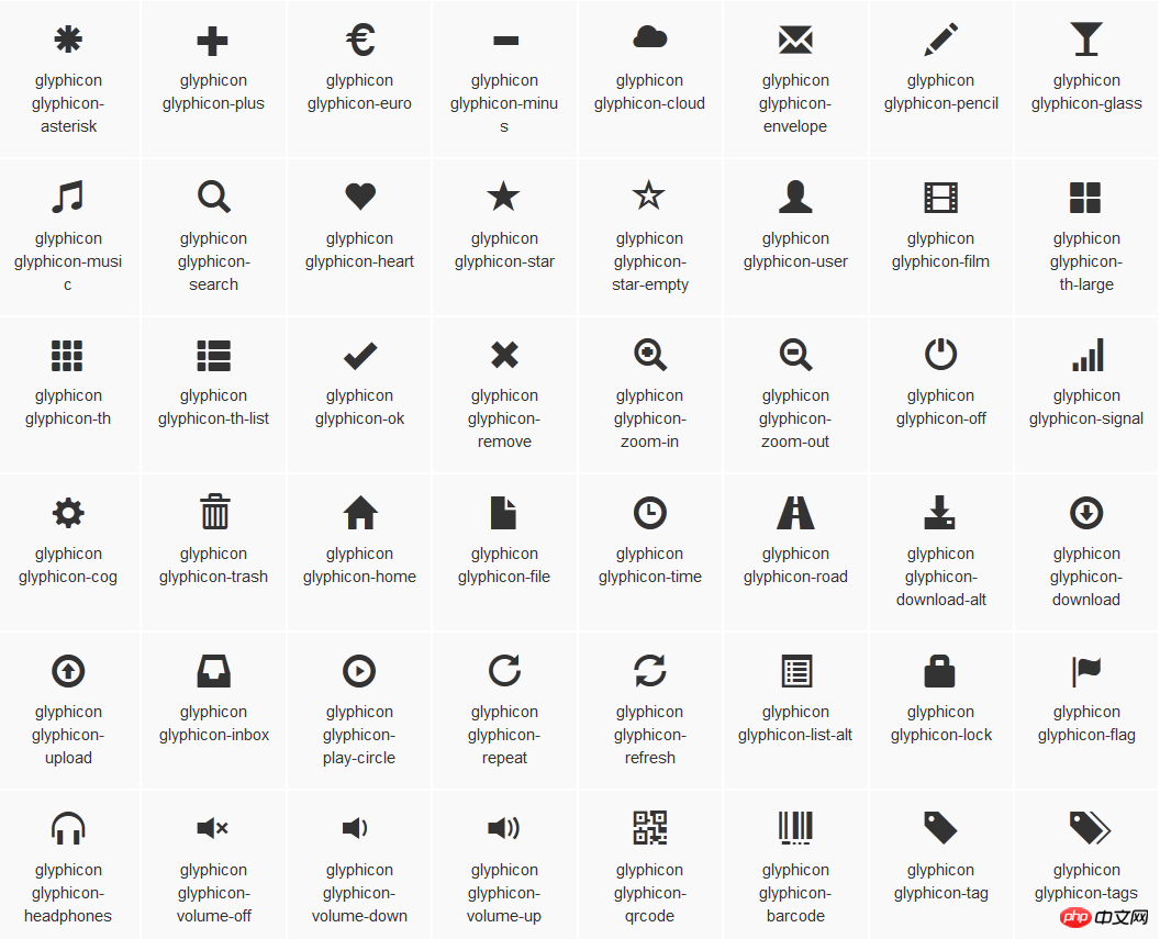
}图标
:查看全部图标

@font-face {
font-family: 'Glyphicons Halflings';
src: url('../fonts/glyphicons-halflings-regular.eot');
src: url('../fonts/glyphicons-halflings-regular.eot?#iefix') format('embedded-opentype'), url('../fonts/glyphicons-halflings-regular.woff') format('woff'), url('../fonts/glyphicons-halflings-regular.ttf') format('truetype'), url('../fonts/glyphicons-halflings-regular.svg#glyphicons_halflingsregular') format('svg');
}

<!--使用-->
.glyphicon {
position: relative;
top: 1px;
display: inline-block;
font-family: 'Glyphicons Halflings';
font-style: normal;
font-weight: normal;
line-height: 1;
  -webkit-font-smoothing: antialiased;
  -moz-osx-font-smoothing: grayscale;
}
.glyphicon-asterisk:before {
content: "\2a";
}

Das obige ist der detaillierte Inhalt vonBeispielcode für Formulare im Bootstrap. Für weitere Informationen folgen Sie bitte anderen verwandten Artikeln auf der PHP chinesischen Website!