
Heim >Web-Frontend >CSS-Tutorial >Beispielcode-Sharing für die CSS-Implementierung des Tab-Layouts (Bild)
Beispielcode-Sharing für die CSS-Implementierung des Tab-Layouts (Bild)

- 黄舟Original
- 2017-04-15 09:30:491613Durchsuche
Der folgende Editor zeigt Ihnen ein einfaches Beispiel für die Verwendung von CSS zur Implementierung des Tab-Layouts (unbedingt lesen). Der Herausgeber findet es ziemlich gut, deshalb werde ich es jetzt mit Ihnen teilen und es allen als Referenz geben. Schauen Sie sich den Editor an
1. Layout-Methode

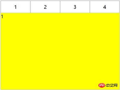
2. Inhalt und Tab integriert
<p class="container">
   <ul>
     <li class="item active">
       <p class="title">1</p>
       <p class="content">1</p>
     </li>
     <li class="item">
       <p class="title">2</p>
       <p class="content ml1">2</p>
     </li>
     <li class="item">
       <p class="title">3</p>
       <p class="content ml2">3</p>
     </li>
     <li class="item">
       <p class="title">4</p>
       <p class="content ml3">4</p>
     </li>
   </ul>
</p>
ul,li,p{
  margin:0;
  padding:0;
  list-style:none;
}
.container{
  width:400px;
  height:300px;
  background-color:silver;
  border:1px solid silver;
}
.container ul{
  width:100%;
  height:100%;
  overflow:hidden;
}
.container .item{
  float:left;
  width:25%;
  height:100%;
  background-color:white;
}
.container .item .title{
  line-height:40px;
  border:1px solid silver;
  box-sizing:border-box;
  text-align:center;
  cursor:pointer;
}
.container .item .content{
  width:400%;
  height:100%;
  background-color:yellow;
}
.ml1{
  margin-left:-100%;
}
.ml2{
  margin-left:-200%;
}
.ml3{
  margin-left:-300%;
}
.active{
  position:relative;
  z-index:1
}
.container .item:hover{
  position:relative;
  z-index:1
}
.container .item:hover .title{
  border-bottom:none;
  background-color:yellow;
}
2. CSS-Interaktion
1. Anker Implementierung (Ziel)
(1) Für Layout eins: Elemente werden von oben nach unten angeordnet und der Tab-Inhalt des übergeordneten Elements wird mit overflow:hidden hinzugefügt. Mithilfe von Ankerpunkten wechselt das Element mit der entsprechenden ID beim Klicken auf verschiedene Tags zur Ansicht des Tab-Inhalts und fügt dann per Hover einen Wechselstil zur Tab--Schaltfläche .
<p class="container">
   <p class="tab-content">
     <p id="item1" class="item">内容1</p>
     <p id="item2" class="item">内容2</p>
     <p id="item3" class="item">内容3</p>
     <p id="item4" class="item">内容4</p>
   </p>
   <p class="tab-control">
     <ul>
        <li><a href="#item1">内容1</a></li>
        <li><a href="#item2">内容2</a></li>
        <li><a href="#item3">内容3</a></li>
        <li><a href="#item4">内容4</a></li>
     </ul>
   </p>
</p>
ul,li{
  margin:0;
  padding:0;
  list-style:none;
}
.container{
  width:400px;
  height:300px;
  background-color:silver;
}
.tab-content{
  width:100%;
  height:80%;
  overflow:hidden;
}
.tab-content .item{
  width:100%;
  height:100%;
}
.tab-control{
  width:100%;
  height:20%;
}
.tab-control ul{
  height:100%;
}
.tab-control li{
  width:25%;
  height:100%;
  float:left;
  border:1px solid silver;
  box-sizing:border-box;
  background-color:white;
  cursor: pointer;
}
.tab-control li:hover{
  background-color:#7b7474
}
.tab-control a{
  display:inline-block;
  width:100%;
  height:100%;
  line-height:100%;
  text-align:center;
  text-decoration: none;
}
.tab-control a::after{
  content:"";
  display:inline-block;
  height:100%;
  vertical-align:middle;
}
ul,li{
  margin:0;
  padding:0;
  list-style:none;
}
.container{
  width:400px;
  height:300px;
  background-color:silver;
}
.tab-content{
  position:relative;
  width:100%;
  height:80%;
  overflow:hidden;
}
.tab-content .item{
  position:absolute;
  left:0;
  top:0;
  width:100%;
  height:100%;
}
.tab-control{
  width:100%;
  height:20%;
}
.tab-control ul{
  height:100%;
}
.tab-control li{
  width:25%;
  height:100%;
  float:left;
  border:1px solid silver;
  box-sizing:border-box;
  background-color:white;
  cursor: pointer;
}
.tab-control li:hover{
  background-color:#7b7474
}
.tab-control a{
  display:inline-block;
  width:100%;
  height:100%;
  line-height:100%;
  text-align:center;
  text-decoration: none;
}
.tab-control a::after{
  content:"";
  display:inline-block;
  height:100%;
  vertical-align:middle;
}

.tab-content .item:target{
  z-index:1;
  background-color:yellow;
}
absolute Positionierungzu verwenden, und verwenden Sie dann :target, um den Z-Index des Elements zu ändern um den Schalteffekt zu erzielen (Tatsächlich kann der Schalteffekt auch durch Steuern der Anzeige von Elementen erreicht werden)
(2) Für Layout zwei:
<p class="container">
   <ul>
     <li class="item active" id="item1">
       <p class="title"><a href="#item1">1</a></p>
       <p class="content">1</p>
     </li>
     <li class="item" id="item2">
       <p class="title"><a href="#item2">2</a></p>
       <p class="content ml1">2</p>
     </li>
     <li class="item" id="item3">
       <p class="title"><a href="#item3">3</a></p>
       <p class="content ml2">3</p>
     </li>
     <li class="item" id="item4">
       <p class="title"><a href="#item4">4</a></p>
       <p class="content ml3">4</p>
     </li>
   </ul>
</p>
ul,
li,
p {
  margin: 0;
  padding: 0;
  list-style: none;
}

.container {
  width: 400px;
  height: 300px;
  background-color: silver;
  border: 1px solid silver;
}

.container ul {
  width: 100%;
  height: 100%;
  overflow: hidden;
}

.container .item {
  float: left;
  width: 25%;
  height: 100%;
  background-color: white;
}

.container .item .title {
  line-height: 40px;
  border: 1px solid silver;
  box-sizing: border-box;
  text-align: center;
  cursor: pointer;
}
.container .item a {
  display:inline-block;
  width:100%;
  height:100%;
  text-decoration: none;
}

.container .item .content {
  width: 400%;
  height: 100%;
  background-color: yellow;
}

.ml1 {
  margin-left: -100%;
}

.ml2 {
  margin-left: -200%;
}

.ml3 {
  margin-left: -300%;
}

.active {
  position: relative;
  z-index: 1
}

.container .item:target {
  position: relative;
  z-index: 1
}

.container .item:target .title {
  border-bottom: none;
  background-color: yellow;
}
2. Hover-Implementierung
(1) Für Layout eins: kann nicht einfach durch CSS erreicht werden
(2) Für Layout zwei:
<p class="container">
   <ul>
     <li class="item active">
       <p class="title">1</p>
       <p class="content">1</p>
     </li>
     <li class="item">
       <p class="title">2</p>
       <p class="content ml1">2</p>
     </li>
     <li class="item">
       <p class="title">3</p>
       <p class="content ml2">3</p>
     </li>
     <li class="item">
       <p class="title">4</p>
       <p class="content ml3">4</p>
     </li>
   </ul>
</p>
ul,li,p{
  margin:0;
  padding:0;
  list-style:none;
}
.container{
  width:400px;
  height:300px;
  background-color:silver;
  border:1px solid silver;
}
.container ul{
  width:100%;
  height:100%;
  overflow:hidden;
}
.container .item{
  float:left;
  width:25%;
  height:100%;
  background-color:white;
}
.container .item .title{
  line-height:40px;
  border:1px solid silver;
  box-sizing:border-box;
  text-align:center;
  cursor:pointer;
}
.container .item .content{
  width:400%;
  height:100%;
  background-color:yellow;
}
.ml1{
  margin-left:-100%;
}
.ml2{
  margin-left:-200%;
}
.ml3{
  margin-left:-300%;
}
.active{
  position:relative;
  z-index:1
}
.container .item:hover{
  position:relative;
  z-index:1
}
.container .item:hover .title{
  border-bottom:none;
  background-color:yellow;
}
3. Label und :geprüfte Implementierung
(1) Für Layout eins:
<p class="container">
  <p class="tab-content">
    <input type="radio" name="item" class="radio-item" id="item1" checked/>
    <p class="item">内容1</p>
    <input type="radio" name="item" class="radio-item" id="item2" />
    <p class="item">内容2</p>
    <input type="radio" name="item" class="radio-item" id="item3" />
    <p class="item">内容3</p>
    <input type="radio" name="item" class="radio-item" id="item4" />
    <p class="item">内容4</p>
  </p>
  <p class="tab-control">
    <ul>
      <li><label for="item1">内容1</label></li>
      <li><label for="item2">内容2</label></li>
      <li><label for="item3">内容3</label></li>
      <li><label for="item4">内容4</label></li>
    </ul>
  </p>
</p>
ul,
li {
  margin: 0;
  padding: 0;
  list-style: none;
}

.container {
  width: 400px;
  height: 300px;
  background-color: silver;
}

.tab-content {
  position: relative;
  width: 100%;
  height: 80%;
  overflow: hidden;
}

input {
  margin: 0;
  width: 0;
}

.tab-content .item {
  position: absolute;
  left: 0;
  top: 0;
  width: 100%;
  height: 100%;
}

.tab-control {
  width: 100%;
  height: 20%;
}

.tab-control ul {
  height: 100%;
}

.tab-control li {
  width: 25%;
  height: 100%;
  float: left;
  border: 1px solid silver;
  box-sizing: border-box;
  background-color: white;
}

.tab-control li:hover {
  background-color: #7b7474
}

.tab-control label {
  display: inline-block;
  width: 100%;
  height: 100%;
  line-height: 100%;
  text-align: center;
  text-decoration: none;
  cursor: pointer;
}

.tab-control label::after {
  content: "";
  display: inline-block;
  height: 100%;
  vertical-align: middle;
}
.tab-content .radio-item{
  display:none;
}
.tab-content .radio-item:checked+.item {
  z-index: 1;
  background-color: yellow;
}
(2) Für Layout zwei:
<p class="container">
   <ul>
     <li class="item active">
       <input type="radio" name="item" class="radio-item" id="item1" checked/>
       <label class="title" for="item1">1</label>
       <p class="content">1</p>
     </li>
     <li class="item">
       <input type="radio" name="item" class="radio-item" id="item2" />
       <label class="title" for="item2">2</label>
       <p class="content ml1">2</p>
     </li>
     <li class="item">
       <input type="radio" name="item" class="radio-item" id="item3" />
       <label class="title" for="item3">3</label>
       <p class="content ml2">3</p>
     </li>
     <li class="item">
       <input type="radio" name="item" class="radio-item" id="item4" />
       <label class="title" for="item4">4</label>
       <p class="content ml3">4</p>
     </li>
   </ul>
</p>
Das obige ist der detaillierte Inhalt vonBeispielcode-Sharing für die CSS-Implementierung des Tab-Layouts (Bild). Für weitere Informationen folgen Sie bitte anderen verwandten Artikeln auf der PHP chinesischen Website!