
Heim >Web-Frontend >CSS-Tutorial >Erstellen einer responsiven Benutzeroberfläche für Profileinstellungen mit Tailwind CSS
Erstellen einer responsiven Benutzeroberfläche für Profileinstellungen mit Tailwind CSS

- PHPzOriginal
- 2024-07-18 20:48:011252Durchsuche
In diesem Abschnitt erstellen wir mit Tailwind CSS ein Design für Benutzerprofileinstellungen. Dieser Prozess umfasst die Gestaltung einer Benutzeroberfläche, die optisch ansprechend und benutzerfreundlich ist und den Utility-First-Ansatz von Tailwind CSS nutzt, um verschiedene Komponenten effektiv zu gestalten.
Erstellen Sie mit Tailwind CSS ein minimalistisches Benutzerprofil-Setup mit Benutzername, E-Mail-Adresse und Passwort.
<div class="bg-gray-100 h-screen flex items-center justify-center">
    <div class="bg-white p-8 rounded shadow-md w-full max-w-md">
        <h1 class="text-2xl font-semibold mb-4">Profile Settings</h1>

        <form>
            <div class="mb-4">
                <label for="username" class="block text-sm font-medium text-gray-600">Username</label>
                <input type="text" id="username" name="username" class="mt-1 p-2 border border-gray-300 rounded-md w-full focus:outline-none focus:ring focus:border-blue-300">
            </div>

            <div class="mb-4">
                <label for="email" class="block text-sm font-medium text-gray-600">Email</label>
                <input type="email" id="email" name="email" class="mt-1 p-2 border border-gray-300 rounded-md w-full focus:outline-none focus:ring focus:border-blue-300">
            </div>

            <div class="mb-6">
                <label for="password" class="block text-sm font-medium text-gray-600">Password</label>
                <input type="password" id="password" name="password" class="mt-1 p-2 border border-gray-300 rounded-md w-full focus:outline-none focus:ring focus:border-blue-300">
            </div>

            <button type="submit" class="w-full bg-blue-500 text-white p-2 rounded-md hover:bg-blue-600 focus:outline-none focus:ring focus:border-blue-300">
                Save Changes
            </button>
        </form>
    </div>
</div>

Entwerfen von Benutzerprofilverbesserungen mit Tailwind CSS: Vorname, Nachname, E-Mail, neues Passwort, Aktualisierung des Profilbilds und Schaltfläche zum Löschen des Kontos.
<div class="bg-gray-100 min-h-screen flex items-center justify-center">
    <div class="max-w-md bg-white p-8 rounded shadow-md">
        <!-- Erstellen einer responsiven Benutzeroberfläche für Profileinstellungen mit Tailwind CSS Section -->
        <div class="flex items-center justify-center mb-6">
            <div class="w-20 h-20 mr-4 overflow-hidden rounded-full">
                <img src="https://picsum.photos/200/300" alt="Erstellen einer responsiven Benutzeroberfläche für Profileinstellungen mit Tailwind CSS" class="w-full h-full object-cover">
            </div>
            <div>
                <label for="avatar" class="cursor-pointer text-blue-500 hover:underline">Change Profile Picture</label>
                <input type="file" id="avatar" class="hidden">
            </div>
        </div>

        <!-- Name Section -->
        <div class="grid grid-cols-2 gap-4 mb-6">
            <div>
                <label for="firstName" class="block text-gray-700 text-sm font-bold mb-2">First Name</label>
                <input type="text" id="firstName" class="w-full px-4 py-2 border rounded focus:outline-none focus:border-blue-500">
            </div>
            <div>
                <label for="lastName" class="block text-gray-700 text-sm font-bold mb-2">Last Name</label>
                <input type="text" id="lastName" class="w-full px-4 py-2 border rounded focus:outline-none focus:border-blue-500">
            </div>
        </div>

        <!-- Email Section -->
        <div class="mb-6">
            <label for="email" class="block text-gray-700 text-sm font-bold mb-2">Email</label>
            <input type="email" id="email" class="w-full px-4 py-2 border rounded focus:outline-none focus:border-blue-500">
        </div>

        <!-- Password Section -->
        <div class="mb-6">
            <label for="password" class="block text-gray-700 text-sm font-bold mb-2">New Password</label>
            <input type="password" id="password" class="w-full px-4 py-2 border rounded focus:outline-none focus:border-blue-500">
        </div>

        <!-- Buttons -->
        <div class="flex justify-between">
            <button class="bg-blue-500 text-white px-4 py-2 rounded hover:bg-blue-600 focus:outline-none focus:shadow-outline-blue" type="button">
                Save Changes
            </button>
            <button class="bg-red-500 text-white px-4 py-2 rounded hover:bg-red-600 focus:outline-none focus:shadow-outline-red" type="button">
                Delete Account
            </button>
        </div>
    </div>
</div>

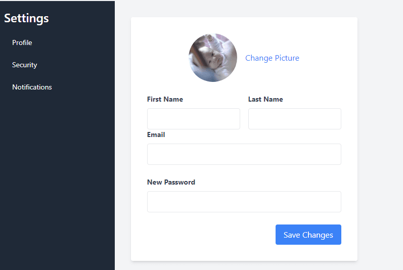
Erstellen einer responsiven Profileinstellungsseite mit Seitenleiste mithilfe von Tailwind CSS.
<div class="flex min-h-screen bg-gray-100">
    <!-- Sidebar -->
    <aside class="hidden w-1/4 bg-gray-800 text-white md:block">
        <div class="p-4">
            <h2 class="text-2xl font-semibold">Settings</h2>
            <ul class="mt-4 space-y-2">
                <li><a href="#" class="block px-4 py-2 text-sm hover:bg-gray-700">Profile</a></li>
                <li><a href="#" class="block px-4 py-2 text-sm hover:bg-gray-700">Security</a></li>
                <li><a href="#" class="block px-4 py-2 text-sm hover:bg-gray-700">Notifications</a></li>
            </ul>
        </div>
    </aside>
    <!-- Content -->
    <div class="flex-1 p-8">
        <!-- Mobile Menu Toggle Button (hidden on larger screens) -->
        <div class="flex justify-end md:hidden">
            <button id="menuToggle" class="text-gray-700 hover:text-gray-900 focus:outline-none">
                <svg class="h-6 w-6" fill="none" stroke="currentColor" viewbox="0 0 24 24" xmlns="http://www.w3.org/2000/svg">
                    <path stroke-linecap="round" stroke-linejoin="round" stroke-width="2" d="M4 6h16M4 12h16m-7 6h7">
                    </path>
                </svg>
            </button>
        </div>
        <!-- Profile Settings -->
        <div class="max-w-md rounded bg-white p-8 shadow-md">
            <!-- Erstellen einer responsiven Benutzeroberfläche für Profileinstellungen mit Tailwind CSS Section -->
            <div class="mb-6 flex items-center justify-center">
                <div class="mr-4 h-24 w-24 overflow-hidden rounded-full">
                    <img src="https://picsum.photos/200/300" alt="Erstellen einer responsiven Benutzeroberfläche für Profileinstellungen mit Tailwind CSS" class="h-full w-full object-cover">
                </div>
                <div>
                    <label for="avatar" class="cursor-pointer text-blue-500 hover:underline">Change Picture</label>
                    <input type="file" id="avatar" class="hidden">
                </div>
            </div>
            <!-- Form Section -->
            <form>
                <div class="grid grid-cols-2 gap-4">
                    <div>
                        <label for="firstName" class="mb-2 block text-sm font-bold text-gray-700">First Name</label>
                        <input type="text" id="firstName" class="w-full rounded border px-4 py-2 focus:border-blue-500 focus:outline-none">
                    </div>
                    <div>
                        <label for="lastName" class="mb-2 block text-sm font-bold text-gray-700">Last Name</label>
                        <input type="text" id="lastName" class="w-full rounded border px-4 py-2 focus:border-blue-500 focus:outline-none">
                    </div>
                </div>
                <div class="mb-6">
                    <label for="email" class="mb-2 block text-sm font-bold text-gray-700">Email</label>
                    <input type="email" id="email" class="w-full rounded border px-4 py-2 focus:border-blue-500 focus:outline-none">
                </div>
                <div class="mb-6">
                    <label for="password" class="mb-2 block text-sm font-bold text-gray-700">New Password</label>
                    <input type="password" id="password" class="w-full rounded border px-4 py-2 focus:border-blue-500 focus:outline-none">
                </div>
                <!-- Buttons -->
                <div class="flex justify-end">
                    <button class="focus:shadow-outline-blue rounded bg-blue-500 px-4 py-2 text-white hover:bg-blue-600 focus:outline-none" type="button">Save Changes</button>
                </div>
            </form>
        </div>
    </div>
</div>
Das obige ist der detaillierte Inhalt vonErstellen einer responsiven Benutzeroberfläche für Profileinstellungen mit Tailwind CSS. Für weitere Informationen folgen Sie bitte anderen verwandten Artikeln auf der PHP chinesischen Website!